Download to read offline

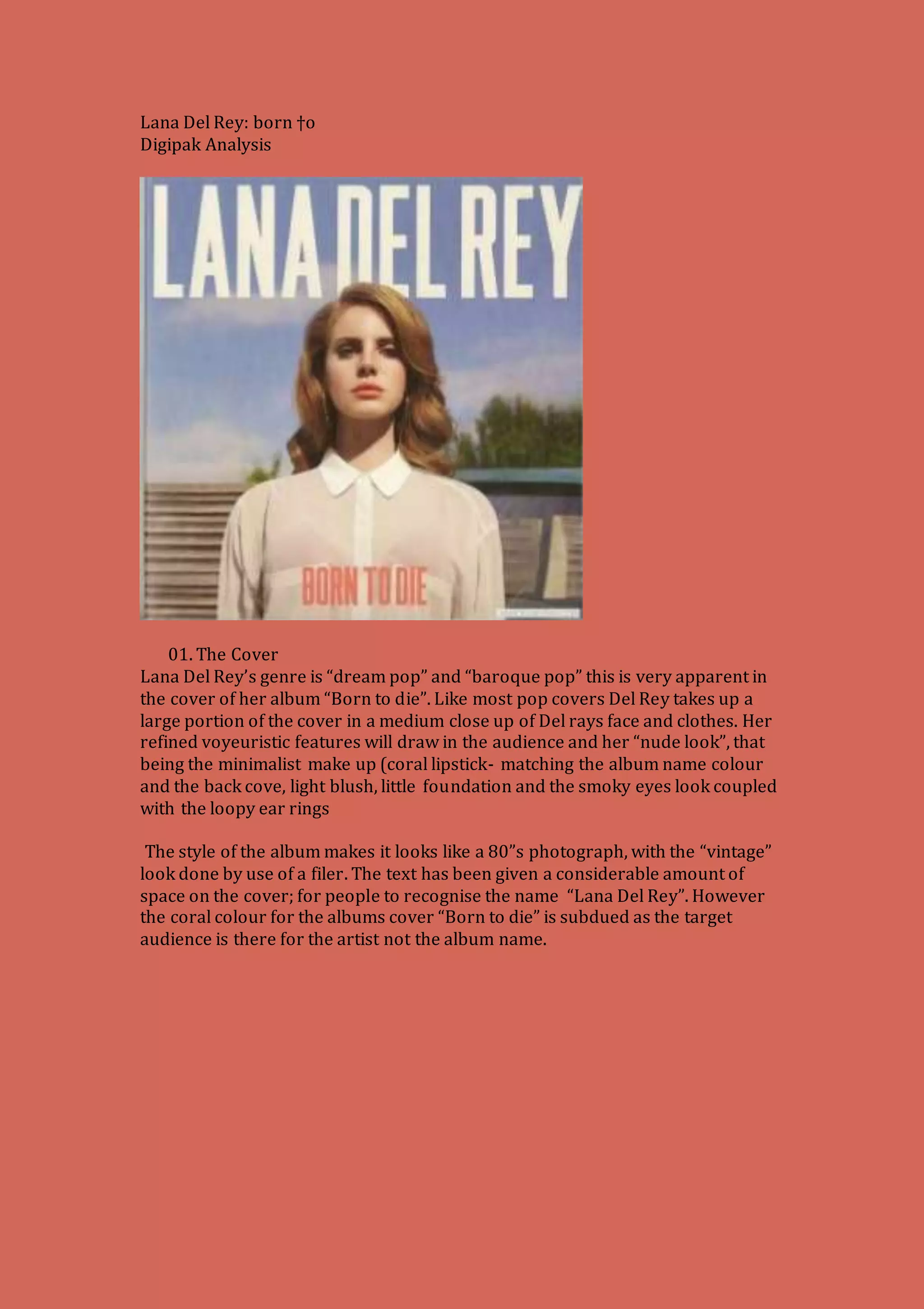

The document analyzes the digipack for Lana Del Rey's album "Born to Die". It discusses each element of the packaging including the front cover photo of Del Rey, the retro aesthetic and color scheme carried throughout. The back cover highlights the song titles and exclusives. Inside are bonus photos of Del Rey and lyrics pages conveying the melancholy themes through imagery like splattered blood. The CD itself features roses to symbolize the album's passionate yet dark sound.


