Analysis of Digipak’s
Oliver Garrett
The large image inside of the digipak shows a lot of emotion through
the use of colour; because Rhianna is lying on a bunch of roses this
could represent weakness. The image could also make the audience
think about different messages that it would be representing. Sex
appeal is also shown through the seductive look within the album cover,
this could also strongly appeal to the male audience. Looking at this
image we see Rhianna; the main artist looking calm although her facial
expression shows the audience that is passionate about her new album.
We are immediately drawn to the boldness of both her red hair and her
red lips, which connoted romance and femininity. This digipak I believe
is a massive contrast to the name of the album, as the these itself is
love, romance and weakness, which is reflecting the emotional songs
within her album. However Rhianna is a bold female within the media,
the fact that the album is called ‘LOUD’ reflects her personality. When
analysing the typography that is being used within this Digipak we see
the artists name ‘Rhianna’ and the album name ‘LOUD’; these are placed
upon the front cover, above and below the image. The colour white
connotates pureness and adds to the feminine and romantic
background; the colour white also stands out from the background of
Rhianna’s face. It appears ironic that the title ‘LOUD’ is in a subtle colour
instead of a bold colour; however the image itself seems to be bold.
The mise en scene of the front cover presents Lana’s ‘classy’ style. Her hair is styled in a traditional
1960/40’s way with the large curls; she uses direct mode of address which we see her face being
expressionless, this indicates to me that she takes her music very seriously and also may suggest what
style inspires to be the way she is. The rural setting creates a working class stereotype which may
indicate her own personal life or to purposely contrast against the 4-/6-’s upper middle class style that
is being presented through her clothing/makeup and hair. This rural setting also contrasts against her
music genre, I don’t think the alternative/pop genre which is her genre is conveyed through this front
cover. The front cover extremely postmodern as it uses bricolage, creating confusion between
2012(when the album was released) and the 1940s era through mise en scene custom especially.
Another postmodern feature used is pastiche, she looks very similar to an actress in the 40/60s the
front cover and the rest of her music albums/videos, she is inspired by. The artists make up is subtle
which enhances her natural beauty and enhances her character as religious and innocent, almost the
idea that she is ‘angel like’. The fact that the shirt is buttoned up and is long sleeves conveys how Lana
doesn’t have to overly sexualise herself to be noticed; this contrasts against other artists in the music
industry especially in the pop genre such as Miley Cyrus. She consistently uses a red, white and blue
colour scheme which is iconic of the American flag; this makes the album personal to her and pays
homage to America which is where she is from. A lot of artists do this with their work as they like their
audience to be able to recognise them through the use of consistent house style hey use. The CD
cover on the right is very simplistic which again conveys her soft natural voice; the red rose may
indicate a love or a danger/warning narrative – this suggests the album is personal to her love life
therefore intrigues her fans more to listen to the CD. The back of the cover is the names of the songs
which feature on the album – this allows the audience to maybe notice their favourite songs which
may encourage them to buy the CD. The layout is very simplistic and the image doesn’t look as
though it has been overly manipulated through editing software therefore again emphasising that she
her overall ‘look’ and music performance style is quite naturalistic which appeals to her fans as they
respect her more for her voice/talent rather than her entertainment skills(e.g dancing performance).
This digipak tells us so much about the artists and the impression being made, just from a glance. Firstly, lets focus on the monochrome colour scheme which sets the genre. Indie
music is typically associated with audiences who avoid the mainstream and advert typical social behaviour. They are also associated with being particularly different and sometimes
moody, this colour scheme adheres to all of these elements. Often a front cover will be vibrant to grab attention, but like indie audiences, this cover avoid typical conventions. The
way the artist is dressed further illustrates this careless attitude. He is hunched over slightly, with his shirt unbuttoned and he maintains direct eye contract with the camera whilst
taking a pull from his cigarette. Smoking is seen among young people to be rebellious, the artist is photographed in a mid shot with a brand logo positioned on the left side as
though it had been stamped on without much though. All these factors contribute towards a reckless youth sort of image. A theme is conveyed throughout the digipak via the
colour scheme, typography and prop use. The artists is seen smoking a cigarette in both the front and back of the album cover, and so one CD is made up completely of cigarettes,
whilst the other is plain black with the band logo, retaining brand identity but also a minimalistic approach. The typography helps also, as only two fonts are used, one on the logo
and one for the track list and extra information at the bottom, so the digipak is not contrasting, cluttered or confusing. There is contrast on this digipak. The first one noticeable is
the difference in the front and back photos. In the first, the artist seems confident and cocky, however in the second, he is more hunched over and hiding his face, suggesting he is
shameful in some way. Perhaps this signifies contrasting emotions, this encourages the audience to want to listen to the album, as this is how they might find answers. Also only
one band member is found on the cover, which is not typical. This digipak is appealing to audiences because the artists is presented as fairly common, working class and possible
and similar to the audience themselves. Instead of being put down on a superior level, he appears relatable and therefore more likeable. Essentially, this makes the band seem
more ‘down to earth’. The cigarettes could signify characteristics of the band, risky, dangerous, rebellious and associated highly with youth culture.

Analysis of digipaks

  • 1.
  • 2.
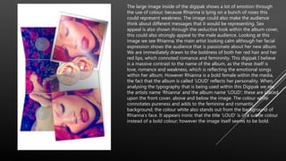
    The large imageinside of the digipak shows a lot of emotion through the use of colour; because Rhianna is lying on a bunch of roses this could represent weakness. The image could also make the audience think about different messages that it would be representing. Sex appeal is also shown through the seductive look within the album cover, this could also strongly appeal to the male audience. Looking at this image we see Rhianna; the main artist looking calm although her facial expression shows the audience that is passionate about her new album. We are immediately drawn to the boldness of both her red hair and her red lips, which connoted romance and femininity. This digipak I believe is a massive contrast to the name of the album, as the these itself is love, romance and weakness, which is reflecting the emotional songs within her album. However Rhianna is a bold female within the media, the fact that the album is called ‘LOUD’ reflects her personality. When analysing the typography that is being used within this Digipak we see the artists name ‘Rhianna’ and the album name ‘LOUD’; these are placed upon the front cover, above and below the image. The colour white connotates pureness and adds to the feminine and romantic background; the colour white also stands out from the background of Rhianna’s face. It appears ironic that the title ‘LOUD’ is in a subtle colour instead of a bold colour; however the image itself seems to be bold.
  • 3.
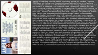
    The mise enscene of the front cover presents Lana’s ‘classy’ style. Her hair is styled in a traditional 1960/40’s way with the large curls; she uses direct mode of address which we see her face being expressionless, this indicates to me that she takes her music very seriously and also may suggest what style inspires to be the way she is. The rural setting creates a working class stereotype which may indicate her own personal life or to purposely contrast against the 4-/6-’s upper middle class style that is being presented through her clothing/makeup and hair. This rural setting also contrasts against her music genre, I don’t think the alternative/pop genre which is her genre is conveyed through this front cover. The front cover extremely postmodern as it uses bricolage, creating confusion between 2012(when the album was released) and the 1940s era through mise en scene custom especially. Another postmodern feature used is pastiche, she looks very similar to an actress in the 40/60s the front cover and the rest of her music albums/videos, she is inspired by. The artists make up is subtle which enhances her natural beauty and enhances her character as religious and innocent, almost the idea that she is ‘angel like’. The fact that the shirt is buttoned up and is long sleeves conveys how Lana doesn’t have to overly sexualise herself to be noticed; this contrasts against other artists in the music industry especially in the pop genre such as Miley Cyrus. She consistently uses a red, white and blue colour scheme which is iconic of the American flag; this makes the album personal to her and pays homage to America which is where she is from. A lot of artists do this with their work as they like their audience to be able to recognise them through the use of consistent house style hey use. The CD cover on the right is very simplistic which again conveys her soft natural voice; the red rose may indicate a love or a danger/warning narrative – this suggests the album is personal to her love life therefore intrigues her fans more to listen to the CD. The back of the cover is the names of the songs which feature on the album – this allows the audience to maybe notice their favourite songs which may encourage them to buy the CD. The layout is very simplistic and the image doesn’t look as though it has been overly manipulated through editing software therefore again emphasising that she her overall ‘look’ and music performance style is quite naturalistic which appeals to her fans as they respect her more for her voice/talent rather than her entertainment skills(e.g dancing performance).
  • 4.
    This digipak tellsus so much about the artists and the impression being made, just from a glance. Firstly, lets focus on the monochrome colour scheme which sets the genre. Indie music is typically associated with audiences who avoid the mainstream and advert typical social behaviour. They are also associated with being particularly different and sometimes moody, this colour scheme adheres to all of these elements. Often a front cover will be vibrant to grab attention, but like indie audiences, this cover avoid typical conventions. The way the artist is dressed further illustrates this careless attitude. He is hunched over slightly, with his shirt unbuttoned and he maintains direct eye contract with the camera whilst taking a pull from his cigarette. Smoking is seen among young people to be rebellious, the artist is photographed in a mid shot with a brand logo positioned on the left side as though it had been stamped on without much though. All these factors contribute towards a reckless youth sort of image. A theme is conveyed throughout the digipak via the colour scheme, typography and prop use. The artists is seen smoking a cigarette in both the front and back of the album cover, and so one CD is made up completely of cigarettes, whilst the other is plain black with the band logo, retaining brand identity but also a minimalistic approach. The typography helps also, as only two fonts are used, one on the logo and one for the track list and extra information at the bottom, so the digipak is not contrasting, cluttered or confusing. There is contrast on this digipak. The first one noticeable is the difference in the front and back photos. In the first, the artist seems confident and cocky, however in the second, he is more hunched over and hiding his face, suggesting he is shameful in some way. Perhaps this signifies contrasting emotions, this encourages the audience to want to listen to the album, as this is how they might find answers. Also only one band member is found on the cover, which is not typical. This digipak is appealing to audiences because the artists is presented as fairly common, working class and possible and similar to the audience themselves. Instead of being put down on a superior level, he appears relatable and therefore more likeable. Essentially, this makes the band seem more ‘down to earth’. The cigarettes could signify characteristics of the band, risky, dangerous, rebellious and associated highly with youth culture.