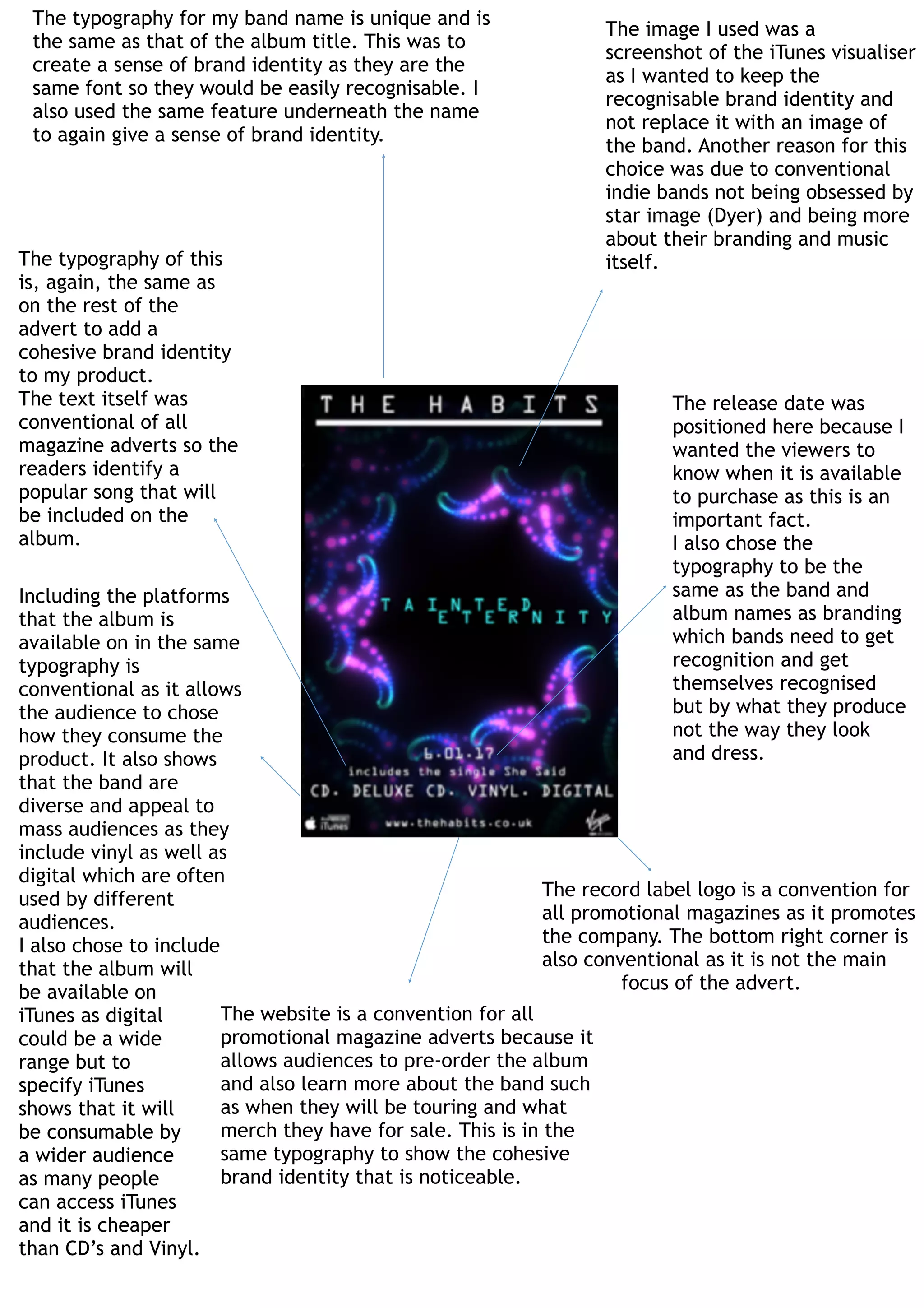
The document discusses the design choices made for a band's promotional magazine advertisement. Key points include:
- The same font was used for the band and album names to create a consistent brand identity.
- An iTunes visualizer screenshot was used instead of a band image to focus on branding over personality.
- Standard elements like the record label logo, release date, and website were included in the same font for cohesive branding.
- Including multiple formats (vinyl, digital) shows the band appeals to a wide audience. Specifying iTunes ensures wide digital access.