DIGIPAK ANALYSIS
At the beginning of last decade, digipaks were introduce by record labels and
artists. Their purpose is to advertise the artist and to increase sales.
Approximately, the same effect is created by music videos. However, a digipak
focuses more on the reasons why the people should buy the album instead of
simply listening to it on their smart devices.
Digipaks gives the buyers the option of being able to compare the album with
the method of buy it online. It also comes with additional pictures of the
artist and its message to the fans, and sometimes, the lyrics of each songs are
included.
In conclusion, the digipacks look more appealing to the fans/buyers who are
interested in the artist as it gives a different experience as they are personally
able to purchase it and entitle to benefit from extra features included.
WHAT IS A DIGIPAK?
HOW IS A DIGIPAK DISPLAYED?.
The front cover
Picture of the artist
Name of the artist
Colour scheme
Inside
The album disk
Lyrics booklet
Artist message to the fans
The back cover
A list of the songs included
in the album
Record company and
website
Copyright information
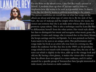
For the Born to die album cover, Lana Del Rey used a picture of
herself. A medium close up shot of her was used in order to
emphasise how she wants to be seen as a powerful artist. It almost
looks like she directly wants to address something to the viewer.
The picture establishes an overall idea on what her songs on the
album are about and what type of artist she is. By the style of her
hair , the use of makeup and the simple white blouse she wears, the
viewer can connote that she is an indie artist whose album does not
promote a pop culture. This is also a technique used by Lana Del Rey
to differentiate herself from the other artists. Her visual style allows
her fans to distinguish her music and recognise what music genre she
promotes. A retro and vintage vibe is created due to the classy blouse,
the hoops earrings and the red lipstick. As it was pointed out before,
Lana wants to be seen as an unique artist. Her performances and
songs make her look as an artist who was born in a wrong era. She
makes the audience feel like they live in the 1960’s as she produces
songs which do not match with nowadays songs.Also, the use of the
retro car which is slightly in the shot, adds up to the vintage look and
old era. By having a first glance, it makes the viewer able to denote
how the album does not appeal to a mass audience, and it’s rather
created for a specific group of listeners(her fans/people interested in
indie music) also known as niche audience.
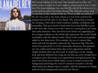
The colour scheme is very clear. The background is a blue sky
which makes it easier for Lana’s name to stand out as it had a white
font.The same technique was used for the title of the album as it is
positioned on top of her white blouse. This time, the colour used
for the font is blue similar to the sky. As an overall, the colour of
the sky was used as the main colour as it was both used for the
background and the title of the album. The colour blue is known
for creating a calm effect which connotes stability, confidence and
tranquillity. This goes hand in hand with how Lana Del Rey’s pose
in this shot. She comes out to the viewer as a strong but at the same
time calm character. Also, the front cover looks very appealing for
the younger audience as the whole idea represents ‘the youth’ which
contradicts with the album’s name. There is also some iconography
added to the front cover. For example, the use of colours blue,
white and red( her lipstick) represent the American flag. This also
shows how proud she is of her nationality. However, this elements
are very subtle and rather classy due to her appearance and the
simple medium close up shot used. It emphasises on the vintage
look and how different her songs are for this era, even though she is
a modern artist. Her name is in capital letters and spread across the
top of the front cover which makes it easy to stand out from the
background and brings the viewer’s attention towards it. On the
other hand, the albums name is smaller with the intention of fitting
with the white background created by her blouse.
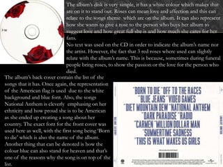
The album’s disk is very simple, it has a white colour which makes that
are on it to stand out. Roses can mean love and affection and this can
relate to the songs theme which are on the album. It can also represent
how she wants to give a rose to the person who buys her album to
suggest love and how great full she is and how much she cares for her
fans.
No text was used on the CD in order to indicate the album’s name nor
the artist. However, the fact that 3 red roses where used can slightly
relate with the album’s name. This is because, sometimes during funeral
people bring roses, to show the passion or the love for the person who
died.
The album’s back cover contain the list of the
songs that it has. Once again, the representation
of the American flag is used due to the white
background and blue font. Also, the songs
National Anthem is cleverly emphasing on her
ethnicity and how proud she is to be American
as she ended up creating a song about her
country. The exact font for the front cover was
used here as well, with the first song being ‘Born
to die’ which is also the name of the album.
Another thing that can be denoted is how the
colour blue can also stand for heaven and that’s
one of the reasons why the song is on top of the
list.

Digi pak analysis

  • 1.
  • 2.
    At the beginningof last decade, digipaks were introduce by record labels and artists. Their purpose is to advertise the artist and to increase sales. Approximately, the same effect is created by music videos. However, a digipak focuses more on the reasons why the people should buy the album instead of simply listening to it on their smart devices. Digipaks gives the buyers the option of being able to compare the album with the method of buy it online. It also comes with additional pictures of the artist and its message to the fans, and sometimes, the lyrics of each songs are included. In conclusion, the digipacks look more appealing to the fans/buyers who are interested in the artist as it gives a different experience as they are personally able to purchase it and entitle to benefit from extra features included. WHAT IS A DIGIPAK?
  • 3.
    HOW IS ADIGIPAK DISPLAYED?. The front cover Picture of the artist Name of the artist Colour scheme Inside The album disk Lyrics booklet Artist message to the fans The back cover A list of the songs included in the album Record company and website Copyright information
  • 4.
    For the Bornto die album cover, Lana Del Rey used a picture of herself. A medium close up shot of her was used in order to emphasise how she wants to be seen as a powerful artist. It almost looks like she directly wants to address something to the viewer. The picture establishes an overall idea on what her songs on the album are about and what type of artist she is. By the style of her hair , the use of makeup and the simple white blouse she wears, the viewer can connote that she is an indie artist whose album does not promote a pop culture. This is also a technique used by Lana Del Rey to differentiate herself from the other artists. Her visual style allows her fans to distinguish her music and recognise what music genre she promotes. A retro and vintage vibe is created due to the classy blouse, the hoops earrings and the red lipstick. As it was pointed out before, Lana wants to be seen as an unique artist. Her performances and songs make her look as an artist who was born in a wrong era. She makes the audience feel like they live in the 1960’s as she produces songs which do not match with nowadays songs.Also, the use of the retro car which is slightly in the shot, adds up to the vintage look and old era. By having a first glance, it makes the viewer able to denote how the album does not appeal to a mass audience, and it’s rather created for a specific group of listeners(her fans/people interested in indie music) also known as niche audience.
  • 5.
    The colour schemeis very clear. The background is a blue sky which makes it easier for Lana’s name to stand out as it had a white font.The same technique was used for the title of the album as it is positioned on top of her white blouse. This time, the colour used for the font is blue similar to the sky. As an overall, the colour of the sky was used as the main colour as it was both used for the background and the title of the album. The colour blue is known for creating a calm effect which connotes stability, confidence and tranquillity. This goes hand in hand with how Lana Del Rey’s pose in this shot. She comes out to the viewer as a strong but at the same time calm character. Also, the front cover looks very appealing for the younger audience as the whole idea represents ‘the youth’ which contradicts with the album’s name. There is also some iconography added to the front cover. For example, the use of colours blue, white and red( her lipstick) represent the American flag. This also shows how proud she is of her nationality. However, this elements are very subtle and rather classy due to her appearance and the simple medium close up shot used. It emphasises on the vintage look and how different her songs are for this era, even though she is a modern artist. Her name is in capital letters and spread across the top of the front cover which makes it easy to stand out from the background and brings the viewer’s attention towards it. On the other hand, the albums name is smaller with the intention of fitting with the white background created by her blouse.
  • 6.
    The album’s diskis very simple, it has a white colour which makes that are on it to stand out. Roses can mean love and affection and this can relate to the songs theme which are on the album. It can also represent how she wants to give a rose to the person who buys her album to suggest love and how great full she is and how much she cares for her fans. No text was used on the CD in order to indicate the album’s name nor the artist. However, the fact that 3 red roses where used can slightly relate with the album’s name. This is because, sometimes during funeral people bring roses, to show the passion or the love for the person who died. The album’s back cover contain the list of the songs that it has. Once again, the representation of the American flag is used due to the white background and blue font. Also, the songs National Anthem is cleverly emphasing on her ethnicity and how proud she is to be American as she ended up creating a song about her country. The exact font for the front cover was used here as well, with the first song being ‘Born to die’ which is also the name of the album. Another thing that can be denoted is how the colour blue can also stand for heaven and that’s one of the reasons why the song is on top of the list.