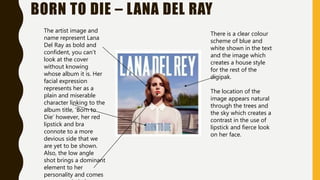
DIGIPAK
ANALYSIS
BORN TO DIE – LANA DEL RAY
The artist image and
name represent Lana
Del Ray as bold and
confident, you can’t
look at the cover
without knowing
whose album it is. Her
facial expression
represents her as a
plain and miserable
character linking to the
album title, ‘Born to
Die’ however, her red
lipstick and bra
connote to a more
devious side that we
are yet to be shown.
Also, the low angle
shot brings a dominant
element to her
personality and comes
There is a clear colour
scheme of blue and
white shown in the text
and the image which
creates a house style
for the rest of the
digipak.
The location of the
image appears natural
through the trees and
the sky which creates a
contrast in the use of
lipstick and fierce look
on her face.
BORN TO DIE – LANA DEL RAY
The blue and white
style is used again on
the track list keeping
within the house style.
The bold font is also
used again and the
album information is
located typically at the
bottom.
The clear and precise
style is in keeping with
the theme of the
digipak giving Lana Del
Ray a focused image.
The layout of the
back of the album is
clear and precise
making it easy for the
buyer to take a quick
glance at what they’re
purchasing.
The titles of the songs
have a varied theme,
‘Born To Die,’
‘Summertime
Sadness’ and ‘Dark
Paradise’ have a
negative tone that
link to the title of the
album creating a
serious quality.
BORN TO DIE – LANA DEL RAY
The red of the roses
demonstrates synergy
with the album cover,
this connotes to the
danger and rebellion that
Lana Del Ray displays
discretely by using small
sections of red in various
places.
The large spaces
of white show
the purity and
innocence of
her character
which contrast
with the red
colour.
Flowers are also
used as synergy
throughout of
the rest of the
album.
BORN TO DIE – LANA DEL RAY
Song titles in
large font to give
an obvious
structure which is
easy to read.
By including a
booklet with
song lyrics, this
gives buyers
something extra
that might
convince them
to buy the
product.
The use of flowers as detail around the edges is in keeping with the house
style and theme of the digipak.

Digipak analysis

  • 1.
  • 2.
    BORN TO DIE– LANA DEL RAY The artist image and name represent Lana Del Ray as bold and confident, you can’t look at the cover without knowing whose album it is. Her facial expression represents her as a plain and miserable character linking to the album title, ‘Born to Die’ however, her red lipstick and bra connote to a more devious side that we are yet to be shown. Also, the low angle shot brings a dominant element to her personality and comes There is a clear colour scheme of blue and white shown in the text and the image which creates a house style for the rest of the digipak. The location of the image appears natural through the trees and the sky which creates a contrast in the use of lipstick and fierce look on her face.
  • 3.
    BORN TO DIE– LANA DEL RAY The blue and white style is used again on the track list keeping within the house style. The bold font is also used again and the album information is located typically at the bottom. The clear and precise style is in keeping with the theme of the digipak giving Lana Del Ray a focused image. The layout of the back of the album is clear and precise making it easy for the buyer to take a quick glance at what they’re purchasing. The titles of the songs have a varied theme, ‘Born To Die,’ ‘Summertime Sadness’ and ‘Dark Paradise’ have a negative tone that link to the title of the album creating a serious quality.
  • 4.
    BORN TO DIE– LANA DEL RAY The red of the roses demonstrates synergy with the album cover, this connotes to the danger and rebellion that Lana Del Ray displays discretely by using small sections of red in various places. The large spaces of white show the purity and innocence of her character which contrast with the red colour. Flowers are also used as synergy throughout of the rest of the album.
  • 5.
    BORN TO DIE– LANA DEL RAY Song titles in large font to give an obvious structure which is easy to read. By including a booklet with song lyrics, this gives buyers something extra that might convince them to buy the product. The use of flowers as detail around the edges is in keeping with the house style and theme of the digipak.