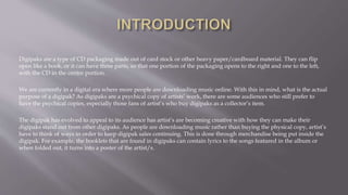
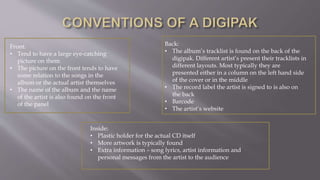
Digipaks are a type of CD packaging made out of card stock or other heavy paper/cardboard material. They can flip
open like a book, or it can have three parts, so that one portion of the packaging opens to the right and one to the left,
with the CD in the centre portion.
We are currently in a digital era where more people are downloading music online. With this in mind, what is the actual
purpose of a digipak? As digipaks are a psychical copy of artists’ work, there are some audiences who still prefer to
have the psychical copies, especially those fans of artist’s who buy digipaks as a collector’s item.
The digipak has evolved to appeal to its audience has artist’s are becoming creative with how they can make their
digipaks stand out from other digipaks. As people are downloading music rather than buying the physical copy, artist’s
have to think of ways in order to keep digipak sales continuing. This is done through merchandise being put inside the
digipak. For example, the booklets that are found in digipaks can contain lyrics to the songs featured in the album or
when folded out, it turns into a poster of the artist/s.
Front:
• Tend to have a large eye-catching
picture on them
• The picture on the front tends to have
some relation to the songs in the
album or the actual artist themselves
• The name of the album and the name
of the artist is also found on the front
of the panel
Back:
• The album’s tracklist is found on the back of the
digipak. Different artist’s present their tracklists in
different layouts. Most typically they are
presented either in a column on the left hand side
of the cover or in the middle
• The record label the artist is signed to is also on
the back
• Barcode
• The artist’s website
Inside:
• Plastic holder for the actual CD itself
• More artwork is typically found
• Extra information – song lyrics, artist information and
personal messages from the artist to the audience
The name of the album, ‘Loud’
reflects the artist’ s personality
and her style in fashion and her
music.
The font used is quite simple and bold enough
to be seen on the artist’s image. The simplicity
of it helps to keep the main image the main
focus of the cover.
The artist isn’t looking
directly at the audience
which could connote
shyness and innocence. As
the album is about love and
romance, the artist is
probably feeling vulnerable
as she is letting the audience
into her emotions.
There seem to be a narrative to the digipak as the artwork in the inside of the album suggests a fairy-tale like
setting suggesting that the CD may be a story about love as the roses symbolise love. The image shows a lot of
emotion through the background filled with big, red roses and the way the artist is lying on them, showing some
sort of weakness within the artist herself.
The boldness of the
artist’s red lips and hair
attracts the audience. The
brightness of the red
adds to the pop culture in
which her music fits into.
The pink rose that is designed on the CD reflects
beauty which creates an idea the music from this
album is beautiful. The rose symbolises love
which coincides with the theme of the album
which is love and relationships.
There is very minimal text seen
in the digipak, aside from the
name of the artist and the name
of the album. This is effective as
it displays power and emotion
through the artist’s body
language.
The use of colour and the design of the
digipak gives the audience an idea of
the type of artist the singer is.
The way the 2 CDs have been designed are done in a way to make
it seen as if the CDs are sweets. Sweets are typically seen to be
some sort of guilty pleasure to some people. With this in mind, it
could be said to say that this album could be some sort of guilty
pleasure. This makes the whole digipak look fun and reflects the
artist and the audience she appeals to.
The image on the inside of the digipak, shows the artist wearing
a prom dress. The crown she wears reinforces this prom feel as it
makes the audience feel as if she has won prom queen. This
whole ‘prom theme’ links with the album name ‘teenage dream’
– as every teenage girl would have dreamt of being prom queen.
The images on both the left hand and
right hand side are quite provocative
and sexual. In both images, the artist is
seen naked. The artist is seen as a sex
symbol, which explains her nakedness.
This choice in ‘clothing’ will gain her
attention from male audiences.
The font of the tracklist has been printed
in white and red spiralling text. This has
been done so it stands out from the pink
clouds in the background. This again
represents the young female target
audience, as those are her main audience
who her music is made for.
The background is covered with pink
clouds which also looks like
candyfloss. The ‘candyfloss’ is keeping
to theme of ‘sweets’ that is seen
throughout the digipak. Also, the pink
clouds almost make it seem as if the
artist is in a dream state which refers
to the album title, ‘teenage dream’.
The way the artist has posed in
the back image is very strong
and takes up most of the space
of the cover. The choice of
clothing for this image makes
the artist appear tough, what
with her biker jacket and
leather gloves. This appearance
could reflect the songs that are
in the album.
The black and white effect on the album makes the
artist stand out, especially she takes up most of the
space throughout the digipak. As black and white are
contrasting it could reflect the types of songs that are in
the album; there could be songs that are negative and
some that are positive.
The back cover of a digipak, conventionally has the songs that are in the
album so the audience is aware of what songs they can find in this album.
However, this artist has chosen to break this convention and has instead
chosen to name individuals who are involved in the making of the album and
those who are a part of her management. This could have been done so the
audience is left intrigued in finding out what songs they can expect to hear
from this album.
The choice of colour for the
artist’s name makes the album
stand out. Also the colour being
bright pink, shows the artist’s
feminine side.
You can associate these types with the
police and so with this in mind, a sense
of danger is created for the album and
the artist.
The boldness of the font makes it
stand out and also emphasises the
whole danger feel that is brought
about from the use of tapes.
The body language the artist is
showing shows the seriousness
about her. She’s directly looking
at the audience which allows
them to feel how she feels.
The name of the album
‘NO BOYS ALLOWED’
makes the audience think
that she’s had some bad
experiences in life with
boys and so they might
hear about it in the songs
in the album.

Digipak Analysis

  • 2.
    Digipaks are atype of CD packaging made out of card stock or other heavy paper/cardboard material. They can flip open like a book, or it can have three parts, so that one portion of the packaging opens to the right and one to the left, with the CD in the centre portion. We are currently in a digital era where more people are downloading music online. With this in mind, what is the actual purpose of a digipak? As digipaks are a psychical copy of artists’ work, there are some audiences who still prefer to have the psychical copies, especially those fans of artist’s who buy digipaks as a collector’s item. The digipak has evolved to appeal to its audience has artist’s are becoming creative with how they can make their digipaks stand out from other digipaks. As people are downloading music rather than buying the physical copy, artist’s have to think of ways in order to keep digipak sales continuing. This is done through merchandise being put inside the digipak. For example, the booklets that are found in digipaks can contain lyrics to the songs featured in the album or when folded out, it turns into a poster of the artist/s.
  • 3.
    Front: • Tend tohave a large eye-catching picture on them • The picture on the front tends to have some relation to the songs in the album or the actual artist themselves • The name of the album and the name of the artist is also found on the front of the panel Back: • The album’s tracklist is found on the back of the digipak. Different artist’s present their tracklists in different layouts. Most typically they are presented either in a column on the left hand side of the cover or in the middle • The record label the artist is signed to is also on the back • Barcode • The artist’s website Inside: • Plastic holder for the actual CD itself • More artwork is typically found • Extra information – song lyrics, artist information and personal messages from the artist to the audience
  • 4.
    The name ofthe album, ‘Loud’ reflects the artist’ s personality and her style in fashion and her music. The font used is quite simple and bold enough to be seen on the artist’s image. The simplicity of it helps to keep the main image the main focus of the cover. The artist isn’t looking directly at the audience which could connote shyness and innocence. As the album is about love and romance, the artist is probably feeling vulnerable as she is letting the audience into her emotions. There seem to be a narrative to the digipak as the artwork in the inside of the album suggests a fairy-tale like setting suggesting that the CD may be a story about love as the roses symbolise love. The image shows a lot of emotion through the background filled with big, red roses and the way the artist is lying on them, showing some sort of weakness within the artist herself. The boldness of the artist’s red lips and hair attracts the audience. The brightness of the red adds to the pop culture in which her music fits into. The pink rose that is designed on the CD reflects beauty which creates an idea the music from this album is beautiful. The rose symbolises love which coincides with the theme of the album which is love and relationships. There is very minimal text seen in the digipak, aside from the name of the artist and the name of the album. This is effective as it displays power and emotion through the artist’s body language.
  • 5.
    The use ofcolour and the design of the digipak gives the audience an idea of the type of artist the singer is. The way the 2 CDs have been designed are done in a way to make it seen as if the CDs are sweets. Sweets are typically seen to be some sort of guilty pleasure to some people. With this in mind, it could be said to say that this album could be some sort of guilty pleasure. This makes the whole digipak look fun and reflects the artist and the audience she appeals to. The image on the inside of the digipak, shows the artist wearing a prom dress. The crown she wears reinforces this prom feel as it makes the audience feel as if she has won prom queen. This whole ‘prom theme’ links with the album name ‘teenage dream’ – as every teenage girl would have dreamt of being prom queen. The images on both the left hand and right hand side are quite provocative and sexual. In both images, the artist is seen naked. The artist is seen as a sex symbol, which explains her nakedness. This choice in ‘clothing’ will gain her attention from male audiences. The font of the tracklist has been printed in white and red spiralling text. This has been done so it stands out from the pink clouds in the background. This again represents the young female target audience, as those are her main audience who her music is made for. The background is covered with pink clouds which also looks like candyfloss. The ‘candyfloss’ is keeping to theme of ‘sweets’ that is seen throughout the digipak. Also, the pink clouds almost make it seem as if the artist is in a dream state which refers to the album title, ‘teenage dream’.
  • 6.
    The way theartist has posed in the back image is very strong and takes up most of the space of the cover. The choice of clothing for this image makes the artist appear tough, what with her biker jacket and leather gloves. This appearance could reflect the songs that are in the album. The black and white effect on the album makes the artist stand out, especially she takes up most of the space throughout the digipak. As black and white are contrasting it could reflect the types of songs that are in the album; there could be songs that are negative and some that are positive. The back cover of a digipak, conventionally has the songs that are in the album so the audience is aware of what songs they can find in this album. However, this artist has chosen to break this convention and has instead chosen to name individuals who are involved in the making of the album and those who are a part of her management. This could have been done so the audience is left intrigued in finding out what songs they can expect to hear from this album. The choice of colour for the artist’s name makes the album stand out. Also the colour being bright pink, shows the artist’s feminine side. You can associate these types with the police and so with this in mind, a sense of danger is created for the album and the artist. The boldness of the font makes it stand out and also emphasises the whole danger feel that is brought about from the use of tapes. The body language the artist is showing shows the seriousness about her. She’s directly looking at the audience which allows them to feel how she feels. The name of the album ‘NO BOYS ALLOWED’ makes the audience think that she’s had some bad experiences in life with boys and so they might hear about it in the songs in the album.