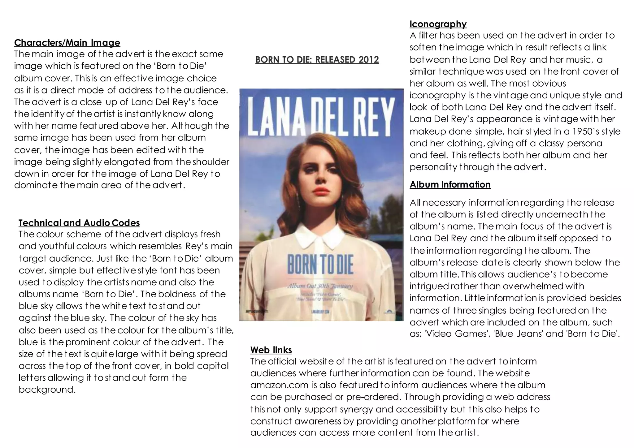
1. BORN TO DIE: RELEASED 2012
Characters/Main Image
The main image of the advert is the exact same
image which is featured on the ‘Born to Die’
album cover. This is an effective image choice
as it is a direct mode of address to the audience.
The advert is a close up of Lana Del Rey’s face
the identity of the artist is instantlyknow along
with her name featured above her. Although the
same image has been used from her album
cover, the image has been edited with the
image being slightly elongated from the shoulder
down in order for the image of Lana Del Rey to
dominate the main area of the advert.
Technical and Audio Codes
The colour scheme of the advert displays fresh
and youthful colours which resembles Rey’s main
target audience. Just like the ‘Born to Die’ album
cover, simple but effective style font has been
used to display the artists name and also the
albums name ‘Born to Die’. The boldness of the
blue sky allows the white text to stand out
against the blue sky. The colour of the sky has
also been used as the colour for the album’s title,
blue is the prominent colour of the advert. The
size of the text is quite large with it being spread
across the top of the front cover, in bold capital
letters allowing it to stand out form the
background.
Iconography
A filter has been used on the advert in order to
soften the image which in result reflects a link
between the Lana Del Rey and her music, a
similar technique was used on the front cover of
her album as well. The most obvious
iconography is the vintage and unique style and
look of both Lana Del Rey and the advert itself.
Lana Del Rey’s appearance is vintage with her
makeup done simple, hair styled in a 1950’s style
and her clothing, giving off a classy persona
and feel. This reflects both her album and her
personality through the advert.
Album Information
All necessary information regarding the release
of the album is listed directly underneath the
album’s name. The main focus of the advert is
Lana Del Rey and the album itself opposed to
the information regarding the album. The
album’s release date is clearly shown below the
album title. This allows audience’s to become
intrigued rather than overwhelmed with
information. Little information is provided besides
names of three singles being featured on the
advert which are included on the album, such
as; 'Video Games', 'Blue Jeans' and 'Born to Die'.
Web links
The official website of the artist is featured on the advert to inform
audiences where further information can be found. The website
amazon.com is also featured to inform audiences where the album
can be purchased or pre-ordered. Through providing a web address
this not only support synergy and accessibility but this also helps to
construct awareness by providing another platform for where
audiences can access more content from the artist.