
Recommended
More Related Content
What's hot
What's hot (20)
Viewers also liked
Similar to Justin Bieber album, single and advert analysis
Similar to Justin Bieber album, single and advert analysis (20)
Recently uploaded
Recently uploaded (20)
Justin Bieber album, single and advert analysis
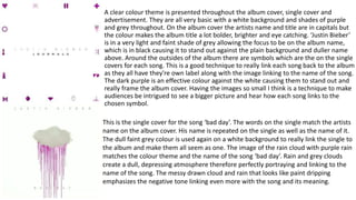
- 1. A clear colour theme is presented throughout the album cover, single cover and advertisement. They are all very basic with a white background and shades of purple and grey throughout. On the album cover the artists name and title are in capitals but the colour makes the album title a lot bolder, brighter and eye catching. ‘Justin Bieber’ is in a very light and faint shade of grey allowing the focus to be on the album name, which is in black causing it to stand out against the plain background and duller name above. Around the outsides of the album there are symbols which are the on the single covers for each song. This is a good technique to really link each song back to the album as they all have they're own label along with the image linking to the name of the song. The dark purple is an effective colour against the white causing them to stand out and really frame the album cover. Having the images so small I think is a technique to make audiences be intrigued to see a bigger picture and hear how each song links to the chosen symbol. This is the single cover for the song ‘bad day’. The words on the single match the artists name on the album cover. His name is repeated on the single as well as the name of it. The dull faint grey colour is used again on a white background to really link the single to the album and make them all seem as one. The image of the rain cloud with purple rain matches the colour theme and the name of the song ‘bad day’. Rain and grey clouds create a dull, depressing atmosphere therefore perfectly portraying and linking to the name of the song. The messy drawn cloud and rain that looks like paint dripping emphasizes the negative tone linking even more with the song and its meaning.
- 2. Every Monday leading up to the album release date Justin Bieber released one single from the album creating the hash tag #MusicMondays. This is a very good technique to excite the audience for the album release and really involve his fans in the process. The advertisement follows the same colour theme as the album and single covers with a white background, capital writing and a purple image. The text on the advertisement is black and ‘music’ is emphasized more as it is bolder. This is Justin's way of portraying his love for music. Each week the symbol on the advertisement changed depending on the single that was being released. This image is from the single ‘Heart breaker’ and was posted by Justin on social media a week before the single was released.