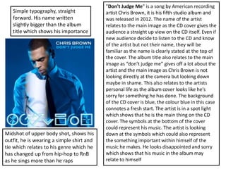
1. "Don't Judge Me" is a song by American recording
artist Chris Brown, it is his fifth studio album and
was released in 2012. The name of the artist
relates to the main image as the CD cover gives the
audience a straight up view on the CD itself. Even if
new audience decide to listen to the CD and know
of the artist but not their name, they will be
familiar as the name is clearly stated at the top of
the cover. The album title also relates to the main
image as “don’t judge me” gives off a lot about the
artist and the main image as Chris Brown is not
looking directly at the camera but looking down
maybe in shame. This also relates to the artists
personal life as the album cover looks like he's
sorry for something he has done. The background
of the CD cover is blue, the colour blue in this case
connotes a fresh start. The artist is in a spot light
which shows that he is the main thing on the CD
cover. The symbols at the bottom of the cover
could represent his music. The artist is looking
down at the symbols which could also represent
the something important within himself of the
music he makes. He looks disappointed and sorry
which shows that his music in the album may
relate to himself
Simple typography, straight
forward. His name written
slightly bigger than the album
title which shows his importance
Midshot of upper body shot, shows his
outfit, he is wearing a simple shirt and
tie which relates to his genre which he
has changed up from hip-hop to RnB
as he sings more than he raps
2. “Spirit” is an album by British singer-songwriter
Leona Lewis, it was released in November 2007 in the
United Kingdom followed by a worldwide release
during early 2008. The music genre of this artist is
pop and RnB. The typography on the CD cover is
simple and bold. The text is placed right in the middle
of the cover and her name is written as the first
thing. The audience instantly sees this and the main
image before anything else which is what the CD
aims to do. The colour of the typography is in gold
which represents her type of music and her as an
artist, very sophiscated. The album title is in the
middle and in a different font which differentiates
from her artist name, this doesn't confuse any new
audience. The main image takes up all of the cover, it
is of the main artist herself. She looks very
sophisticated and simple which relates to the
typography and album name. the background has
some shade of pink which connotes the femininity of
the music. Under the album name it has “the deluxe
edition” which is used to market the CD which has a
selection of songs for instance live recordings or edits
of an album. Overall it seems to appeal to a various
type of audience, specifically young females
Same font and colour of the two lines
1) name of the artist 2) the marketing
of the CD as comparison to the name of
the album. This suggests and
differentiates the two things one how
the CD relates to the name of the artist
and the marketing and two that the
album name is completely different as
it stands out and is the main part of the
CD
3. The “Teenage Dream "album by American recording
artist Katy Perry was released on August 24, 2010. She
makes music of the pop genre. This CD is very different
from other pop genre artists as it is very colourful and
suits the artists personality as well as music and target
audience. The background of the CD cover is very
flowery and colourful. It is not the typical types of
flowers it is more surreal with different kinds of bright
colours. This links to the main image as it is of the artist
and the artist has colourful pink/blue/purple hair. This
suggests the “out-there” type of pop music that this
artist produces, more untypical, different and unique. By
this you can tell that the CD is aimed at girls of the age
range 13-16. the typography is very colourful as well, it
matches the whole theme of the album and has a very
bubbly, curly kind of font. All these aspects of the CD
cover link in to the target audience and the artists
unique kind of music. The main image is more of a close
up which shows mainly her hair and a bit of her upper
body. This suggests that the main part of the image is
focused on her hair as it gives off her personality and the
kind of music she makes. As she is young and
unique, this represents the new artist of todays genre
which again links to the target audience of the younger
generation. The main image looks as if she is looking at
her album title which shows that the main thing the
audience is meant to follow is the name of the album
The album name clearly suggests that the
target audience for this CD is
teenagers, specifically females as the colours
are very feminine and bright. It could also
suggest that teenagers dream of having this
kind of lifestyle and that their lifestyle consists
of fun and brightness