This document summarizes and analyzes several album covers and promotional materials for Eminem's "Recovery" album:
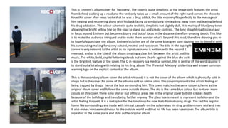
1) The original album cover features Eminem from behind walking up a road, symbolizing his recovery from drug addiction. It has a simple blue/grey color scheme.
2) An alternate album cover depicts Eminem trapped in a glass box, representing feeling trapped by his drug abuse.
3) A promotional poster exactly replicates the original cover but adds the release date and critic reviews to sell the album.
4) The single cover for "No Love" features a minimal white background and links to the album covers through elements like the parental advisory stamp.