SlideShare a Scribd company logo
1 of 19
Taylor swift – RedThe red colour used on the album is a
vibrant red. This is Taylors signature colour.
Red is used both on her lips and on the
name of album.
All other colours on the album are natural
and this is similar to all her other album
covers because it makes her look sweet as
she doesn’t need much photo shop or to
cover up behind makeup. This appeals to
her audience as they are all young and
don’t wear much make up themselves.
Although the title name is in red which
connotates danger or love, her name is
written in white which connotates purity
and innocence. The colour scheme could
be representing her song choices about
love on he album.
Compared to many of Taylors previous
albums, this album cover is a lot more
simple and doesn't show her off as
much. This could be showing that she is
older and more mature or it could be to
highlight the colour of her lips.
The font on the album cover is the same
for her name and the album name. this
makes the cover look a lot more mature
and professional also showing she has
aged.
The colour red could be Taylor trying to
create a star image similar to other
famous women as red lips could be what
she is remembered for.
A convention of a tour poster is to have
the name if the artist and the name of
the tour.
Also the name if the special guest as
that may intrigue people more.
The red lipstick stands out
from the natural colours
surrounding it.
However the colour red for
the title and the red for the
decoration is different.
Also the location is in a garden which is
very natural but before she was in a
photo shoot with a white background
so she was the main attraction. This is a
lot more mature so she may be trying to
appeal to an older audience.
This is different to all of her
other tour posters as she is
portrayed as a lot more
natural and care free were as
before she was very dressed
up.
On all of Taylor Swifts marketing campaign for red, the same tone of
red is used throughout it all for the name of the title.
Also the same font is used for her name and the name
of the title. However the only difference is that on the
cd her name is also in red however on the poster and
album cover her name is in white.
The poster and the album cover are very similar,
with the natural colours and Taylor wearing the
red lipstick and a hat. This makes her look a lot
more mature suggesting she is trying to appeal to
an older audience now.
Ed Sheeran- X
On the tour poster a bright colour
green has been used with a darker
colour X.
There is a picture of Ed Sheeran
playing the guitar which gives the
audience an idea of what his music
is about and lets everyone know he
plays his own music. Also a convention of an album
poster is to have the special guests.
The font of his name is a unique
font with a signature paw print
making him more recognisable.
His tattoos are very bright a lot like
the picture of himself making him
stand out a lot.
On the album cover the X is
dark making it stand out
more, this will allow people to
easily see the name of the
album.
The unique font is used on the
album cover.
A picture of Ed Sheeran is on the
front with his guitar again letting
people know he plays his own
music.
His name is written in white
which makes it stand out from
the other dark colours used.
White implies he is innocent
and pure which could be a
representation of his music.
The picture of Ed Sheeran is in
back and white almost making
him blend into the X.
Green and black are again used on
the back of the album however this
time the background is green and
Ed Sheeran is outlined in green.
The barcode and mentions are on
the back of the album.
The same font is used for the
names of the songs as for his
name on the front. This
connects the from of the
album and the back.
The same colour green was used on
all of the products, this allows
people to associate that colour to his
album. Also black was another
consistent colour throughout the
products.
The font for his name stayed the same
every time however on the poster he
has a paw print which wasn’t seen on
the others.In all of the photos of Ed
Sheeran he isn't showing his
face suggesting he doesn’t
want to be in the lime light.
On the poster and the album cover his guitar
is in the photo with him highlighting the type
of music he is going to be playing.
Also in all the products he isnt dressed
up like most artists he is in casual
clothes which also suggests he doesn’t
want the attention.
A very simple font is used so the
name of the artist and the name
of the album can be seen easily.
The colours are quite dull compared to
the name of the album which is
‘Illuminate’
He is holding an instrument suggesting
he plays his own music making him
self seem more talented.
Shawn Mendes - Illuminate
The setting is in a plain room
which allows the audience to
focus more on the artist rather
than the visuals.
He isn’t very dressed up suggesting he
wants to be seen as casual and no
different than the public which may
allow people to relate to him more.
The name of the artist and the
name of the album are both
brighter colours compared to the
background making them stand
out more. They are also softer
colours compared to the harsher
green.
The back of the album uses a
different font which is harder
to read.
Conventional of an album the
barcode is also on the back of
the album.
Again dull colours are used
on the back of the album
linking it to the front of the
album.
The guitar, although not
completely on the back is still
shown a bit emphasising the
fact that the artist plays his
own music on the album
enticing people to listen.
The shadow of the guitar
shows there is light which
links to the name of the
album.
The colours used are
very dark unlike the
album where they are
dull rather than dark.
The font for the artists name is the same as the album cover however it is a different colour. Also the name of the
album is a different font and a different colour.
The colours on the poster represent the name of the album as
they are illuminating Shawn Mendes face.
The tour poster is
unconventional as it
doesn’t mention any
special guests or any tour
dates.
The album cover and back are very similar in the colours they use and with the use of pictures of the guitar, however the font
is different on the back compared to the front.
Although the album is the same the tour poster is very different. The colours are darker in the background and the lighter
colours are a lot brighter in tone compared to the albums.
Also the font is different for the name of the title compared to the album and also the colours are different for his name and
the album name, they swap over. However the font for his name on the tour poster is the same as on the album.
On both the tour poster and the album cover the artist is looking away from the camera in the same direction which links the
two products together.
Adele – 21The front of the album is in
black and white, this implies the
music on the album is going to
be sad ballads. Her facial
expression is also sad, this also
suggests the songs on the
album are emotional.
The picture on the front is a
close up of the artist which
suggests she is mature as she
doesn’t need to show off her
body to get attention and to sell
her album.
The artists name is in all
capitals, in a big font and is
white which stands out from
the background. This shows
she is important. The name of
the album is also in big font
however is a slightly more
faded white which shows she
more import than the album
name but it is still very
important.
Adele is barely wearing any
make up and doesn’t have her
hair perfectly done, this sets
her aside from many other
female artists who wear a lot of
make up.
The simple image on the front
allows the audience to focus on
the name of the album and the
name of the artist.
A picture of the artist is also on the
back of the album however its not
in the center, this shows that on the
back of the album she isnt the most
important as the name of the songs
are.
The back of the album also has
the barcode which is
conventional of an album back.
The same font has been used for the
name of the artist, name of the album
and name of the songs. This links them
all together.
The name of the songs are also in
the same colour as the name of the
artist and album. Also the songs are
lay out in a simple way so the
audience can read them clearly.
The pictures are very similar
however this one is darker tones
also making the names of the
songs stand out more as they are
more important on the back of
the album.
The tour poster is very similar to
the album cover allowing people to
link them together.
It also has a picture of the album
on it allowing the audience to
know that the tour is for that
album.
Conventional of a tour poster, special
guests are added.
Although the font and colour of the
artists name is the same as the album,
the colour of the other information
isn't the same colour, this could make it
stand out more as it is important
information.
The artists name is still the biggest
thing on the poster showing that
she is very important.
The products all have the same font for the artists name
and the album title. This allows the audience to link them
together.
The photo is the same for the album
cove and the tour poster.
All the photos have a vintage feel to them and
although the back of the album is a different
tone it still relates to the other product as it is
black and white.
The difference on the tour poster is that the font is in
green for the important information but this helps it
stand out from the black and white background.
Rihanna – loudThe close up of Rihanna
shows her wearing red lipstick
which signifies danger and
romance. This could be a taste
of what the songs on the
album are like such as love
songs.
The close up of the artist
makes the audience focus on
her showing she is very
important. It also shows her
maturity as she doesn’t have
to flaunt her body to her
audience.
The name of the album is in a
clear font however isn’t very
bold which also highlights the
artist being very important.
The artists isn’t looking at the
camera showing she isn’t
connecting with the audience.
The back of the album
has a barcode which is
conventional of an
album.
The names of the songs
are in the same font
and are the same
colour as the name of
the album.
The picture of the artists is
a full body image showing
her flaunting her figure.
Also she is looking at the
audience showing she is
interacting with them
allowing them to feel
closer to the artist.
The colours are dark unlike the front cover
which is bright.
The font is the same on the tour
poster as the CD which allows
the audience to know they are
linked.
Again she is looking at the
audience in a seductive way as if
to entice them to go to her tour.
The colours are again bright to
allow the artists face to stand
out on the tour poster.
‘Special guests’ may persuade
the audience to go the tour
more and is also a convention
of a tour poster.
A picture of the album is also on
the tour poster to allow the
audience to know the selection
of songs she will be playing.
The same font has been used across all media
to allow the audience to link the poster to the
CD. This also makes it look more professional.
Also the same colour of white is being used for
the font which connotes innocence and purity
however the red of her hair implies danger.
On the tour and back of the CD she
is interacting with the audience
enticing them to listen to her
music.
The close up of the artist
allows the audience to
feel closer to her and
music.

More Related Content

What's hot

Analysis of digi pak covers and print magazine adverts
Analysis of digi pak covers and print magazine advertsAnalysis of digi pak covers and print magazine adverts
Analysis of digi pak covers and print magazine advertsmadelainegee
 
Album cover analysis
Album cover analysisAlbum cover analysis
Album cover analysislouisa09
 
Cd cover/magazine adverts analysis
Cd cover/magazine adverts analysisCd cover/magazine adverts analysis
Cd cover/magazine adverts analysis08BMolla
 
Brandon - ATR
Brandon - ATRBrandon - ATR
Brandon - ATRB H
 
Digipak aalysis1
Digipak aalysis1Digipak aalysis1
Digipak aalysis1Saad Latif
 
Digipak analysis
Digipak analysisDigipak analysis
Digipak analysisAbbieYapp
 
Album cd cover analysis
Album cd cover analysisAlbum cd cover analysis
Album cd cover analysisAzakria
 
Cd cover analysis media studies
Cd cover analysis media studiesCd cover analysis media studies
Cd cover analysis media studiesmaden171
 
Album cover analysis
Album cover analysisAlbum cover analysis
Album cover analysisjulianna321
 
Tanya's Digipak
Tanya's DigipakTanya's Digipak
Tanya's Digipakwhegg
 
Cd cover annotations
Cd cover annotationsCd cover annotations
Cd cover annotationsLukeDamagnez
 
Album Cover Analysis
Album Cover AnalysisAlbum Cover Analysis
Album Cover AnalysisKhalid
 
Album covers
Album coversAlbum covers
Album coversnaylovesu
 
Brookes Digipak
Brookes DigipakBrookes Digipak
Brookes Digipakwhegg
 
Digipakaalysis1
Digipakaalysis1Digipakaalysis1
Digipakaalysis1Saad Latif
 
Album cover annotations
Album cover annotationsAlbum cover annotations
Album cover annotationsZackAttack14
 
Analysis Of DVD Covers
Analysis Of DVD CoversAnalysis Of DVD Covers
Analysis Of DVD CoversAdil AbbAs
 

What's hot (20)

Analysis of digi pak covers and print magazine adverts
Analysis of digi pak covers and print magazine advertsAnalysis of digi pak covers and print magazine adverts
Analysis of digi pak covers and print magazine adverts
 
Album Poster Analysis
Album Poster AnalysisAlbum Poster Analysis
Album Poster Analysis
 
Album cover analysis
Album cover analysisAlbum cover analysis
Album cover analysis
 
Cd cover/magazine adverts analysis
Cd cover/magazine adverts analysisCd cover/magazine adverts analysis
Cd cover/magazine adverts analysis
 
Brandon - ATR
Brandon - ATRBrandon - ATR
Brandon - ATR
 
Digipak aalysis1
Digipak aalysis1Digipak aalysis1
Digipak aalysis1
 
Digipak Analysis
Digipak AnalysisDigipak Analysis
Digipak Analysis
 
Digipak analysis
Digipak analysisDigipak analysis
Digipak analysis
 
Album cd cover analysis
Album cd cover analysisAlbum cd cover analysis
Album cd cover analysis
 
Cd cover analysis media studies
Cd cover analysis media studiesCd cover analysis media studies
Cd cover analysis media studies
 
Album cover analysis
Album cover analysisAlbum cover analysis
Album cover analysis
 
Album cover analysis
Album cover analysisAlbum cover analysis
Album cover analysis
 
Tanya's Digipak
Tanya's DigipakTanya's Digipak
Tanya's Digipak
 
Cd cover annotations
Cd cover annotationsCd cover annotations
Cd cover annotations
 
Album Cover Analysis
Album Cover AnalysisAlbum Cover Analysis
Album Cover Analysis
 
Album covers
Album coversAlbum covers
Album covers
 
Brookes Digipak
Brookes DigipakBrookes Digipak
Brookes Digipak
 
Digipakaalysis1
Digipakaalysis1Digipakaalysis1
Digipakaalysis1
 
Album cover annotations
Album cover annotationsAlbum cover annotations
Album cover annotations
 
Analysis Of DVD Covers
Analysis Of DVD CoversAnalysis Of DVD Covers
Analysis Of DVD Covers
 

Similar to ancillary task

Similar to ancillary task (20)

Cover analysis
Cover analysisCover analysis
Cover analysis
 
Digipak analysis 2
Digipak analysis 2Digipak analysis 2
Digipak analysis 2
 
Ancillary task research Regan
Ancillary task research ReganAncillary task research Regan
Ancillary task research Regan
 
Digipak analysis
Digipak analysisDigipak analysis
Digipak analysis
 
Album release
Album releaseAlbum release
Album release
 
Digipak analysis
Digipak analysisDigipak analysis
Digipak analysis
 
Digipaks
DigipaksDigipaks
Digipaks
 
Digi pak analysis
Digi pak analysisDigi pak analysis
Digi pak analysis
 
Digipak
DigipakDigipak
Digipak
 
Neon jungle digipak
Neon jungle digipakNeon jungle digipak
Neon jungle digipak
 
Album covers
Album coversAlbum covers
Album covers
 
Jaymes - Ancillary Research
Jaymes - Ancillary ResearchJaymes - Ancillary Research
Jaymes - Ancillary Research
 
Digipak analysis
Digipak analysisDigipak analysis
Digipak analysis
 
Case studies
Case studiesCase studies
Case studies
 
Digipak analysis
Digipak analysis Digipak analysis
Digipak analysis
 
Digipak and poster analysis (2)l
Digipak and poster analysis (2)lDigipak and poster analysis (2)l
Digipak and poster analysis (2)l
 
Digipakanalysis2
Digipakanalysis2Digipakanalysis2
Digipakanalysis2
 
Assignment 3 - Michael
Assignment 3 - MichaelAssignment 3 - Michael
Assignment 3 - Michael
 
Assignment 3
Assignment 3Assignment 3
Assignment 3
 
Case studies for print products
Case studies for print productsCase studies for print products
Case studies for print products
 

More from Grace Godden

More from Grace Godden (9)

Lost boy lyric analysis
Lost boy lyric analysisLost boy lyric analysis
Lost boy lyric analysis
 
Ancillary task draft
Ancillary task draftAncillary task draft
Ancillary task draft
 
Mood board
Mood boardMood board
Mood board
 
Mood board
Mood board  Mood board
Mood board
 
Psychographic profile
Psychographic profilePsychographic profile
Psychographic profile
 
Ancillary task
Ancillary taskAncillary task
Ancillary task
 
Story Board
Story BoardStory Board
Story Board
 
Poll daddy survey analysis
Poll daddy survey analysisPoll daddy survey analysis
Poll daddy survey analysis
 
Real media research
Real media researchReal media research
Real media research
 

Recently uploaded

Software Engineering Methodologies (overview)
Software Engineering Methodologies (overview)Software Engineering Methodologies (overview)
Software Engineering Methodologies (overview)eniolaolutunde
 
Call Girls in Dwarka Mor Delhi Contact Us 9654467111
Call Girls in Dwarka Mor Delhi Contact Us 9654467111Call Girls in Dwarka Mor Delhi Contact Us 9654467111
Call Girls in Dwarka Mor Delhi Contact Us 9654467111Sapana Sha
 
Sanyam Choudhary Chemistry practical.pdf
Sanyam Choudhary Chemistry practical.pdfSanyam Choudhary Chemistry practical.pdf
Sanyam Choudhary Chemistry practical.pdfsanyamsingh5019
 
Alper Gobel In Media Res Media Component
Alper Gobel In Media Res Media ComponentAlper Gobel In Media Res Media Component
Alper Gobel In Media Res Media ComponentInMediaRes1
 
Concept of Vouching. B.Com(Hons) /B.Compdf
Concept of Vouching. B.Com(Hons) /B.CompdfConcept of Vouching. B.Com(Hons) /B.Compdf
Concept of Vouching. B.Com(Hons) /B.CompdfUmakantAnnand
 
Hybridoma Technology ( Production , Purification , and Application )
Hybridoma Technology  ( Production , Purification , and Application  ) Hybridoma Technology  ( Production , Purification , and Application  )
Hybridoma Technology ( Production , Purification , and Application ) Sakshi Ghasle
 
Presiding Officer Training module 2024 lok sabha elections
Presiding Officer Training module 2024 lok sabha electionsPresiding Officer Training module 2024 lok sabha elections
Presiding Officer Training module 2024 lok sabha electionsanshu789521
 
Incoming and Outgoing Shipments in 1 STEP Using Odoo 17
Incoming and Outgoing Shipments in 1 STEP Using Odoo 17Incoming and Outgoing Shipments in 1 STEP Using Odoo 17
Incoming and Outgoing Shipments in 1 STEP Using Odoo 17Celine George
 
Presentation by Andreas Schleicher Tackling the School Absenteeism Crisis 30 ...
Presentation by Andreas Schleicher Tackling the School Absenteeism Crisis 30 ...Presentation by Andreas Schleicher Tackling the School Absenteeism Crisis 30 ...
Presentation by Andreas Schleicher Tackling the School Absenteeism Crisis 30 ...EduSkills OECD
 
Interactive Powerpoint_How to Master effective communication
Interactive Powerpoint_How to Master effective communicationInteractive Powerpoint_How to Master effective communication
Interactive Powerpoint_How to Master effective communicationnomboosow
 
Kisan Call Centre - To harness potential of ICT in Agriculture by answer farm...
Kisan Call Centre - To harness potential of ICT in Agriculture by answer farm...Kisan Call Centre - To harness potential of ICT in Agriculture by answer farm...
Kisan Call Centre - To harness potential of ICT in Agriculture by answer farm...Krashi Coaching
 
A Critique of the Proposed National Education Policy Reform
A Critique of the Proposed National Education Policy ReformA Critique of the Proposed National Education Policy Reform
A Critique of the Proposed National Education Policy ReformChameera Dedduwage
 
Paris 2024 Olympic Geographies - an activity
Paris 2024 Olympic Geographies - an activityParis 2024 Olympic Geographies - an activity
Paris 2024 Olympic Geographies - an activityGeoBlogs
 
Employee wellbeing at the workplace.pptx
Employee wellbeing at the workplace.pptxEmployee wellbeing at the workplace.pptx
Employee wellbeing at the workplace.pptxNirmalaLoungPoorunde1
 
Introduction to ArtificiaI Intelligence in Higher Education
Introduction to ArtificiaI Intelligence in Higher EducationIntroduction to ArtificiaI Intelligence in Higher Education
Introduction to ArtificiaI Intelligence in Higher Educationpboyjonauth
 
Separation of Lanthanides/ Lanthanides and Actinides
Separation of Lanthanides/ Lanthanides and ActinidesSeparation of Lanthanides/ Lanthanides and Actinides
Separation of Lanthanides/ Lanthanides and ActinidesFatimaKhan178732
 
_Math 4-Q4 Week 5.pptx Steps in Collecting Data
_Math 4-Q4 Week 5.pptx Steps in Collecting Data_Math 4-Q4 Week 5.pptx Steps in Collecting Data
_Math 4-Q4 Week 5.pptx Steps in Collecting DataJhengPantaleon
 
KSHARA STURA .pptx---KSHARA KARMA THERAPY (CAUSTIC THERAPY)————IMP.OF KSHARA ...
KSHARA STURA .pptx---KSHARA KARMA THERAPY (CAUSTIC THERAPY)————IMP.OF KSHARA ...KSHARA STURA .pptx---KSHARA KARMA THERAPY (CAUSTIC THERAPY)————IMP.OF KSHARA ...
KSHARA STURA .pptx---KSHARA KARMA THERAPY (CAUSTIC THERAPY)————IMP.OF KSHARA ...M56BOOKSTORE PRODUCT/SERVICE
 

Recently uploaded (20)

Código Creativo y Arte de Software | Unidad 1
Código Creativo y Arte de Software | Unidad 1Código Creativo y Arte de Software | Unidad 1
Código Creativo y Arte de Software | Unidad 1
 
Software Engineering Methodologies (overview)
Software Engineering Methodologies (overview)Software Engineering Methodologies (overview)
Software Engineering Methodologies (overview)
 
Call Girls in Dwarka Mor Delhi Contact Us 9654467111
Call Girls in Dwarka Mor Delhi Contact Us 9654467111Call Girls in Dwarka Mor Delhi Contact Us 9654467111
Call Girls in Dwarka Mor Delhi Contact Us 9654467111
 
Sanyam Choudhary Chemistry practical.pdf
Sanyam Choudhary Chemistry practical.pdfSanyam Choudhary Chemistry practical.pdf
Sanyam Choudhary Chemistry practical.pdf
 
Alper Gobel In Media Res Media Component
Alper Gobel In Media Res Media ComponentAlper Gobel In Media Res Media Component
Alper Gobel In Media Res Media Component
 
Concept of Vouching. B.Com(Hons) /B.Compdf
Concept of Vouching. B.Com(Hons) /B.CompdfConcept of Vouching. B.Com(Hons) /B.Compdf
Concept of Vouching. B.Com(Hons) /B.Compdf
 
Hybridoma Technology ( Production , Purification , and Application )
Hybridoma Technology  ( Production , Purification , and Application  ) Hybridoma Technology  ( Production , Purification , and Application  )
Hybridoma Technology ( Production , Purification , and Application )
 
Presiding Officer Training module 2024 lok sabha elections
Presiding Officer Training module 2024 lok sabha electionsPresiding Officer Training module 2024 lok sabha elections
Presiding Officer Training module 2024 lok sabha elections
 
Incoming and Outgoing Shipments in 1 STEP Using Odoo 17
Incoming and Outgoing Shipments in 1 STEP Using Odoo 17Incoming and Outgoing Shipments in 1 STEP Using Odoo 17
Incoming and Outgoing Shipments in 1 STEP Using Odoo 17
 
Presentation by Andreas Schleicher Tackling the School Absenteeism Crisis 30 ...
Presentation by Andreas Schleicher Tackling the School Absenteeism Crisis 30 ...Presentation by Andreas Schleicher Tackling the School Absenteeism Crisis 30 ...
Presentation by Andreas Schleicher Tackling the School Absenteeism Crisis 30 ...
 
Interactive Powerpoint_How to Master effective communication
Interactive Powerpoint_How to Master effective communicationInteractive Powerpoint_How to Master effective communication
Interactive Powerpoint_How to Master effective communication
 
Kisan Call Centre - To harness potential of ICT in Agriculture by answer farm...
Kisan Call Centre - To harness potential of ICT in Agriculture by answer farm...Kisan Call Centre - To harness potential of ICT in Agriculture by answer farm...
Kisan Call Centre - To harness potential of ICT in Agriculture by answer farm...
 
A Critique of the Proposed National Education Policy Reform
A Critique of the Proposed National Education Policy ReformA Critique of the Proposed National Education Policy Reform
A Critique of the Proposed National Education Policy Reform
 
Paris 2024 Olympic Geographies - an activity
Paris 2024 Olympic Geographies - an activityParis 2024 Olympic Geographies - an activity
Paris 2024 Olympic Geographies - an activity
 
Employee wellbeing at the workplace.pptx
Employee wellbeing at the workplace.pptxEmployee wellbeing at the workplace.pptx
Employee wellbeing at the workplace.pptx
 
Introduction to ArtificiaI Intelligence in Higher Education
Introduction to ArtificiaI Intelligence in Higher EducationIntroduction to ArtificiaI Intelligence in Higher Education
Introduction to ArtificiaI Intelligence in Higher Education
 
Separation of Lanthanides/ Lanthanides and Actinides
Separation of Lanthanides/ Lanthanides and ActinidesSeparation of Lanthanides/ Lanthanides and Actinides
Separation of Lanthanides/ Lanthanides and Actinides
 
_Math 4-Q4 Week 5.pptx Steps in Collecting Data
_Math 4-Q4 Week 5.pptx Steps in Collecting Data_Math 4-Q4 Week 5.pptx Steps in Collecting Data
_Math 4-Q4 Week 5.pptx Steps in Collecting Data
 
TataKelola dan KamSiber Kecerdasan Buatan v022.pdf
TataKelola dan KamSiber Kecerdasan Buatan v022.pdfTataKelola dan KamSiber Kecerdasan Buatan v022.pdf
TataKelola dan KamSiber Kecerdasan Buatan v022.pdf
 
KSHARA STURA .pptx---KSHARA KARMA THERAPY (CAUSTIC THERAPY)————IMP.OF KSHARA ...
KSHARA STURA .pptx---KSHARA KARMA THERAPY (CAUSTIC THERAPY)————IMP.OF KSHARA ...KSHARA STURA .pptx---KSHARA KARMA THERAPY (CAUSTIC THERAPY)————IMP.OF KSHARA ...
KSHARA STURA .pptx---KSHARA KARMA THERAPY (CAUSTIC THERAPY)————IMP.OF KSHARA ...
 

ancillary task

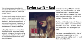
  • 1. Taylor swift – RedThe red colour used on the album is a vibrant red. This is Taylors signature colour. Red is used both on her lips and on the name of album. All other colours on the album are natural and this is similar to all her other album covers because it makes her look sweet as she doesn’t need much photo shop or to cover up behind makeup. This appeals to her audience as they are all young and don’t wear much make up themselves. Although the title name is in red which connotates danger or love, her name is written in white which connotates purity and innocence. The colour scheme could be representing her song choices about love on he album. Compared to many of Taylors previous albums, this album cover is a lot more simple and doesn't show her off as much. This could be showing that she is older and more mature or it could be to highlight the colour of her lips. The font on the album cover is the same for her name and the album name. this makes the cover look a lot more mature and professional also showing she has aged. The colour red could be Taylor trying to create a star image similar to other famous women as red lips could be what she is remembered for.
  • 2. A convention of a tour poster is to have the name if the artist and the name of the tour. Also the name if the special guest as that may intrigue people more. The red lipstick stands out from the natural colours surrounding it. However the colour red for the title and the red for the decoration is different. Also the location is in a garden which is very natural but before she was in a photo shoot with a white background so she was the main attraction. This is a lot more mature so she may be trying to appeal to an older audience. This is different to all of her other tour posters as she is portrayed as a lot more natural and care free were as before she was very dressed up.
  • 3. On all of Taylor Swifts marketing campaign for red, the same tone of red is used throughout it all for the name of the title. Also the same font is used for her name and the name of the title. However the only difference is that on the cd her name is also in red however on the poster and album cover her name is in white. The poster and the album cover are very similar, with the natural colours and Taylor wearing the red lipstick and a hat. This makes her look a lot more mature suggesting she is trying to appeal to an older audience now.
  • 4. Ed Sheeran- X On the tour poster a bright colour green has been used with a darker colour X. There is a picture of Ed Sheeran playing the guitar which gives the audience an idea of what his music is about and lets everyone know he plays his own music. Also a convention of an album poster is to have the special guests. The font of his name is a unique font with a signature paw print making him more recognisable. His tattoos are very bright a lot like the picture of himself making him stand out a lot.
  • 5. On the album cover the X is dark making it stand out more, this will allow people to easily see the name of the album. The unique font is used on the album cover. A picture of Ed Sheeran is on the front with his guitar again letting people know he plays his own music. His name is written in white which makes it stand out from the other dark colours used. White implies he is innocent and pure which could be a representation of his music. The picture of Ed Sheeran is in back and white almost making him blend into the X.
  • 6. Green and black are again used on the back of the album however this time the background is green and Ed Sheeran is outlined in green. The barcode and mentions are on the back of the album. The same font is used for the names of the songs as for his name on the front. This connects the from of the album and the back.
  • 7. The same colour green was used on all of the products, this allows people to associate that colour to his album. Also black was another consistent colour throughout the products. The font for his name stayed the same every time however on the poster he has a paw print which wasn’t seen on the others.In all of the photos of Ed Sheeran he isn't showing his face suggesting he doesn’t want to be in the lime light. On the poster and the album cover his guitar is in the photo with him highlighting the type of music he is going to be playing. Also in all the products he isnt dressed up like most artists he is in casual clothes which also suggests he doesn’t want the attention.
  • 8. A very simple font is used so the name of the artist and the name of the album can be seen easily. The colours are quite dull compared to the name of the album which is ‘Illuminate’ He is holding an instrument suggesting he plays his own music making him self seem more talented. Shawn Mendes - Illuminate The setting is in a plain room which allows the audience to focus more on the artist rather than the visuals. He isn’t very dressed up suggesting he wants to be seen as casual and no different than the public which may allow people to relate to him more. The name of the artist and the name of the album are both brighter colours compared to the background making them stand out more. They are also softer colours compared to the harsher green.
  • 9. The back of the album uses a different font which is harder to read. Conventional of an album the barcode is also on the back of the album. Again dull colours are used on the back of the album linking it to the front of the album. The guitar, although not completely on the back is still shown a bit emphasising the fact that the artist plays his own music on the album enticing people to listen. The shadow of the guitar shows there is light which links to the name of the album.
  • 10. The colours used are very dark unlike the album where they are dull rather than dark. The font for the artists name is the same as the album cover however it is a different colour. Also the name of the album is a different font and a different colour. The colours on the poster represent the name of the album as they are illuminating Shawn Mendes face. The tour poster is unconventional as it doesn’t mention any special guests or any tour dates.
  • 11. The album cover and back are very similar in the colours they use and with the use of pictures of the guitar, however the font is different on the back compared to the front. Although the album is the same the tour poster is very different. The colours are darker in the background and the lighter colours are a lot brighter in tone compared to the albums. Also the font is different for the name of the title compared to the album and also the colours are different for his name and the album name, they swap over. However the font for his name on the tour poster is the same as on the album. On both the tour poster and the album cover the artist is looking away from the camera in the same direction which links the two products together.
  • 12. Adele – 21The front of the album is in black and white, this implies the music on the album is going to be sad ballads. Her facial expression is also sad, this also suggests the songs on the album are emotional. The picture on the front is a close up of the artist which suggests she is mature as she doesn’t need to show off her body to get attention and to sell her album. The artists name is in all capitals, in a big font and is white which stands out from the background. This shows she is important. The name of the album is also in big font however is a slightly more faded white which shows she more import than the album name but it is still very important. Adele is barely wearing any make up and doesn’t have her hair perfectly done, this sets her aside from many other female artists who wear a lot of make up. The simple image on the front allows the audience to focus on the name of the album and the name of the artist.
  • 13. A picture of the artist is also on the back of the album however its not in the center, this shows that on the back of the album she isnt the most important as the name of the songs are. The back of the album also has the barcode which is conventional of an album back. The same font has been used for the name of the artist, name of the album and name of the songs. This links them all together. The name of the songs are also in the same colour as the name of the artist and album. Also the songs are lay out in a simple way so the audience can read them clearly. The pictures are very similar however this one is darker tones also making the names of the songs stand out more as they are more important on the back of the album.
  • 14. The tour poster is very similar to the album cover allowing people to link them together. It also has a picture of the album on it allowing the audience to know that the tour is for that album. Conventional of a tour poster, special guests are added. Although the font and colour of the artists name is the same as the album, the colour of the other information isn't the same colour, this could make it stand out more as it is important information. The artists name is still the biggest thing on the poster showing that she is very important.
  • 15. The products all have the same font for the artists name and the album title. This allows the audience to link them together. The photo is the same for the album cove and the tour poster. All the photos have a vintage feel to them and although the back of the album is a different tone it still relates to the other product as it is black and white. The difference on the tour poster is that the font is in green for the important information but this helps it stand out from the black and white background.
  • 16. Rihanna – loudThe close up of Rihanna shows her wearing red lipstick which signifies danger and romance. This could be a taste of what the songs on the album are like such as love songs. The close up of the artist makes the audience focus on her showing she is very important. It also shows her maturity as she doesn’t have to flaunt her body to her audience. The name of the album is in a clear font however isn’t very bold which also highlights the artist being very important. The artists isn’t looking at the camera showing she isn’t connecting with the audience.
  • 17. The back of the album has a barcode which is conventional of an album. The names of the songs are in the same font and are the same colour as the name of the album. The picture of the artists is a full body image showing her flaunting her figure. Also she is looking at the audience showing she is interacting with them allowing them to feel closer to the artist. The colours are dark unlike the front cover which is bright.
  • 18. The font is the same on the tour poster as the CD which allows the audience to know they are linked. Again she is looking at the audience in a seductive way as if to entice them to go to her tour. The colours are again bright to allow the artists face to stand out on the tour poster. ‘Special guests’ may persuade the audience to go the tour more and is also a convention of a tour poster. A picture of the album is also on the tour poster to allow the audience to know the selection of songs she will be playing.
  • 19. The same font has been used across all media to allow the audience to link the poster to the CD. This also makes it look more professional. Also the same colour of white is being used for the font which connotes innocence and purity however the red of her hair implies danger. On the tour and back of the CD she is interacting with the audience enticing them to listen to her music. The close up of the artist allows the audience to feel closer to her and music.