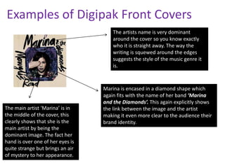
Conventions Of a Digipak
Digipaks normally include certain things in order to make it fit a
particular image, we need to analyse these conventions to
make sure our digipak looks as professional as possible.
Conventions include;
• A main dominant image on the cover with an image of the
artist themselves or an image relating to the album.
• The artists name, to make it explicitly clear who the album is
by.
• Track list on the reverse side of the cover so people know
which songs are featured.
• The album name, so people know they are buying the right
album.
• Barcode.
• Multiple images of the artist.
• Record Companies.
• Copyright information.
• Parental guidance(If needed)
Examples of Digipak Front Covers
The artists name is very dominant
around the cover so you know exactly
who it is straight away. The way the
writing is squewed around the edges
suggests the style of the music genre it
is.

The main artist ‘Marina’ is in
the middle of the cover, this
clearly shows that she is the
main artist by being the
dominant image. The fact her
hand is over one of her eyes is
quite strange but brings an air
of mystery to her appearance..

Marina is encased in a diamond shape which
again fits with the name of her band ‘Marina
and the Diamonds’. This again explicitly shows
the link between the image and the artist
making it even more clear to the audience their
brand identity.
Examples of Digipak Front Covers
The front cover has clear writing to show
off the artists name. This means that the
audience know straight away who the
album is from. The accent above the E
gives it an elegant feel as it is not typically
written.
The album name is just ‘4’. This is very
straight forward and simple giving a hint as to
what the music will be like. It is also an
effective way into clearly portraying the
album title so the audience know that they
are buying the right album. album.
Beyoncé is the main dominant
image which will make it easier
for people to spot who the album
Is about. This will also appeal to
males as looks very attractive.

The background of the cover is very neutral this
could suggest that she is trying to appeal to a
Wider audience of both genders by not aiming it
Too much towards either sex.
Examples of Digipak Front Covers
Her name again is very dominant on the front
cover, this seems to be a recurring factor. The
large bold name makes sure that you cannot
miss who the album is by.

Having her face as the main dominant image
instantly makes the album more recognisable
to the audience buying it. This gives it an
advantage as people who like her music will
instantly be drawn to the album.
The album name again is
very clear on the cover
making it as simple as
possible for people to know
which album it is.

Rather than the background being neutral like the
other covers this one has an outside background
that is very sunny. It brings a lighter feel to the
cover and suggests that she is actually signing
about real life issues as she includes the outside
in her background.
Overall we need to make sure that
our digipak does follow some of
these conventions in order to make it
look as professional as possible.
Analysing these front covers has
made me realise that we need to
make everything explicitly clear to
the audience. We need a dominant
image, album title and artists name
to make it clear to the audience
about the album.

Digipak conventions

  • 1.
    Conventions Of aDigipak Digipaks normally include certain things in order to make it fit a particular image, we need to analyse these conventions to make sure our digipak looks as professional as possible. Conventions include; • A main dominant image on the cover with an image of the artist themselves or an image relating to the album. • The artists name, to make it explicitly clear who the album is by. • Track list on the reverse side of the cover so people know which songs are featured. • The album name, so people know they are buying the right album. • Barcode. • Multiple images of the artist. • Record Companies. • Copyright information. • Parental guidance(If needed)
  • 2.
    Examples of DigipakFront Covers The artists name is very dominant around the cover so you know exactly who it is straight away. The way the writing is squewed around the edges suggests the style of the music genre it is. The main artist ‘Marina’ is in the middle of the cover, this clearly shows that she is the main artist by being the dominant image. The fact her hand is over one of her eyes is quite strange but brings an air of mystery to her appearance.. Marina is encased in a diamond shape which again fits with the name of her band ‘Marina and the Diamonds’. This again explicitly shows the link between the image and the artist making it even more clear to the audience their brand identity.
  • 3.
    Examples of DigipakFront Covers The front cover has clear writing to show off the artists name. This means that the audience know straight away who the album is from. The accent above the E gives it an elegant feel as it is not typically written. The album name is just ‘4’. This is very straight forward and simple giving a hint as to what the music will be like. It is also an effective way into clearly portraying the album title so the audience know that they are buying the right album. album. Beyoncé is the main dominant image which will make it easier for people to spot who the album Is about. This will also appeal to males as looks very attractive. The background of the cover is very neutral this could suggest that she is trying to appeal to a Wider audience of both genders by not aiming it Too much towards either sex.
  • 4.
    Examples of DigipakFront Covers Her name again is very dominant on the front cover, this seems to be a recurring factor. The large bold name makes sure that you cannot miss who the album is by. Having her face as the main dominant image instantly makes the album more recognisable to the audience buying it. This gives it an advantage as people who like her music will instantly be drawn to the album. The album name again is very clear on the cover making it as simple as possible for people to know which album it is. Rather than the background being neutral like the other covers this one has an outside background that is very sunny. It brings a lighter feel to the cover and suggests that she is actually signing about real life issues as she includes the outside in her background.
  • 5.
    Overall we needto make sure that our digipak does follow some of these conventions in order to make it look as professional as possible. Analysing these front covers has made me realise that we need to make everything explicitly clear to the audience. We need a dominant image, album title and artists name to make it clear to the audience about the album.