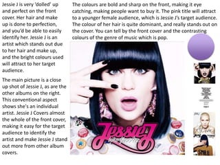
CD Front Cover
Analysis
Faye White
The main picture is a close
up shot of Jessie J, as are the
other albums on the right.
This conventional aspect
shows she's an individual
artist. Jessie J Covers almost
the whole of the front cover,
making it easy for the target
audience to identify the
artist and make Jessie J stand
out more from other album
covers.
The colours are bold and sharp on the front, making it eye
catching, making people want to buy it. The pink title will attract
to a younger female audience, which is Jessie J’s target audience.
The colour of her hair is quite dominant, and really stands out on
the cover. You can tell by the front cover and the contrasting
colours of the genre of music which is pop.
Jessie J is very ‘dolled’ up
and perfect on the front
cover. Her hair and make
up is done to perfection,
and you’d be able to easily
identify her. Jessie J is an
artist which stands out due
to her hair and make up,
and the bright colours used
will attract to her target
audience.
They’ve used
conventional aspects
by having Close
up/mid shot photos.
This is used to show
that she is a single
artist and show her
importance. There is
contrasting colours
used, bolder colours
used for the titles to
attract to the
audience. The
colours are all
matched up, e.g.
Title red – red
lipstick. White title –
white shirt. This
portrays Taylor, she’s
shown to be perfect.
These front covers
are simply and easily
identifiable for her
target audience.
The photo relates to the
title in red. Taylor is giving
quite a stern look, and is sat
on her own, suggesting
she’s single. This also gives a
good idea to her
audience/fans the style of
songs on her album/cd.
Taylor is looking away from
the camera, and its more of
an action shot. The album
cover is very clear and all
the colours contrast very
well together.
The top of the photo is slightly darkened,
showing she could be in a shadow. Making
her look mysterious, and because she isn’t
looking at the camera, the effect of the
shadowing goes well. Her lipstick stands
out, and contrasts well with the title ‘RED’.
You get more of a vintage 80’s feel from
the album cover, as its darker and she isn’t
lit up so much. Her facial expressions link
well with the songs on the album, but
only fans could relate to this. I think the
albums easily identified, and is simple and
bold.
The photo is a close up of Ed
Sheeran, showing that he’s an
individual artist. The paw print
and cross are some symbols
which are referenced to Ed
Sheeran, which his fans would
know. The colours that are
used contrast well. The photo
is orange and has a grainy
effect, making it look like an
old photograph, something
which links with his style/genre
‘Indie’. You can also relate the
colour orange on the front to
his trademark ginger hair,
which he is well known for. The
colours are bold and stand out,
making it easily indefinable and
eye catching.
The photo is slightly blurred
out around his face, giving a
mysterious feel to the album,
making more people wanting
to buy it.
The album doesn't’t give much away about the lyrics or
what the audience are to expect. The albums called ‘Plus’
but instead of using the word plus, they have used the ‘+’
sign, making it look more creative and interesting. The
album cover is clear, bold and eye catching. It attracts to his
target audience well, and also from an audience
perspective is stands out from a lot of other album covers.

Cd Cover nalyse

  • 1.
  • 2.
    The main pictureis a close up shot of Jessie J, as are the other albums on the right. This conventional aspect shows she's an individual artist. Jessie J Covers almost the whole of the front cover, making it easy for the target audience to identify the artist and make Jessie J stand out more from other album covers. The colours are bold and sharp on the front, making it eye catching, making people want to buy it. The pink title will attract to a younger female audience, which is Jessie J’s target audience. The colour of her hair is quite dominant, and really stands out on the cover. You can tell by the front cover and the contrasting colours of the genre of music which is pop. Jessie J is very ‘dolled’ up and perfect on the front cover. Her hair and make up is done to perfection, and you’d be able to easily identify her. Jessie J is an artist which stands out due to her hair and make up, and the bright colours used will attract to her target audience.
  • 3.
    They’ve used conventional aspects byhaving Close up/mid shot photos. This is used to show that she is a single artist and show her importance. There is contrasting colours used, bolder colours used for the titles to attract to the audience. The colours are all matched up, e.g. Title red – red lipstick. White title – white shirt. This portrays Taylor, she’s shown to be perfect. These front covers are simply and easily identifiable for her target audience. The photo relates to the title in red. Taylor is giving quite a stern look, and is sat on her own, suggesting she’s single. This also gives a good idea to her audience/fans the style of songs on her album/cd. Taylor is looking away from the camera, and its more of an action shot. The album cover is very clear and all the colours contrast very well together. The top of the photo is slightly darkened, showing she could be in a shadow. Making her look mysterious, and because she isn’t looking at the camera, the effect of the shadowing goes well. Her lipstick stands out, and contrasts well with the title ‘RED’. You get more of a vintage 80’s feel from the album cover, as its darker and she isn’t lit up so much. Her facial expressions link well with the songs on the album, but only fans could relate to this. I think the albums easily identified, and is simple and bold.
  • 4.
    The photo isa close up of Ed Sheeran, showing that he’s an individual artist. The paw print and cross are some symbols which are referenced to Ed Sheeran, which his fans would know. The colours that are used contrast well. The photo is orange and has a grainy effect, making it look like an old photograph, something which links with his style/genre ‘Indie’. You can also relate the colour orange on the front to his trademark ginger hair, which he is well known for. The colours are bold and stand out, making it easily indefinable and eye catching. The photo is slightly blurred out around his face, giving a mysterious feel to the album, making more people wanting to buy it. The album doesn't’t give much away about the lyrics or what the audience are to expect. The albums called ‘Plus’ but instead of using the word plus, they have used the ‘+’ sign, making it look more creative and interesting. The album cover is clear, bold and eye catching. It attracts to his target audience well, and also from an audience perspective is stands out from a lot of other album covers.