The document summarizes the visual themes and design elements used on several music album covers, including:
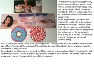
- Katy Perry's "Teenage Dream" album uses a candy and sweets theme with pink, blue, white and red colors. Images feature cakes and sweets.
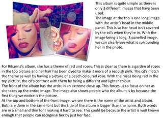
- Rihanna's album features a red rose garden theme with roses and her hair dyed reddish pink. Images include roses.
- The Script album uses black, yellow and off-white colors across images, though one image of hands in gold does not fit the theme.
- Mika's "Life in Cartoon Motion" album is entirely hand drawn to match his animated music video, with cartoons in similar style
A great presentation on how to ace a massage therapy interview for sports and massage therapist's. Presentation from our workshop event at the St John Street clinic on the 8th August 2015.
Rendicion de cuentas el sauce cod 10092 2013/14centro el sauce
Â
RendiciĂłn de cuentas bajo la administraciĂłn de un bien publico a las personas interesadas, sobre las finanzas del Centro Escolar El Sauce 2014
El Salvador C.A
I have looked into the layout and composition of magazine adverts for some digipak front covers, some digipak front covers and screenshots of some music videos.
Students, digital devices and success - Andreas Schleicher - 27 May 2024..pptxEduSkills OECD
Â
Andreas Schleicher presents at the OECD webinar âDigital devices in schools: detrimental distraction or secret to success?â on 27 May 2024. The presentation was based on findings from PISA 2022 results and the webinar helped launch the PISA in Focus âManaging screen time: How to protect and equip students against distractionâ https://www.oecd-ilibrary.org/education/managing-screen-time_7c225af4-en and the OECD Education Policy Perspective âStudents, digital devices and successâ can be found here - https://oe.cd/il/5yV
We all have good and bad thoughts from time to time and situation to situation. We are bombarded daily with spiraling thoughts(both negative and positive) creating all-consuming feel , making us difficult to manage with associated suffering. Good thoughts are like our Mob Signal (Positive thought) amidst noise(negative thought) in the atmosphere. Negative thoughts like noise outweigh positive thoughts. These thoughts often create unwanted confusion, trouble, stress and frustration in our mind as well as chaos in our physical world. Negative thoughts are also known as âdistorted thinkingâ.
The Art Pastor's Guide to Sabbath | Steve ThomasonSteve Thomason
Â
What is the purpose of the Sabbath Law in the Torah. It is interesting to compare how the context of the law shifts from Exodus to Deuteronomy. Who gets to rest, and why?
Operation âBlue Starâ is the only event in the history of Independent India where the state went into war with its own people. Even after about 40 years it is not clear if it was culmination of states anger over people of the region, a political game of power or start of dictatorial chapter in the democratic setup.
The people of Punjab felt alienated from main stream due to denial of their just demands during a long democratic struggle since independence. As it happen all over the word, it led to militant struggle with great loss of lives of military, police and civilian personnel. Killing of Indira Gandhi and massacre of innocent Sikhs in Delhi and other India cities was also associated with this movement.
Palestine last event orientationfvgnh .pptxRaedMohamed3
Â
An EFL lesson about the current events in Palestine. It is intended to be for intermediate students who wish to increase their listening skills through a short lesson in power point.
This is a presentation by Dada Robert in a Your Skill Boost masterclass organised by the Excellence Foundation for South Sudan (EFSS) on Saturday, the 25th and Sunday, the 26th of May 2024.
He discussed the concept of quality improvement, emphasizing its applicability to various aspects of life, including personal, project, and program improvements. He defined quality as doing the right thing at the right time in the right way to achieve the best possible results and discussed the concept of the "gap" between what we know and what we do, and how this gap represents the areas we need to improve. He explained the scientific approach to quality improvement, which involves systematic performance analysis, testing and learning, and implementing change ideas. He also highlighted the importance of client focus and a team approach to quality improvement.
ESC Beyond Borders _From EU to You_ InfoPack general.pdf
Â
Digipaks
1. For Katy Perryâs album âTeenage Dreamâ,
she has used a candy and sweets theme.
There is a colour scheme of mostly pink,
blue, white and red. These colours are
linked to the different sweets used. Pink
for candy floss and red and white for the
peppermints.
All the images match this theme. The
image at the top has the artist surrounds
by cakes and wearing a crown of sweets.
The 2 cdâs have patterns on them that
relate to this theme. One is a peppermint
that is also used on the back cover in
place of any âoâs in the text. The other cd
resembles a donut with icing and
sprinkles on top.
For 2 of the images above, the artist isnât wearing clothes. This appeals to the male audience and fits in with
Laura Mulveyâs theory of the male gaze. This could also be a part of Goodwinâs theory of voyeurism as the
female body is being looked at.
On the back of the album there is the track list. This is common to see on albums. Each of the songs fits with
the theme and colour scheme as there is a peppermint instead of an âoâ and the text is in red and blue. The
image on this panel is the extended image of the front panel.
2. For Rihannaâs album, she has a theme of red and roses. This is clear as there is a garden of roses
in the top picture and her hair has been dyed to make it more of a reddish pink. The cdâs match
the theme as well by having a picture of a peach coloured rose. With the roses being red in the
top picture, the cdâs contrast with them by being a different and lighter colour.
The front of the album has the artist in an extreme close up. This forces us to focus on her as
she takes up the entire image. The image also shows people who the album is by because the
first thing we notice is the picture.
At the top and bottom of the front image, we see there is the name of the artist and album.
Both are done in the same font but the title of the album is bigger than the name. Both words
are in a small and thin font making it hard to see. This could be because the artist is well known
enough that people can recognise her by just her face.
This album is quite simple as there is
only 3 different images that have been
used.
The image at the top is one long image
with the artistâs head in the middle
panel. This is so her head isnât covered
by the cdâs when theyâre in. With the
image being a long, 3 panelled image,
we can clearly see what is surrounding
her in the photo.
3. For The Scriptâs album they have used the colours black, yellow and an off white.
The cd looks a bit different compared to the rest of the digipak as the background colour is black. The other
images use an off white or a location as the background. The image in gold appears to be glowing which also
doesnât seem to fit. This could be related to one of the songsâ music videos on the album.
The image in the top left is quite different as we can see the group in the photo. The other 2 images only
feature some hands and donât show the artistsâ faces. However the colours used are the same making the
images link together.
On the back panel, there is the track listings. They are written in a very small font making the image of the
hands more dominant. The font is the same used on the title of the album.
The name of the group is larger than the title of the album which is barely readable. This could be because
they think the group name is more important than the title. The image on the front features them which
would suggest that people will recognise them by the front cover.
4. For Mikaâs album, he has everything hand drawn.
This fits with his music video âLollipopâ as that was
cartoon animation. Each panel has a similar
picture that uses the same style and colours.
These images fit with the name of the album as
itâs called âLife in cartoon motionâ and we can see
many cartoons on the images.
The inside panel features a picture of the artist.
However it looks out of place as the photo is
dimly lit with very few colours. It completely
contrasts with the album. When we look at the
front panel though, we can see the artist to the
left of the âMâ. Unlike most other artists, he is
small and to the side whereas other artists will
have the dominant image as them. With the small
image of the artist to the side, we can see a better
link with the inside image.
On the back panel, there is the track list that is
written in the same font as the title on the front
panel. It also neatly fits into the blue section of
the image making it look more like itâs a part of
the picture rather than text put over the top.
5. For Olly Mursâ album, he has an image of
himself in the middle of the front cover. This
makes him the dominant image of the album.
When people are looking at albums they will be
able to tell itâs him because they will see the
picture first.
For the inside booklet, the front cover has the
exact same picture as the front of the album.
The link couldnât be any clearer between the 2.
For this album there is a clear colour scheme of
red, white, a greyish blue and black. The text
and the costume the artist is wearing all use the
same colours. This helps link together the whole
album.
On the back panel there is the track list which is
written in the same font as the title. This keeps
the style of the album the same. Even on the
cdâs there is the same font used.