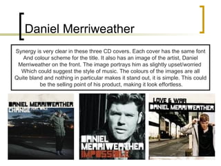
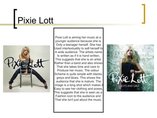
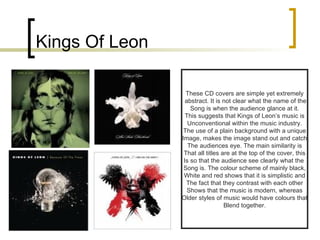
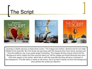
Digipack 1 This presentation shows existing digipacks from the current music industry. I have briefly explained the similarities between them and why the similarities are purposely created.
James Morrison It is very clear that all  James Morrison’s work  contains some aspect of synergy. The font of the artist and title are  the same throughout.  All promotional items have  the artist on the front, with  a plain background. This could be so that it is clear that James  Morrison is the artist. The colours are all dull which suggests the  theme of the music is quite  dull/depressing.
James Blunt It is clear to see which CD  covers are from which album. The  top left and bottom right are from his album “all the lost souls”(1). and the top right and bottom left are from his album “back to bedlam”(2).  The similarities between the first 2  CD covers are the artist name and title. They are both in red with the song name underneath. This is done so that the synergy is apparent  and the audience know it is  from the same album. The images  both have the same camera angle/shot and it is the actual artist on the front.  This is so the audience knows exactly  who it is and can recognise it straight away.  This is the same for the second covers , they both have the same font and positioning and the image is the artist on the left.
Take That These covers all have lots of intertextuality between them. The band, for instance, are on the front of every cover. Although this is a  Popular band, they may need to make it clear that it is there music, perhaps to  make it stand out against other covers. All 3 titles are written at the top, this is  Conventional of music covers and it makes it easy for the buyer to clearly see The name etc. All the colours of the covers are basic, it is clear that the colours  of the artists clothing compliments the background to make it look appealing. All images look as if the  artists are walking forward, this could suggest that they are moving up in the music industry and becoming more popular.
Daniel Merriweather Synergy is very clear in these three CD covers. Each cover has the same font And colour scheme for the title. It also has an image of the artist, Daniel Merriweather on the front. The image portrays him as slightly upset/worried  Which could suggest the style of music. The colours of the images are all Quite bland and nothing in particular makes it stand out, it is simple. This could be the selling point of his product, making it look effortless.
Pixie Lott Pixie Lott is aiming her music at a  younger audience because she is  Only a teenager herself. She has Used intertextuality to sell herself to A wide audience. The artists name Is written as if it is hand written, This suggests that she is an artist  Rather than a band and also shows That she takes time and care to  Produce her music. The colour  Scheme is quite simple with blacks, greys and blues. This shows the  audience that she is mature. The image is a long shot which makes it Easy to see her clothing and poses, This suggests that she is seen as a  Fashion icon to the audience and  That she isn't just about the music.
Kings Of Leon These CD covers are simple yet extremely abstract. It is not clear what the name of the Song is when the audience glance at it. This suggests that Kings of Leon’s music is Unconventional within the music industry. The use of a plain background with a unique Image, makes the image stand out and catch The audiences eye. The main similarity is That all titles are at the top of the cover, this Is so that the audience see clearly what the  Song is. The colour scheme of mainly black, White and red shows that it is simplistic and The fact that they contrast with each other Shows that the music is modern, whereas Older styles of music would have colours that Blend together.
The Script Synergy is clearly obvious in these three covers. The images are random, abstract and do not really Relate to the song title. But The Script can get away with this because they have clever synergy and  Have the ability to use a very good range of branding. The images all have strong colours for the  Background which makes the main pictures stand out. All the images are linked because they have One main aspect in the centre, which ties in with the song title and they all have a city/town in  the background. The title colour is white on all covers, this is so that it stands out from the background And catches the audiences attention.
The libertines The thing that makes these Covers link in with each other Are the titles. They are all  Identical through colour, font And layout. They all have  Images of the band on and None of the images relate To the song titles. The colours  Of the covers all relate to each Other, the colour scheme is Red, black, white and yellow.

Digipack Presentation

  • 1.
    Digipack 1 Thispresentation shows existing digipacks from the current music industry. I have briefly explained the similarities between them and why the similarities are purposely created.
  • 2.
    James Morrison Itis very clear that all James Morrison’s work contains some aspect of synergy. The font of the artist and title are the same throughout. All promotional items have the artist on the front, with a plain background. This could be so that it is clear that James Morrison is the artist. The colours are all dull which suggests the theme of the music is quite dull/depressing.
  • 3.
    James Blunt Itis clear to see which CD covers are from which album. The top left and bottom right are from his album “all the lost souls”(1). and the top right and bottom left are from his album “back to bedlam”(2). The similarities between the first 2 CD covers are the artist name and title. They are both in red with the song name underneath. This is done so that the synergy is apparent and the audience know it is from the same album. The images both have the same camera angle/shot and it is the actual artist on the front. This is so the audience knows exactly who it is and can recognise it straight away. This is the same for the second covers , they both have the same font and positioning and the image is the artist on the left.
  • 4.
    Take That Thesecovers all have lots of intertextuality between them. The band, for instance, are on the front of every cover. Although this is a Popular band, they may need to make it clear that it is there music, perhaps to make it stand out against other covers. All 3 titles are written at the top, this is Conventional of music covers and it makes it easy for the buyer to clearly see The name etc. All the colours of the covers are basic, it is clear that the colours of the artists clothing compliments the background to make it look appealing. All images look as if the artists are walking forward, this could suggest that they are moving up in the music industry and becoming more popular.
  • 5.
    Daniel Merriweather Synergyis very clear in these three CD covers. Each cover has the same font And colour scheme for the title. It also has an image of the artist, Daniel Merriweather on the front. The image portrays him as slightly upset/worried Which could suggest the style of music. The colours of the images are all Quite bland and nothing in particular makes it stand out, it is simple. This could be the selling point of his product, making it look effortless.
  • 6.
    Pixie Lott PixieLott is aiming her music at a younger audience because she is Only a teenager herself. She has Used intertextuality to sell herself to A wide audience. The artists name Is written as if it is hand written, This suggests that she is an artist Rather than a band and also shows That she takes time and care to Produce her music. The colour Scheme is quite simple with blacks, greys and blues. This shows the audience that she is mature. The image is a long shot which makes it Easy to see her clothing and poses, This suggests that she is seen as a Fashion icon to the audience and That she isn't just about the music.
  • 7.
    Kings Of LeonThese CD covers are simple yet extremely abstract. It is not clear what the name of the Song is when the audience glance at it. This suggests that Kings of Leon’s music is Unconventional within the music industry. The use of a plain background with a unique Image, makes the image stand out and catch The audiences eye. The main similarity is That all titles are at the top of the cover, this Is so that the audience see clearly what the Song is. The colour scheme of mainly black, White and red shows that it is simplistic and The fact that they contrast with each other Shows that the music is modern, whereas Older styles of music would have colours that Blend together.
  • 8.
    The Script Synergyis clearly obvious in these three covers. The images are random, abstract and do not really Relate to the song title. But The Script can get away with this because they have clever synergy and Have the ability to use a very good range of branding. The images all have strong colours for the Background which makes the main pictures stand out. All the images are linked because they have One main aspect in the centre, which ties in with the song title and they all have a city/town in the background. The title colour is white on all covers, this is so that it stands out from the background And catches the audiences attention.
  • 9.
    The libertines Thething that makes these Covers link in with each other Are the titles. They are all Identical through colour, font And layout. They all have Images of the band on and None of the images relate To the song titles. The colours Of the covers all relate to each Other, the colour scheme is Red, black, white and yellow.