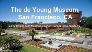
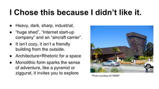
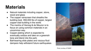
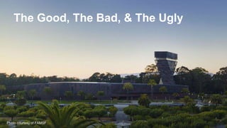
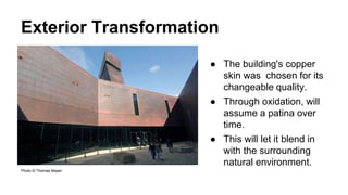
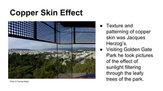
The de Young Museum,
San Francisco, CA
2005, Herzog & de Meuron Designer, Fong & Chan Architects
Photo courtesy of FAMSF
Quick Facts!
● Most visited art museum west of the Mississippi
● 6th most visited art museum in North America
● 1.2 million visitors last year.
● American art from the 17th through the 20th centuries, textile
arts, and art of Africa, Oceania, and the Americas.
● Original museum opened in 1895, aged poorly and was done
in by the Loma Prieta earthquake in 1989.
● 1999 competition for design won by Herzog & de Meuron
(Designer) & Fong & Chan (Architects)
● $135 million to construct
I Chose this because I didn’t like it.
● Heavy, dark, sharp, industrial,
● “huge shed”, “Internet start-up
company” and an “aircraft carrier”.
● It isn’t cozy, it isn’t a friendly
building from the outside,
● Architecture=Rhetoric for a space
● Monolithic form sparks the sense
of adventure, like a pyramid or
ziggurat, it invites you to explore Photo courtesy of FAMSF
Materials
● Natural materials including copper, stone,
wood and glass
● The copper rainscreen that sheaths the
building took 950,000 lbs of copper, largest
copper-clad building in the world.
● The mantra of Herzog & de Meuron is to
focus on using common materials in an
uncommon way.
● Copper plating which is expected to
eventually oxidize and take on a greenish
tone and blend into the park.
● Ball-bearing slide plates and viscous fluid
dampers help withstand future earthquakes
Photo courtesy of FAMSF
The Good, The Bad, & The Ugly
Photo courtesy of FAMSF
The Good: Outside
● Flat base and tower draw
the eye to the museum,
and it looks both ancient
and modern.
● 144 foot tower twists from
the ground to the sky
● It aligns with the grid
formed by the streets of
the nearby
neighborhoods.
● At the top an observation
floor provides views of the
Bay area.
© Iwan Baan
Exterior Transformation
Photo © Thomas Mayer
● The building's copper
skin was chosen for its
changeable quality.
● Through oxidation, will
assume a patina over
time.
● This will let it blend in
with the surrounding
natural environment.
Copper Skin Effect
Photo © Thomas Mayer
● Texture and
patterning of copper
skin was Jacques
Herzog’s.
● Visiting Golden Gate
Park he took pictures
of the effect of
sunlight filtering
through the leafy
trees of the park.
The Good: Interior
● Once inside it is light and more
non-descript.
● The focus of visitor is no longer
on the building but instead on the
art
● Takes advantage of what light is
available in the Bay.
● You still have a sense of the
outside because of all of the light
filtering through the copper skin.
● You don’t feel confined.
Photo © Thomas Mayer
Interior Transformation
● The rotating
exhibits that are in
the lower gallery
are able to
transform their
environment.
○ Tutankhamen
○ Andy Warhol
Picture credited to FAMSF
Museum Navigation
● Easy to lose
yourself, hard
to get lost.
● You won’t
miss artwork
in your
wandering of
the museum.
Picture credited to FAMSF
Photo courtesy of FAMSF
The Bad
● Copper structure canopy was
meant to cover the outdoor
cafe.
● It leaks copper dust and tainted
copper runoff onto patron’s
food and cafe furniture.
○ A permanent temporary
structure has been placed
under the canopy.
The Ugly
● The building is anti-sustainable.
● Copper run off from the building is poisoning the
environment 73.5lbs of copper run off/year.
● This is equal to 25% of the copper pollution for all of
Palo Alto.
● Copper runoff is such a severe problem in Palo Alto that
they issued an Ordinance that prohibits copper roofing
materials.
How and What
Architecture (What): User needs & site objectives, FAMSF Mission
statement: it needs to serve, be accessible, and draw broad audiences.
● Draws people to the structure through imposing size and tower.
● Series of outside corridors all lead visitors to the the main entrance.
Design: (How): Interaction design, navigation design.
● Interior of building is easily navigated, it allows for easy flow of traffic
and guides visitors.
● Interaction between the art inside and the art and natural beauty
outside.
To be good it doesn’t have to be beautiful.
References
http://www.critiquethis.us/2009/12/17/de-young-museum-by-herzog-de-meuron-the-copper-killer/
http://en.wikipedia.org/wiki/De_Young_(museum)
https://deyoung.famsf.org/about
https://deyoung.famsf.org/about/history-de-young-museum
http://www.arcspace.com/features/herzog--de-meuron/de-young-museum/
http://www.copper.org/consumers/arts/2010/august/restoring-de-young-museum-with-copper.html

Information Architecture: Building Story- The de Young Museum, San Francisco, CA

  • 1.
    The de YoungMuseum, San Francisco, CA 2005, Herzog & de Meuron Designer, Fong & Chan Architects Photo courtesy of FAMSF
  • 2.
    Quick Facts! ● Mostvisited art museum west of the Mississippi ● 6th most visited art museum in North America ● 1.2 million visitors last year. ● American art from the 17th through the 20th centuries, textile arts, and art of Africa, Oceania, and the Americas. ● Original museum opened in 1895, aged poorly and was done in by the Loma Prieta earthquake in 1989. ● 1999 competition for design won by Herzog & de Meuron (Designer) & Fong & Chan (Architects) ● $135 million to construct
  • 3.
    I Chose thisbecause I didn’t like it. ● Heavy, dark, sharp, industrial, ● “huge shed”, “Internet start-up company” and an “aircraft carrier”. ● It isn’t cozy, it isn’t a friendly building from the outside, ● Architecture=Rhetoric for a space ● Monolithic form sparks the sense of adventure, like a pyramid or ziggurat, it invites you to explore Photo courtesy of FAMSF
  • 4.
    Materials ● Natural materialsincluding copper, stone, wood and glass ● The copper rainscreen that sheaths the building took 950,000 lbs of copper, largest copper-clad building in the world. ● The mantra of Herzog & de Meuron is to focus on using common materials in an uncommon way. ● Copper plating which is expected to eventually oxidize and take on a greenish tone and blend into the park. ● Ball-bearing slide plates and viscous fluid dampers help withstand future earthquakes Photo courtesy of FAMSF
  • 5.
    The Good, TheBad, & The Ugly Photo courtesy of FAMSF
  • 6.
    The Good: Outside ●Flat base and tower draw the eye to the museum, and it looks both ancient and modern. ● 144 foot tower twists from the ground to the sky ● It aligns with the grid formed by the streets of the nearby neighborhoods. ● At the top an observation floor provides views of the Bay area. © Iwan Baan
  • 7.
    Exterior Transformation Photo ©Thomas Mayer ● The building's copper skin was chosen for its changeable quality. ● Through oxidation, will assume a patina over time. ● This will let it blend in with the surrounding natural environment.
  • 8.
    Copper Skin Effect Photo© Thomas Mayer Photo © Thomas Mayer ● Texture and patterning of copper skin was Jacques Herzog’s. ● Visiting Golden Gate Park he took pictures of the effect of sunlight filtering through the leafy trees of the park.
  • 9.
    The Good: Interior ●Once inside it is light and more non-descript. ● The focus of visitor is no longer on the building but instead on the art ● Takes advantage of what light is available in the Bay. ● You still have a sense of the outside because of all of the light filtering through the copper skin. ● You don’t feel confined. Photo © Thomas Mayer
  • 10.
    Interior Transformation ● Therotating exhibits that are in the lower gallery are able to transform their environment. ○ Tutankhamen ○ Andy Warhol Picture credited to FAMSF
  • 11.
    Museum Navigation ● Easyto lose yourself, hard to get lost. ● You won’t miss artwork in your wandering of the museum. Picture credited to FAMSF
  • 12.
  • 13.
    The Bad ● Copperstructure canopy was meant to cover the outdoor cafe. ● It leaks copper dust and tainted copper runoff onto patron’s food and cafe furniture. ○ A permanent temporary structure has been placed under the canopy.
  • 14.
    The Ugly ● Thebuilding is anti-sustainable. ● Copper run off from the building is poisoning the environment 73.5lbs of copper run off/year. ● This is equal to 25% of the copper pollution for all of Palo Alto. ● Copper runoff is such a severe problem in Palo Alto that they issued an Ordinance that prohibits copper roofing materials.
  • 15.
    How and What Architecture(What): User needs & site objectives, FAMSF Mission statement: it needs to serve, be accessible, and draw broad audiences. ● Draws people to the structure through imposing size and tower. ● Series of outside corridors all lead visitors to the the main entrance. Design: (How): Interaction design, navigation design. ● Interior of building is easily navigated, it allows for easy flow of traffic and guides visitors. ● Interaction between the art inside and the art and natural beauty outside. To be good it doesn’t have to be beautiful.
  • 16.