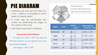
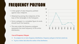
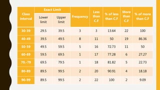
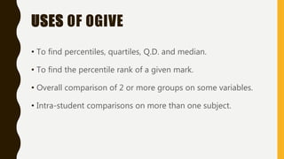
GRAPHS
AND
DIAGRAMS
GRAPHS
• Graph can be defined as a pictorial representation or a
diagram that represents data or values in an organized
manner.
• The points on the graph often represent the relationship
between two or more things.
• Important graphical representations used in statistics are
– bar diagram
– Histogram
– frequency polygon
– cumulative frequency curve
– Ogive
USES OF GRAPHS
• easier, more convenient and quicker to draw
inferences
• Comparison of data also becomes easier
• helps us to understand any data very easily
• explain statistical data
BAR-DIAGRAM • A bar diagram is a chart that uses bars to show
comparisons between categories of data.
• The bars can be either horizontal or vertical.
• Bar graphs can be either horizontal or vertical.
• The height or length of each bar relates directly to
its value.
• A bar diagram will have two axes.
Uses of Bar Diagrams
Compare the performance of students in different school
subjects
Compare the different persons or groups on a single or many
variables.
PIE DIAGRAM
• resembles pie and with the help of a
circle – called as circle graph or sector
graph or angular graph.
• A circle may be sub-divided into
sectors by subtending the angles at
the centre of the circle.
• Each data is expressed in degrees.
Construction of Pie-Diagram
An angle of a circle is 360⁰. By using the
following formula we can represent the given
data in the Pie diagram.
Pie diagram = (f/N) × 360⁰
HISTOGRAM
• Looks very much like a bar chart.
• The frequencies within each interval
of Histogram are presented by a
rectangle,
• The base of which equals the length
of the class interval and height of
which equals the numbers of the
scores within a given class interval.
• In Histogram the scores are assumed
to be spread uniformly over the
entire interval, the area of each
rectangle
FREQUENCY POLYGON
• A line graph of class frequency plotted
against class midpoint.
• Obtained by joining the midpoints of the
tops of the rectangles in the histogram.
• Since a polygon is a complete figure its ends
should touch the baseline.
• The area under the frequency polygon
represents the total frequency of the entire
distribution.
Uses of Frequency Polygon
 To compare two or more frequency distributions, frequency polygon is the best suited one.
 It gives a better idea about the outline of the distribution.
0
2
4
6
8
10
24.5
34.5
44.5
54.5
64.5
74.5
84.5
94.5
104.5
CUMULATIVE FREQUENCY
PERCENTAGE CURVE – OGIVE CURVE
• Here the frequencies are expressed as cumulative percents of N(total
number of cases).
• Size of the classes are plotted against the percentage of the cumulative
frequency of the class.
• When plotted on normal graph paper, the cumulative frequency curve
resembles an S-shape.
• Here cumulative percentage frequency is taken on the Y-axis when we take
exact upper limit of class intervals in x-axis
Class
interval
Exact Limit
Frequency
Less
than
C.F
% of less
than C.F
More
than
C.F
% of more
than C.F
Lower
limit
Upper
limit
30-39 29.5 39.5 3 3 13.64 22 100
40-49 39.5 49.5 8 11 50 19 86.36
50-59 49.5 59.5 5 16 72.73 11 50
60-69 59.5 69.5 1 17 77.28 6 27.27
70.-79 69.5 79.5 1 18 81.82 5 22.73
80-89 89.5 99.5 2 20 90.91 4 18.18
90-99 89.5 99.5 2 22 100 2 9.09
USES OF OGIVE
• To find percentiles, quartiles, Q.D. and median.
• To find the percentile rank of a given mark.
• Overall comparison of 2 or more groups on some variables.
• Intra-student comparisons on more than one subject.

GRAPHS AND DIAGRAMS.pptx

  • 1.
  • 2.
    GRAPHS • Graph canbe defined as a pictorial representation or a diagram that represents data or values in an organized manner. • The points on the graph often represent the relationship between two or more things. • Important graphical representations used in statistics are – bar diagram – Histogram – frequency polygon – cumulative frequency curve – Ogive
  • 3.
    USES OF GRAPHS •easier, more convenient and quicker to draw inferences • Comparison of data also becomes easier • helps us to understand any data very easily • explain statistical data
  • 4.
    BAR-DIAGRAM • Abar diagram is a chart that uses bars to show comparisons between categories of data. • The bars can be either horizontal or vertical. • Bar graphs can be either horizontal or vertical. • The height or length of each bar relates directly to its value. • A bar diagram will have two axes. Uses of Bar Diagrams Compare the performance of students in different school subjects Compare the different persons or groups on a single or many variables.
  • 5.
    PIE DIAGRAM • resemblespie and with the help of a circle – called as circle graph or sector graph or angular graph. • A circle may be sub-divided into sectors by subtending the angles at the centre of the circle. • Each data is expressed in degrees. Construction of Pie-Diagram An angle of a circle is 360⁰. By using the following formula we can represent the given data in the Pie diagram. Pie diagram = (f/N) × 360⁰
  • 6.
    HISTOGRAM • Looks verymuch like a bar chart. • The frequencies within each interval of Histogram are presented by a rectangle, • The base of which equals the length of the class interval and height of which equals the numbers of the scores within a given class interval. • In Histogram the scores are assumed to be spread uniformly over the entire interval, the area of each rectangle
  • 7.
    FREQUENCY POLYGON • Aline graph of class frequency plotted against class midpoint. • Obtained by joining the midpoints of the tops of the rectangles in the histogram. • Since a polygon is a complete figure its ends should touch the baseline. • The area under the frequency polygon represents the total frequency of the entire distribution. Uses of Frequency Polygon  To compare two or more frequency distributions, frequency polygon is the best suited one.  It gives a better idea about the outline of the distribution. 0 2 4 6 8 10 24.5 34.5 44.5 54.5 64.5 74.5 84.5 94.5 104.5
  • 8.
    CUMULATIVE FREQUENCY PERCENTAGE CURVE– OGIVE CURVE • Here the frequencies are expressed as cumulative percents of N(total number of cases). • Size of the classes are plotted against the percentage of the cumulative frequency of the class. • When plotted on normal graph paper, the cumulative frequency curve resembles an S-shape. • Here cumulative percentage frequency is taken on the Y-axis when we take exact upper limit of class intervals in x-axis
  • 9.
    Class interval Exact Limit Frequency Less than C.F % ofless than C.F More than C.F % of more than C.F Lower limit Upper limit 30-39 29.5 39.5 3 3 13.64 22 100 40-49 39.5 49.5 8 11 50 19 86.36 50-59 49.5 59.5 5 16 72.73 11 50 60-69 59.5 69.5 1 17 77.28 6 27.27 70.-79 69.5 79.5 1 18 81.82 5 22.73 80-89 89.5 99.5 2 20 90.91 4 18.18 90-99 89.5 99.5 2 22 100 2 9.09
  • 10.
    USES OF OGIVE •To find percentiles, quartiles, Q.D. and median. • To find the percentile rank of a given mark. • Overall comparison of 2 or more groups on some variables. • Intra-student comparisons on more than one subject.