Download as PDF, PPTX


![References
• Garrett, H. E. (1926). Statistics in psychology and education. Longman’s Green & Co
• Mathew, T.K., and Mollykutty, T.M. (2011). Science education -Theoretical bases of
teaching and pedagogic analysis - Physical Science and Natural Science. Rainbow Book
Publishers
• Mangal. S. K. (2014). Statistics in psychology and education. PHI Learning Private
Limited
• NCERT. (2013). Teaching of science.
• Radha Mohan. (2007). Teaching of physical science. (3rd ed.). PHI Learning
• Rathinasabapathy, P. (2001). கல்வியில் தேர்வு [Examination in Education]. (2nd
ed.). Shantha Publishers.
• Srinivasan, P. (2011). அறிவியல் கற்பிே்ேல் [Teaching of science]. DDE, Tamil
Univeristy
• Images from google](https://image.slidesharecdn.com/frequencydistribtutioncurve-210509071305/85/Frequency-distribtution-curve-51-320.jpg)

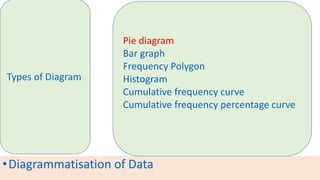
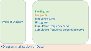
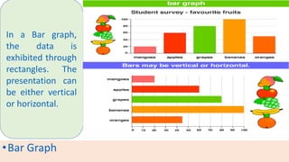
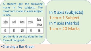
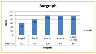
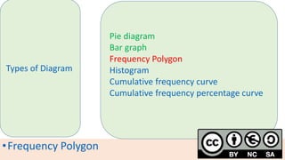
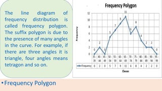
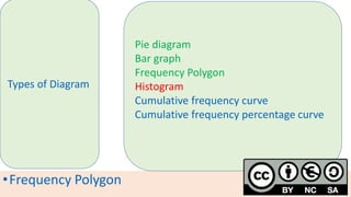
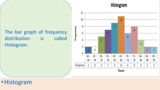
The document provides information about different types of diagrams used to represent statistical data visually, including pie charts, bar graphs, frequency polygons, histograms, and cumulative frequency curves. It explains how to construct each type of diagram by plotting variables like frequency and class on x and y axes. Examples are given of drawing each diagram based on sample data. The document also discusses concepts like percentiles, quartiles, and deciles for dividing a data set and calculating measures like median and skewness from a cumulative frequency curve.