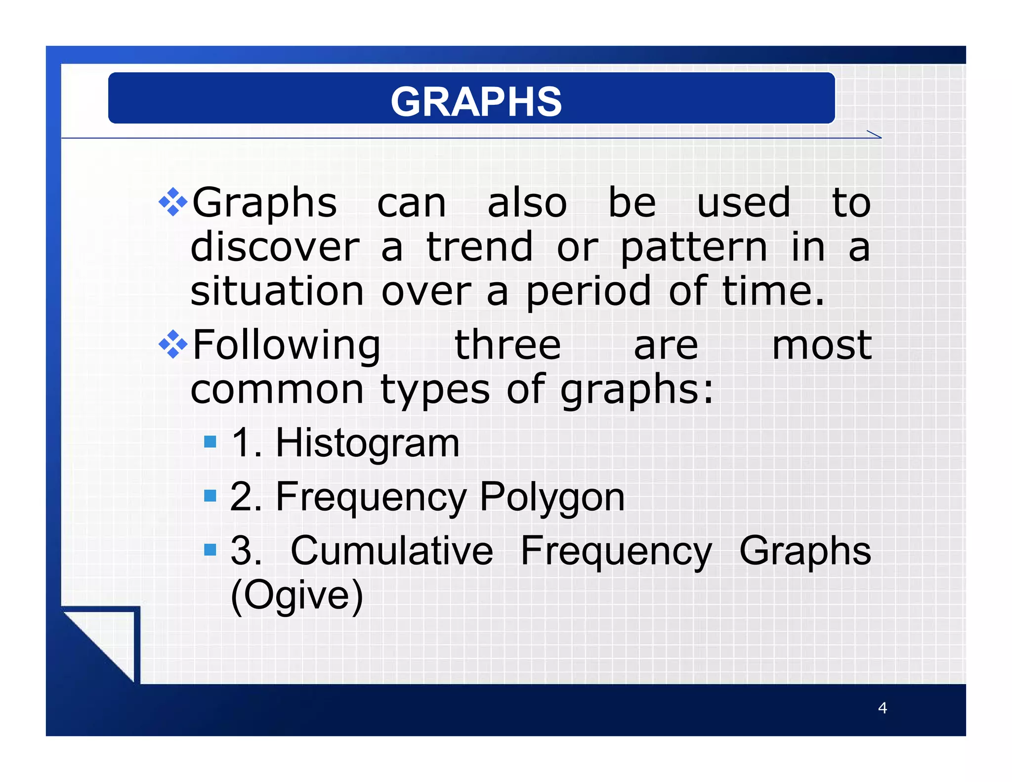
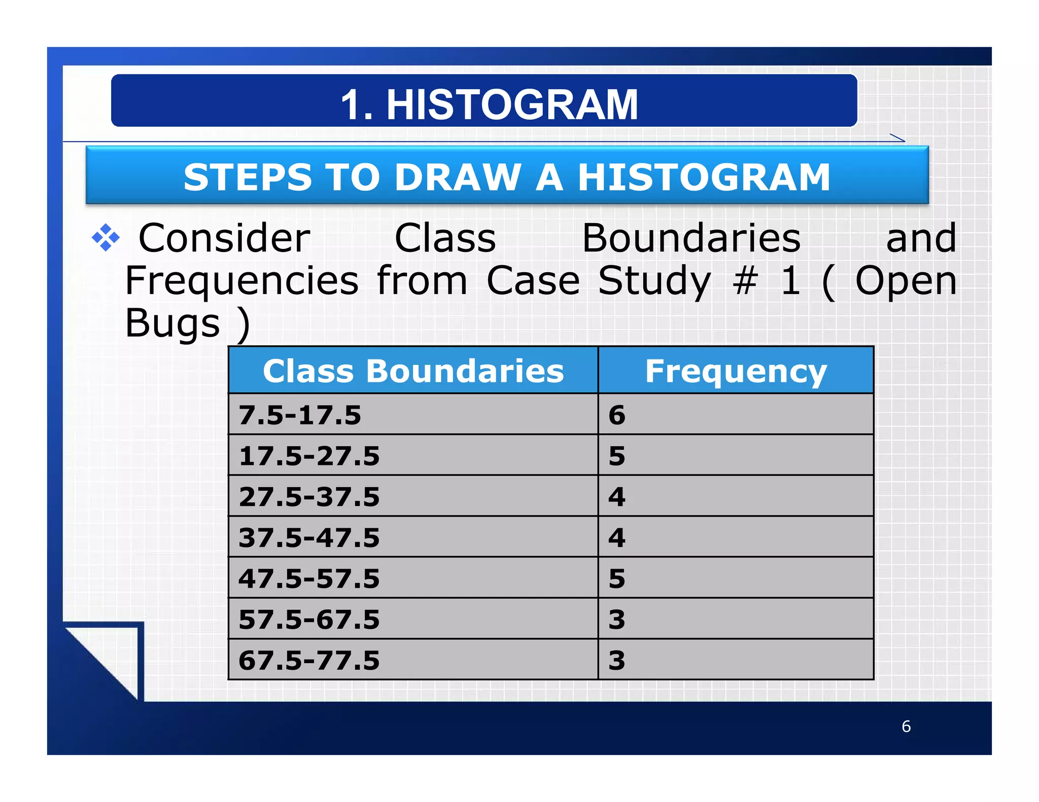
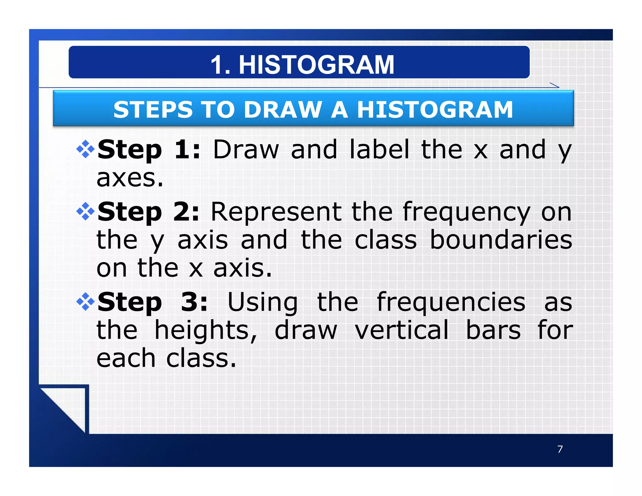
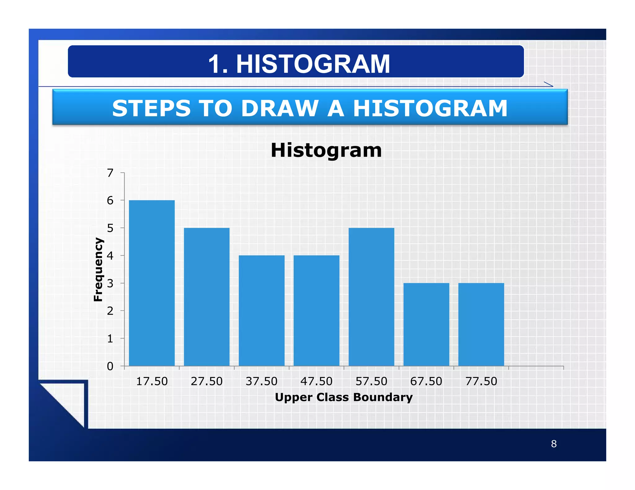
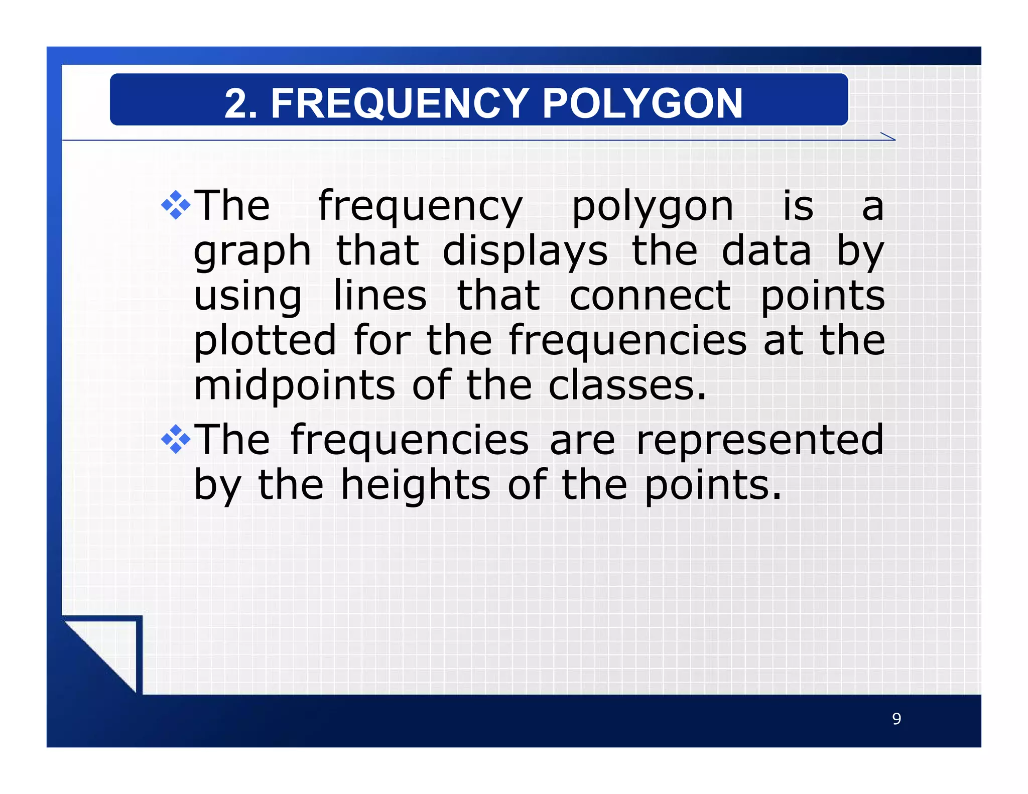
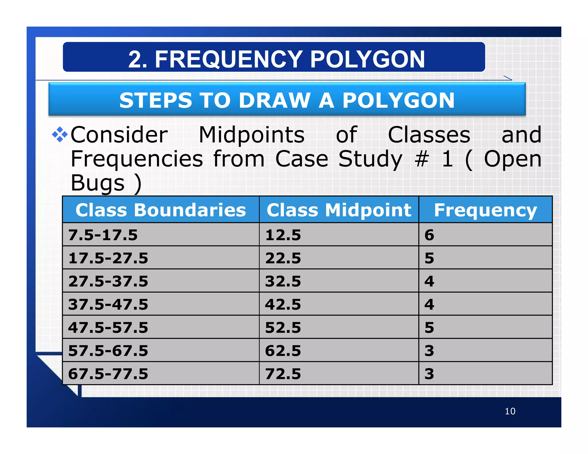
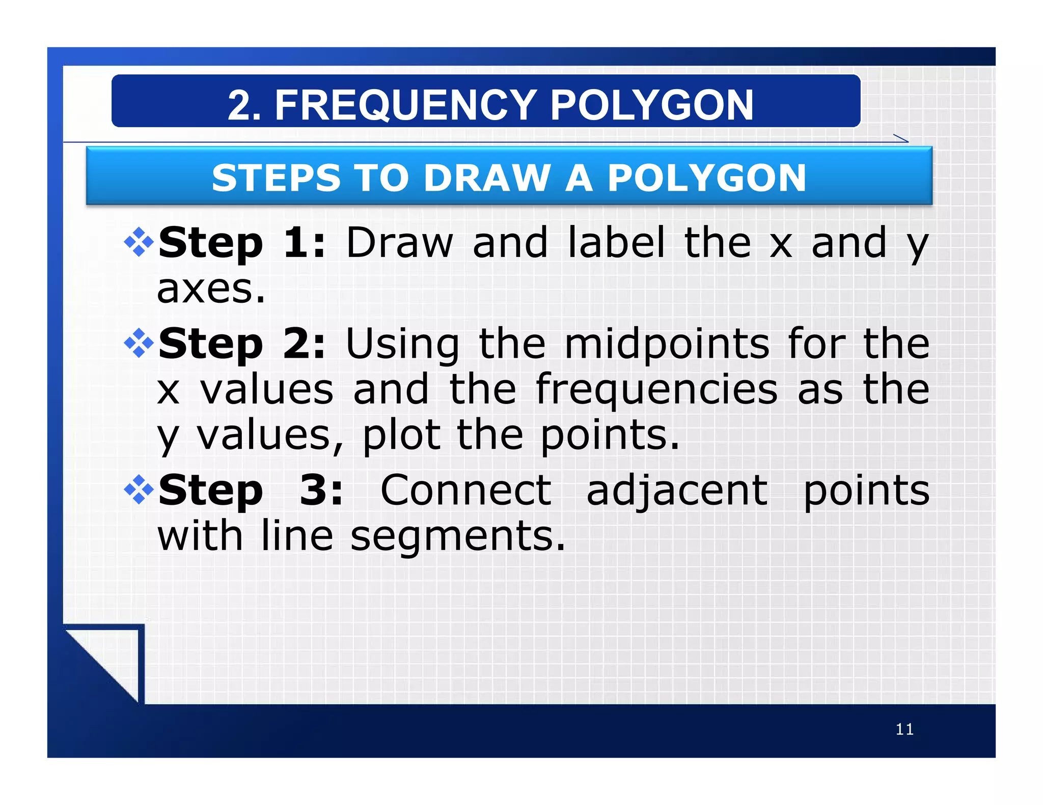
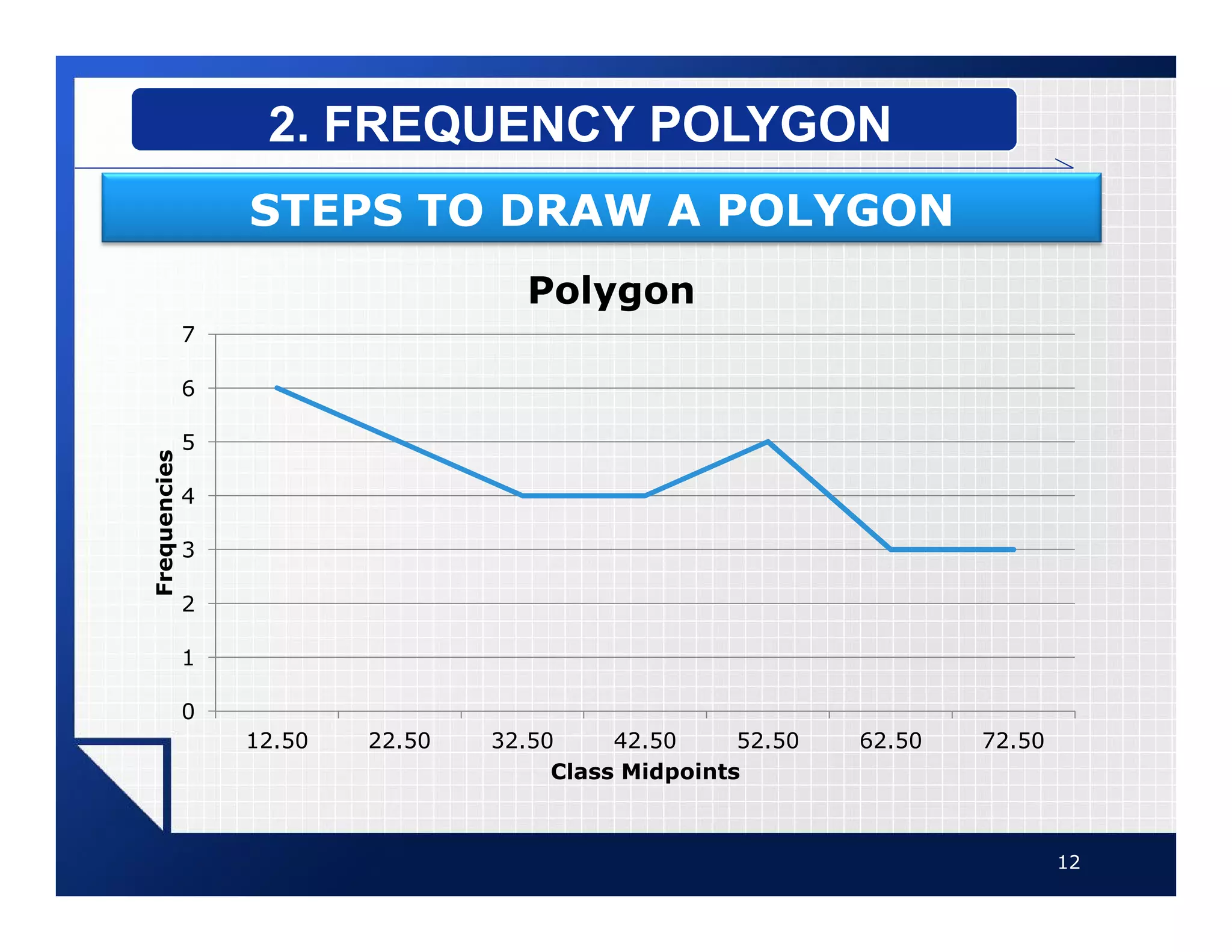
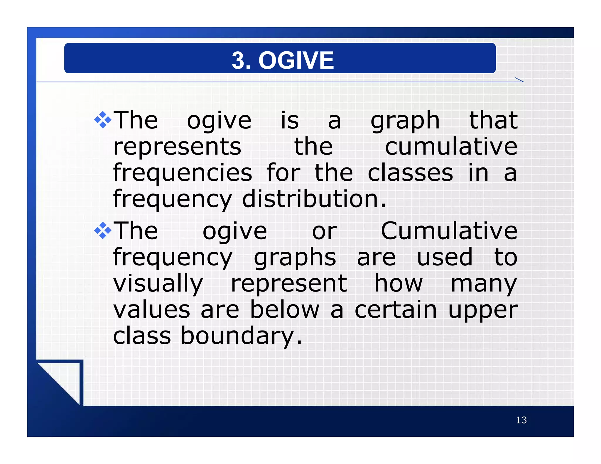
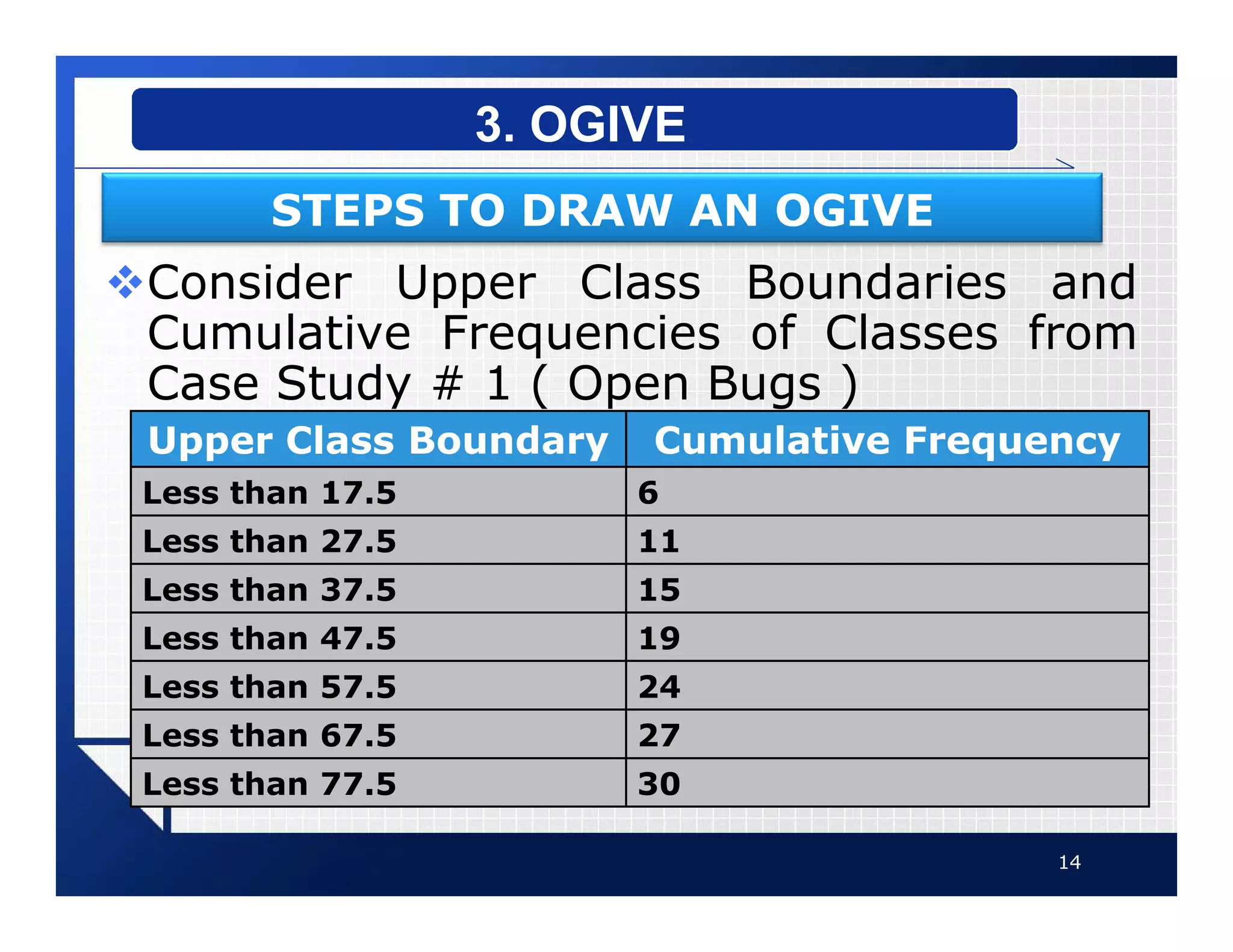
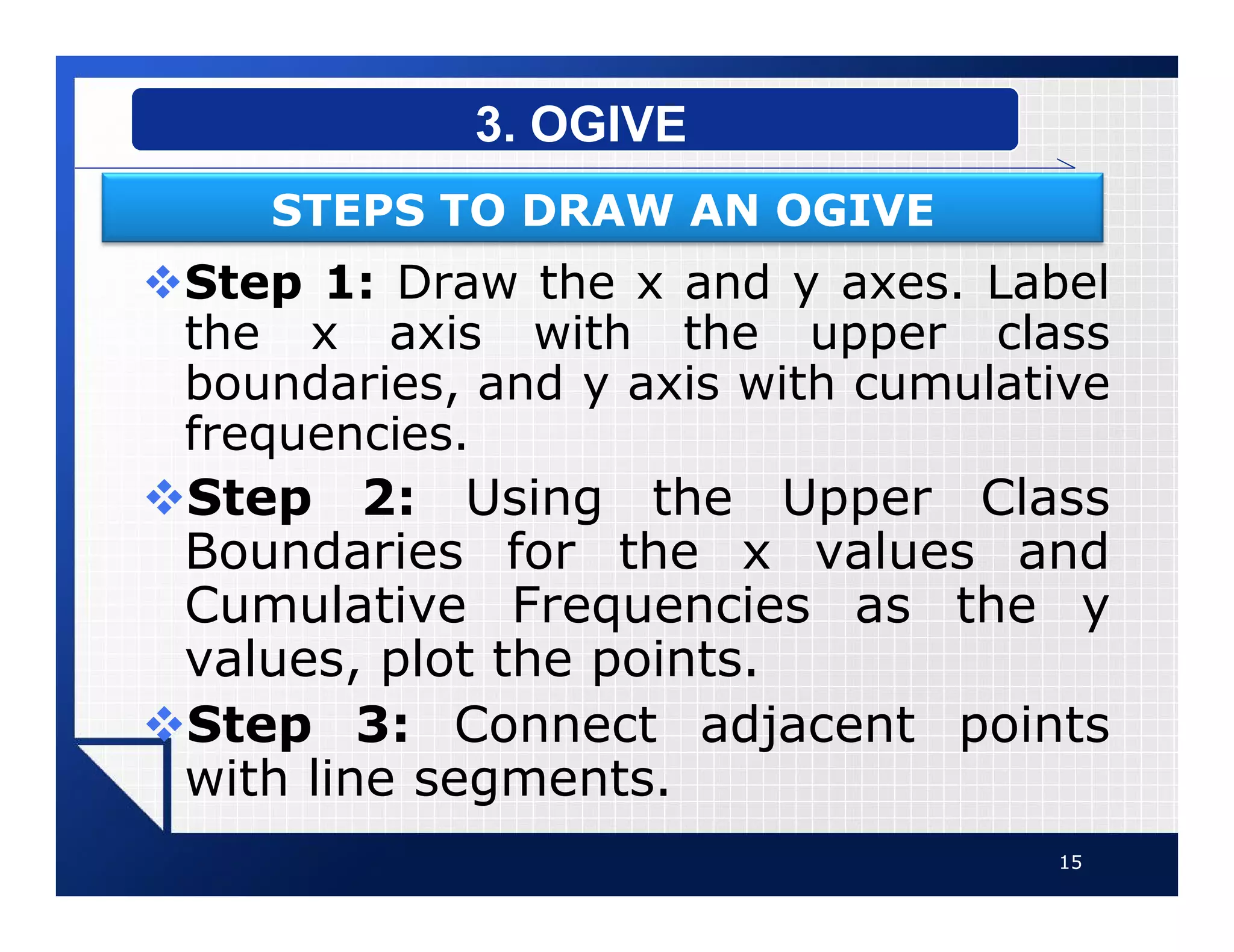
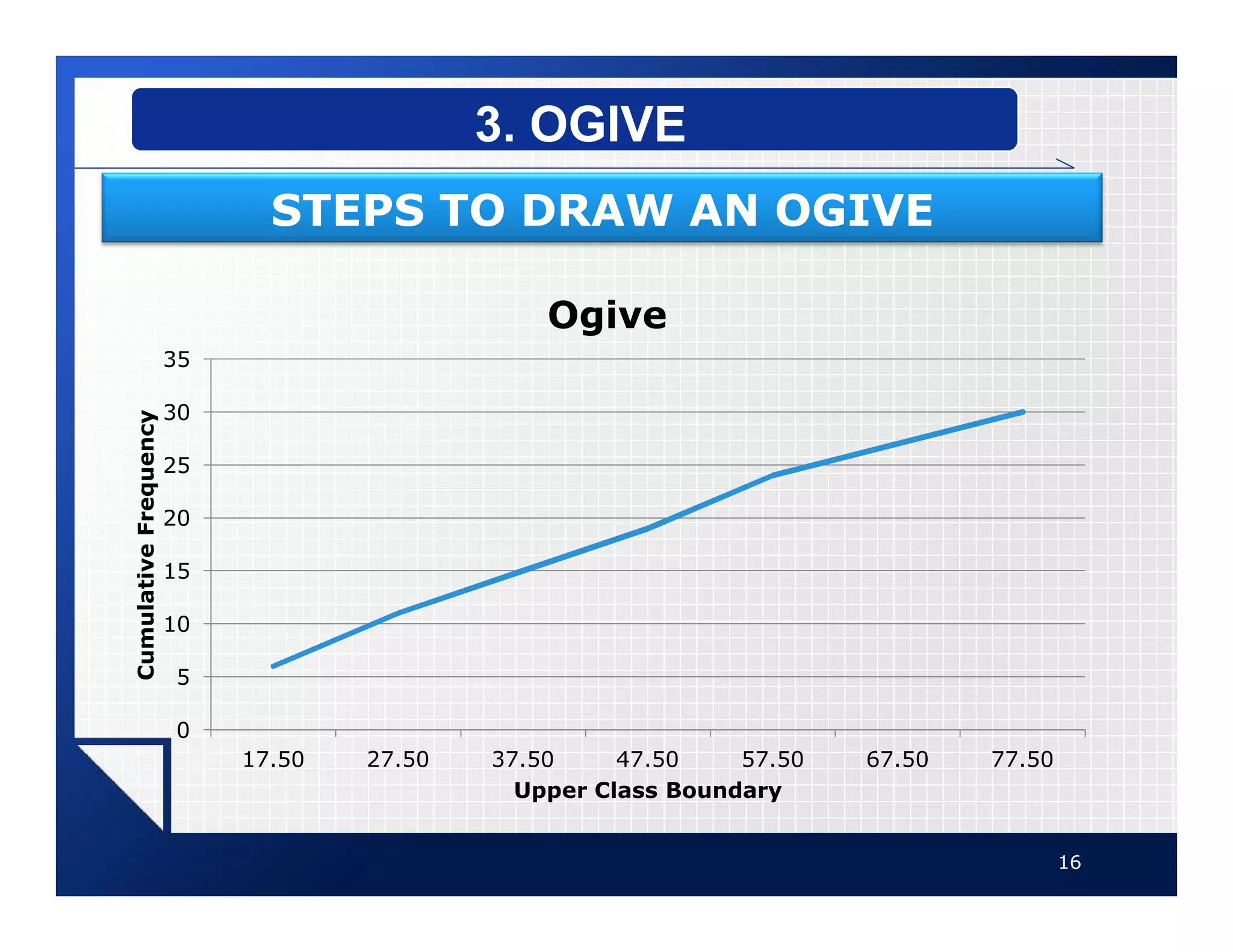
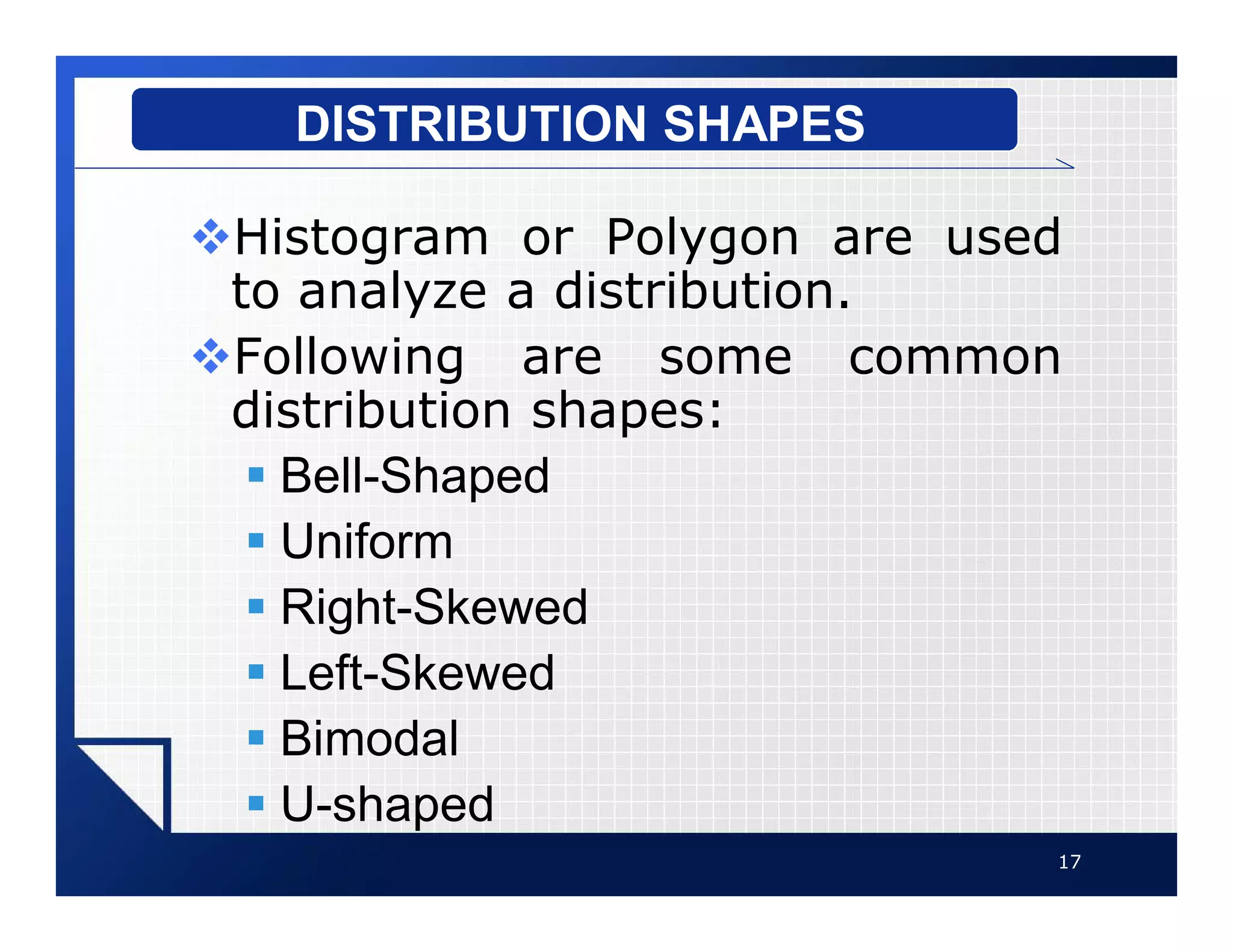
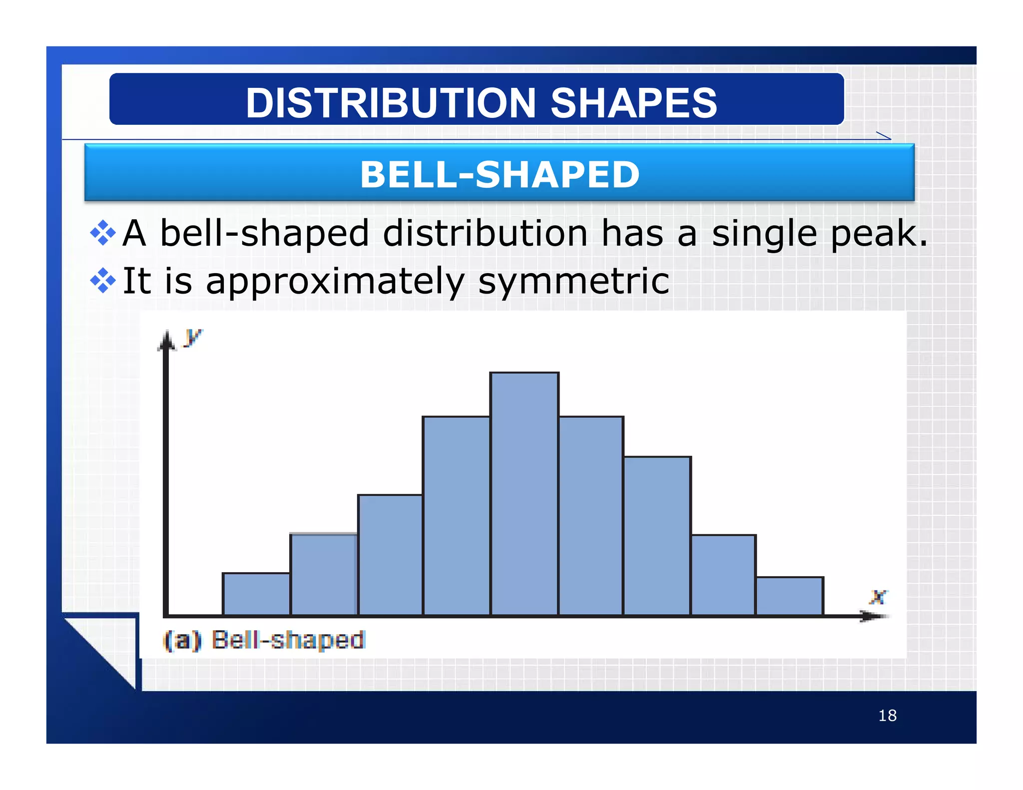
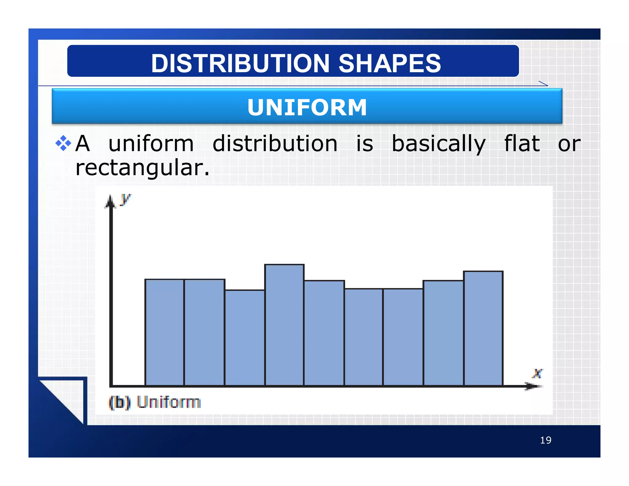
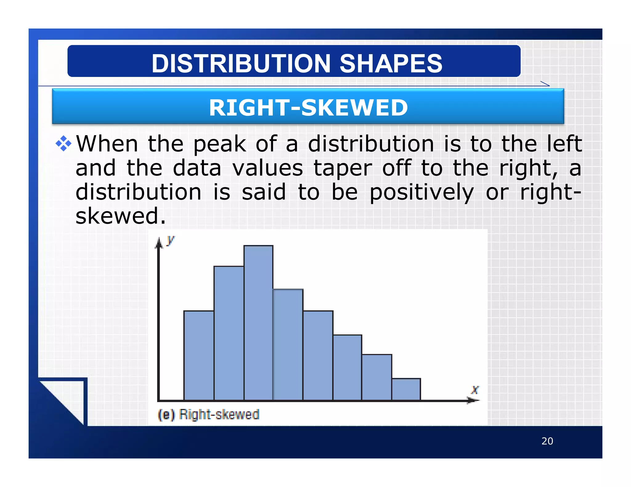
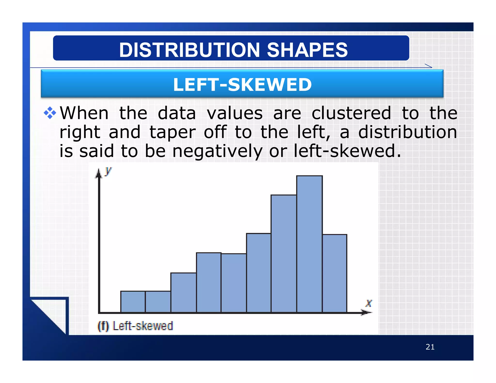
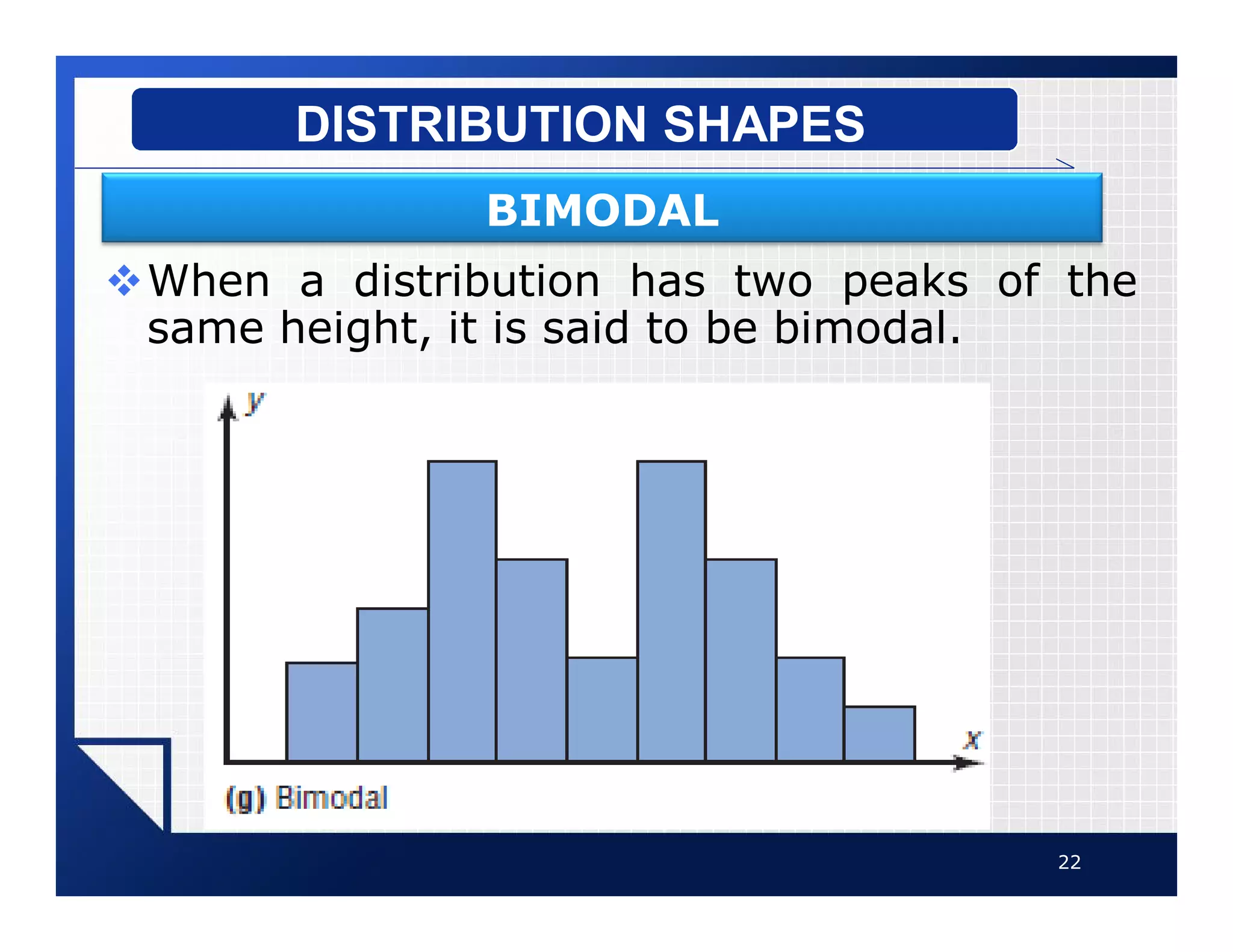
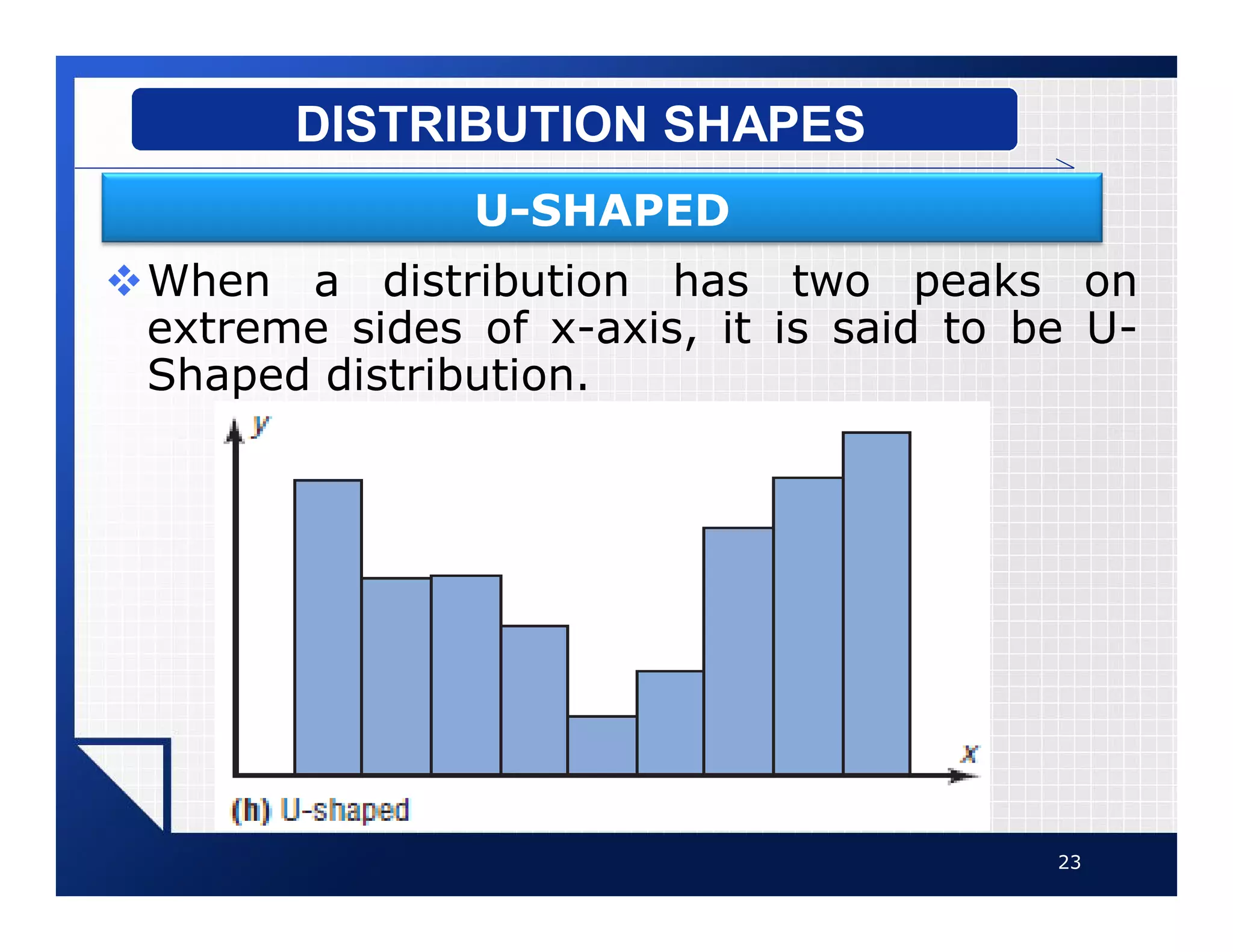
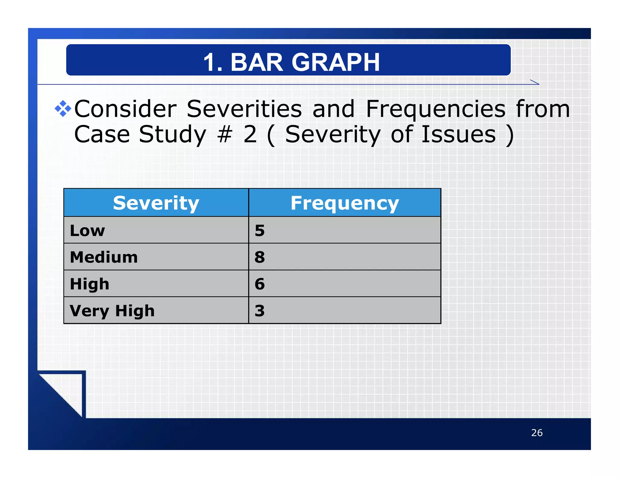
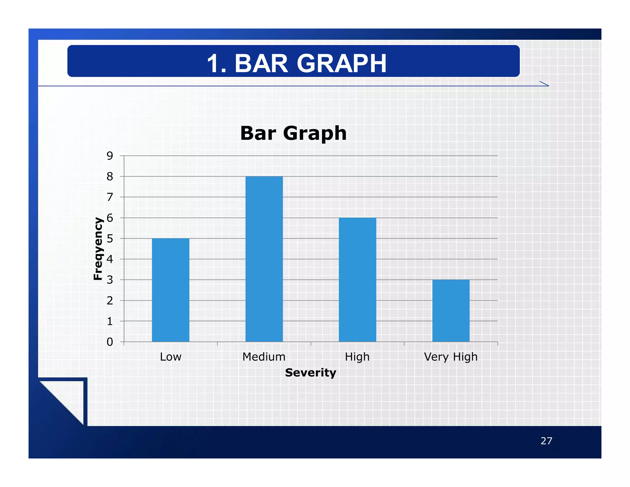
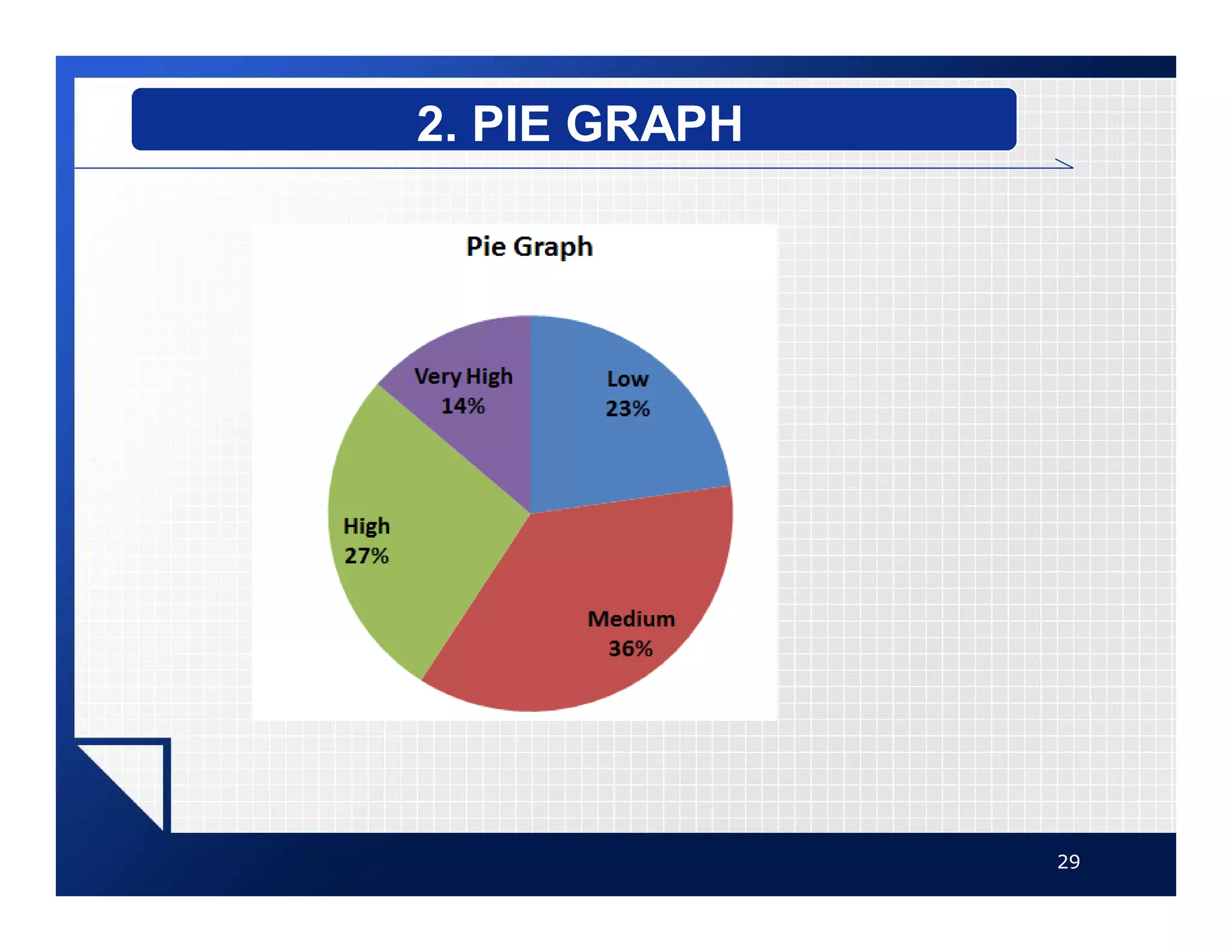
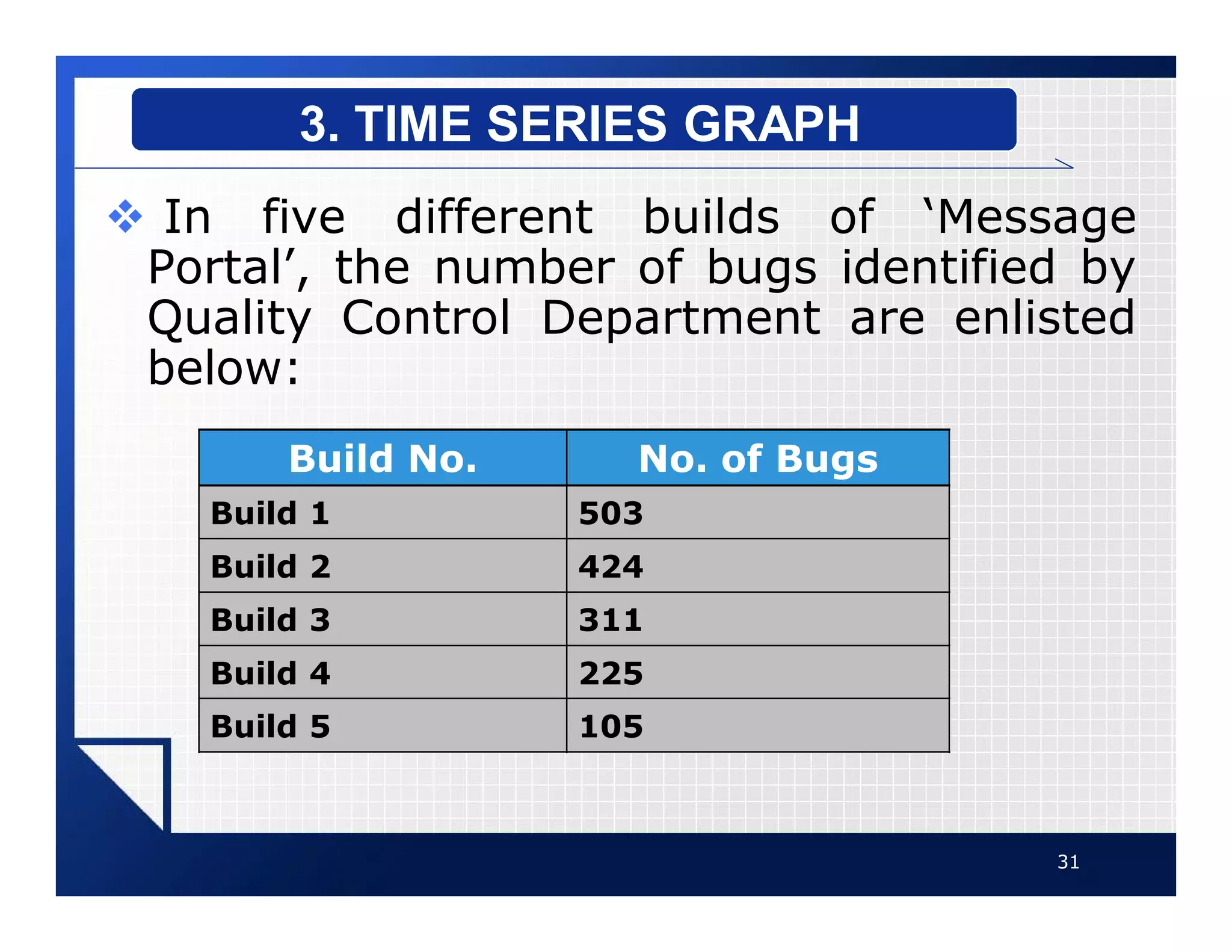
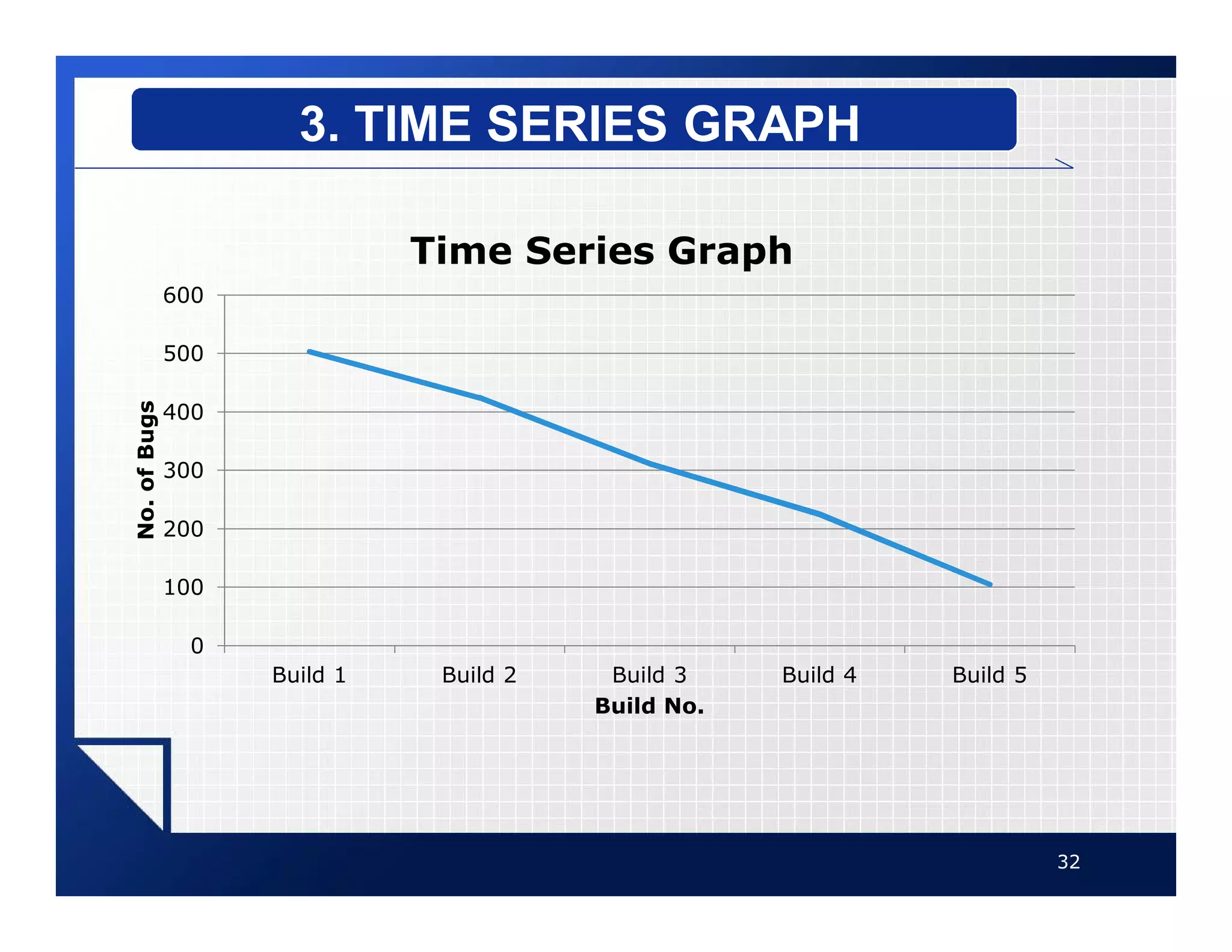
Presentation of Data
1
2
GRAPHS
1
vGraphs are used to present the
data in pictorial form.
vIt is easier for most people to
comprehend the meaning of
data presented graphically than
data presented numerically in
tables or frequency distributions.
vGraphs are used to discuss an
issue, reinforce a critical point,
or summarize a data set.
3
GRAPHS
vGraphs can also be used to
discover a trend or pattern in a
situation over a period of time.
vFollowing three are most
common types of graphs:
§ 1. Histogram
§ 2. Frequency Polygon
§ 3. Cumulative Frequency Graphs
(Ogive)
4
GRAPHS
vThe histogram is a graph that
displays the data by using
contiguous vertical bars of
various heights to represent the
frequencies of the classes.
5
1. HISTOGRAM
v Consider Class Boundaries and
Frequencies from Case Study # 1 ( Open
Bugs )
6
1. HISTOGRAM
STEPS TO DRAW A HISTOGRAM
Class Boundaries Frequency
7.5-17.5 6
17.5-27.5 5
27.5-37.5 4
37.5-47.5 4
47.5-57.5 5
57.5-67.5 3
67.5-77.5 3
vStep 1: Draw and label the x and y
axes.
vStep 2: Represent the frequency on
the y axis and the class boundaries
on the x axis.
vStep 3: Using the frequencies as
the heights, draw vertical bars for
each class.
7
1. HISTOGRAM
STEPS TO DRAW A HISTOGRAM
8
1. HISTOGRAM
STEPS TO DRAW A HISTOGRAM
0
1
2
3
4
5
6
7
17.50 27.50 37.50 47.50 57.50 67.50 77.50
Frequency
Upper Class Boundary
Histogram
vThe frequency polygon is a
graph that displays the data by
using lines that connect points
plotted for the frequencies at the
midpoints of the classes.
vThe frequencies are represented
by the heights of the points.
9
2. FREQUENCY POLYGON
vConsider Midpoints of Classes and
Frequencies from Case Study # 1 ( Open
Bugs )
10
2. FREQUENCY POLYGON
STEPS TO DRAW A POLYGON
Class Boundaries Class Midpoint Frequency
7.5-17.5 12.5 6
17.5-27.5 22.5 5
27.5-37.5 32.5 4
37.5-47.5 42.5 4
47.5-57.5 52.5 5
57.5-67.5 62.5 3
67.5-77.5 72.5 3
vStep 1: Draw and label the x and y
axes.
vStep 2: Using the midpoints for the
x values and the frequencies as the
y values, plot the points.
vStep 3: Connect adjacent points
with line segments.
11
2. FREQUENCY POLYGON
STEPS TO DRAW A POLYGON
12
2. FREQUENCY POLYGON
STEPS TO DRAW A POLYGON
0
1
2
3
4
5
6
7
12.50 22.50 32.50 42.50 52.50 62.50 72.50
Frequencies
Class Midpoints
Polygon
vThe ogive is a graph that
represents the cumulative
frequencies for the classes in a
frequency distribution.
vThe ogive or Cumulative
frequency graphs are used to
visually represent how many
values are below a certain upper
class boundary.
13
3. OGIVE
vConsider Upper Class Boundaries and
Cumulative Frequencies of Classes from
Case Study # 1 ( Open Bugs )
14
3. OGIVE
STEPS TO DRAW AN OGIVE
Upper Class Boundary Cumulative Frequency
Less than 17.5 6
Less than 27.5 11
Less than 37.5 15
Less than 47.5 19
Less than 57.5 24
Less than 67.5 27
Less than 77.5 30
vStep 1: Draw the x and y axes. Label
the x axis with the upper class
boundaries, and y axis with cumulative
frequencies.
vStep 2: Using the Upper Class
Boundaries for the x values and
Cumulative Frequencies as the y
values, plot the points.
vStep 3: Connect adjacent points
with line segments.
15
3. OGIVE
STEPS TO DRAW AN OGIVE
16
3. OGIVE
STEPS TO DRAW AN OGIVE
0
5
10
15
20
25
30
35
17.50 27.50 37.50 47.50 57.50 67.50 77.50
Cumulative
Frequency
Upper Class Boundary
Ogive
vHistogram or Polygon are used
to analyze a distribution.
vFollowing are some common
distribution shapes:
§ Bell-Shaped
§ Uniform
§ Right-Skewed
§ Left-Skewed
§ Bimodal
§ U-shaped
17
DISTRIBUTION SHAPES
vA bell-shaped distribution has a single peak.
vIt is approximately symmetric
18
DISTRIBUTION SHAPES
BELL-SHAPED
vA uniform distribution is basically flat or
rectangular.
19
DISTRIBUTION SHAPES
UNIFORM
vWhen the peak of a distribution is to the left
and the data values taper off to the right, a
distribution is said to be positively or right-
skewed.
20
DISTRIBUTION SHAPES
RIGHT-SKEWED
vWhen the data values are clustered to the
right and taper off to the left, a distribution
is said to be negatively or left-skewed.
21
DISTRIBUTION SHAPES
LEFT-SKEWED
vWhen a distribution has two peaks of the
same height, it is said to be bimodal.
22
DISTRIBUTION SHAPES
BIMODAL
vWhen a distribution has two peaks on
extreme sides of x-axis, it is said to be U-
Shaped distribution.
23
DISTRIBUTION SHAPES
U-SHAPED
vSome other famous types of
graphs are as follows:
§ Bar Graph
§ Pie Graph
§ Time Series Graph
24
OTHER TYPES OF GRAPHS
vA bar graph represents the data
by using vertical or horizontal
bars whose heights or lengths
represent the frequencies of the
data.
25
1. BAR GRAPH
vConsider Severities and Frequencies from
Case Study # 2 ( Severity of Issues )
26
1. BAR GRAPH
Severity Frequency
Low 5
Medium 8
High 6
Very High 3
27
1. BAR GRAPH
0
1
2
3
4
5
6
7
8
9
Low Medium High Very High
Freqyency
Severity
Bar Graph
vA pie graph is a circle that is
divided into sections according
to the percentage of frequencies
in each category of the
distribution.
28
2. PIE GRAPH
29
2. PIE GRAPH
vA time series graph represents
data that occur over a specific
period of time.
30
3. TIME SERIES GRAPH
v In five different builds of ‘Message
Portal’, the number of bugs identified by
Quality Control Department are enlisted
below:
31
3. TIME SERIES GRAPH
Build No. No. of Bugs
Build 1 503
Build 2 424
Build 3 311
Build 4 225
Build 5 105
32
3. TIME SERIES GRAPH
0
100
200
300
400
500
600
Build 1 Build 2 Build 3 Build 4 Build 5
No.
of
Bugs
Build No.
Time Series Graph

Graphs.pdf

  • 1.
  • 2.
  • 3.
    vGraphs are usedto present the data in pictorial form. vIt is easier for most people to comprehend the meaning of data presented graphically than data presented numerically in tables or frequency distributions. vGraphs are used to discuss an issue, reinforce a critical point, or summarize a data set. 3 GRAPHS
  • 4.
    vGraphs can alsobe used to discover a trend or pattern in a situation over a period of time. vFollowing three are most common types of graphs: § 1. Histogram § 2. Frequency Polygon § 3. Cumulative Frequency Graphs (Ogive) 4 GRAPHS
  • 5.
    vThe histogram isa graph that displays the data by using contiguous vertical bars of various heights to represent the frequencies of the classes. 5 1. HISTOGRAM
  • 6.
    v Consider ClassBoundaries and Frequencies from Case Study # 1 ( Open Bugs ) 6 1. HISTOGRAM STEPS TO DRAW A HISTOGRAM Class Boundaries Frequency 7.5-17.5 6 17.5-27.5 5 27.5-37.5 4 37.5-47.5 4 47.5-57.5 5 57.5-67.5 3 67.5-77.5 3
  • 7.
    vStep 1: Drawand label the x and y axes. vStep 2: Represent the frequency on the y axis and the class boundaries on the x axis. vStep 3: Using the frequencies as the heights, draw vertical bars for each class. 7 1. HISTOGRAM STEPS TO DRAW A HISTOGRAM
  • 8.
    8 1. HISTOGRAM STEPS TODRAW A HISTOGRAM 0 1 2 3 4 5 6 7 17.50 27.50 37.50 47.50 57.50 67.50 77.50 Frequency Upper Class Boundary Histogram
  • 9.
    vThe frequency polygonis a graph that displays the data by using lines that connect points plotted for the frequencies at the midpoints of the classes. vThe frequencies are represented by the heights of the points. 9 2. FREQUENCY POLYGON
  • 10.
    vConsider Midpoints ofClasses and Frequencies from Case Study # 1 ( Open Bugs ) 10 2. FREQUENCY POLYGON STEPS TO DRAW A POLYGON Class Boundaries Class Midpoint Frequency 7.5-17.5 12.5 6 17.5-27.5 22.5 5 27.5-37.5 32.5 4 37.5-47.5 42.5 4 47.5-57.5 52.5 5 57.5-67.5 62.5 3 67.5-77.5 72.5 3
  • 11.
    vStep 1: Drawand label the x and y axes. vStep 2: Using the midpoints for the x values and the frequencies as the y values, plot the points. vStep 3: Connect adjacent points with line segments. 11 2. FREQUENCY POLYGON STEPS TO DRAW A POLYGON
  • 12.
    12 2. FREQUENCY POLYGON STEPSTO DRAW A POLYGON 0 1 2 3 4 5 6 7 12.50 22.50 32.50 42.50 52.50 62.50 72.50 Frequencies Class Midpoints Polygon
  • 13.
    vThe ogive isa graph that represents the cumulative frequencies for the classes in a frequency distribution. vThe ogive or Cumulative frequency graphs are used to visually represent how many values are below a certain upper class boundary. 13 3. OGIVE
  • 14.
    vConsider Upper ClassBoundaries and Cumulative Frequencies of Classes from Case Study # 1 ( Open Bugs ) 14 3. OGIVE STEPS TO DRAW AN OGIVE Upper Class Boundary Cumulative Frequency Less than 17.5 6 Less than 27.5 11 Less than 37.5 15 Less than 47.5 19 Less than 57.5 24 Less than 67.5 27 Less than 77.5 30
  • 15.
    vStep 1: Drawthe x and y axes. Label the x axis with the upper class boundaries, and y axis with cumulative frequencies. vStep 2: Using the Upper Class Boundaries for the x values and Cumulative Frequencies as the y values, plot the points. vStep 3: Connect adjacent points with line segments. 15 3. OGIVE STEPS TO DRAW AN OGIVE
  • 16.
    16 3. OGIVE STEPS TODRAW AN OGIVE 0 5 10 15 20 25 30 35 17.50 27.50 37.50 47.50 57.50 67.50 77.50 Cumulative Frequency Upper Class Boundary Ogive
  • 17.
    vHistogram or Polygonare used to analyze a distribution. vFollowing are some common distribution shapes: § Bell-Shaped § Uniform § Right-Skewed § Left-Skewed § Bimodal § U-shaped 17 DISTRIBUTION SHAPES
  • 18.
    vA bell-shaped distributionhas a single peak. vIt is approximately symmetric 18 DISTRIBUTION SHAPES BELL-SHAPED
  • 19.
    vA uniform distributionis basically flat or rectangular. 19 DISTRIBUTION SHAPES UNIFORM
  • 20.
    vWhen the peakof a distribution is to the left and the data values taper off to the right, a distribution is said to be positively or right- skewed. 20 DISTRIBUTION SHAPES RIGHT-SKEWED
  • 21.
    vWhen the datavalues are clustered to the right and taper off to the left, a distribution is said to be negatively or left-skewed. 21 DISTRIBUTION SHAPES LEFT-SKEWED
  • 22.
    vWhen a distributionhas two peaks of the same height, it is said to be bimodal. 22 DISTRIBUTION SHAPES BIMODAL
  • 23.
    vWhen a distributionhas two peaks on extreme sides of x-axis, it is said to be U- Shaped distribution. 23 DISTRIBUTION SHAPES U-SHAPED
  • 24.
    vSome other famoustypes of graphs are as follows: § Bar Graph § Pie Graph § Time Series Graph 24 OTHER TYPES OF GRAPHS
  • 25.
    vA bar graphrepresents the data by using vertical or horizontal bars whose heights or lengths represent the frequencies of the data. 25 1. BAR GRAPH
  • 26.
    vConsider Severities andFrequencies from Case Study # 2 ( Severity of Issues ) 26 1. BAR GRAPH Severity Frequency Low 5 Medium 8 High 6 Very High 3
  • 27.
    27 1. BAR GRAPH 0 1 2 3 4 5 6 7 8 9 LowMedium High Very High Freqyency Severity Bar Graph
  • 28.
    vA pie graphis a circle that is divided into sections according to the percentage of frequencies in each category of the distribution. 28 2. PIE GRAPH
  • 29.
  • 30.
    vA time seriesgraph represents data that occur over a specific period of time. 30 3. TIME SERIES GRAPH
  • 31.
    v In fivedifferent builds of ‘Message Portal’, the number of bugs identified by Quality Control Department are enlisted below: 31 3. TIME SERIES GRAPH Build No. No. of Bugs Build 1 503 Build 2 424 Build 3 311 Build 4 225 Build 5 105
  • 32.
    32 3. TIME SERIESGRAPH 0 100 200 300 400 500 600 Build 1 Build 2 Build 3 Build 4 Build 5 No. of Bugs Build No. Time Series Graph