Download to read offline

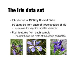
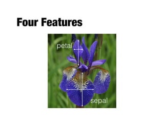
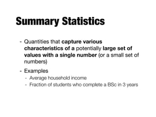

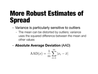
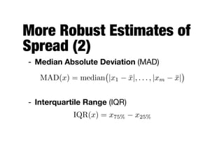
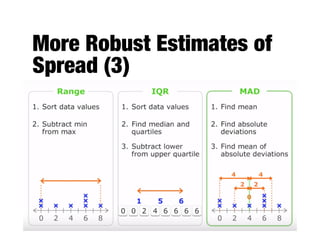
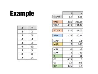

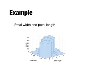
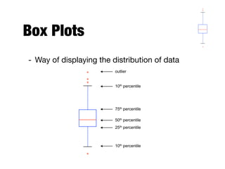
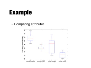
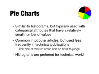
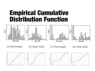
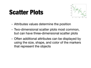
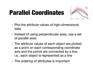
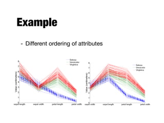
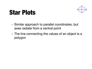
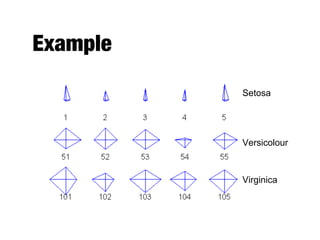
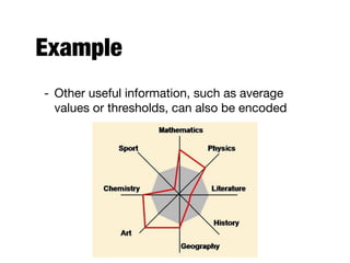
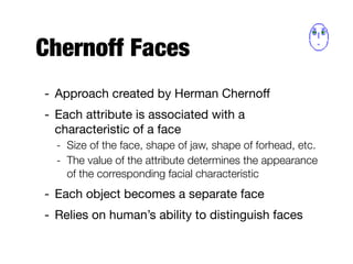
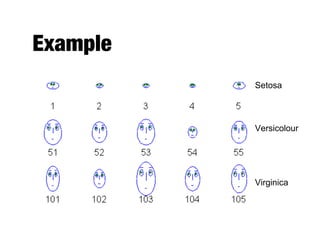
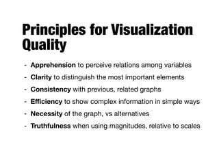

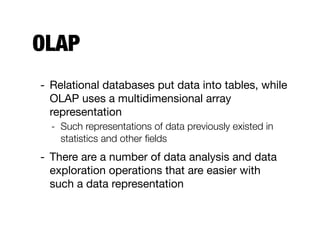
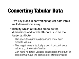
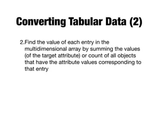
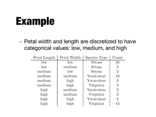
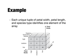
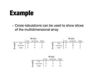
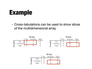
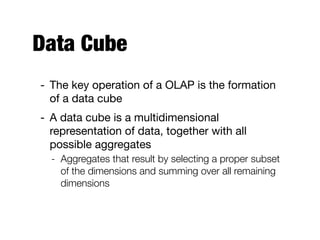
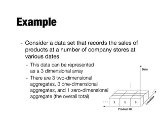
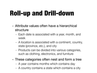
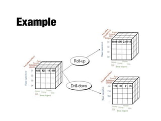

The document discusses data exploration techniques in data mining, focusing on preliminary data investigation to understand characteristics and guide preprocessing and analysis. It covers key concepts such as summary statistics, visualization methods, and OLAP (Online Analytical Processing) for multidimensional data analysis, referencing the Iris dataset as an example. Various statistical measures, visualization techniques, and OLAP operations are explored to enhance data understanding and presentation.