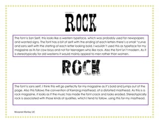
The document discusses different fonts and evaluates their suitability for a magazine targeted at teenagers who like rock music. It analyzes several serif and sans serif fonts, finding that most do not have the boldness, modernity, or appeal to both genders needed. However, one sans serif font is deemed suitable as it is bold and looks eroded like cracked rock music might, fitting the genre and following conventions of similar magazines.