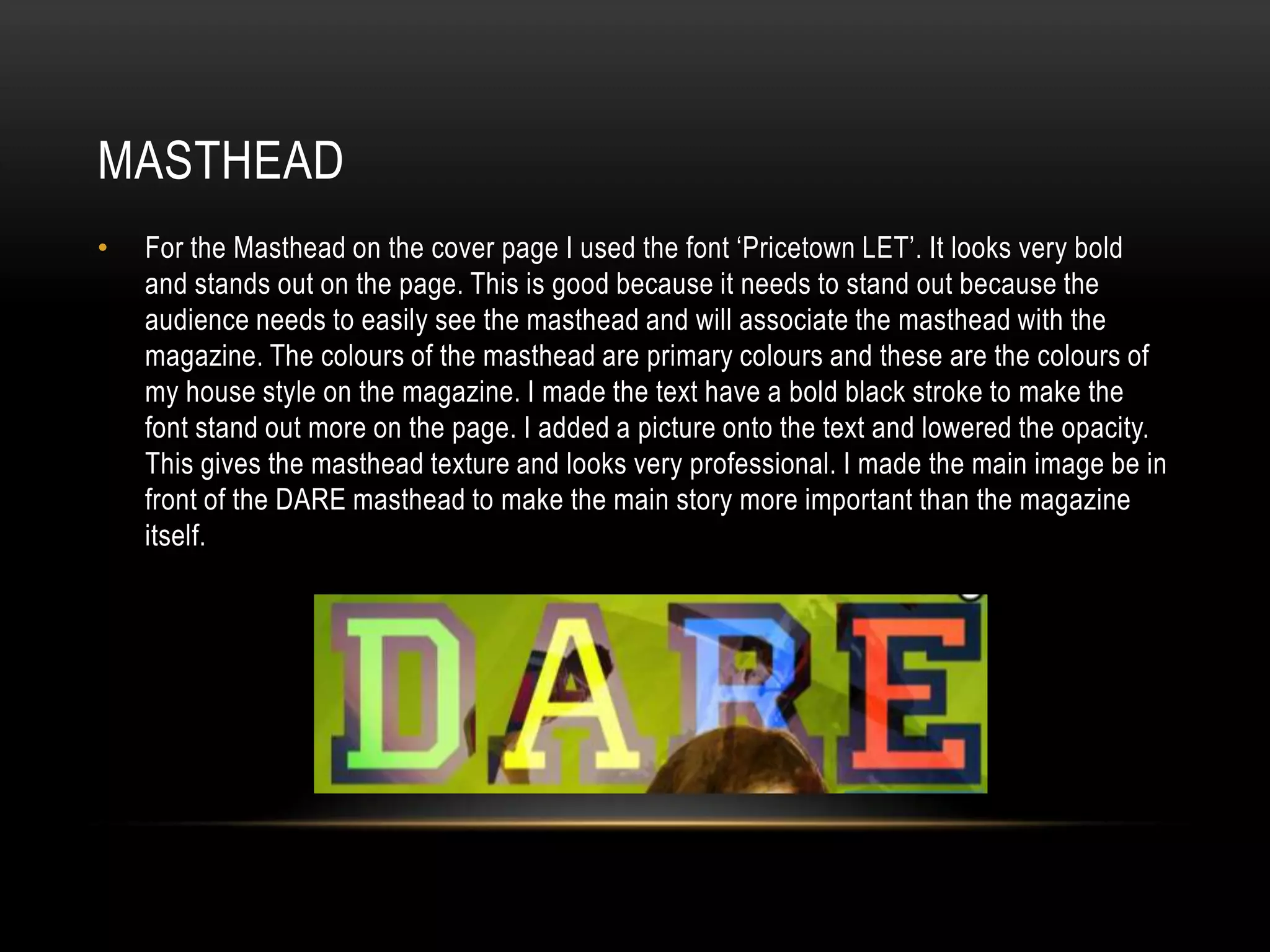
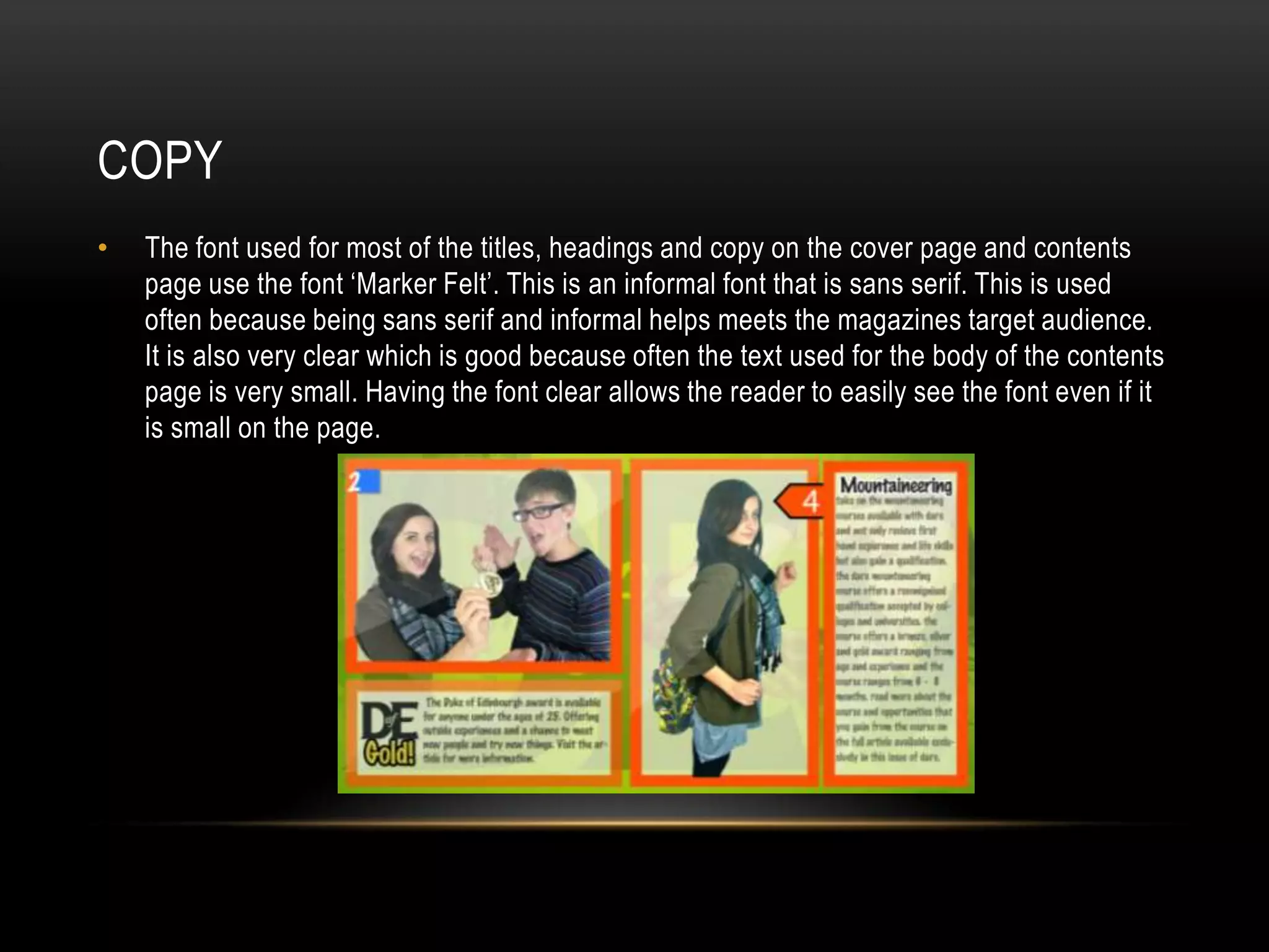
Download to read offline
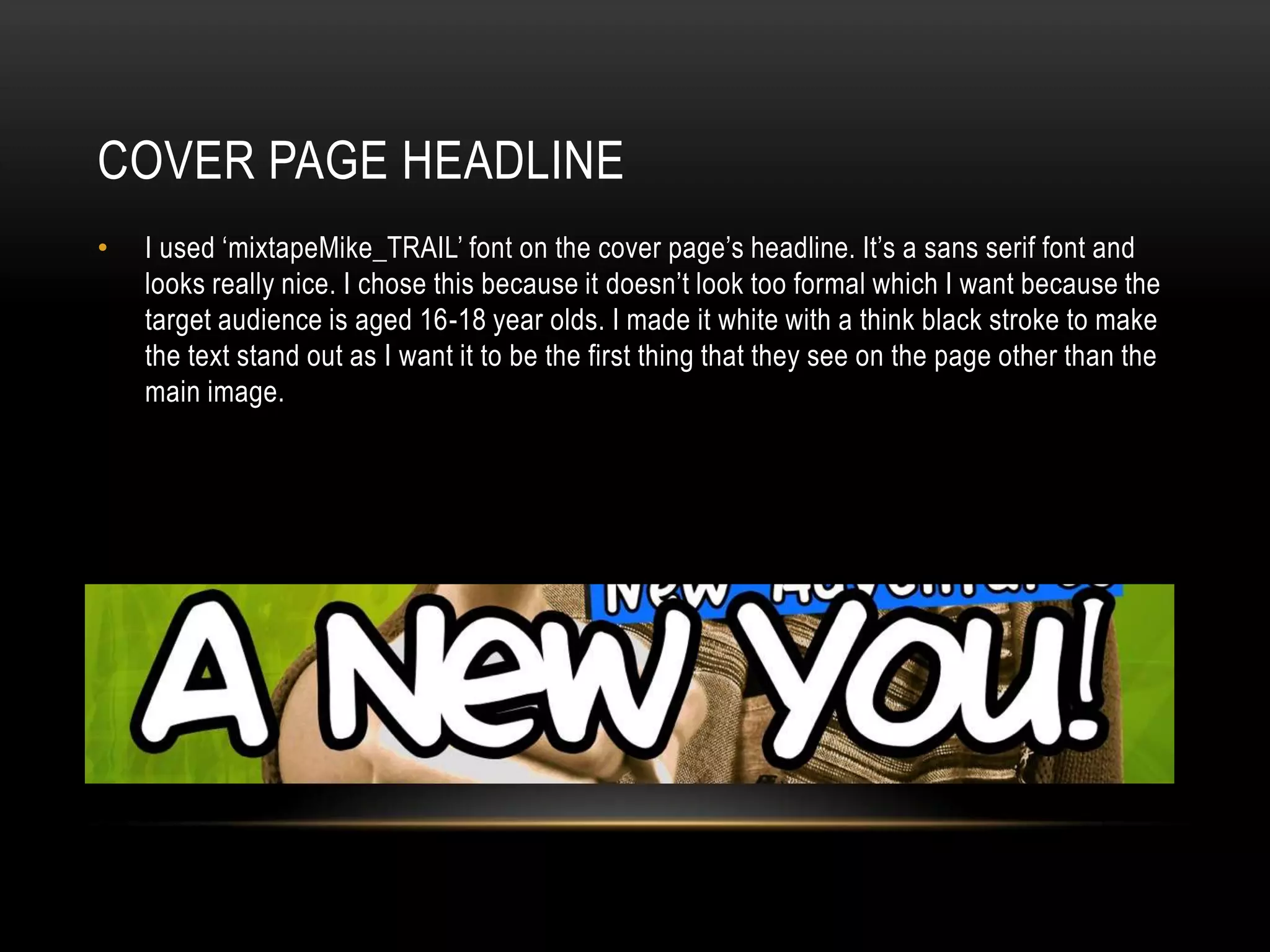
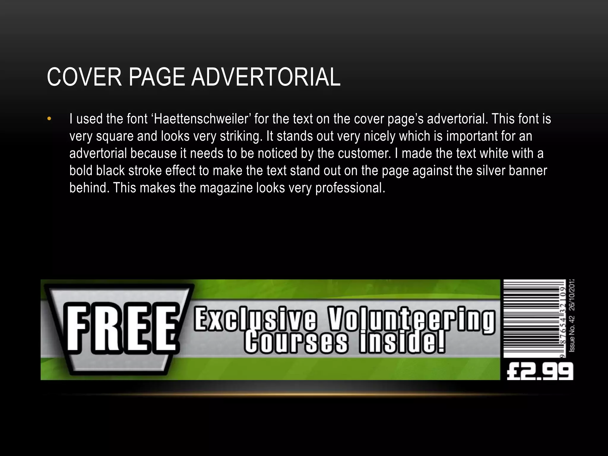
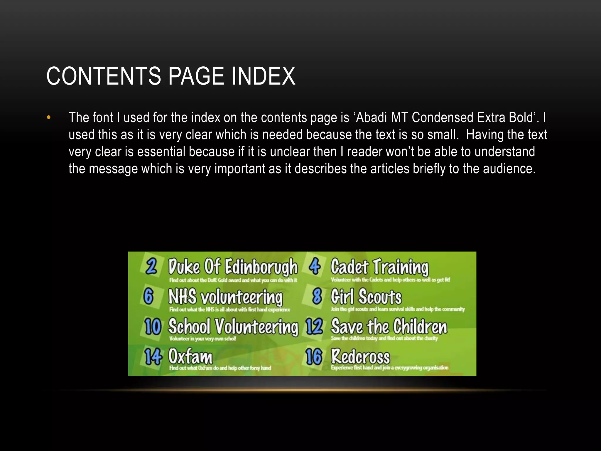

This document discusses the font choices made for different elements of a magazine design. For the cover page headline, a sans serif font called 'mixtapeMike_TRAIL' was used to appear informal for the 16-18 year old target audience. On the cover advertorial, the square font 'Haettenschweiler' was used to stand out and be noticed. For the small text of the contents page index, the clear font 'Abadi MT Condensed Extra Bold' was chosen. Throughout the magazine, the sans serif font 'Marker Felt' was generally used for body text to appear clear and informal for readers.


