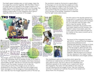
The two magazine pages use bright green bubbles and a faded effect to link the pages together visually without an actual page split. Quotes from the featured band help provide insight into the band's personalities while drawing the reader in. The layout uses a combination of text and images in a way that is both appealing and professional. While the background could use more visual interest and some images might benefit from different cropping, overall the spread effectively introduces the reader to the band through its design.


