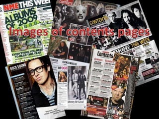
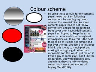
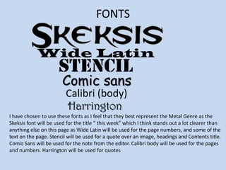
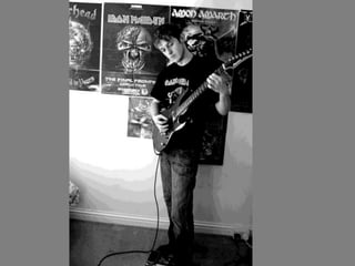
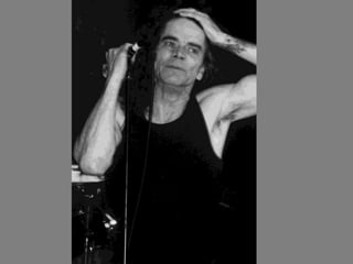
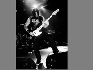
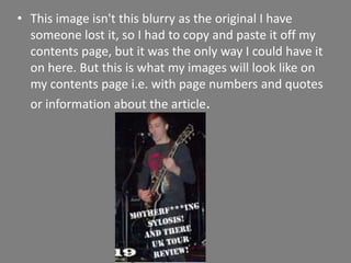
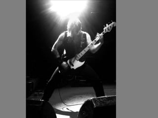
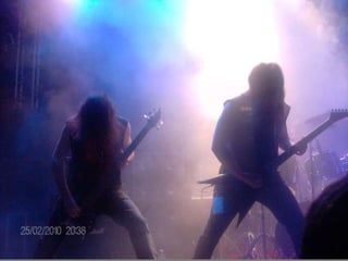
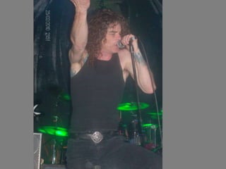
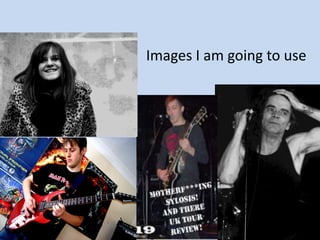
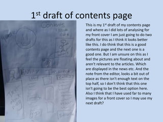
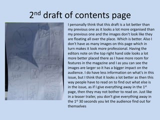
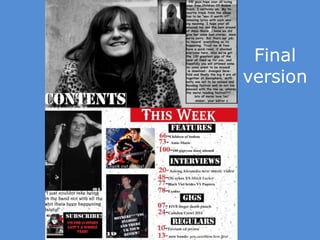
The document discusses the author's process for planning and creating a contents page for their magazine called "Metal Entity". They go through multiple drafts, focusing on layout, image selection, font choices and keeping the design consistent with the rest of the magazine. They evaluate their final contents page as having an organized structure with a good use of images and fonts to represent the metal genre and draw in readers.
How to Create Map Views in the Odoo 17 ERPCeline George
The map views are useful for providing a geographical representation of data. They allow users to visualize and analyze the data in a more intuitive manner.
The Indian economy is classified into different sectors to simplify the analysis and understanding of economic activities. For Class 10, it's essential to grasp the sectors of the Indian economy, understand their characteristics, and recognize their importance. This guide will provide detailed notes on the Sectors of the Indian Economy Class 10, using specific long-tail keywords to enhance comprehension.
For more information, visit-www.vavaclasses.com
Welcome to TechSoup New Member Orientation and Q&A (May 2024).pdfTechSoup
In this webinar you will learn how your organization can access TechSoup's wide variety of product discount and donation programs. From hardware to software, we'll give you a tour of the tools available to help your nonprofit with productivity, collaboration, financial management, donor tracking, security, and more.
The French Revolution, which began in 1789, was a period of radical social and political upheaval in France. It marked the decline of absolute monarchies, the rise of secular and democratic republics, and the eventual rise of Napoleon Bonaparte. This revolutionary period is crucial in understanding the transition from feudalism to modernity in Europe.
For more information, visit-www.vavaclasses.com
Students, digital devices and success - Andreas Schleicher - 27 May 2024..pptxEduSkills OECD
Andreas Schleicher presents at the OECD webinar ‘Digital devices in schools: detrimental distraction or secret to success?’ on 27 May 2024. The presentation was based on findings from PISA 2022 results and the webinar helped launch the PISA in Focus ‘Managing screen time: How to protect and equip students against distraction’ https://www.oecd-ilibrary.org/education/managing-screen-time_7c225af4-en and the OECD Education Policy Perspective ‘Students, digital devices and success’ can be found here - https://oe.cd/il/5yV
3. What I am planning to do I am hopefully going to create a contents page for my magazine Metal Entity. I am going to use my planning power point slide in hope that I can use some slides from there to help me here in this one. As I don't want to have to re-write anything at the end as if I had planned out to have times new roman as the main header and I use comic sans then I would have to explain why I didn't use it. So I am trying as much as I can to stick to my planning as it looks better when I go back to it. I hope that I am able to create a contents page so that it looks real enough to be apart of Metal Entity and it doesn't look out of place with the rest of my magazine. Un like in my previous slide of contents pages which I don't think are that good, I hope that I don't make any of these mistakes and go on to create a great contents page .
4. Colour scheme By using these colours for my contents page shows that I am following conventions by keeping my colour scheme the same/similar. As some contents pages tend to not follow conventions and go for an outgoing front cover then have a dull contents page. I am hoping to keep the same colour scheme and style throughout my magazine as I think this is the best thing to do as its nice and simple and not over the top. Like NME in this issue I think this is way to much pink and making it look girly girl rather than rock/indie and this would put me off if I was a guy as some guys, don't like the colour pink. But with black red grey and white, they are mix-gendered colours so it wont put anyone off buying Metal Entity
5. FONTS Wide Latin stencil Comic sans Calibri (body) Harrington I have chosen to use these fonts as I feel that they best represent the Metal Genre as the Skeksis font will be used for the title “ this week” which I think stands out a lot clearer than anything else on this page as Wide Latin will be used for the page numbers, and some of the text on the page. Stencil will be used for a quote over an image, headings and Contents title. Comic Sans will be used for the note from the editor. Calibri body will be used for the pages and numbers. Harrington will be used for quotes
17. This image isn't this blurry as the original I have someone lost it, so I had to copy and paste it off my contents page, but it was the only way I could have it on here. But this is what my images will look like on my contents page i.e. with page numbers and quotes or information about the article.
22. Mode of address As I'm following conventions and this page is where your drawing the readers in to read more, I will be using an informal style i.e.: you could be apart of this, LOL, OMG, where you here? Things like this can come across as if you are talking to the reader. Also because of my target audience 14-24ish they tend to use shortened abbreviations of words I.e. OMG, yeh, lmao, lol, yhoo, my bad, okay, buh. Words like this are used in teenagers lives everyday. So if I can incorporate this into my work then it shows that I am thinking of my target audience.
23. 1st draft of contents page This is my 1st draft of my contents page and where as I did lots of analysing for my front cover I am just going to do two drafts for this as I think it looks better like this. I do think that this is a good contents page and the next one is a good one. But I am unsure on this as I feel the pictures are floating about and aren't relevant to the articles. Which are displayed in the news etc. And the note from the editor, looks a bit out of place as there isn't enough text on the top half, so I don't think that this one isn't going to be the best option here. Also I think that I have used far to many images for a front cover so I may use my next draft?
24. 2nd draft of contents page I personally think that this draft is a lot better than my previous one as it looks a lot more organised than my previous one and the images don't look like they are floating all over the place. Which is better. Also I don't have as many images on this page which in turn makes it look more professional. Having the editors note on the top right hand side looks a lot more better placed there as I have more room for features in the magazine and I as you can see the images are larger so it has a bigger impact on the audience. I do have less information on what's in this issue, but I think that it looks a lot better as then this way people have to read on to find out what else is in the issue, as if I give everything away in the 1st page, then they may not bother to read on. Just like in a teaser trailer, you don't give everything away in the 1st 30 seconds you let the audience find out for themselves
26. Evaluation Overall I think that my contents page has turned out better than I thought it would of. As before I got to this stage I had create 6 other versions and each time I was getting better and better at creating them. I am happy with my final outcome as the colour scheme shows that I am following conventions by keeping it the same. The only thing that I did change was the white background as I felt that this didn't really fit in. So I looked on Google and I found the white background with little dashes on it. I think that having Amie taking up half of the page, again has a bigger impact on the reader as she's placed more and more into their eye contact and its almost making them want to read the story even if they hate her. Its a bit like Justin bieber everyone I know who is my target audience hates him, and if he had a story like “ I'm gay” then I'm sure people would want to read that. Also I'm happy that I stuck to my planning as I didn't need to create more work for my self. The images that I have used here I think it really represents the metal genre as the image is of Bobby "Blitz" Ellsworth. And it was great timing . The image and quote of sylosis really makes me want to read on. The note from the editor was a real challenge for me as I had to get the mode of address right. As this is basic selling the magazine in a few sentences. So hopefully I have done that correct.