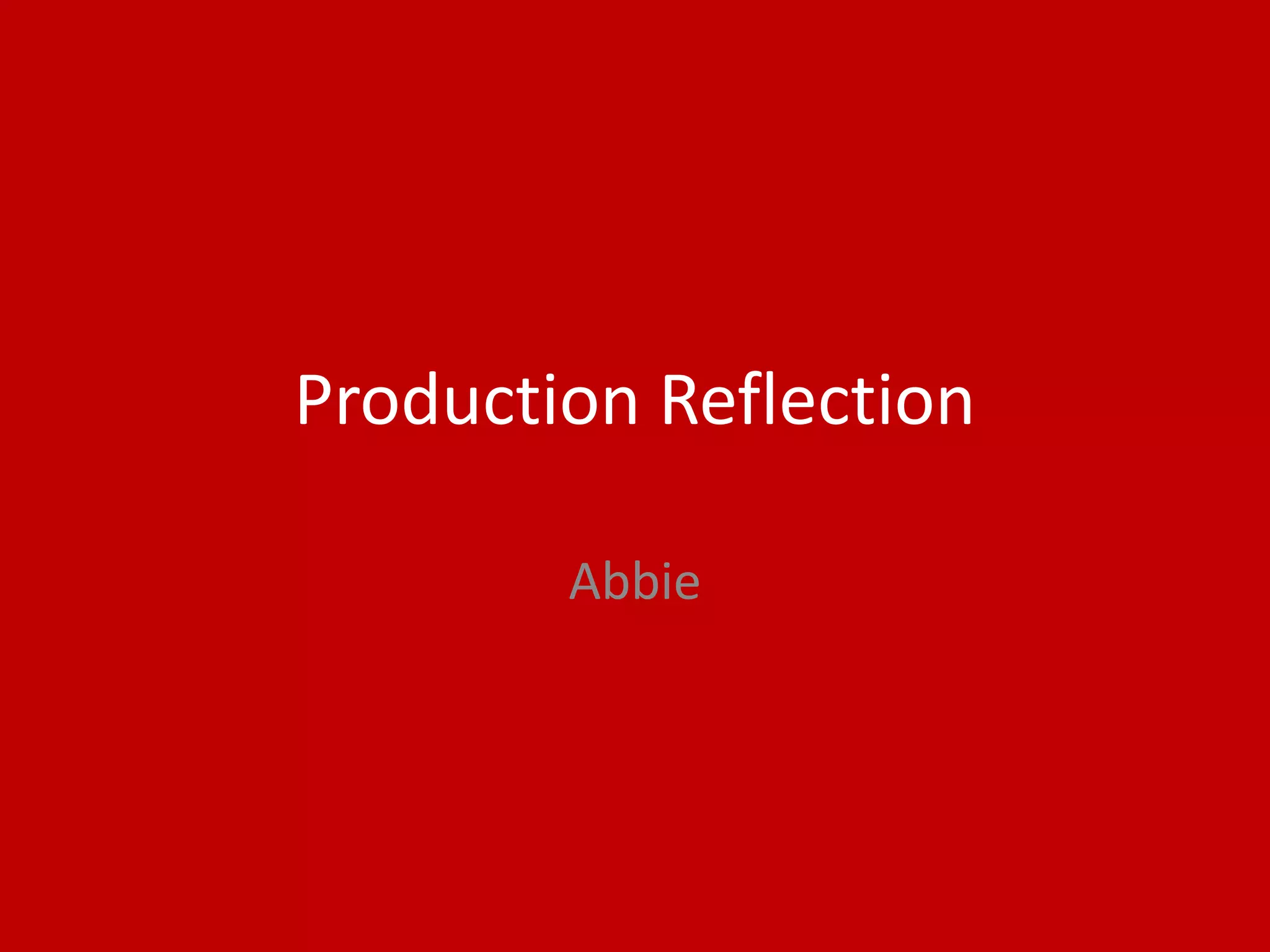
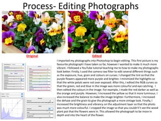
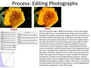
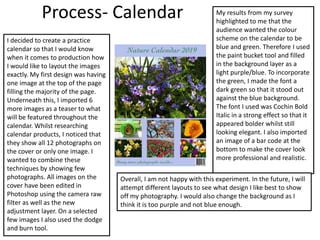
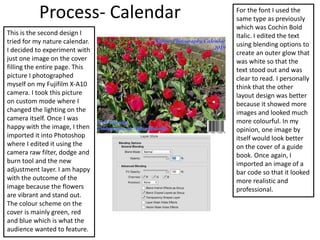
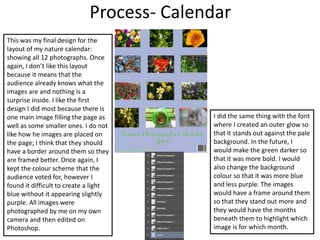
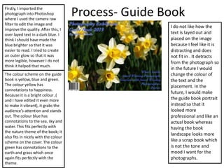
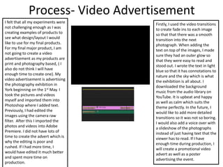
Production Reflection
Abbie
Process- Editing Photographs
Original Edited
I imported my photographs into Photoshop to begin editing. This first picture is my
favourite photograph I have taken so far, however I wanted to make it much more
vibrant. I followed a YouTube tutorial teaching me to how to make my photographs
look better. Firstly, I used the camera raw filter to edit several different things such
as the exposure, hue, grain and colours on curves. I changed the tint so that the
purple flowers appeared more purple and brighter. I minimized the highlights so
that the white petals were not over exposed. After this, I edited the RGB curves so
that the green, red and blue in the image was more colourful and eye catching. I
then edited the colours in the image. For example, I made the red darker as well as
the orange and purple. However, I increased the yellow so that it more luminous. I
also increased the balance to make the image brighter. Furthermore, I increased
the dehaze and the grain to give the photograph a more vintage look. Finally, I
increased the brightness and vibrancy on the adjustment layer so that the photo
was much more colourful. I cropped the image so that you couldn't’t see the wood
plant pot that the flowers were in. This allowed the photograph to be more in
depth and into the heart of the flower.
Process- Editing Photographs
Original Edited
This is the second image I edited in Photoshop. I am not very happy
with this edit because I wanted the flower to be much more yellow
and bold. Once again I cropped the image so that the main focus is on
the flower and the little bug inside. I took down the exposure as the
lighting on some petals was too white. To make them appear darker I
increased the contrast as well as taking away a percentage of white. I
increased the vibrancy so that the yellow was brighter, however I
noticed that it turned the flower orange. I experimented with RGB
curves, mainly blue, so that the green leaves in the background stood
out more. I sharpened the image and increased the detail so that the
little bug in the flower stood out more as well as the tiny hairs on the
inside. Once again, on the adjustment layer I changed the brightness
and vibrancy, however I am not happy with the outcome. I tried to
change the colour with the dodge and burn tool to lighten the petals,
although they changed to a lighter orange. In the future, I would keep
the flower yellow and make the bug stand out more by highlighting it
and possibly cropping even more of the image.
Process- Calendar
I decided to create a practice
calendar so that I would know
when it comes to production how
I would like to layout the images
exactly. My first design was having
one image at the top of the page
filling the majority of the page.
Underneath this, I imported 6
more images as a teaser to what
will be featured throughout the
calendar. Whilst researching
calendar products, I noticed that
they show all 12 photographs on
the cover or only one image. I
wanted to combine these
techniques by showing few
photographs. All images on the
cover have been edited in
Photoshop using the camera raw
filter as well as the new
adjustment layer. On a selected
few images I also used the dodge
and burn tool.
My results from my survey
highlighted to me that the
audience wanted the colour
scheme on the calendar to be
blue and green. Therefore I used
the paint bucket tool and filled
in the background layer as a
light purple/blue. To incorporate
the green, I made the font a
dark green so that it stood out
against the blue background.
The font I used was Cochin Bold
Italic in a strong effect so that it
appeared bolder whilst still
looking elegant. I also imported
an image of a bar code at the
bottom to make the cover look
more professional and realistic.
Overall, I am not happy with this experiment. In the future, I will
attempt different layouts to see what design I like best to show
off my photography. I would also change the background as I
think it is too purple and not blue enough.
Process- Calendar
This is the second design I
tried for my nature calendar.
I decided to experiment with
just one image on the cover
filling the entire page. This
picture I photographed
myself on my Fujifilm X-A10
camera. I took this picture
on custom mode where I
changed the lighting on the
camera itself. Once I was
happy with the image, I then
imported it into Photoshop
where I edited it using the
camera raw filter, dodge and
burn tool and the new
adjustment layer. I am happy
with the outcome of the
image because the flowers
are vibrant and stand out.
The colour scheme on the
cover is mainly green, red
and blue which is what the
audience wanted to feature.
For the font I used the
same type as previously
which was Cochin Bold
Italic. I edited the text
using blending options to
create an outer glow that
was white so that the
text stood out and was
clear to read. I personally
think that the other
layout design was better
because it showed more
images and looked much
more colourful. In my
opinion, one image by
itself would look better
on the cover of a guide
book. Once again, I
imported an image of a
bar code so that it looked
more realistic and
professional.
Process- Calendar
This was my final design for the
layout of my nature calendar:
showing all 12 photographs. Once
again, I don’t like this layout
because it means that the
audience already knows what the
images are and nothing is a
surprise inside. I like the first
design I did most because there is
one main image filling the page as
well as some smaller ones. I do not
like how he images are placed on
the page; I think that they should
have a border around them so they
are framed better. Once again, I
kept the colour scheme that the
audience voted for, however I
found it difficult to create a light
blue without it appearing slightly
purple. All images were
photographed by me on my own
camera and then edited on
Photoshop.
I did the same thing with the font
where I created an outer glow so
that it stands out against the pale
background. In the future, I
would make the green darker so
that it was more bold. I would
also change the background
colour so that it was more blue
and less purple. The images
would have a frame around them
so that they stand out more and
they would have the months
beneath them to highlight which
image is for which month.
Process- Guide BookFirstly, I imported the
photograph into Photoshop
where I used the camera raw
filter to edit the image and
improve the quality. After this, I
over layed text in a dark blue. I
think I should have made the
blue brighter so that it was
easier to read. I tried to create
an outer glow so that it was
more legible, however I do not
think it helped that much.
The colour scheme on the guide
book is yellow, blue and green.
The colour yellow has
connotations to happiness.
Because it is a bright colour ,(
and I have edited it even more
to make it vibrant), it grabs the
audience's attention and stands
out. The colour blue has
connotations to the sea, sky and
water. This fits perfectly with
the nature theme of the book; it
also fits in nicely with the colour
scheme on the cover. The colour
green has connotations to the
earth and grass which once
again fits perfectly with the
theme.
I do not like how the
text is layed out and
placed on the image
because I feel like it is
distracting and does
not fit in . It detracts
from the photograph so
in the future I would
change the colour of
the text and the
placement. In the
future, I would make
the guide book portrait
instead so that it
looked more
professional and like an
actual book whereas
having the book
landscape looks more
like a scrap book which
is not the tone and
mood I want for the
photographs.
Process- Video Advertisement
I felt that all my experiments were
not challenging enough as I was
creating examples of products to
see what design/layout I would
like to use for my final products.
For my final major product, I am
not going to create a video
advertisement as my products are
print and photography based, ( I
also do not think I will have
enough time to create one). My
video advertisement is advertising
the photography exhibition in
York beginning on the 1st May. I
took the pictures and videos
myself and imported them into
Photoshop where I added text.
Previously, I had edited the
images using the camera raw
filter. After this I imported the
photos and videos into Adobe
Premiere. I did not have lots of
time to create the advert which is
why the editing is poor and
rushed. If I had more time, I
would have edited it much better
and spent more time on
production.
Firstly, I used the video transitions
to create fade ins to each image
so that that there was a smooth
transition into the next
photograph. When adding the
text on top of the images, I made
sure they had an outer glow so
that they were easy to read and
stood out. I wrote the text in light
blue so that it has connotations to
nature and the sky which is what
the exhibition is all about. I
downloaded the background
music from the audio library on
YouTube. It is upbeat and happy
as well as calm which suits the
theme perfectly. In the future, I
would like to add more detailed
transitions so it was not so boring.
I would also add a voice over with
a slideshow of the photographs
instead of just having text that the
viewer has to read. If I have
enough time during production, I
will create a promotional video
advert as well as a poster
advertising the event.

Fmp experiment reflection

  • 1.
  • 2.
    Process- Editing Photographs OriginalEdited I imported my photographs into Photoshop to begin editing. This first picture is my favourite photograph I have taken so far, however I wanted to make it much more vibrant. I followed a YouTube tutorial teaching me to how to make my photographs look better. Firstly, I used the camera raw filter to edit several different things such as the exposure, hue, grain and colours on curves. I changed the tint so that the purple flowers appeared more purple and brighter. I minimized the highlights so that the white petals were not over exposed. After this, I edited the RGB curves so that the green, red and blue in the image was more colourful and eye catching. I then edited the colours in the image. For example, I made the red darker as well as the orange and purple. However, I increased the yellow so that it more luminous. I also increased the balance to make the image brighter. Furthermore, I increased the dehaze and the grain to give the photograph a more vintage look. Finally, I increased the brightness and vibrancy on the adjustment layer so that the photo was much more colourful. I cropped the image so that you couldn't’t see the wood plant pot that the flowers were in. This allowed the photograph to be more in depth and into the heart of the flower.
  • 3.
    Process- Editing Photographs OriginalEdited This is the second image I edited in Photoshop. I am not very happy with this edit because I wanted the flower to be much more yellow and bold. Once again I cropped the image so that the main focus is on the flower and the little bug inside. I took down the exposure as the lighting on some petals was too white. To make them appear darker I increased the contrast as well as taking away a percentage of white. I increased the vibrancy so that the yellow was brighter, however I noticed that it turned the flower orange. I experimented with RGB curves, mainly blue, so that the green leaves in the background stood out more. I sharpened the image and increased the detail so that the little bug in the flower stood out more as well as the tiny hairs on the inside. Once again, on the adjustment layer I changed the brightness and vibrancy, however I am not happy with the outcome. I tried to change the colour with the dodge and burn tool to lighten the petals, although they changed to a lighter orange. In the future, I would keep the flower yellow and make the bug stand out more by highlighting it and possibly cropping even more of the image.
  • 4.
    Process- Calendar I decidedto create a practice calendar so that I would know when it comes to production how I would like to layout the images exactly. My first design was having one image at the top of the page filling the majority of the page. Underneath this, I imported 6 more images as a teaser to what will be featured throughout the calendar. Whilst researching calendar products, I noticed that they show all 12 photographs on the cover or only one image. I wanted to combine these techniques by showing few photographs. All images on the cover have been edited in Photoshop using the camera raw filter as well as the new adjustment layer. On a selected few images I also used the dodge and burn tool. My results from my survey highlighted to me that the audience wanted the colour scheme on the calendar to be blue and green. Therefore I used the paint bucket tool and filled in the background layer as a light purple/blue. To incorporate the green, I made the font a dark green so that it stood out against the blue background. The font I used was Cochin Bold Italic in a strong effect so that it appeared bolder whilst still looking elegant. I also imported an image of a bar code at the bottom to make the cover look more professional and realistic. Overall, I am not happy with this experiment. In the future, I will attempt different layouts to see what design I like best to show off my photography. I would also change the background as I think it is too purple and not blue enough.
  • 5.
    Process- Calendar This isthe second design I tried for my nature calendar. I decided to experiment with just one image on the cover filling the entire page. This picture I photographed myself on my Fujifilm X-A10 camera. I took this picture on custom mode where I changed the lighting on the camera itself. Once I was happy with the image, I then imported it into Photoshop where I edited it using the camera raw filter, dodge and burn tool and the new adjustment layer. I am happy with the outcome of the image because the flowers are vibrant and stand out. The colour scheme on the cover is mainly green, red and blue which is what the audience wanted to feature. For the font I used the same type as previously which was Cochin Bold Italic. I edited the text using blending options to create an outer glow that was white so that the text stood out and was clear to read. I personally think that the other layout design was better because it showed more images and looked much more colourful. In my opinion, one image by itself would look better on the cover of a guide book. Once again, I imported an image of a bar code so that it looked more realistic and professional.
  • 6.
    Process- Calendar This wasmy final design for the layout of my nature calendar: showing all 12 photographs. Once again, I don’t like this layout because it means that the audience already knows what the images are and nothing is a surprise inside. I like the first design I did most because there is one main image filling the page as well as some smaller ones. I do not like how he images are placed on the page; I think that they should have a border around them so they are framed better. Once again, I kept the colour scheme that the audience voted for, however I found it difficult to create a light blue without it appearing slightly purple. All images were photographed by me on my own camera and then edited on Photoshop. I did the same thing with the font where I created an outer glow so that it stands out against the pale background. In the future, I would make the green darker so that it was more bold. I would also change the background colour so that it was more blue and less purple. The images would have a frame around them so that they stand out more and they would have the months beneath them to highlight which image is for which month.
  • 7.
    Process- Guide BookFirstly,I imported the photograph into Photoshop where I used the camera raw filter to edit the image and improve the quality. After this, I over layed text in a dark blue. I think I should have made the blue brighter so that it was easier to read. I tried to create an outer glow so that it was more legible, however I do not think it helped that much. The colour scheme on the guide book is yellow, blue and green. The colour yellow has connotations to happiness. Because it is a bright colour ,( and I have edited it even more to make it vibrant), it grabs the audience's attention and stands out. The colour blue has connotations to the sea, sky and water. This fits perfectly with the nature theme of the book; it also fits in nicely with the colour scheme on the cover. The colour green has connotations to the earth and grass which once again fits perfectly with the theme. I do not like how the text is layed out and placed on the image because I feel like it is distracting and does not fit in . It detracts from the photograph so in the future I would change the colour of the text and the placement. In the future, I would make the guide book portrait instead so that it looked more professional and like an actual book whereas having the book landscape looks more like a scrap book which is not the tone and mood I want for the photographs.
  • 8.
    Process- Video Advertisement Ifelt that all my experiments were not challenging enough as I was creating examples of products to see what design/layout I would like to use for my final products. For my final major product, I am not going to create a video advertisement as my products are print and photography based, ( I also do not think I will have enough time to create one). My video advertisement is advertising the photography exhibition in York beginning on the 1st May. I took the pictures and videos myself and imported them into Photoshop where I added text. Previously, I had edited the images using the camera raw filter. After this I imported the photos and videos into Adobe Premiere. I did not have lots of time to create the advert which is why the editing is poor and rushed. If I had more time, I would have edited it much better and spent more time on production. Firstly, I used the video transitions to create fade ins to each image so that that there was a smooth transition into the next photograph. When adding the text on top of the images, I made sure they had an outer glow so that they were easy to read and stood out. I wrote the text in light blue so that it has connotations to nature and the sky which is what the exhibition is all about. I downloaded the background music from the audio library on YouTube. It is upbeat and happy as well as calm which suits the theme perfectly. In the future, I would like to add more detailed transitions so it was not so boring. I would also add a voice over with a slideshow of the photographs instead of just having text that the viewer has to read. If I have enough time during production, I will create a promotional video advert as well as a poster advertising the event.

Editor's Notes

  • #3 Discuss the tools and processes used in your production. Log your thoughts and feelings about your work.
  • #4 Discuss the tools and processes used in your production. Log your thoughts and feelings about your work.
  • #5 Discuss the tools and processes used in your production. Log your thoughts and feelings about your work.
  • #6 Discuss the tools and processes used in your production. Log your thoughts and feelings about your work.
  • #7 Discuss the tools and processes used in your production. Log your thoughts and feelings about your work.