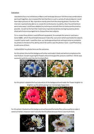
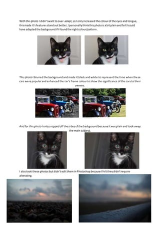
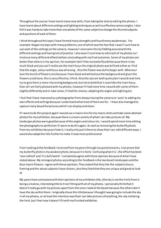
Evaluation 
I decided to focus my exhibition on Macro and landscape because I felt these two combinations 
went well together, also I enjoyed the fact that there is such a variety of natural objects I could 
have taken pictures of. My inspiration mainly came from the amazing photos I found on the 
internet; I wanted to be able to re-create this to the best to my ability. Also I found that there 
were many ways I could have adapted my techniques and edit them to look as professional as 
possible. As well as the fact that I took many inspirational photos during my practise photo-shoot 
which also encouraged me to choose these two subjects. 
To re-create these photos I used different equipment, for example the camera I used was a 
Canon 600D, which I found helpful because it had a flip-out screen which was helpful for objects 
I couldn’t quite reach. I used the close-up, landscape and portrait setting to help me complete 
my photos to the best of my ability and an SD card to save the photos I took. I used Photoshop 
to edit some of them. 
I edited 6/8 of my photos here are the outcomes. 
For this photo I blurred the background further and made it black and white to emphasise the 
main feature. As well as giving the flowers a blue tint to give the picture a cold feel. I think I was 
successful with this and I like the finished effect. 
For this photo I adapted the hue/saturation of the background and made the flower brighter to 
brighten up the photo giving it an increasingly happy tone. 
For this photo I blacked out the background and boosted the butterflies colour quality to make it 
stand out better, however I don’t actually like this photo because there is too much black.
With this photo I didn’t want to over-adapt, so I only increased the colour of the eyes and tongue, 
this made it’s features stand out better, I personally think this photo is a bit plain and felt I could 
have adapted the background if I found the right colour/pattern. 
This photo I blurred the background and made it black and white to represent the time when these 
cars were popular and enhanced the car’s frame colour to show the significance of the cars to their 
owners. 
And for this photo I only cropped off the sides of the background because it was plain and took away 
the main subject. 
I also took these photos but didn’t edit them in Photoshop because I felt they didn’t require 
alterating.
Throughout the course I have learnt many new skills, from taking the shot to editing the photos. I 
have learnt about different settings and lighting techniques as well as effective camera angles. I also 
felt it was handy to take more than one photo of the same subject to change the blurred subjects 
and positions of each of them. 
I think throughout this topic I have formed many strengths and found many weaknesses. For 
example I began my topic with many problems; one of which was the fact that I wasn’t sure how to 
use each of the settings on the camera, however I overcame this by fiddling around with the 
different settings and having lots of practice. I also wasn’t sure how to edit each of my photos so I 
tried out many different effects before concluding with my final outcomes. Some of my photos are 
better than others in my opinion, for example I don’t like my butterfly edit because there is too 
much black and you can’t really see the main focus the original photo was brilliant either as I find 
that the angle, colour and focus was all wrong . Also the flower was dull to begin with. Whereas I 
love the bunch of flowers one because I have black and whited out the background and given the 
flowers a cold tone, this is very effective, I think. Also the cats are both quite plain I would next time 
try to give them a more interesting background, but not to bold that it overrides the main focus. 
Over all I am fairly pleased with my photos, however if I had more time I would edit some of them 
slightly differently and re-take some, if I had the chance; adapting the angles and lighting etc. 
I feel that I have improved as a photographer from always having the camera on ‘auto’ to adding my 
own effects and settings because I understand what most of them are for. I have also managed to 
capture many beautiful pictures which I can display and share. 
If I were to do this project again I would use a macro lens for my macro shots and take some abstract 
photos for my exhibition, because there is a more variety of what I can take pictures of. My 
landscape photos were good because of the angles and colour etc. I would spend more time editing 
the photographs to perfection if I were to do this again. As well as removing the butterfly photo 
from my exhibition because I hate it, I really only put it there to show that I can edit different ways. I 
would also adapt the title further to make it look more professional. 
From looking at the feedback I received from my peers through my questionnaires, I can prove that 
my butterfly photo is my weakest photo, because it is fairly ‘confusing what it is’, the effect has been 
‘over edited’ and ‘it is dull/weird’. I completely agree with these opinions because of what I have 
stated above. My strongest photos according to the feedback is the two beach landscapes and the 
blue macro flowers. I agree with these opinions. They stated that they like the subject colours, 
framing and the actual subjects I have chosen, also they liked that they are unique and great to look 
at. 
My peers have contrasted with their opinions of my exhibition title, (the sky is not the limit) from it 
being a creative, interesting title to it not fitting with all of my photos. I personally think that it 
doesn’t really go with my pictures apart from the ones I took at the beach because the others don’t 
have the sky within them. I originally chose this title because I thought I was going to include the sky 
in all my photos, or at least the intention was that I can take pictures of anything, the sky not being 
the limit, but I feel now it doesn’t fit with my finished exhibition.
They all said that they would go and see my exhibition and think that it looks professional which is 
positive to know. If I were to do this again from the feedback I got from my peers I would choose a 
main theme to focus on rather than ‘Macro and Landscape’ in general. Make the photos more relate 
to my title or change the title to fit with my photos, as well as adapting the overall look of the font, 
colour, make words clearer etc. of the title. And on some of the images I would focus more on a 
main feature. Maybe I would also change to having only one of the cat photos. Other than that my 
overall topic has been good and I have learnt many new skills throughout it.

Evaluation

  • 1.
    Evaluation I decidedto focus my exhibition on Macro and landscape because I felt these two combinations went well together, also I enjoyed the fact that there is such a variety of natural objects I could have taken pictures of. My inspiration mainly came from the amazing photos I found on the internet; I wanted to be able to re-create this to the best to my ability. Also I found that there were many ways I could have adapted my techniques and edit them to look as professional as possible. As well as the fact that I took many inspirational photos during my practise photo-shoot which also encouraged me to choose these two subjects. To re-create these photos I used different equipment, for example the camera I used was a Canon 600D, which I found helpful because it had a flip-out screen which was helpful for objects I couldn’t quite reach. I used the close-up, landscape and portrait setting to help me complete my photos to the best of my ability and an SD card to save the photos I took. I used Photoshop to edit some of them. I edited 6/8 of my photos here are the outcomes. For this photo I blurred the background further and made it black and white to emphasise the main feature. As well as giving the flowers a blue tint to give the picture a cold feel. I think I was successful with this and I like the finished effect. For this photo I adapted the hue/saturation of the background and made the flower brighter to brighten up the photo giving it an increasingly happy tone. For this photo I blacked out the background and boosted the butterflies colour quality to make it stand out better, however I don’t actually like this photo because there is too much black.
  • 2.
    With this photoI didn’t want to over-adapt, so I only increased the colour of the eyes and tongue, this made it’s features stand out better, I personally think this photo is a bit plain and felt I could have adapted the background if I found the right colour/pattern. This photo I blurred the background and made it black and white to represent the time when these cars were popular and enhanced the car’s frame colour to show the significance of the cars to their owners. And for this photo I only cropped off the sides of the background because it was plain and took away the main subject. I also took these photos but didn’t edit them in Photoshop because I felt they didn’t require alterating.
  • 3.
    Throughout the courseI have learnt many new skills, from taking the shot to editing the photos. I have learnt about different settings and lighting techniques as well as effective camera angles. I also felt it was handy to take more than one photo of the same subject to change the blurred subjects and positions of each of them. I think throughout this topic I have formed many strengths and found many weaknesses. For example I began my topic with many problems; one of which was the fact that I wasn’t sure how to use each of the settings on the camera, however I overcame this by fiddling around with the different settings and having lots of practice. I also wasn’t sure how to edit each of my photos so I tried out many different effects before concluding with my final outcomes. Some of my photos are better than others in my opinion, for example I don’t like my butterfly edit because there is too much black and you can’t really see the main focus the original photo was brilliant either as I find that the angle, colour and focus was all wrong . Also the flower was dull to begin with. Whereas I love the bunch of flowers one because I have black and whited out the background and given the flowers a cold tone, this is very effective, I think. Also the cats are both quite plain I would next time try to give them a more interesting background, but not to bold that it overrides the main focus. Over all I am fairly pleased with my photos, however if I had more time I would edit some of them slightly differently and re-take some, if I had the chance; adapting the angles and lighting etc. I feel that I have improved as a photographer from always having the camera on ‘auto’ to adding my own effects and settings because I understand what most of them are for. I have also managed to capture many beautiful pictures which I can display and share. If I were to do this project again I would use a macro lens for my macro shots and take some abstract photos for my exhibition, because there is a more variety of what I can take pictures of. My landscape photos were good because of the angles and colour etc. I would spend more time editing the photographs to perfection if I were to do this again. As well as removing the butterfly photo from my exhibition because I hate it, I really only put it there to show that I can edit different ways. I would also adapt the title further to make it look more professional. From looking at the feedback I received from my peers through my questionnaires, I can prove that my butterfly photo is my weakest photo, because it is fairly ‘confusing what it is’, the effect has been ‘over edited’ and ‘it is dull/weird’. I completely agree with these opinions because of what I have stated above. My strongest photos according to the feedback is the two beach landscapes and the blue macro flowers. I agree with these opinions. They stated that they like the subject colours, framing and the actual subjects I have chosen, also they liked that they are unique and great to look at. My peers have contrasted with their opinions of my exhibition title, (the sky is not the limit) from it being a creative, interesting title to it not fitting with all of my photos. I personally think that it doesn’t really go with my pictures apart from the ones I took at the beach because the others don’t have the sky within them. I originally chose this title because I thought I was going to include the sky in all my photos, or at least the intention was that I can take pictures of anything, the sky not being the limit, but I feel now it doesn’t fit with my finished exhibition.
  • 4.
    They all saidthat they would go and see my exhibition and think that it looks professional which is positive to know. If I were to do this again from the feedback I got from my peers I would choose a main theme to focus on rather than ‘Macro and Landscape’ in general. Make the photos more relate to my title or change the title to fit with my photos, as well as adapting the overall look of the font, colour, make words clearer etc. of the title. And on some of the images I would focus more on a main feature. Maybe I would also change to having only one of the cat photos. Other than that my overall topic has been good and I have learnt many new skills throughout it.