Download to read offline

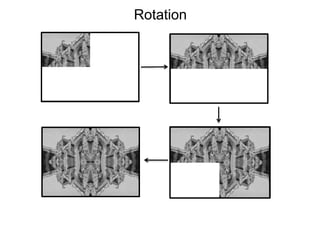
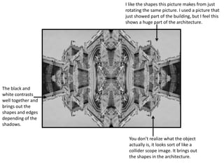
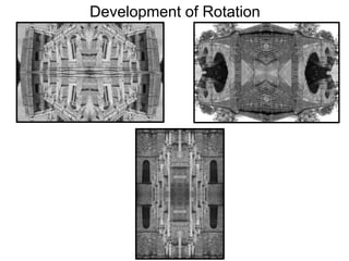
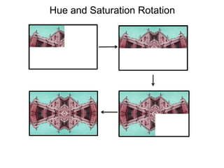
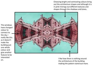
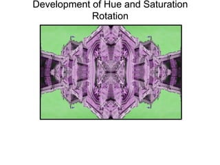
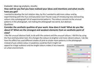
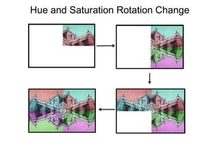
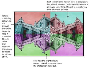
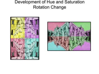
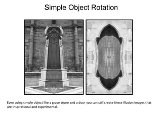

The document is a student's reflection on experimental photography projects exploring the rotation technique. In the first project, the student used rotation to transform an architectural photo into abstract patterns and shapes. They felt this achieved their goal of expressing architecture in a new, exciting way. Later projects experimented with adjusting hue and saturation during rotation. While bright colors made patterns stand out, they moved away from the brief's urban theme. The student's favorite was the original black and white rotation for its abstract shapes and urban feel. Overall, the student felt rotation was an effective experimental technique but that some color adjustments did not fully fulfill the theme of expressing urban culture through abstract photography.


![6. [pro forma] project pro-forma](https://cdn.slidesharecdn.com/ss_thumbnails/6-170626122927-thumbnail.jpg?width=640&height=640&fit=bounds)

![6. [pro forma] project pro-forma](https://cdn.slidesharecdn.com/ss_thumbnails/6-170702230528-thumbnail.jpg?width=640&height=640&fit=bounds)


