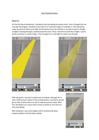
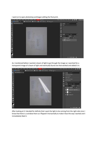
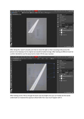
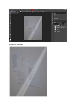
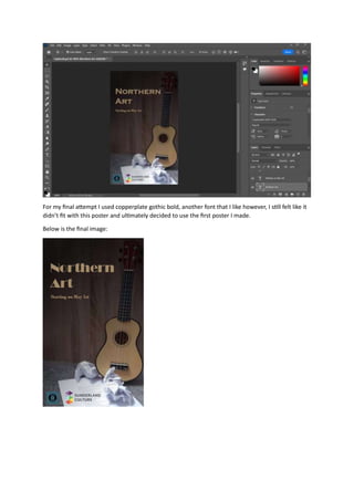
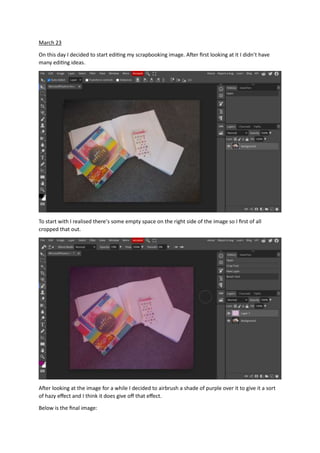
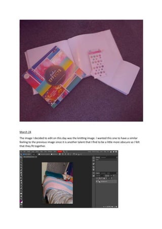
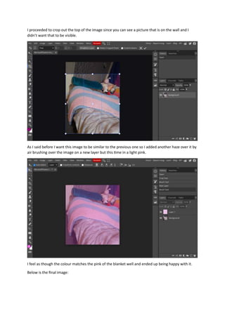
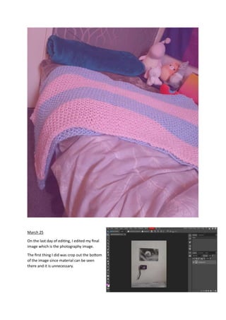
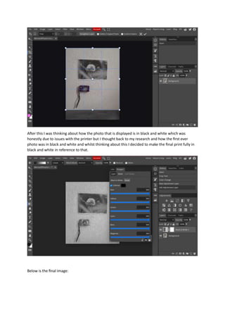
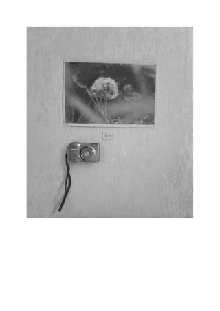
Post-Production Diary
March 21
For the first day of production, I decided to start by editing the poetry shots. Since I thought this one
may take the longest, I decided to start with it so I will have longer to complete it. I first started by
using my phone to draw some light not the picture since my intention is to make it seem as though
sunlight is seeping through a partially opened curtain. Since I wanted it to look like sunlight, I used a
yellow and drew in a beam shape, I then changed it to a soft light to make it see-through.
After doing this I saw that it looked very unrealistic, although this is
only a draft version it doesn’t have to look perfect, I wanted to at least
get an idea of what colours to use to make the process easier. After
this I decided to try a colour that is closer to white to see if that we
look more fitting.
After doing this I was much happier with it and feel that when
properly edited it will look fairly realistic.
I went on to open photoshop and began editing the final print.
As I mentioned before I wanted a beam of light to go through the image so I searched for a
transparent image of a beam of light and eventually found one that worked and added it in.
After looking at it I decided for definite that I want the light to be coming from the right side since I
know that there is a window there so I flipped it horizontally to make it face the way I wanted and I
immediately liked it.
After doing this I wasn’t actually sure how to move the light so that it would go fully across the
picture since keeping it at its original size would’ve looked strange. After looking at different tools for
a while I decided to use the warp tool to make it fit the way I wanted.
After looking at this I felt as though the beam was too bright since you can hardly see the words
underneath so I lowered the opacity to 85anf after this I was much happier with it.
Below is the final image:
March 22
The second image I decided to edit was the music image since I wasn’t very sure on how it was going
to look. The reason for this is because the space the photo was taken in was small so a few parts
would have to be cropped out which would make it difficult to work with.
As can be seen the original image has a lot going on in the background that’s distracting and looks
messy distracting from the intention of the image.
After cropping it I was worried about the ukulele not being in the centre but I continued editing and
hoping it would turn out well.
I then added a gradient so it would seem as though there is a shadow in the corner since I felt this
was a good contrast compared to the previous image.
I felt that the shadow was too dark so I turned the opacity down to 85 and was much happier with it.
I feel as though the shadow also did a god job of filling up the blank spot on the left side.
Below is the original final image:
After this I was made aware that my project wasn’t clearly enough about the Northeast and I so I
made one print into a promotional poster to really show that. I chose to do that with this image since
it seemed like there was something missing from the final print since there is a large blank space to
the side.
This was my first attempt at this, I started by adding my logo and the Sunderland culture logo to
show the client and make it obvious that it is about the northeast. I then added in the title of the
project using a Bodoni font and the start date underneath it.
Although, I was already happy with this I thought I should try experimenting with different fonts for
the title.
Next, I tried the Bauhaus font which I think is a nice font however, I don’t think it’s fitting for this
specific poster though since it feels like a font that should be used in brighter pieces unlike this piece.
For my final attempt I used copperplate gothic bold, another font that I like however, I still felt like it
didn’t fit with this poster and ultimately decided to use the first poster I made.
Below is the final image:
March 23
On this day I decided to start editing my scrapbooking image. After first looking at it I didn’t have
many editing ideas.
To start with I realised there’s some empty space on the right side of the image so I first of all
cropped that out.
After looking at the image for a while I decided to airbrush a shade of purple over it to give it a sort
of hazy effect and I think it does give off that effect.
Below is the final image:
March 24
The image I decided to edit on this day was the knitting image. I wanted this one to have a similar
feeling to the previous image since it is another talent that I find to be a little more obscure so I felt
that they fit together.
I proceeded to crop out the top of the image since you can see a picture that is on the wall and I
didn’t want that to be visible.
As I said before I want this image to be similar to the previous one so I added another haze over it by
air brushing over the image on a new layer but this time in a light pink.
I feel as though the colour matches the pink of the blanket well and ended up being happy with it.
Below is the final image:
March 25
On the last day of editing, I edited my final
image which is the photography image.
The first thing I did was crop out the bottom
of the image since material can be seen
there and it is unnecessary.
After this I was thinking about how the photo that is displayed is in black and white which was
honestly due to issues with the printer but I thought back to my research and how the first ever
photo was in black and white and whilst thinking about this I decided to make the final print fully in
black and white in reference to that.
Below is the final image:
Post-production Diary

Post-production Diary

  • 1.
    Post-Production Diary March 21 Forthe first day of production, I decided to start by editing the poetry shots. Since I thought this one may take the longest, I decided to start with it so I will have longer to complete it. I first started by using my phone to draw some light not the picture since my intention is to make it seem as though sunlight is seeping through a partially opened curtain. Since I wanted it to look like sunlight, I used a yellow and drew in a beam shape, I then changed it to a soft light to make it see-through. After doing this I saw that it looked very unrealistic, although this is only a draft version it doesn’t have to look perfect, I wanted to at least get an idea of what colours to use to make the process easier. After this I decided to try a colour that is closer to white to see if that we look more fitting. After doing this I was much happier with it and feel that when properly edited it will look fairly realistic.
  • 2.
    I went onto open photoshop and began editing the final print. As I mentioned before I wanted a beam of light to go through the image so I searched for a transparent image of a beam of light and eventually found one that worked and added it in. After looking at it I decided for definite that I want the light to be coming from the right side since I know that there is a window there so I flipped it horizontally to make it face the way I wanted and I immediately liked it.
  • 3.
    After doing thisI wasn’t actually sure how to move the light so that it would go fully across the picture since keeping it at its original size would’ve looked strange. After looking at different tools for a while I decided to use the warp tool to make it fit the way I wanted. After looking at this I felt as though the beam was too bright since you can hardly see the words underneath so I lowered the opacity to 85anf after this I was much happier with it.
  • 4.
    Below is thefinal image:
  • 5.
    March 22 The secondimage I decided to edit was the music image since I wasn’t very sure on how it was going to look. The reason for this is because the space the photo was taken in was small so a few parts would have to be cropped out which would make it difficult to work with. As can be seen the original image has a lot going on in the background that’s distracting and looks messy distracting from the intention of the image. After cropping it I was worried about the ukulele not being in the centre but I continued editing and hoping it would turn out well.
  • 6.
    I then addeda gradient so it would seem as though there is a shadow in the corner since I felt this was a good contrast compared to the previous image. I felt that the shadow was too dark so I turned the opacity down to 85 and was much happier with it. I feel as though the shadow also did a god job of filling up the blank spot on the left side.
  • 7.
    Below is theoriginal final image: After this I was made aware that my project wasn’t clearly enough about the Northeast and I so I made one print into a promotional poster to really show that. I chose to do that with this image since it seemed like there was something missing from the final print since there is a large blank space to the side.
  • 8.
    This was myfirst attempt at this, I started by adding my logo and the Sunderland culture logo to show the client and make it obvious that it is about the northeast. I then added in the title of the project using a Bodoni font and the start date underneath it. Although, I was already happy with this I thought I should try experimenting with different fonts for the title. Next, I tried the Bauhaus font which I think is a nice font however, I don’t think it’s fitting for this specific poster though since it feels like a font that should be used in brighter pieces unlike this piece.
  • 9.
    For my finalattempt I used copperplate gothic bold, another font that I like however, I still felt like it didn’t fit with this poster and ultimately decided to use the first poster I made. Below is the final image:
  • 10.
    March 23 On thisday I decided to start editing my scrapbooking image. After first looking at it I didn’t have many editing ideas. To start with I realised there’s some empty space on the right side of the image so I first of all cropped that out. After looking at the image for a while I decided to airbrush a shade of purple over it to give it a sort of hazy effect and I think it does give off that effect. Below is the final image:
  • 11.
    March 24 The imageI decided to edit on this day was the knitting image. I wanted this one to have a similar feeling to the previous image since it is another talent that I find to be a little more obscure so I felt that they fit together.
  • 12.
    I proceeded tocrop out the top of the image since you can see a picture that is on the wall and I didn’t want that to be visible. As I said before I want this image to be similar to the previous one so I added another haze over it by air brushing over the image on a new layer but this time in a light pink. I feel as though the colour matches the pink of the blanket well and ended up being happy with it. Below is the final image:
  • 13.
    March 25 On thelast day of editing, I edited my final image which is the photography image. The first thing I did was crop out the bottom of the image since material can be seen there and it is unnecessary.
  • 14.
    After this Iwas thinking about how the photo that is displayed is in black and white which was honestly due to issues with the printer but I thought back to my research and how the first ever photo was in black and white and whilst thinking about this I decided to make the final print fully in black and white in reference to that. Below is the final image: