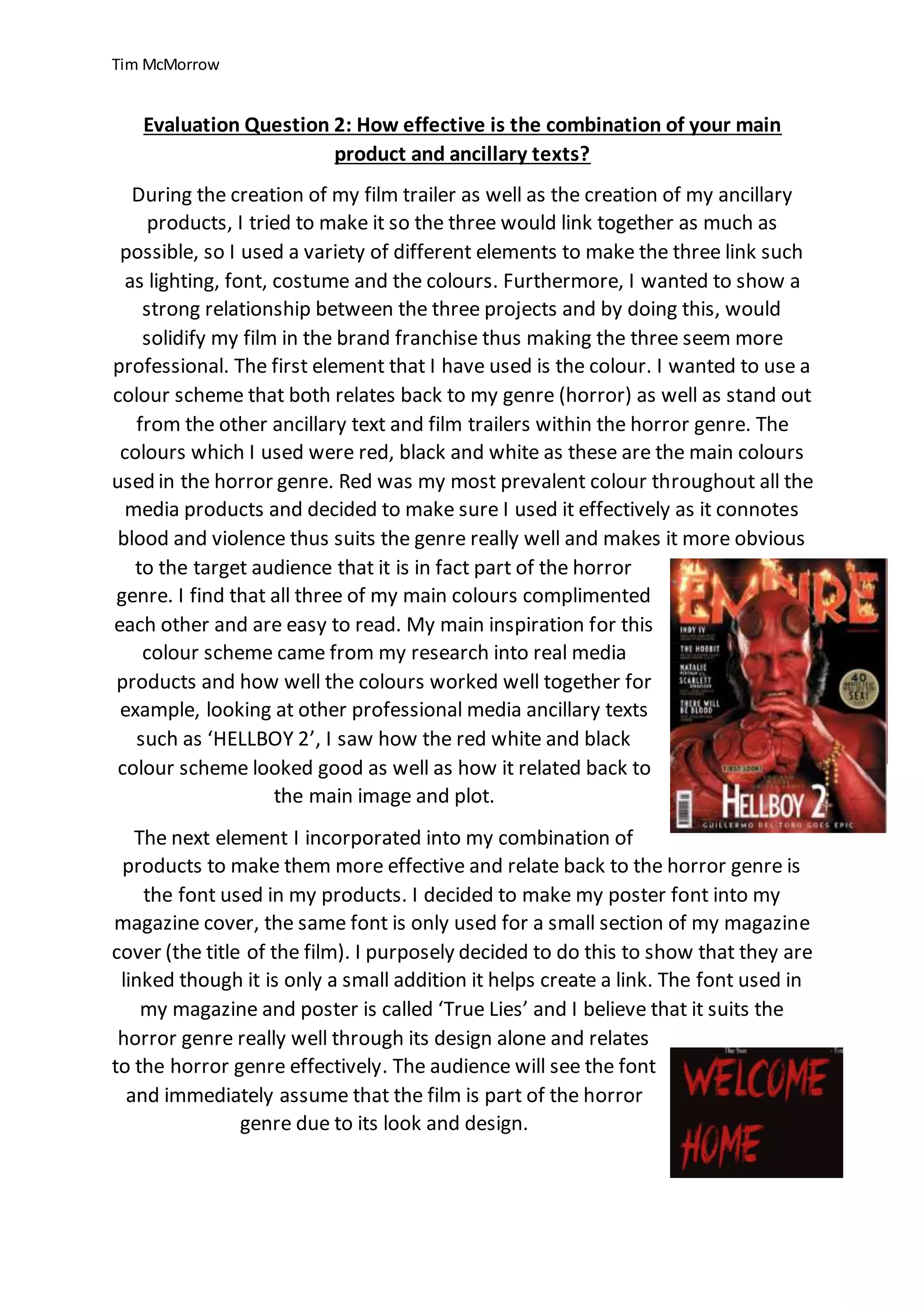
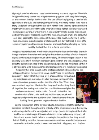
Tim McMorrow created a film trailer and ancillary texts to link together and establish a horror film franchise. He used consistent elements like lighting, font, costumes, and colors across the three projects. A red, black, and white color scheme was used to reference the horror genre. A retro-inspired font called "True Lies" was also used in the magazine cover and poster to connect them. Low-key lighting in the dark images and clips helped set a scary tone. The main characters were identifiable in each product to provide consistency. Overall, the combination of trailer and ancillary texts was effective in capturing the horror genre through genre conventions while also making the projects distinctive.