Download to read offline
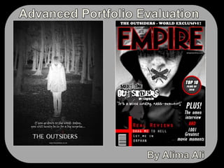


The document summarizes the media products Alima Ali created for her advanced portfolio evaluation, which included a film trailer, magazine cover, and poster. For the trailer, Ali used techniques like close-ups, transitions, and music to develop suspense and engage audiences. The poster and magazine cover featured similar dark colors, fonts, and imagery of a hooded figure to maintain consistency across the products and effectively portray the horror genre. Feedback from audiences showed the trailer, poster, and magazine cover worked well together to grab attention and communicate the intended film was in the horror genre.


