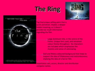
The document discusses conventions of film posters and how the author's media product adheres to or challenges these conventions. Some key conventions discussed include using large dominant images, catchy taglines, casting names, and genre-specific color schemes. The author analyzes how their horror film poster uses a gloomy central image, red title font, and mysterious tagline to follow horror poster conventions while also experimenting with layout elements like quote placement. Overall, the poster aims to intrigue audiences and promote the film through both conventional and some unconventional design choices.


