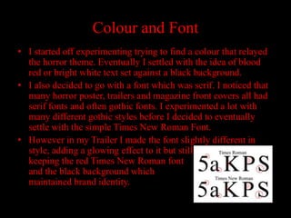
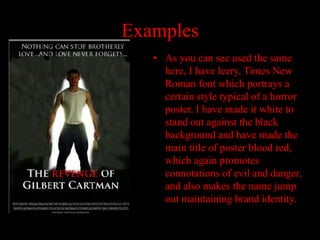
The document evaluates how effectively the main product and ancillary texts work together. It discusses using consistent color, font, and layout across materials to maintain brand identity. Red and black were chosen to convey horror, and a serif font like Times New Roman is typical of the genre. Images of the author in the central role were used on the poster and magazine cover to associate them with the movie. Consistency across materials effectively portrayed the intended horror brand identity.


![Getting Started with Apache Spark: Big Data Made Simple [Free Meetup]](https://cdn.slidesharecdn.com/ss_thumbnails/apachesparkgettingstarted-260203175547-8361bcc3-thumbnail.jpg?width=640&height=640&fit=bounds)