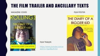
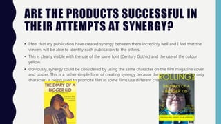
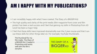
The student created a film magazine cover, poster, and trailer for the film "The Diary of a Bigger Kid" that effectively demonstrate synergy.
All materials use the same yellow background and font (Century Gothic) for consistency. The layouts of the cover and poster are also similar, with a central image and matching element placements.
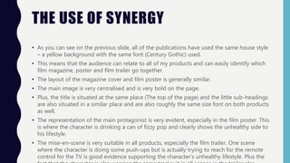
The trailer reinforces the film's themes of an unhealthy lifestyle through scenes like a character struggling to reach the TV remote while doing pushups. The student is pleased with the quality and clarity of the print materials created in Photoshop. They believe the trailer fits conventions of comedy films and will appeal to younger audiences.