
Recommended
More Related Content
What's hot
What's hot (20)
Similar to Cover page analysis
Similar to Cover page analysis (20)
More from Tim McMorrow
More from Tim McMorrow (19)
Recently uploaded
Recently uploaded (20)
Cover page analysis
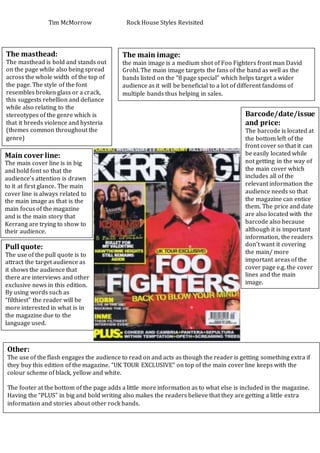
- 1. Tim McMorrow Rock House Styles Revisited The masthead: The masthead is bold and stands out on the page while also being spread across the whole width of the top of the page. The style of the font resembles broken glass or a crack, this suggests rebellion and defiance while also relating to the stereotypes of the genre which is that it breeds violence and hysteria (themes common throughout the genre) Main cover line: The main cover line is in big and bold font so that the audience’s attention is drawn to it at first glance. The main cover line is always related to the main image as that is the main focus of the magazine and is the main story that Kerrang are trying to show to their audience. Pull quote: The use of the pull quote is to attract the target audience as it shows the audience that there are interviews and other exclusive news in this edition. By using words such as “filthiest” the reader will be more interested in what is in the magazine due to the language used. The main image: the main image is a medium shot of Foo Fighters front man David Grohl. The main image targets the fans of the band as well as the bands listed on the “8 page special” which helps target a wider audience as it will be beneficial to a lot of different fandoms of multiple bands thus helping in sales. Barcode/date/issue and price: The barcode is located at the bottom left of the front cover so that it can be easily located while not getting in the way of the main cover which includes all of the relevant information the audience needs so that the magazine can entice them. The price and date are also located with the barcode also because although it is important information, the readers don’t want it covering the main/ more important areas of the cover page e.g. the cover lines and the main image. Other: The use of the flash engages the audience to read on and acts as though the reader is getting something extra if they buy this edition of the magazine. “UK TOUR EXCLUSIVE” on top of the main cover line keeps with the colour scheme of black, yellow and white. The footer at the bottom of the page adds a little more information as to what else is included in the magazine. Having the “PLUS” in big and bold writing also makes the readers believe that they are getting a little extra information and stories about other rock bands.