Download to read offline

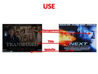
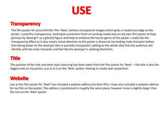
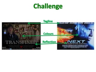

The film poster takes elements from the existing film poster for 'Next' including using transparency to portray the ghostly female character, positioning the title and website address similarly, and including a landscape background and principal cast names. It challenges conventions by using a darker color scheme appropriate for the horror genre rather than the thriller/action colors of 'Next' and by adding a reflection to the title text not found in the original poster. The poster aims to draw initial attention to the male character before revealing the stalking female ghost and convey the narrative and appeal of the film.


