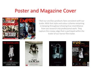
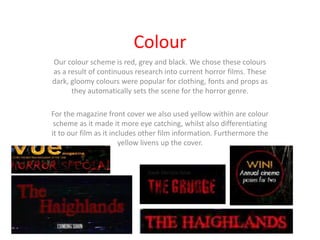
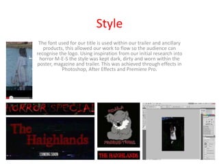
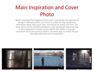
Evaluation Question 2

How effective is the combination of
 your main product and ancillary
               texts?
Outline
 Films use a combination of trailers, posters and other advertising
  techniques. For our A2 coursework our main task was creating a
 trailer for a film. As well as making the trailer we also created our
    own film magazine front cover and a film poster. These three
components need to compliment each other and create successful
    synergy between them. It is important that each of the media
   texts link effectively. Through all of our media texts we had the
                main image of the young possessed girl.
Trailer
 The trailer is the most important marketing tool for a film before
its release, the trailer is used to draw in the audience and identify
the key features of the film. The trailer highlights the areas of the
  film which are the most eye-catching and what will identify the
          film and make it recognizable for the audience.
Poster and Magazine Cover
         I feel our ancillary products  consistent with our
                                         are
         trailer. With font style and colour scheme remaining
           in-keeping throughout showing true resemblance
             from are research into professional work. They
         capture the creepy edge that is portrayed within the
                     trailer of our horror film trailer.
Colour
Our colour scheme is red, grey and black. We chose these colours
as a result of continuous research into current horror films. These
dark, gloomy colours were popular for clothing, fonts and props as
      they automatically sets the scene for the horror genre.

For the magazine front cover we also used yellow within are colour
 scheme as it made it more eye catching, whilst also differentiating
it to our film as it includes other film information. Furthermore the
                        yellow livens up the cover.
Style
 The font used for our title is used within our trailer and ancillary
   products, this allowed our work to flow so the audience can
recognise the logo. Using inspiration from our initial research into
 horror M-E-S the style was kept dark, dirty and worn within the
poster, magazine and trailer. This was achieved through effects in
           Photoshop, After Effects and Premiere Pro.
Main Inspiration and Cover
          Photo
When creating the magazine front cover and poster we wanted to
   bring in elements from our trailer in order for the viewers to
remember what they have seen and desire to watch the film. The
main focus of the ancillary products is the young girl featured She
   is also captured in many scenes within the trailer. Using de-
saturation and transparency effects we were able to make the girl
                look ghostly and more memorable.

Evaluation question 2

  • 1.
    Evaluation Question 2 Howeffective is the combination of your main product and ancillary texts?
  • 2.
    Outline  Films usea combination of trailers, posters and other advertising techniques. For our A2 coursework our main task was creating a trailer for a film. As well as making the trailer we also created our own film magazine front cover and a film poster. These three components need to compliment each other and create successful synergy between them. It is important that each of the media texts link effectively. Through all of our media texts we had the main image of the young possessed girl.
  • 3.
    Trailer The traileris the most important marketing tool for a film before its release, the trailer is used to draw in the audience and identify the key features of the film. The trailer highlights the areas of the film which are the most eye-catching and what will identify the film and make it recognizable for the audience.
  • 4.
    Poster and MagazineCover I feel our ancillary products  consistent with our are trailer. With font style and colour scheme remaining in-keeping throughout showing true resemblance from are research into professional work. They capture the creepy edge that is portrayed within the trailer of our horror film trailer.
  • 5.
    Colour Our colour schemeis red, grey and black. We chose these colours as a result of continuous research into current horror films. These dark, gloomy colours were popular for clothing, fonts and props as they automatically sets the scene for the horror genre. For the magazine front cover we also used yellow within are colour scheme as it made it more eye catching, whilst also differentiating it to our film as it includes other film information. Furthermore the yellow livens up the cover.
  • 6.
    Style The fontused for our title is used within our trailer and ancillary products, this allowed our work to flow so the audience can recognise the logo. Using inspiration from our initial research into horror M-E-S the style was kept dark, dirty and worn within the poster, magazine and trailer. This was achieved through effects in Photoshop, After Effects and Premiere Pro.
  • 7.
    Main Inspiration andCover Photo When creating the magazine front cover and poster we wanted to bring in elements from our trailer in order for the viewers to remember what they have seen and desire to watch the film. The main focus of the ancillary products is the young girl featured She is also captured in many scenes within the trailer. Using de- saturation and transparency effects we were able to make the girl look ghostly and more memorable.