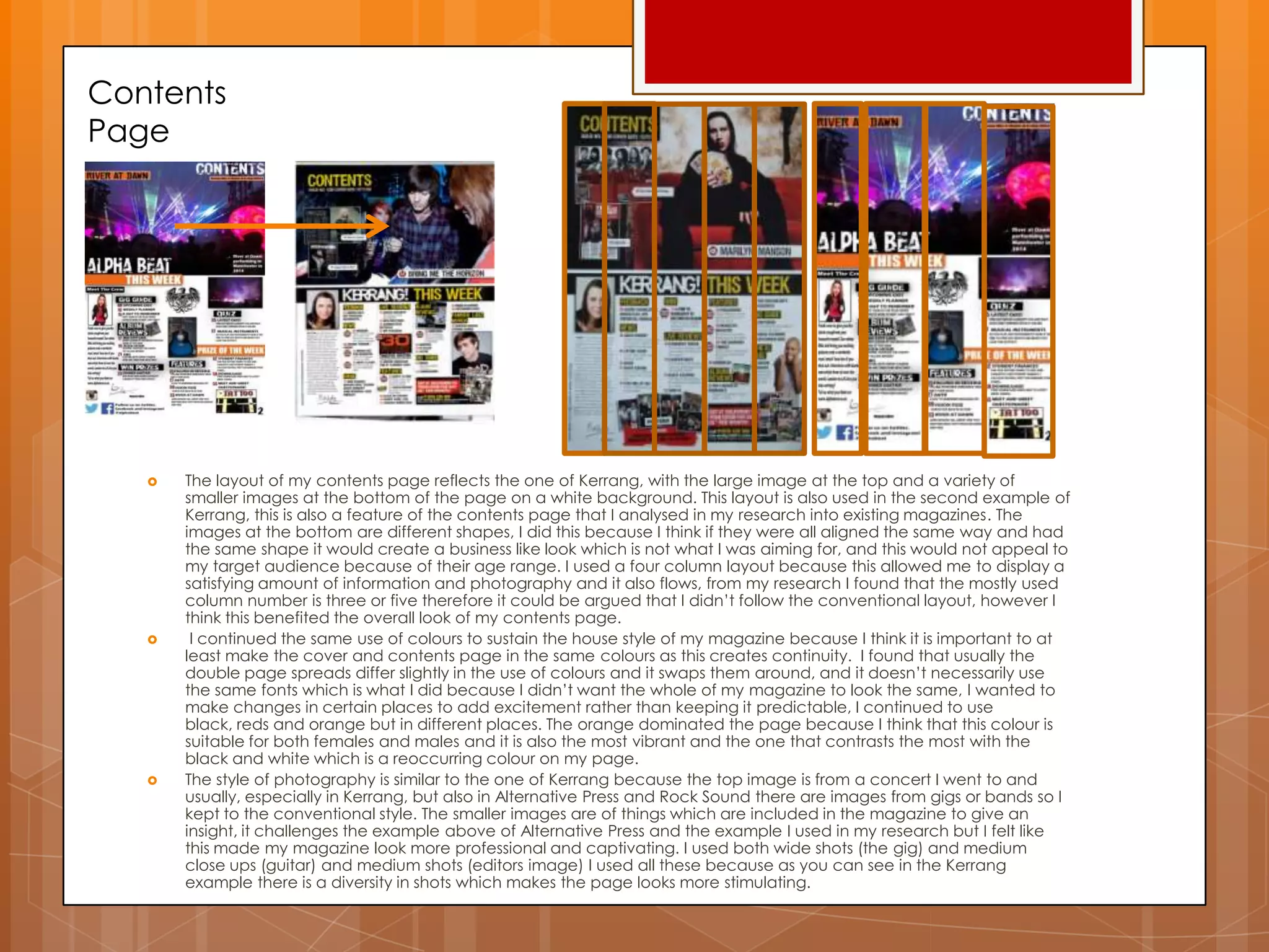
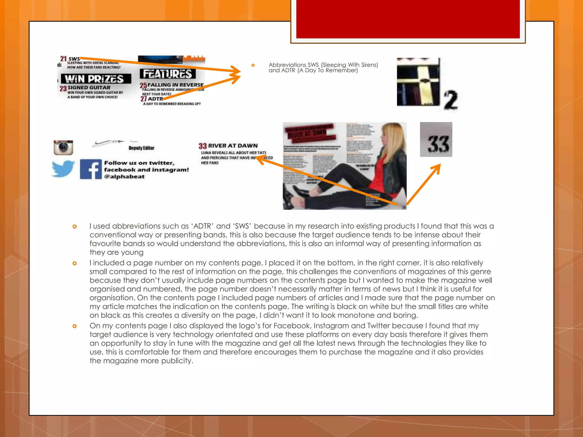
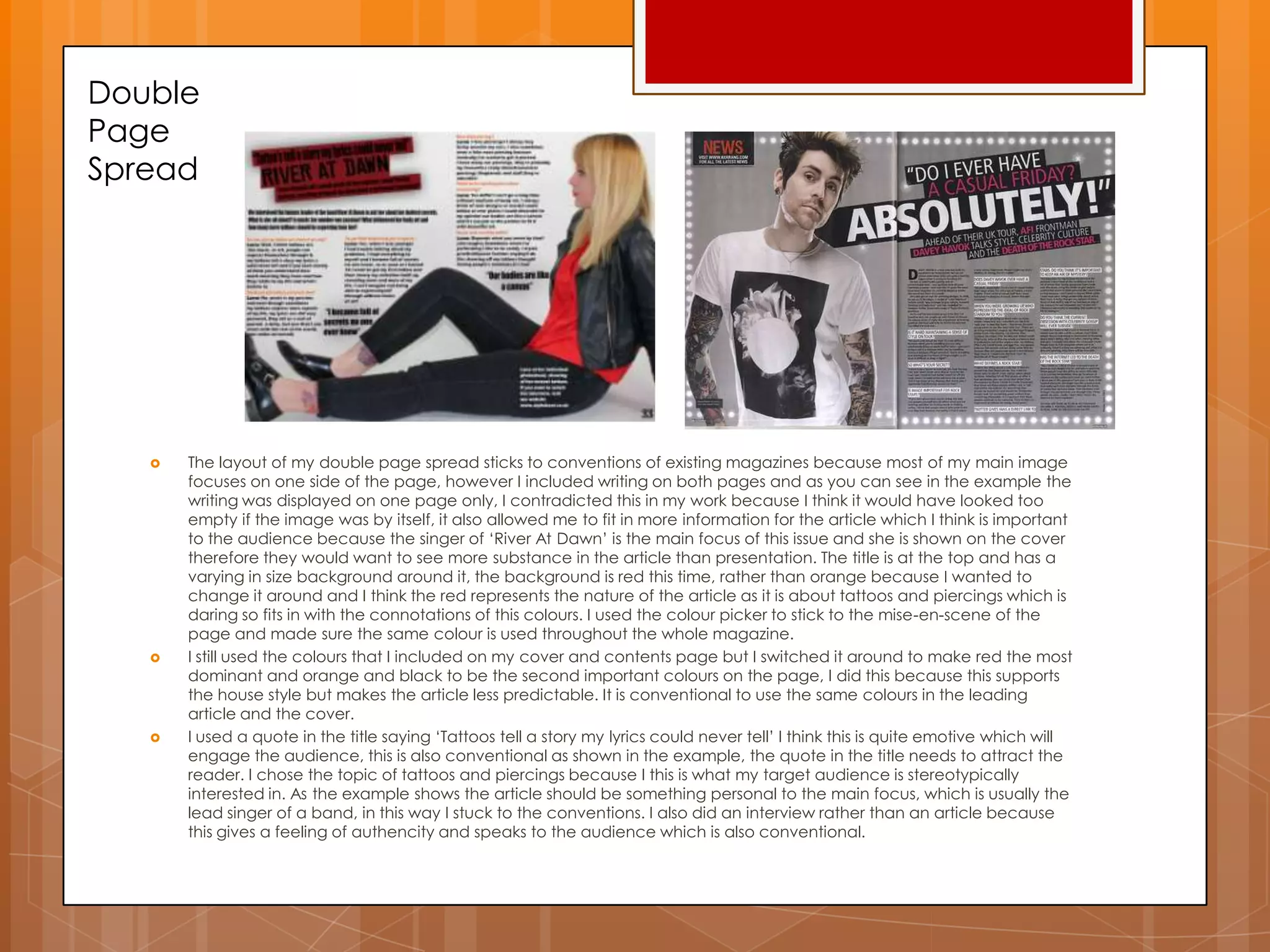
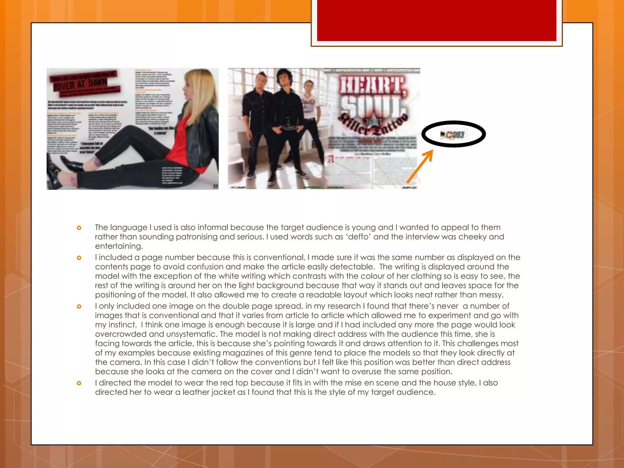
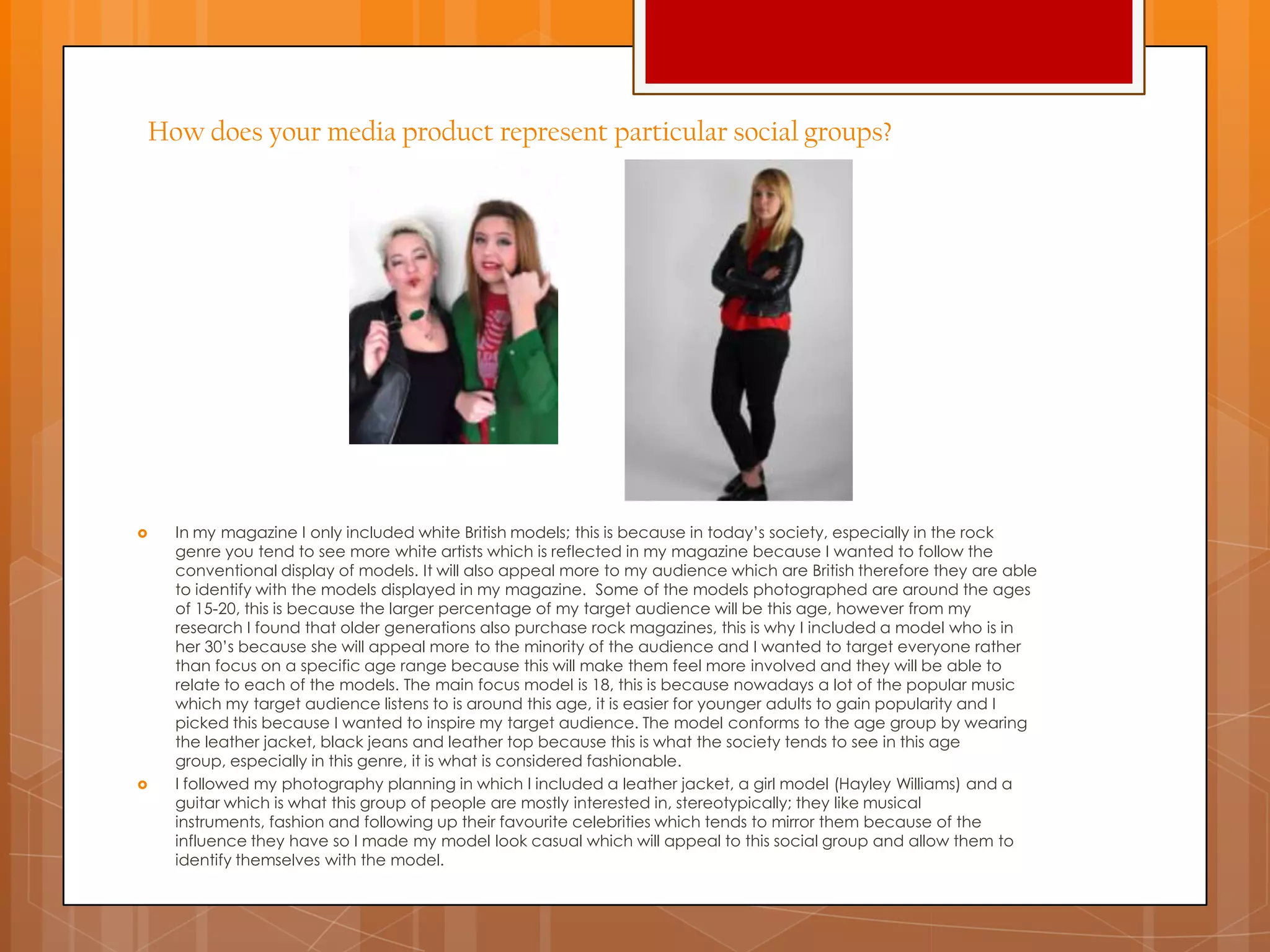
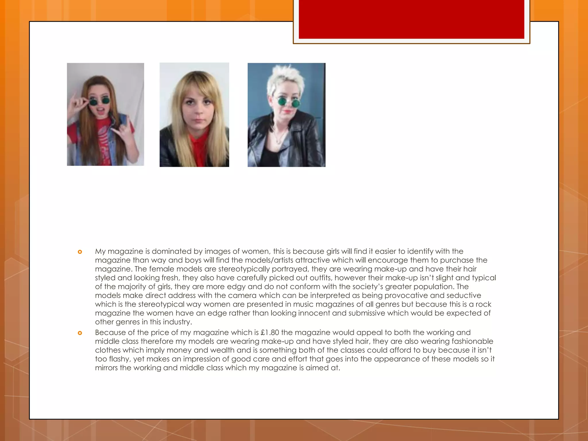
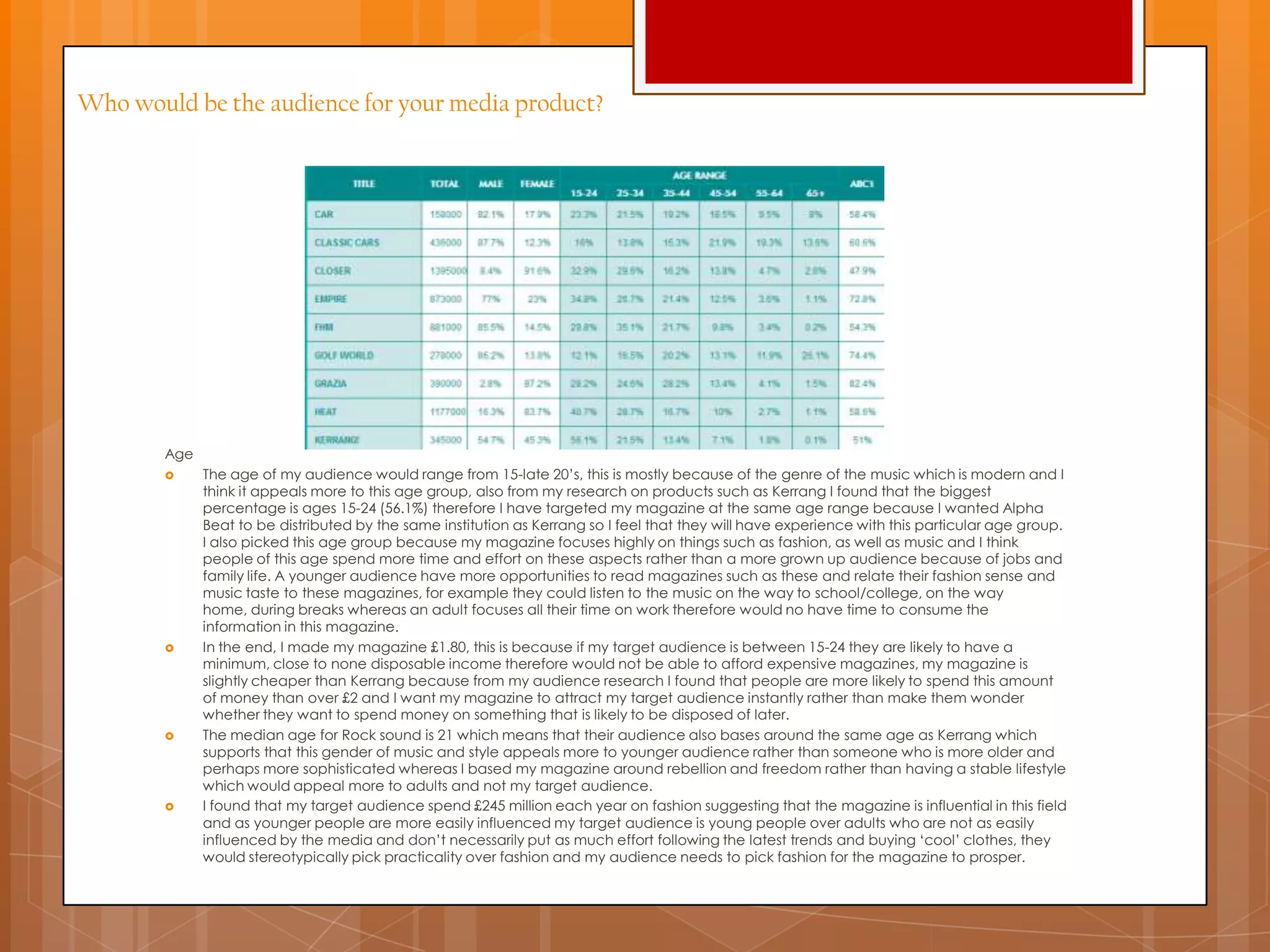
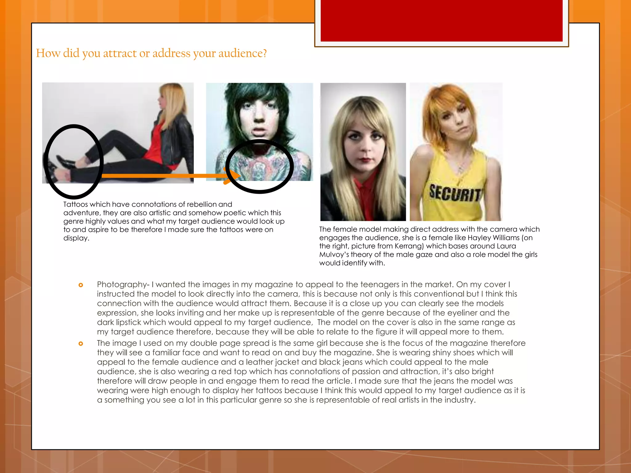
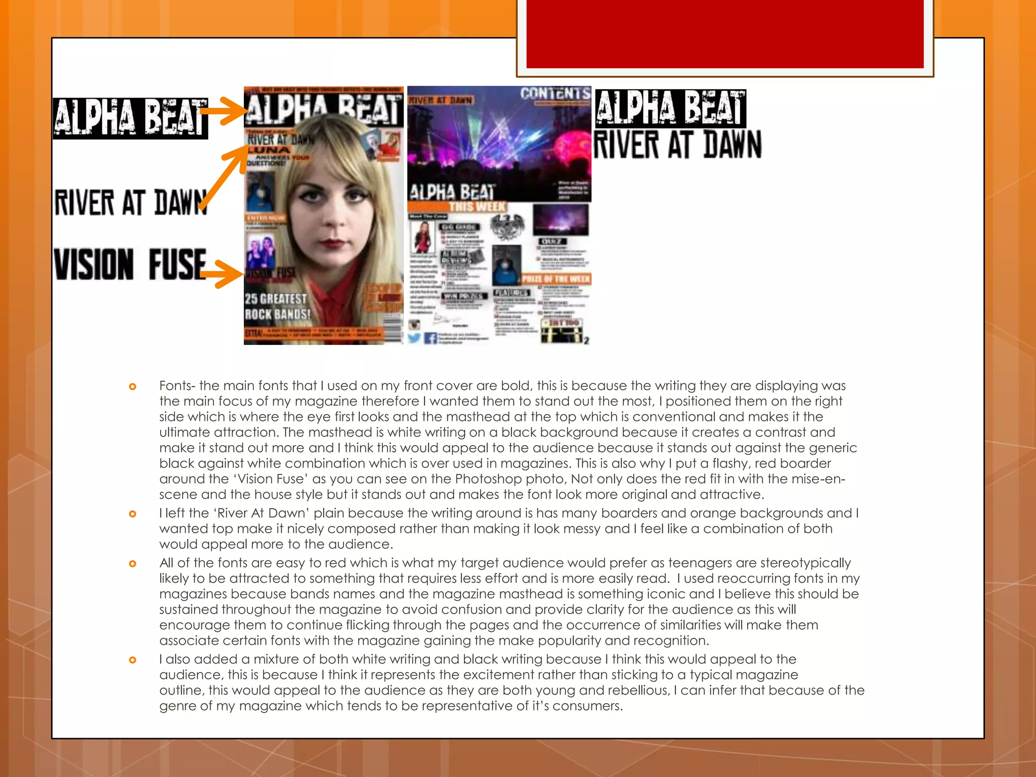
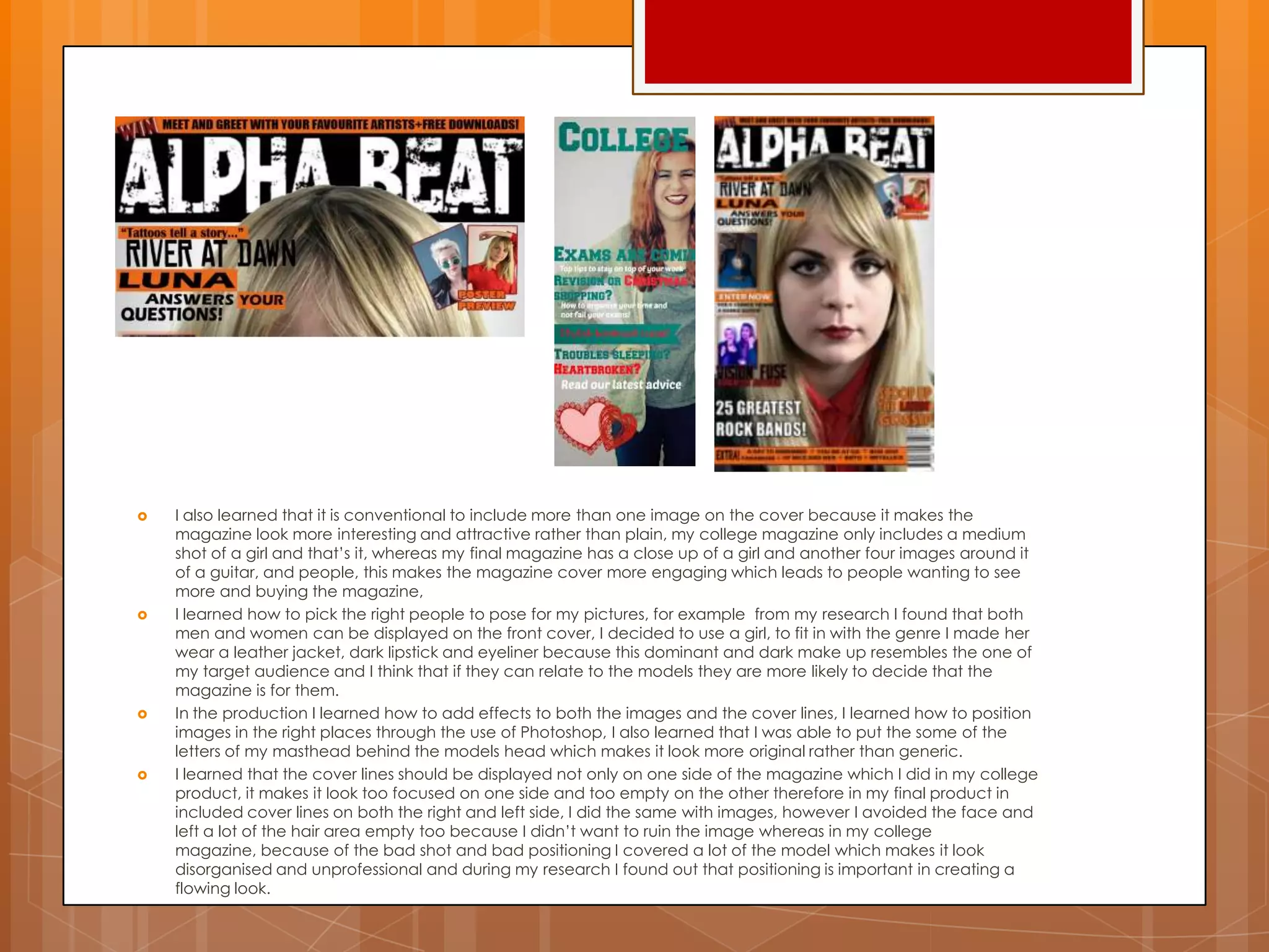
This document provides evaluation questions for a media product and the responses discuss how the created media product compares to real products in the genre. Specifically, it summarizes how the cover, contents page, and other design elements utilize conventions from magazines like Kerrang while also innovating in some ways. Key conventions included colors, fonts, image placement and styles, and column layouts. The target audience of passionate rock fans is addressed through edgy visuals and informal language. Overall the responses analyze the created product in terms of genre conventions and how it represents the interests of its audience.