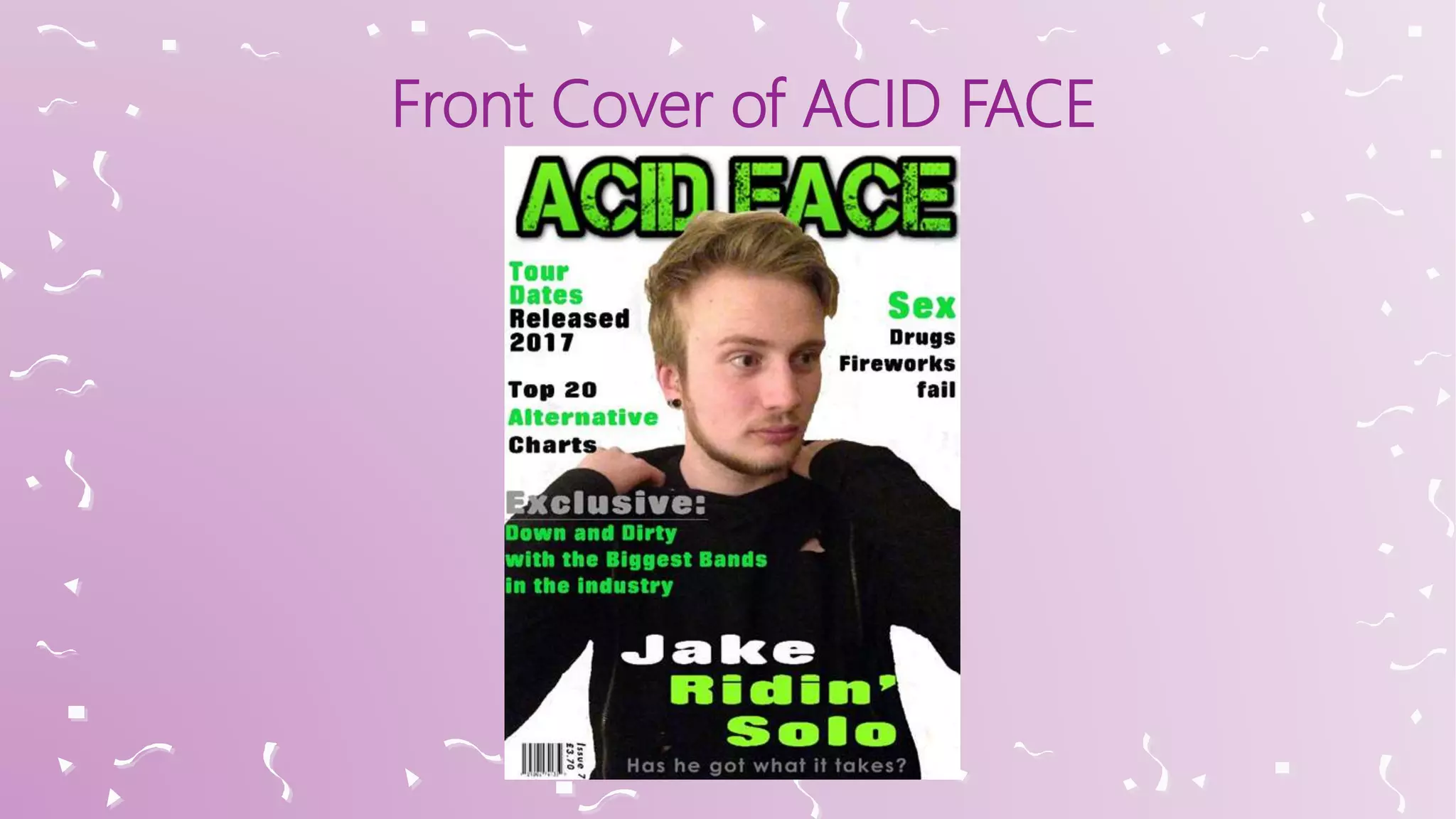
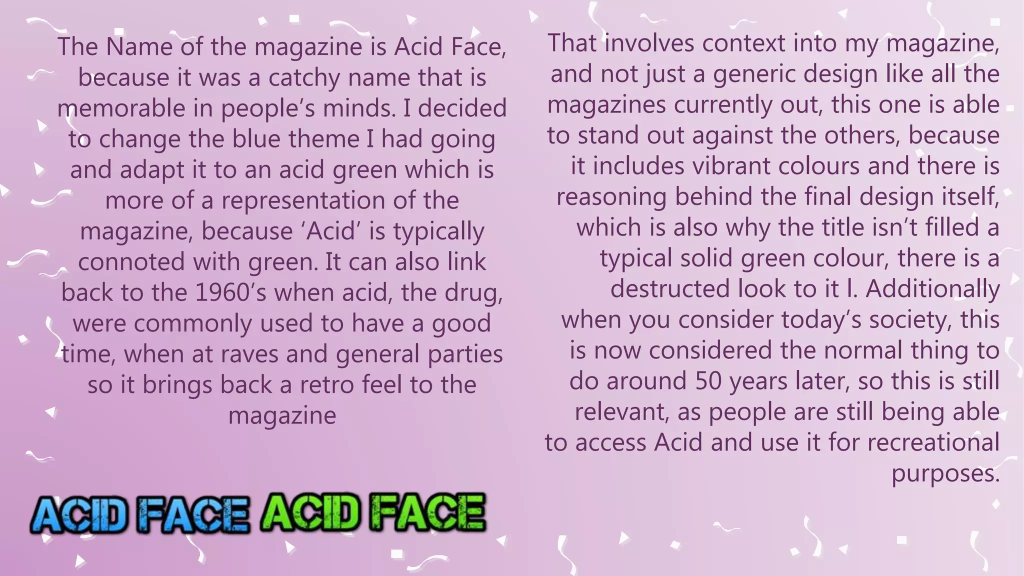
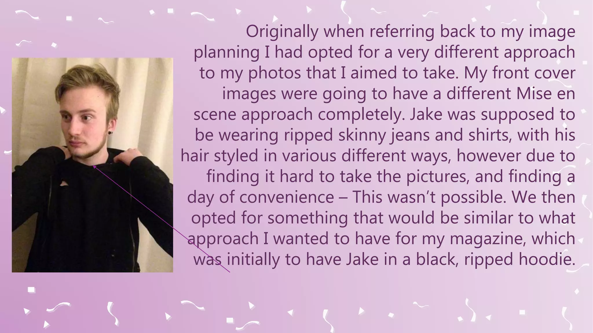
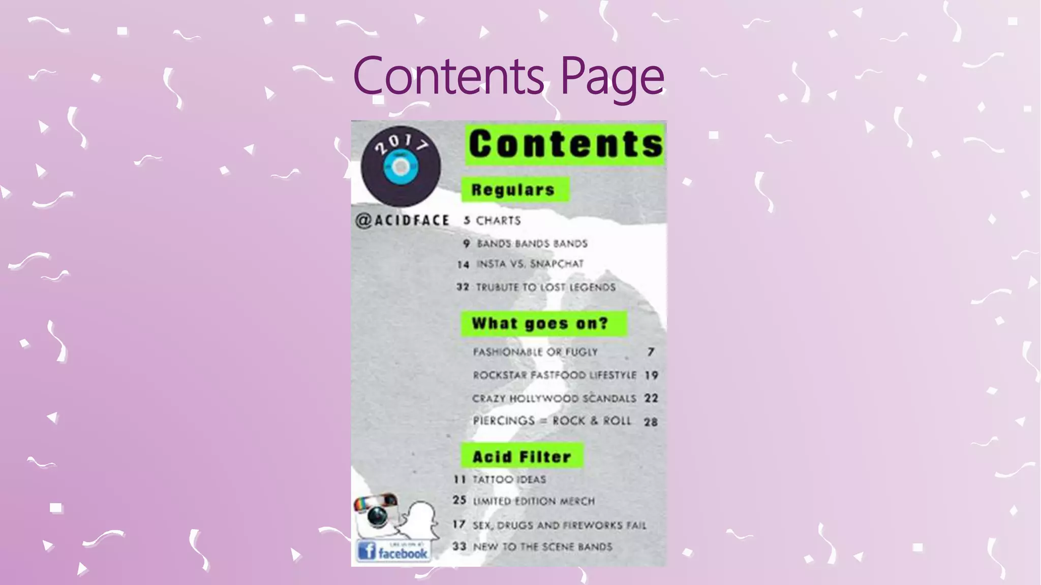
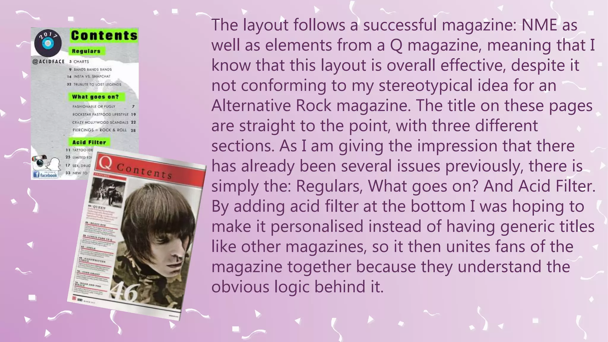
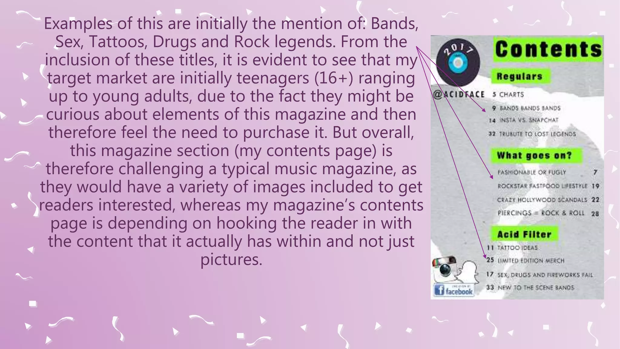
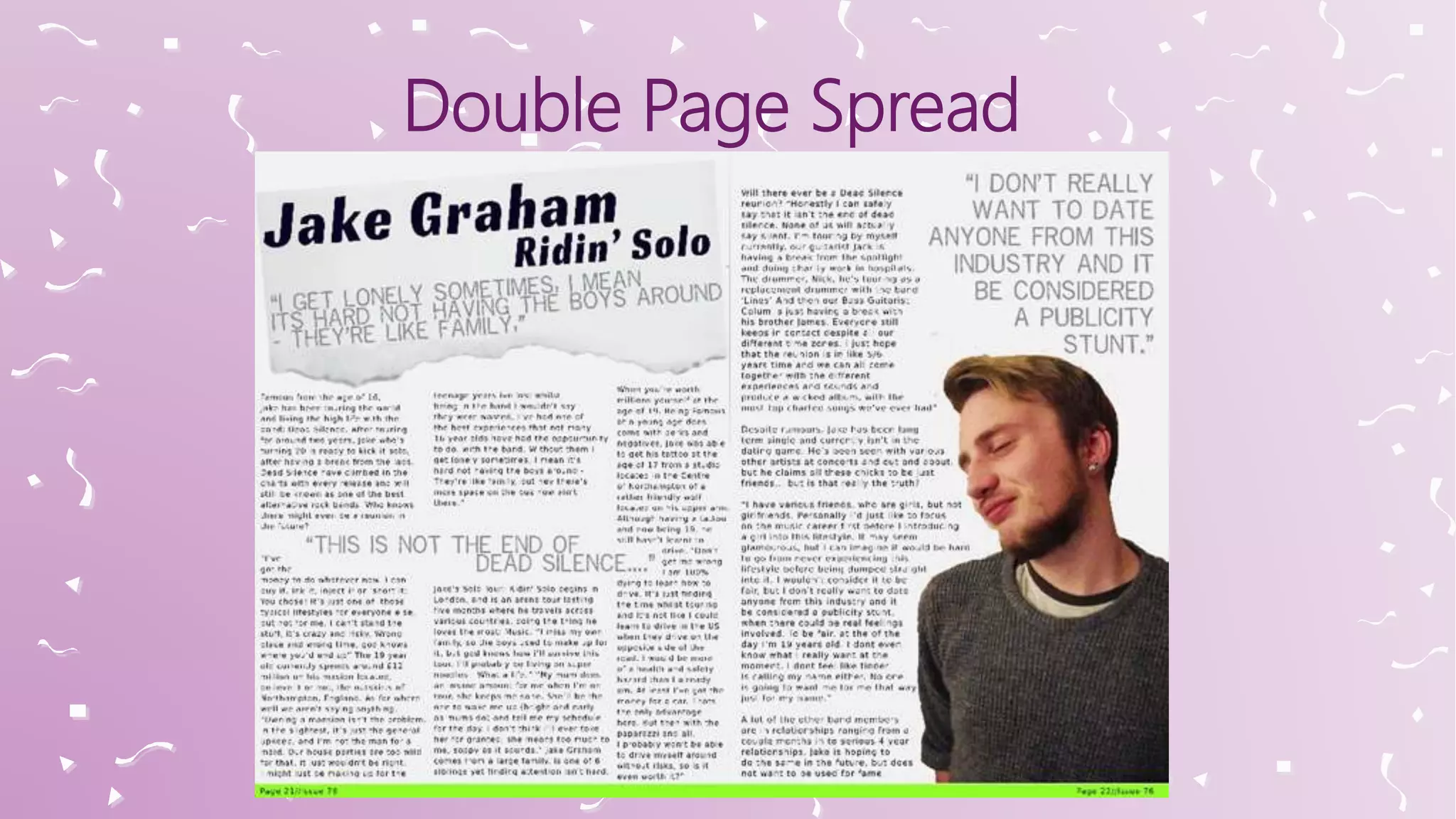
In what way does your media product use, develop or
challenge forms and conventions of real media
products?
Front Cover of ACID FACE
My front cover has been through various stages of development.
Originally to link it back to what my target audience wanted, my
magazine throughout had a blue theme to represent the stereotypical
genre of ‘Alternative.’ Because this is what the target audience decided
what appealed to them, which I discovered when I investigated
through a questionnaire on survey monkey and approached people to
ask for their opinions so the magazines look and content could be
accurate.
The Name of the magazine is Acid Face,
because it was a catchy name that is
memorable in people’s minds. I decided
to change the blue theme I had going
and adapt it to an acid green which is
more of a representation of the
magazine, because ‘Acid’ is typically
connoted with green. It can also link
back to the 1960’s when acid, the drug,
were commonly used to have a good
time, when at raves and general parties
so it brings back a retro feel to the
magazine
That involves context into my magazine,
and not just a generic design like all the
magazines currently out, this one is able
to stand out against the others, because
it includes vibrant colours and there is
reasoning behind the final design itself,
which is also why the title isn’t filled a
typical solid green colour, there is a
destructed look to it l. Additionally
when you consider today’s society, this
is now considered the normal thing to
do around 50 years later, so this is still
relevant, as people are still being able
to access Acid and use it for recreational
purposes.
Throughout the magazine, so the contents, front
page and double page spread, all have a house
theme with green and grey throughout, so it
shows that I am able to consider the key codes
and conventions of the media magazines. In the
future, if Acid Face was to become a generic
magazine, then the logo for the magazine would
be featured on every issue, so eventually it would
mean that it would become an Iconic Logo and
people are able to notice the magazine and
acknowledge it for its repetitive colour scheme
that would be kept the same.
Previously when I began this segment of work, I analysed various
magazines, linking to the genre that I thought I wanted to work into
and create a magazine using them as inspiration. When considering
the Rolling Stones magazine, it is very successful with currently 25
million people monthly visiting the website to read the magazine – It
was clear that if I was to use this magazine as inspiration that if I
genuinely was to release my magazine to the public that I would be
able to eventually achieve a similar popularity outcome to the Rolling
Stones.
When looking at both magazines side by side, it is evident that the
Rolling Stones does look more sophisticated, but this is because they
have a reputation to upkeep to ensure that they are keeping 25 million
people interest and that are still a respected Rock magazine.
For the placement of Jake on the page, I went
against the key codes and conventions of a
typical music magazine, because it is evident
that by having Jake looking to the side, I miss
out on the initial opportunity to have a form of
direct address. However I opted against this, as
personally I believe this makes the layout of the
whole page look better, and I wouldn’t want my
target audience feel as though they have to
purchase the magazine because Jake is
represented as intimidating, due to him
wearing all black clothes and having piercings,
as he can be stereotyped in this way.
Originally when referring back to my image
planning I had opted for a very different approach
to my photos that I aimed to take. My front cover
images were going to have a different Mise en
scene approach completely. Jake was supposed to
be wearing ripped skinny jeans and shirts, with his
hair styled in various different ways, however due to
finding it hard to take the pictures, and finding a
day of convenience – This wasn’t possible. We then
opted for something that would be similar to what
approach I wanted to have for my magazine, which
was initially to have Jake in a black, ripped hoodie.
In my opinion, I believe that this still creates the impression that I
wanted for my magazine, so I am happy with how it turned out.
There is an appeal here to the audience because not only is the
front cover overall eye catchy, due to the colour scheme, but
because it is challenging the key codes and conventions, which is
why I believe more people will be intrigued as to why is isn’t like
other magazines.
Contents Page
My contents page has a similar vibe
to the front cover. All the titles
included throughout the page have a
green backing to relate back to the
idea of having a house theme running
throughout my magazine. It also
allows the titles to stand out against
my background so then it is easier for
my target audience to view what it is
included.
The layout follows a successful magazine: NME as
well as elements from a Q magazine, meaning that I
know that this layout is overall effective, despite it
not conforming to my stereotypical idea for an
Alternative Rock magazine. The title on these pages
are straight to the point, with three different
sections. As I am giving the impression that there
has already been several issues previously, there is
simply the: Regulars, What goes on? And Acid Filter.
By adding acid filter at the bottom I was hoping to
make it personalised instead of having generic titles
like other magazines, so it then unites fans of the
magazine together because they understand the
obvious logic behind it.
For the contents, I have added the numbers on alternative sides
of the text, to make the page more engaging because there are
more places to look on the page, instead straight down in a row.
There are no photos on this page, because I feel like this page
needed to be simple, and by adding photos it then began to look
clustered together and very untidy. However, I didn’t want there
to be a large amount of white space on the page, so I opted for
having the social media logos at the bottom of the page, this is
acts as a small reminder to the fact that the magazine is very
social media based, so people will then feel the need to follow
the social medias and be connected to the magazine as today’s
society is becoming very digitised.
On this page, there isn’t a large representation of my intended genre,
apart from the colour scheme created, with the acid green idea. The
background can be said to suggest the genre, because there is a
distressed look about it and stereotypically that is what the genre of
music is all about, but because it is in the background, it may be that
this isn’t as recognisable to some, but more to others, depending on if
you listen to this genre or not. I feel as though for the presentation of
this page it works very well because it is simple, and not over the top.
On this page, the main appeal is going to be the contents themselves,
as there are no linking images. However on the page it is evident to
see that I have tried to vary up what I am intending to write about and
from the titles included there is a lot of representations of the
stereotypes there.
Examples of this are initially the mention of: Bands,
Sex, Tattoos, Drugs and Rock legends. From the
inclusion of these titles, it is evident to see that my
target market are initially teenagers (16+) ranging
up to young adults, due to the fact they might be
curious about elements of this magazine and then
therefore feel the need to purchase it. But overall,
this magazine section (my contents page) is
therefore challenging a typical music magazine, as
they would have a variety of images included to get
readers interested, whereas my magazine’s contents
page is depending on hooking the reader in with
the content that it actually has within and not just
pictures.
Double Page Spread
Lastly for my double page spread it is evident to
see that I have taken inspiration from the double
page of an NME magazine again, which is also
what I used again for inspiration for my contents
page as well, with the effect and idea of ripped
paper. My article that I have chosen to write is in
the style of a Rolling stone magazine, as I wanted
to include similar content into my article, but still
give the professional vibe to the magazines
article, despite the content that it includes. For my
article, I have chosen to split it into four columns,
as this is typically what you would find in a
magazine of any genre, but specifically a
magazine like NME, this is common.
To add to this, it also makes the article itself to be presented as less
intimidating for the reader, so they won’t feel off put about the
amount of words included in the article, because it is broken down
into flowing segments. The fonts that I have chosen range in variety,
showing that I am able to follow the key codes and conventions of a
generic magazine. All the fonts for the text are the same, and the
writing itself is straightforward and easy to read, but still is a
suggestion of my genre. The pull quotes are in large grey capitals,
standing out against the page, so they are eye catchy for the reader.
They are elements of the magazine, that are considered interesting,
which therefore makes the reader actually want to read the article to
find out either about the band ‘dead silence’ or about his dating life as
a band member going solo into the industry.
On this page again, I have chosen to avoid direct address through
my choice of images as I felt that the positioning of this image
looked the best on this page and it represented the page well. A
young punk teenager. This teenager, is also featured due to the
Mise en scene choices, to have piercings displayed which is why his
head is titled to the side to display these, in my mid shot image.
From this, these piercings again can represent the genre because
the genre of music can be linked to piercings, tattoos and body
modifications. Additionally, as previously stated on my front page,
and contents there is a reoccurring house style throughout, which
is my colour scheme of Black, Grey and Green. This represents the
‘Acid face’ feel throughout the whole magazine, and shows how
the whole of the elements are then linked together, as this acid
green is featured on each of the pages in some way shape or form.
For this segment, it more than likely appeals to the reader as they are
having access to the inside details of a ‘Rock stars’ life, and the idea
that dyer’s star theory could be involved here. As if this band was
actually real, the fan base of the band will want to read this, due to it
being theoretically about their lead singer. So my magazine would
benefit from featuring their story in the magazine, because then more
people who like Jake and his band will feel the need to purchase the
magazine to see if there is a reoccurrence of the band, Dead Silence,
being featured again. To conclude on this question, I believe that my
magazine double page spread is conforming to the stereotypes and
key codes and conventions of an alternative music magazine, and if it
was to be sold in stores, to my target audience, I believe that it would
actually draw in a vast variety of people.

Evaluation Question 1

  • 1.
    In what waydoes your media product use, develop or challenge forms and conventions of real media products?
  • 2.
    Front Cover ofACID FACE
  • 3.
    My front coverhas been through various stages of development. Originally to link it back to what my target audience wanted, my magazine throughout had a blue theme to represent the stereotypical genre of ‘Alternative.’ Because this is what the target audience decided what appealed to them, which I discovered when I investigated through a questionnaire on survey monkey and approached people to ask for their opinions so the magazines look and content could be accurate.
  • 4.
    The Name ofthe magazine is Acid Face, because it was a catchy name that is memorable in people’s minds. I decided to change the blue theme I had going and adapt it to an acid green which is more of a representation of the magazine, because ‘Acid’ is typically connoted with green. It can also link back to the 1960’s when acid, the drug, were commonly used to have a good time, when at raves and general parties so it brings back a retro feel to the magazine That involves context into my magazine, and not just a generic design like all the magazines currently out, this one is able to stand out against the others, because it includes vibrant colours and there is reasoning behind the final design itself, which is also why the title isn’t filled a typical solid green colour, there is a destructed look to it l. Additionally when you consider today’s society, this is now considered the normal thing to do around 50 years later, so this is still relevant, as people are still being able to access Acid and use it for recreational purposes.
  • 5.
    Throughout the magazine,so the contents, front page and double page spread, all have a house theme with green and grey throughout, so it shows that I am able to consider the key codes and conventions of the media magazines. In the future, if Acid Face was to become a generic magazine, then the logo for the magazine would be featured on every issue, so eventually it would mean that it would become an Iconic Logo and people are able to notice the magazine and acknowledge it for its repetitive colour scheme that would be kept the same.
  • 6.
    Previously when Ibegan this segment of work, I analysed various magazines, linking to the genre that I thought I wanted to work into and create a magazine using them as inspiration. When considering the Rolling Stones magazine, it is very successful with currently 25 million people monthly visiting the website to read the magazine – It was clear that if I was to use this magazine as inspiration that if I genuinely was to release my magazine to the public that I would be able to eventually achieve a similar popularity outcome to the Rolling Stones.
  • 7.
    When looking atboth magazines side by side, it is evident that the Rolling Stones does look more sophisticated, but this is because they have a reputation to upkeep to ensure that they are keeping 25 million people interest and that are still a respected Rock magazine.
  • 8.
    For the placementof Jake on the page, I went against the key codes and conventions of a typical music magazine, because it is evident that by having Jake looking to the side, I miss out on the initial opportunity to have a form of direct address. However I opted against this, as personally I believe this makes the layout of the whole page look better, and I wouldn’t want my target audience feel as though they have to purchase the magazine because Jake is represented as intimidating, due to him wearing all black clothes and having piercings, as he can be stereotyped in this way.
  • 9.
    Originally when referringback to my image planning I had opted for a very different approach to my photos that I aimed to take. My front cover images were going to have a different Mise en scene approach completely. Jake was supposed to be wearing ripped skinny jeans and shirts, with his hair styled in various different ways, however due to finding it hard to take the pictures, and finding a day of convenience – This wasn’t possible. We then opted for something that would be similar to what approach I wanted to have for my magazine, which was initially to have Jake in a black, ripped hoodie.
  • 10.
    In my opinion,I believe that this still creates the impression that I wanted for my magazine, so I am happy with how it turned out. There is an appeal here to the audience because not only is the front cover overall eye catchy, due to the colour scheme, but because it is challenging the key codes and conventions, which is why I believe more people will be intrigued as to why is isn’t like other magazines.
  • 11.
  • 12.
    My contents pagehas a similar vibe to the front cover. All the titles included throughout the page have a green backing to relate back to the idea of having a house theme running throughout my magazine. It also allows the titles to stand out against my background so then it is easier for my target audience to view what it is included.
  • 13.
    The layout followsa successful magazine: NME as well as elements from a Q magazine, meaning that I know that this layout is overall effective, despite it not conforming to my stereotypical idea for an Alternative Rock magazine. The title on these pages are straight to the point, with three different sections. As I am giving the impression that there has already been several issues previously, there is simply the: Regulars, What goes on? And Acid Filter. By adding acid filter at the bottom I was hoping to make it personalised instead of having generic titles like other magazines, so it then unites fans of the magazine together because they understand the obvious logic behind it.
  • 14.
    For the contents,I have added the numbers on alternative sides of the text, to make the page more engaging because there are more places to look on the page, instead straight down in a row. There are no photos on this page, because I feel like this page needed to be simple, and by adding photos it then began to look clustered together and very untidy. However, I didn’t want there to be a large amount of white space on the page, so I opted for having the social media logos at the bottom of the page, this is acts as a small reminder to the fact that the magazine is very social media based, so people will then feel the need to follow the social medias and be connected to the magazine as today’s society is becoming very digitised.
  • 15.
    On this page,there isn’t a large representation of my intended genre, apart from the colour scheme created, with the acid green idea. The background can be said to suggest the genre, because there is a distressed look about it and stereotypically that is what the genre of music is all about, but because it is in the background, it may be that this isn’t as recognisable to some, but more to others, depending on if you listen to this genre or not. I feel as though for the presentation of this page it works very well because it is simple, and not over the top. On this page, the main appeal is going to be the contents themselves, as there are no linking images. However on the page it is evident to see that I have tried to vary up what I am intending to write about and from the titles included there is a lot of representations of the stereotypes there.
  • 16.
    Examples of thisare initially the mention of: Bands, Sex, Tattoos, Drugs and Rock legends. From the inclusion of these titles, it is evident to see that my target market are initially teenagers (16+) ranging up to young adults, due to the fact they might be curious about elements of this magazine and then therefore feel the need to purchase it. But overall, this magazine section (my contents page) is therefore challenging a typical music magazine, as they would have a variety of images included to get readers interested, whereas my magazine’s contents page is depending on hooking the reader in with the content that it actually has within and not just pictures.
  • 17.
  • 18.
    Lastly for mydouble page spread it is evident to see that I have taken inspiration from the double page of an NME magazine again, which is also what I used again for inspiration for my contents page as well, with the effect and idea of ripped paper. My article that I have chosen to write is in the style of a Rolling stone magazine, as I wanted to include similar content into my article, but still give the professional vibe to the magazines article, despite the content that it includes. For my article, I have chosen to split it into four columns, as this is typically what you would find in a magazine of any genre, but specifically a magazine like NME, this is common.
  • 19.
    To add tothis, it also makes the article itself to be presented as less intimidating for the reader, so they won’t feel off put about the amount of words included in the article, because it is broken down into flowing segments. The fonts that I have chosen range in variety, showing that I am able to follow the key codes and conventions of a generic magazine. All the fonts for the text are the same, and the writing itself is straightforward and easy to read, but still is a suggestion of my genre. The pull quotes are in large grey capitals, standing out against the page, so they are eye catchy for the reader. They are elements of the magazine, that are considered interesting, which therefore makes the reader actually want to read the article to find out either about the band ‘dead silence’ or about his dating life as a band member going solo into the industry.
  • 20.
    On this pageagain, I have chosen to avoid direct address through my choice of images as I felt that the positioning of this image looked the best on this page and it represented the page well. A young punk teenager. This teenager, is also featured due to the Mise en scene choices, to have piercings displayed which is why his head is titled to the side to display these, in my mid shot image. From this, these piercings again can represent the genre because the genre of music can be linked to piercings, tattoos and body modifications. Additionally, as previously stated on my front page, and contents there is a reoccurring house style throughout, which is my colour scheme of Black, Grey and Green. This represents the ‘Acid face’ feel throughout the whole magazine, and shows how the whole of the elements are then linked together, as this acid green is featured on each of the pages in some way shape or form.
  • 21.
    For this segment,it more than likely appeals to the reader as they are having access to the inside details of a ‘Rock stars’ life, and the idea that dyer’s star theory could be involved here. As if this band was actually real, the fan base of the band will want to read this, due to it being theoretically about their lead singer. So my magazine would benefit from featuring their story in the magazine, because then more people who like Jake and his band will feel the need to purchase the magazine to see if there is a reoccurrence of the band, Dead Silence, being featured again. To conclude on this question, I believe that my magazine double page spread is conforming to the stereotypes and key codes and conventions of an alternative music magazine, and if it was to be sold in stores, to my target audience, I believe that it would actually draw in a vast variety of people.