Evaluation –
Question 1
In what ways does you’re media product use, develop and
challenge forms and conventions of real media products?
Sam Gallacher-Bright
The Masthead


Above is the masthead, conventionally I have put it in the top part of
the magazine and included the issue number, date and price also in
the same area, but in smaller font. Usually in all magazines you can
expect to see the title of the magazine at the top of the page, I used
this typical convention in my magazine to make the front cover look a
lot more realistic and to create a sense of professionalism. Also
naturally the eye goes to the top of the left side of a page, therefore
the ‘R’ instantly catches the readers eye and they could know instantly
that its RADAR music magazine. My title is also in capital letters, this
again is very stereotypical as in a music magazine you would normally
expect to see the title in capital letters, for example ‘NME’, ‘KERRANG’
and ‘MOJO’. Again I have conformed to this convention to catch the
readers eye but I also feel that it is what my target audience would like
to see as from my questionnaire the majority of them like to go to
festivals and parties, therefore a title that wasn’t in capitals, ‘Radar’
would look boring to them and not a title.
Colour Scheme
I chose to do a simple three colour scheme throughout my magazine of red, white
and black. This was because when I did my research on other magazines of the
same genre they all used either three or four colours in their colour scheme, for
example MOJO normally use black, white and gold and NME usually use black,
white, yellow and red. I think these colours and the simplicity suits the genre well
as you would expect to see a pop magazine with loads of different bright colours
 such as blue, pink, yellow etc. So generically I stuck
with a simple colour theme and seeing as other indie
magazines consistently use black and white I chose to
use those colours also. Another reason why I chose
the black, white and red colour scheme is that
according to my questionnaire results it was what
my target audience would like to see. However,
when it came to the focus group which had 3 females
and 2 males at the age of 16 or 17, who had an
interest of indie music and would fall into my target
audience, said that although they liked the colour
scheme and they thought it fitted the genre well,
they would of liked to see more colour on the front
cover or the picture to have been in colour instead of
black and white.
Double Page Spread
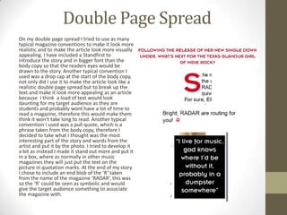
On my double page spread I tried to use as many
typical magazine conventions to make it look more
realistic and to make the article look more visually
appealing. I have included a Standfirst to
introduce the story and in bigger font than the
body copy so that the readers eyes would be
drawn to the story. Another typical convention I
used was a drop cap at the start of the body copy,
not only did I use it to make the article look like a
realistic double page spread but to break up the
text and make it look more appealing as an article
because I think a load of text would look
daunting for my target audience as they are
students and probably wont have a lot of time to
read a magazine, therefore this would make them
think it won’t take long to read. Another typical
convention I used was a pull quote, which is a
phrase taken from the body copy, therefore I
decided to take what I thought was the most
interesting part of the story and words from the
artist and put it by the photo. I tried to develop it
a bit as instead I made it stand out more and put it
in a box, where as normally in other music
magazines they will just put the text on the
picture in quotation marks. At the end of my story
I chose to include an end blob of the ‘R’ taken
from the name of the magazine ‘RADAR’, this was
so the ‘R’ could be seen as symbolic and would
give the target audience something to associate
the magazine with.
Contents Page
I feel that my contents page challenges the typical conventions of a
contents page as mine doesn’t have the usual layout that you would
see in other music magazines. For example the main image covers up
most of the top half of the page and the contents listings are not in
usual column form. I have done this because my magazine portrays to
be about new fresh music and fresh artists in the indie music genre, so
if the whole magazine was just following all typical conventions of
others and just looked the same it wouldn’t be individual and
distinctive, also I think my target audience would find it boring.
However, conventionally on the contents page you would find an
editors word which I have included, this is so I could welcome my
target audience especially as it is the first issue. In my editors word I
say that ‘if you’re into indie music and attending all festivals this is the
right place for you’, this is so my target audience feel like they are right
to be reading my magazine, as in Maslow’s hierarchy of needs (1954) it
states that some people use media to have a sense of belonging and
recognition, by including that sentence I feel that it fulfils that need for
those people.
Conclusion
I think that my front cover and double page spread use most of
the typical conventions of real magazines which I think really
creates a sense of verisimilitude and makes it look like an actual
magazine, however the contents page challenges the
conventions of a typical contents page in a music magazine,
which I think suits the magazines genre.

Evaluation – question_1

  • 1.
    Evaluation – Question 1 Inwhat ways does you’re media product use, develop and challenge forms and conventions of real media products? Sam Gallacher-Bright
  • 2.
    The Masthead Above isthe masthead, conventionally I have put it in the top part of the magazine and included the issue number, date and price also in the same area, but in smaller font. Usually in all magazines you can expect to see the title of the magazine at the top of the page, I used this typical convention in my magazine to make the front cover look a lot more realistic and to create a sense of professionalism. Also naturally the eye goes to the top of the left side of a page, therefore the ‘R’ instantly catches the readers eye and they could know instantly that its RADAR music magazine. My title is also in capital letters, this again is very stereotypical as in a music magazine you would normally expect to see the title in capital letters, for example ‘NME’, ‘KERRANG’ and ‘MOJO’. Again I have conformed to this convention to catch the readers eye but I also feel that it is what my target audience would like to see as from my questionnaire the majority of them like to go to festivals and parties, therefore a title that wasn’t in capitals, ‘Radar’ would look boring to them and not a title.
  • 3.
    Colour Scheme I choseto do a simple three colour scheme throughout my magazine of red, white and black. This was because when I did my research on other magazines of the same genre they all used either three or four colours in their colour scheme, for example MOJO normally use black, white and gold and NME usually use black, white, yellow and red. I think these colours and the simplicity suits the genre well as you would expect to see a pop magazine with loads of different bright colours such as blue, pink, yellow etc. So generically I stuck with a simple colour theme and seeing as other indie magazines consistently use black and white I chose to use those colours also. Another reason why I chose the black, white and red colour scheme is that according to my questionnaire results it was what my target audience would like to see. However, when it came to the focus group which had 3 females and 2 males at the age of 16 or 17, who had an interest of indie music and would fall into my target audience, said that although they liked the colour scheme and they thought it fitted the genre well, they would of liked to see more colour on the front cover or the picture to have been in colour instead of black and white.
  • 4.
    Double Page Spread Onmy double page spread I tried to use as many typical magazine conventions to make it look more realistic and to make the article look more visually appealing. I have included a Standfirst to introduce the story and in bigger font than the body copy so that the readers eyes would be drawn to the story. Another typical convention I used was a drop cap at the start of the body copy, not only did I use it to make the article look like a realistic double page spread but to break up the text and make it look more appealing as an article because I think a load of text would look daunting for my target audience as they are students and probably wont have a lot of time to read a magazine, therefore this would make them think it won’t take long to read. Another typical convention I used was a pull quote, which is a phrase taken from the body copy, therefore I decided to take what I thought was the most interesting part of the story and words from the artist and put it by the photo. I tried to develop it a bit as instead I made it stand out more and put it in a box, where as normally in other music magazines they will just put the text on the picture in quotation marks. At the end of my story I chose to include an end blob of the ‘R’ taken from the name of the magazine ‘RADAR’, this was so the ‘R’ could be seen as symbolic and would give the target audience something to associate the magazine with.
  • 5.
    Contents Page I feelthat my contents page challenges the typical conventions of a contents page as mine doesn’t have the usual layout that you would see in other music magazines. For example the main image covers up most of the top half of the page and the contents listings are not in usual column form. I have done this because my magazine portrays to be about new fresh music and fresh artists in the indie music genre, so if the whole magazine was just following all typical conventions of others and just looked the same it wouldn’t be individual and distinctive, also I think my target audience would find it boring. However, conventionally on the contents page you would find an editors word which I have included, this is so I could welcome my target audience especially as it is the first issue. In my editors word I say that ‘if you’re into indie music and attending all festivals this is the right place for you’, this is so my target audience feel like they are right to be reading my magazine, as in Maslow’s hierarchy of needs (1954) it states that some people use media to have a sense of belonging and recognition, by including that sentence I feel that it fulfils that need for those people.
  • 6.
    Conclusion I think thatmy front cover and double page spread use most of the typical conventions of real magazines which I think really creates a sense of verisimilitude and makes it look like an actual magazine, however the contents page challenges the conventions of a typical contents page in a music magazine, which I think suits the magazines genre.