This document discusses how the media product, a music magazine called Pyramid, uses and develops conventions of real music magazines in its design. It has a close-up front cover image that challenges conventions by having the subject look away from the camera. It uses a single bright color like indie magazines. There is limited catchy text on the cover following conventions. The masthead is centered at the top like other magazines and the name Pyramid references the music scene and targets hipster fashion trends.
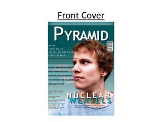
![Masthead
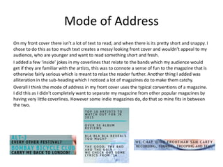
When carrying out research for my magazine I found that nearly all of them had a
bold, white, masthead like The WIRE magazine below, the masthead was always
positioned at the top of the page, central or in the top left corner, and that the
name of the magazine was usually short or just one word like WIRE, CLASH, The
Fly etc.
I chose the name PYRAMID for my magazine as pyramids and triangles are quite
frequently featured on fashion worn by hipsters who I am trying to target as my
audience therefore it will attract them in.
Another reason I chose the name PYRAMID is because it connotes what my
magazine is about; the small bands starting out at the bottom [of the pyramid]
and bigger bands who have already made it to the top of the indie music scene.](https://image.slidesharecdn.com/evaluationquestion1-done-150130075357-conversion-gate02/85/Evaluation-Question-1-Front-Cover-6-320.jpg)


