How effective is the combination of
 your main product and ancillary
               texts?
DigiPak
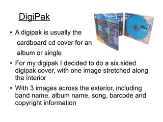
●   A digipak is usually the
    cardboard cd cover for an
    album or single
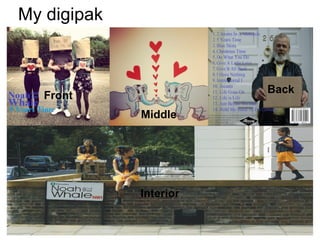
●   For my digipak I decided to do a six sided
    digipak cover, with one image stretched along
    the interior
●   With 3 images across the exterior, including
    band name, album name, song, barcode and
    copyright information
My digipak


                        Back
   Front
             Middle


             Interior
Band Website
●   A bands website is essential for them to be able
    to promote themselves.
●   I ensured I included certain information in my
    own band website such as their name, tour
    dates, about the band members as well as their
    new single released.
Genre of the band
The song for our music video is Noah and the
Whale – 5 years time. They are an alternative folk
rock band. They regard themselves as individuals
which are favoured by a niche market with similar
tastes. The music video therefore is based upon
this theme of being unique and will attract the
niche market. As the music we created is based
upon teenagers falling in love and having fun with
their friends, it's essential to include these themes
in the ancillary task.
Three themes
Three ideas I wanted to focus on for my digipak,
was the use of colours and having variety of them
to give off happy and joyful connotations.
Another important element for my digipak is
different characters, this is a reference to the
music video incorporating our common characters
into the album cover.
Finally, throughout or video we used a variety of
semiotics along with this we used contextual
symbols, these must be present in the cover as
well. These are all important elements to include
when producing a digipak as they need to link
back to the video and have specific meanings.
Colour
A common colour we found in our music video
where yellow and orange which relate back to the
lyrics of 'sun' throughout the song. Therefore on
both my digipak and web page I attempted to use
these colours to combine the two media products.
It's essential to continually combine these
elements in order for it to all relate across all three
platforms.
Characters
●   A variety of characters in my music video are
    different ages, this echos the feeling of it being
    a friendly and video constructed by a group of
    friends.
●   Pictures of these characters are then printed on
    the digpak cover and on the website.
Signs and Symbols
The use of signs and symbols throughout the
music video, website and digipak create a
constant link. These random and often contextual
signs branded the media product.
Images
My images used on the digipak and the website
link back to certain scenes of the music video,
and they have been taken and edited to show a
variety.

Evaluation 2 - Media product and ancillary task

  • 1.
    How effective isthe combination of your main product and ancillary texts?
  • 2.
    DigiPak ● A digipak is usually the cardboard cd cover for an album or single ● For my digipak I decided to do a six sided digipak cover, with one image stretched along the interior ● With 3 images across the exterior, including band name, album name, song, barcode and copyright information
  • 3.
    My digipak Back Front Middle Interior
  • 4.
    Band Website ● A bands website is essential for them to be able to promote themselves. ● I ensured I included certain information in my own band website such as their name, tour dates, about the band members as well as their new single released.
  • 5.
    Genre of theband The song for our music video is Noah and the Whale – 5 years time. They are an alternative folk rock band. They regard themselves as individuals which are favoured by a niche market with similar tastes. The music video therefore is based upon this theme of being unique and will attract the niche market. As the music we created is based upon teenagers falling in love and having fun with their friends, it's essential to include these themes in the ancillary task.
  • 6.
    Three themes Three ideasI wanted to focus on for my digipak, was the use of colours and having variety of them to give off happy and joyful connotations. Another important element for my digipak is different characters, this is a reference to the music video incorporating our common characters into the album cover. Finally, throughout or video we used a variety of semiotics along with this we used contextual symbols, these must be present in the cover as well. These are all important elements to include when producing a digipak as they need to link back to the video and have specific meanings.
  • 7.
    Colour A common colourwe found in our music video where yellow and orange which relate back to the lyrics of 'sun' throughout the song. Therefore on both my digipak and web page I attempted to use these colours to combine the two media products. It's essential to continually combine these elements in order for it to all relate across all three platforms.
  • 8.
    Characters ● A variety of characters in my music video are different ages, this echos the feeling of it being a friendly and video constructed by a group of friends. ● Pictures of these characters are then printed on the digpak cover and on the website.
  • 9.
    Signs and Symbols Theuse of signs and symbols throughout the music video, website and digipak create a constant link. These random and often contextual signs branded the media product.
  • 10.
    Images My images usedon the digipak and the website link back to certain scenes of the music video, and they have been taken and edited to show a variety.