Downloaded 441 times


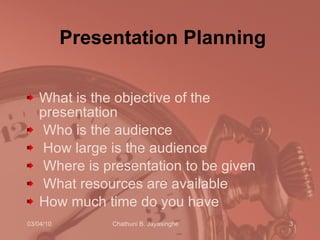


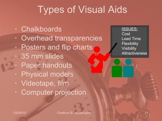


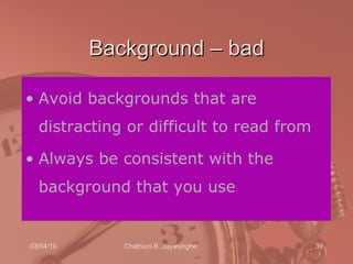


The document provides tips for effective presentations including planning, organization, delivery and use of visual aids. Some key points covered are: 1. Careful preparation is important including outlining objectives, audience, resources and time available. 2. Presentations should have a clear introduction, body and conclusion with an engaging opening and closing. 3. Delivery techniques like eye contact, voice, gestures and body language impact engagement. Visual aids should be simple, colorful and support the spoken content.