Download to read offline


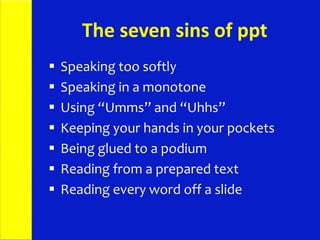


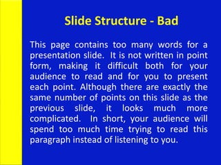
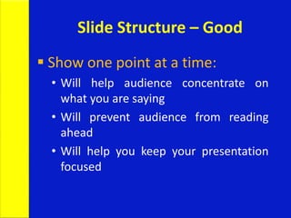
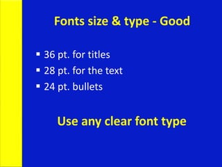


This document provides tips for creating effective presentation slides and delivering presentations confidently. It discusses: 1. The importance of preparing thoroughly and rehearsing, with suggestions to spend an hour preparing for every minute of the presentation. 2. Best practices for slide design, including using simple templates with large text sizes, point form with 4-5 bullet points per slide, and high contrast colors for readability. 3. Tips for public speaking delivery, such as maintaining eye contact, practicing vocal warmups, speaking slowly, and remaining confident during the question period.