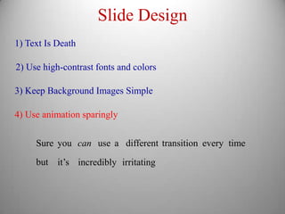
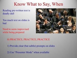
The document provides guidelines for student presentations, emphasizing the importance of knowing the audience and tailoring content accordingly. It outlines key aspects of presentation design, such as minimizing text on slides, using high-contrast colors, and maintaining a clear organizational structure. Additionally, it suggests practicing thoroughly and utilizing tools like 'presenter mode' to enhance delivery.
Presentation Guidelines
Last fourclass days devoted to student presentations
Approx. 20 minutes (15+5) each
Grade: comments from me, comments from peers
This class: Some basic guidelines on presentation technique
2.
Know Your Audience
Firstand most important rule: KNOW YOUR AUDIENCE
Different audiences need different types of talks
Fellow experts Technical jargon OK, Details good
Briefing for Colleagues Some jargon OK, less detailed
General Audience Minimal jargon, “Big Picture” only
Know what style is appropriate for your intended audience
3.
Know Your Point
Makesure you know what you want the audience to take away
1-2 main ideas per talk
Everything must come back to main points
4.
Tell A Story
Organizationis key
Beginning, Middle, End
Clear and Logical Flow
Keep audience informed
Try to streamline presentation so each step is obvious
For very complicated material, outline/ summary breaks
5.
Limit Your Material
Ruleof thumb: 1 slide per minute MAXIMUM
Lecture notes: Typically ~20 slides for 65 minute class
50-minute Research Talk: 26 slides
50-minute Social Media Talk: 32 slides
50-minute Public Lecture: 39 slides
(Very image-heavy)
In-class presentations: No more than 20 slides
6.
Slide Design
1) TextIs Death
The deplorable practice of putting huge blocks of text on
a slide and then reading every single word to the
audience probably accounts for half of the problems
people have with PowerPoint. Most people in the
audience will be able to read the text faster than you can
say it out loud. Those who can’t will be so busy reading it
that they’ll tend to miss what you’re saying.
Keep words on slides to a minimum
This goes double for math/equations
7.
Slide Design
1) TextIs Death
2) Use high-contrast fonts and colors
Certain colors of text are nearly invisible on some backgrounds
Be aware of/ sensitive to visual impairments, like
colorblindness
Don’t use complicated fonts or tiny little text
8.5”x11” printout should be readable from ~10 feet
8.
Slide Design
1) TextIs Death
2) Use high-contrast fonts and colors
3) Keep Background Images Simple
Complicated background images make text disappear
Use solid colors, or simple patterns
9.
Slide Design
1) TextIs Death
2) Use high-contrast fonts and colors
3) Keep Background Images Simple
4) Use animation sparingly
Sure you can use a different transition every time
but it’s incredibly irritating
10.
Know What toSay, When
Reading pre-written text is
deadly dull
Too much text on slides is
bad
Need to seem improvised
while being prepared
0) PRACTICE, PRACTICE, PRACTICE
1) Provide clear (but subtle) prompts on slides
2) Use “Presenter Mode” when available
11.
If It Works,It’s Good
These are suggestions,
not absolute rules
It’s possible to give a talk that
breaks some or all of these
The only solid rule of publishing is:
If it works, it’s good.
-- Teresa Nielsen Hayden