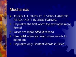
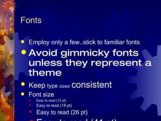
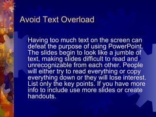
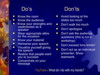
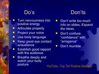
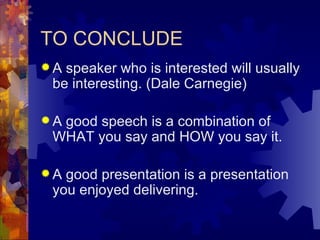
THE PROFESSIONAL PRESENTATION ALIANZA TEACHING CERTIFICATE   2009
Purposes Provide learning experience  Teach life long skills  Bridge the gap between language study and language use  Help students construct information  Enhance team work  Help students become active and autonomous learners
Presentation Skills Difference between Spoken English and Written English  Purpose of Visual Aids  Summarizing and outlining skills  Delivery Body language  Appearance
Good Visuals   Organize Illustrate  Support your communication objective  Enhance your verbal message  Set tone and emotional content Are:  Visible  Clear  Simple
Evaluation Rubrics  Time management  Questions  Answers
A Few Tips Combine right and left brain sensory channels  Left brain: words, sentences Right brain: graphs, charts, pictures Make your audience see what you saw, hear what you heard and feel what you felt
Mechanics and Management  Preparing the Speech  Basic Rules  Background Bullets Text and graphics  Mechanics Fonts  Do’s & Dont’s
Preparing the Speech Explore the communication process Select appropriate information to your topic Clarify your purpose for your speech Research your topic Analyze the  audience YouTube  - How not to begin a presentation
Consider allotted time Develop your main points Structure your speech Use an introduction, transitions and conclusion Employ visuals Preparing the Speech
Basic Rules Don’t try to dazzle the audience with graphics or style…but with the information The medium is not the message The information is the message Use approximately six words per line and  six lines per page
Background Stick with a single background The background is the stage for your information Contrast is important (eg: Light text on a semi dark background)
Bullets Do not center bullets It makes the text ragged It also makes it hard to read and confusing
Bullets Left-justify bullets This keeps information organized It is also easier to follow Bullets are focal points Use concise wording
Text and graphics Place graphics off-center Leave more room for text Left placement leads the eye to the text
Text and Graphics Centered graphics leave little room for text.
Mechanics AVOID ALL CAPS: IT IS VERY HARD TO READ AND IT IS LESS FORMAL Capitalize the first word: the text looks more formal Italics are more difficult to read Use  bold  when you want some words to stand out Capitalize only Content Words in Titles
Fonts Employ only a few..stick to familiar fonts Avoid gimmicky fonts unless they represent a theme Keep   type   sizes   consistent Font size  Easy to read (15 pt) Easy to read (18 pt) Easy to read (26 pt) Easy to read (41   pt)
Avoid Text Overload Having too much text on the screen can defeat the purpose of using PowerPoint. The slides begin to look like a jumble of text, making slides difficult to read and unrecognizable from each other. People will either try to read everything or copy everything down or they will lose interest. List only the key points. If you have more info to include use more slides or create handouts.
Do’s    Don’ts Know the room Know the audience Know your strengths and weaknesses as a speaker Wear appropriate attire for the occasion Know your material Rehearse your speech Visualize yourself giving the speech Realize that people want you to succeed Concentrate on your message Avoid looking at the slides too much Don’t walk too much Don’t apologize Don’t ask the audience questions (this is not a workshop) Don’t exceed time limits!! Don’t act as an individual presenter. Show teamwork.   YouTube  - What do I do with my hands?
Do’s   Don’ts Turn nervousness into positive energy Articulate properly Project your voice Use body language Keep good eye contact w/audience Establish good rapport with the audience  Breathe deeply and watch your body posture Don’t write too much info on slides. Expand the ideas.  Don’t confuse “confidence” with “arrogance” Don’t mumble  YouTube  - Top Ten Positive Gestures
TO CONCLUDE A speaker who is interested will usually be interesting. (Dale Carnegie)   A good speech is a combination of WHAT you say and HOW you say it.  A good presentation is a presentation you enjoyed delivering.
DO YOUR BEST!!! GOOD LUCK!!!

The Professional Presentation

  • 1.
    THE PROFESSIONAL PRESENTATIONALIANZA TEACHING CERTIFICATE 2009
  • 2.
    Purposes Provide learningexperience Teach life long skills Bridge the gap between language study and language use Help students construct information Enhance team work Help students become active and autonomous learners
  • 3.
    Presentation Skills Differencebetween Spoken English and Written English Purpose of Visual Aids Summarizing and outlining skills Delivery Body language Appearance
  • 4.
    Good Visuals Organize Illustrate Support your communication objective Enhance your verbal message Set tone and emotional content Are: Visible Clear Simple
  • 5.
    Evaluation Rubrics Time management Questions Answers
  • 6.
    A Few TipsCombine right and left brain sensory channels Left brain: words, sentences Right brain: graphs, charts, pictures Make your audience see what you saw, hear what you heard and feel what you felt
  • 7.
    Mechanics and Management Preparing the Speech Basic Rules Background Bullets Text and graphics Mechanics Fonts Do’s & Dont’s
  • 8.
    Preparing the SpeechExplore the communication process Select appropriate information to your topic Clarify your purpose for your speech Research your topic Analyze the audience YouTube - How not to begin a presentation
  • 9.
    Consider allotted timeDevelop your main points Structure your speech Use an introduction, transitions and conclusion Employ visuals Preparing the Speech
  • 10.
    Basic Rules Don’ttry to dazzle the audience with graphics or style…but with the information The medium is not the message The information is the message Use approximately six words per line and six lines per page
  • 11.
    Background Stick witha single background The background is the stage for your information Contrast is important (eg: Light text on a semi dark background)
  • 12.
    Bullets Do notcenter bullets It makes the text ragged It also makes it hard to read and confusing
  • 13.
    Bullets Left-justify bulletsThis keeps information organized It is also easier to follow Bullets are focal points Use concise wording
  • 14.
    Text and graphicsPlace graphics off-center Leave more room for text Left placement leads the eye to the text
  • 15.
    Text and GraphicsCentered graphics leave little room for text.
  • 16.
    Mechanics AVOID ALLCAPS: IT IS VERY HARD TO READ AND IT IS LESS FORMAL Capitalize the first word: the text looks more formal Italics are more difficult to read Use bold when you want some words to stand out Capitalize only Content Words in Titles
  • 17.
    Fonts Employ onlya few..stick to familiar fonts Avoid gimmicky fonts unless they represent a theme Keep type sizes consistent Font size Easy to read (15 pt) Easy to read (18 pt) Easy to read (26 pt) Easy to read (41 pt)
  • 18.
    Avoid Text OverloadHaving too much text on the screen can defeat the purpose of using PowerPoint. The slides begin to look like a jumble of text, making slides difficult to read and unrecognizable from each other. People will either try to read everything or copy everything down or they will lose interest. List only the key points. If you have more info to include use more slides or create handouts.
  • 19.
    Do’s Don’ts Know the room Know the audience Know your strengths and weaknesses as a speaker Wear appropriate attire for the occasion Know your material Rehearse your speech Visualize yourself giving the speech Realize that people want you to succeed Concentrate on your message Avoid looking at the slides too much Don’t walk too much Don’t apologize Don’t ask the audience questions (this is not a workshop) Don’t exceed time limits!! Don’t act as an individual presenter. Show teamwork. YouTube - What do I do with my hands?
  • 20.
    Do’s Don’ts Turn nervousness into positive energy Articulate properly Project your voice Use body language Keep good eye contact w/audience Establish good rapport with the audience Breathe deeply and watch your body posture Don’t write too much info on slides. Expand the ideas. Don’t confuse “confidence” with “arrogance” Don’t mumble YouTube - Top Ten Positive Gestures
  • 21.
    TO CONCLUDE Aspeaker who is interested will usually be interesting. (Dale Carnegie) A good speech is a combination of WHAT you say and HOW you say it. A good presentation is a presentation you enjoyed delivering.
  • 22.
    DO YOUR BEST!!!GOOD LUCK!!!