Downloaded 169 times
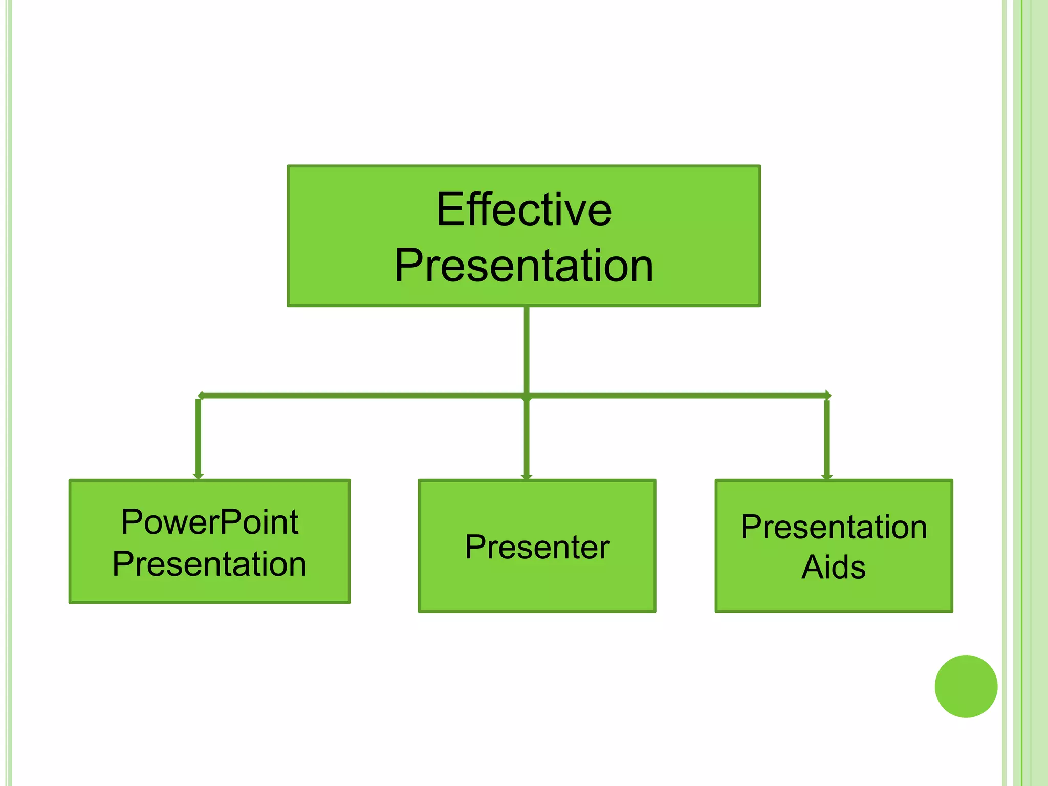
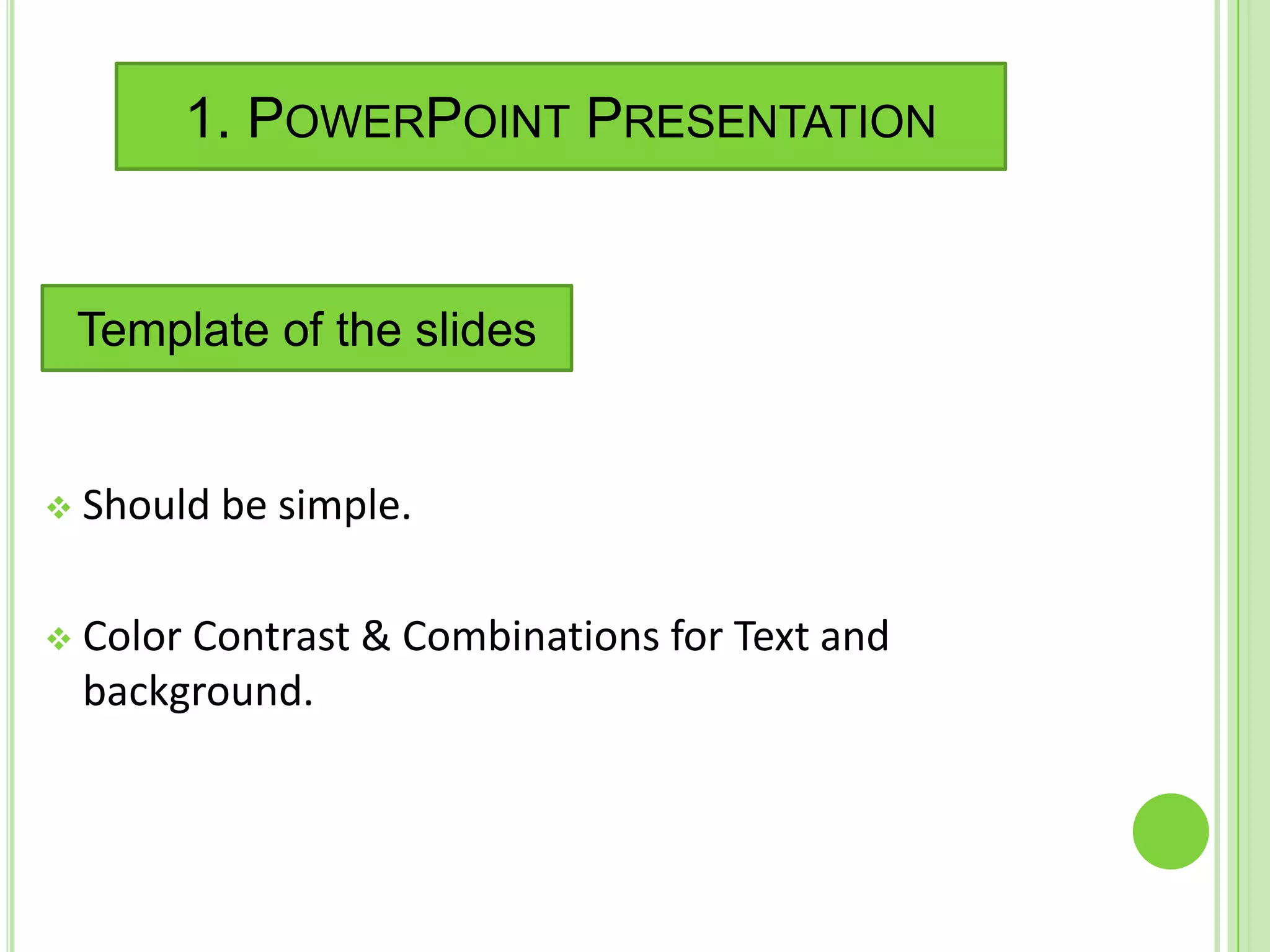
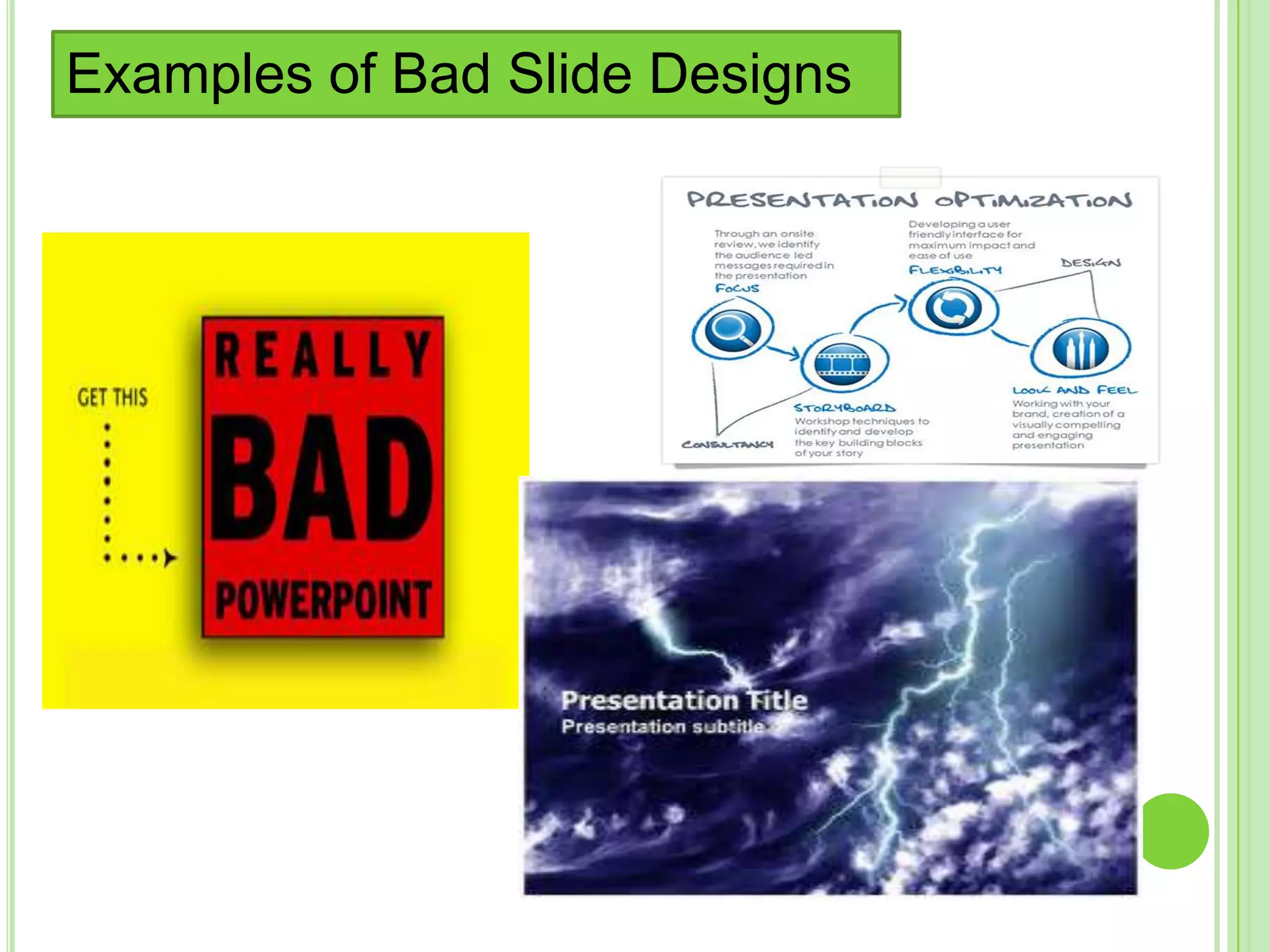
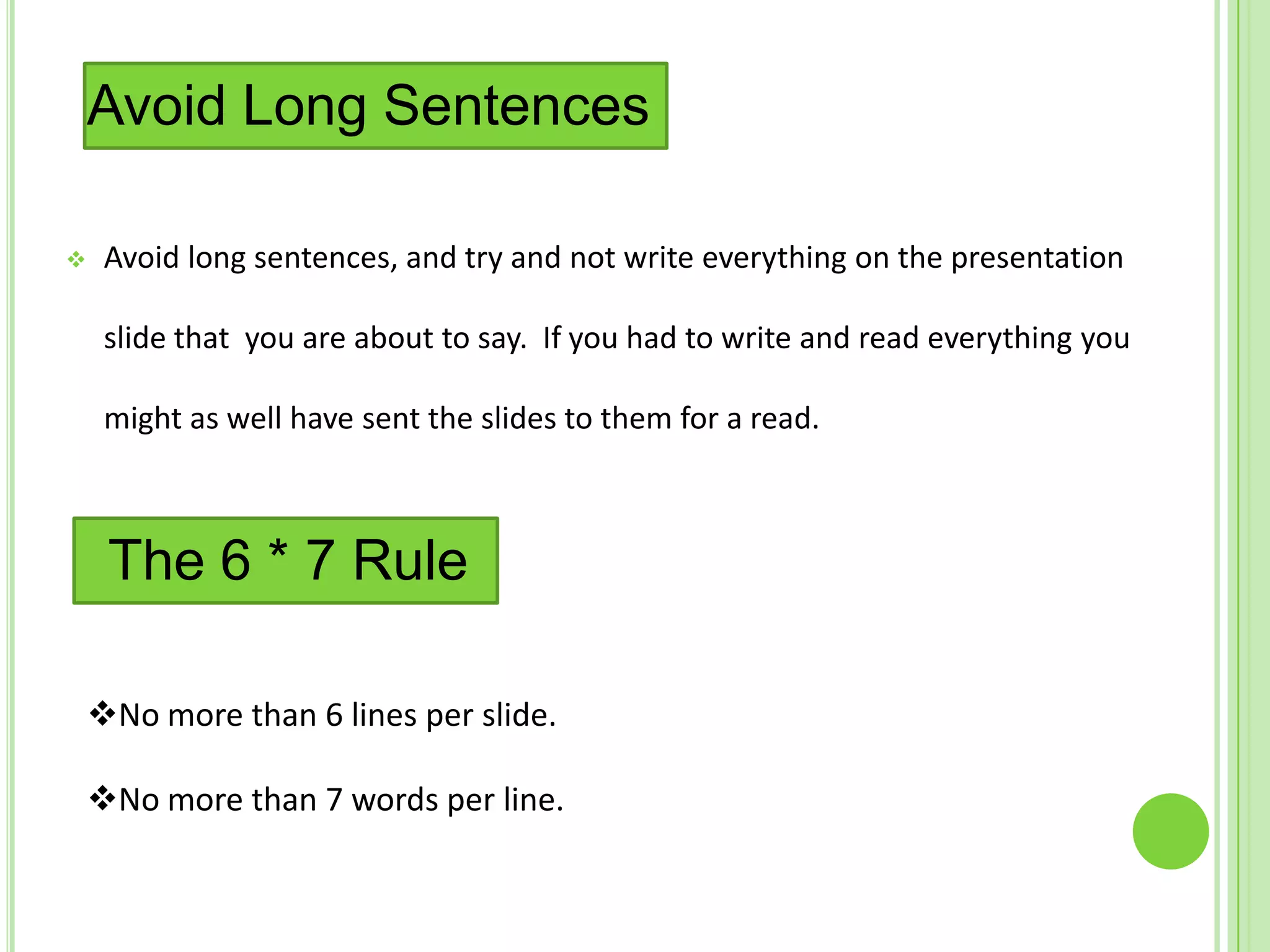
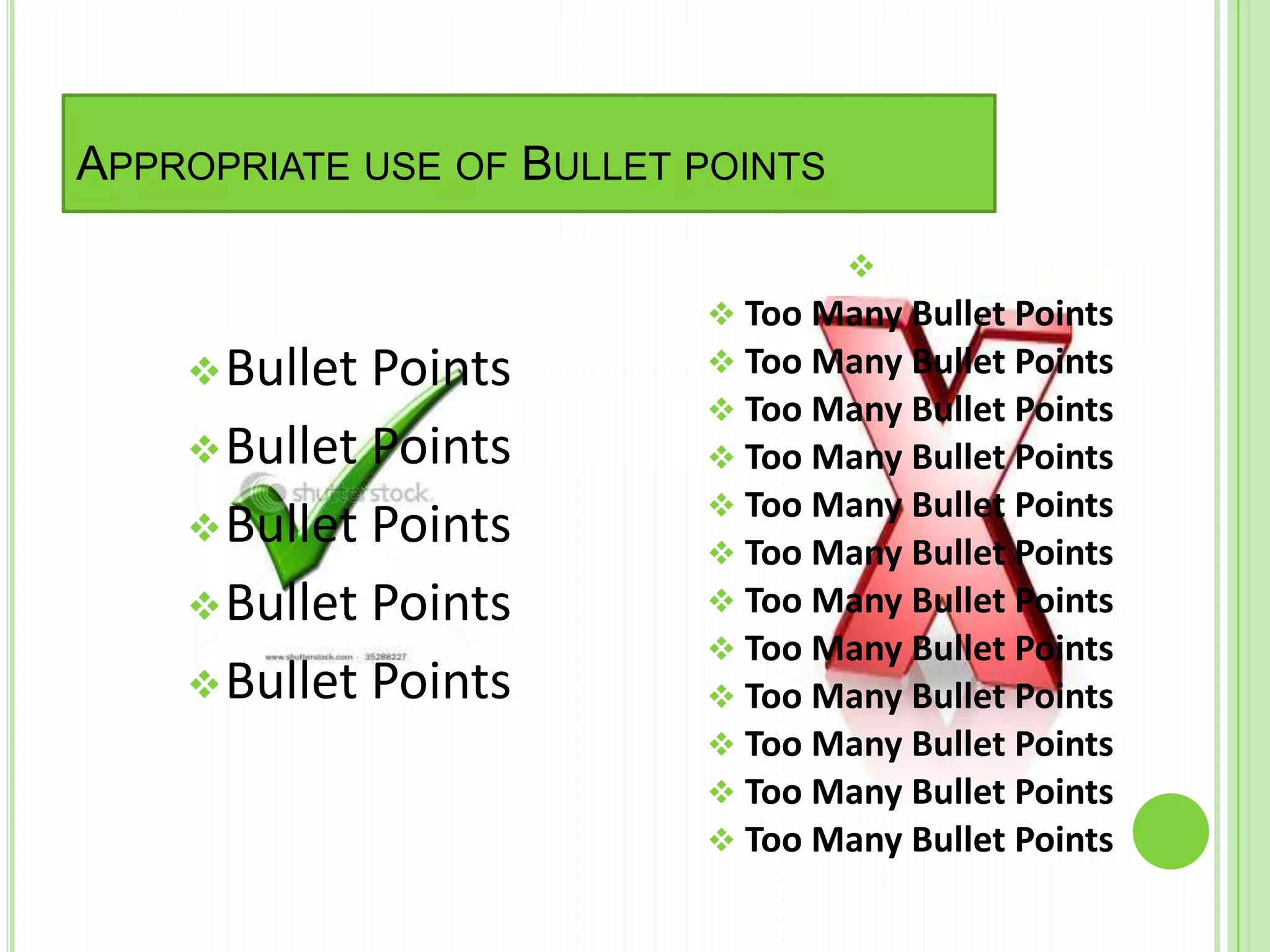
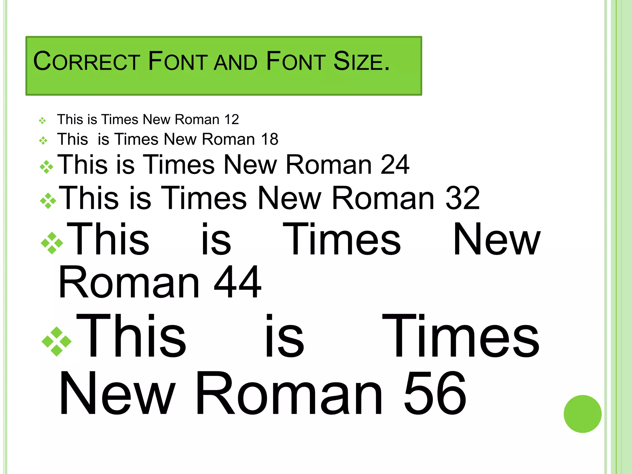
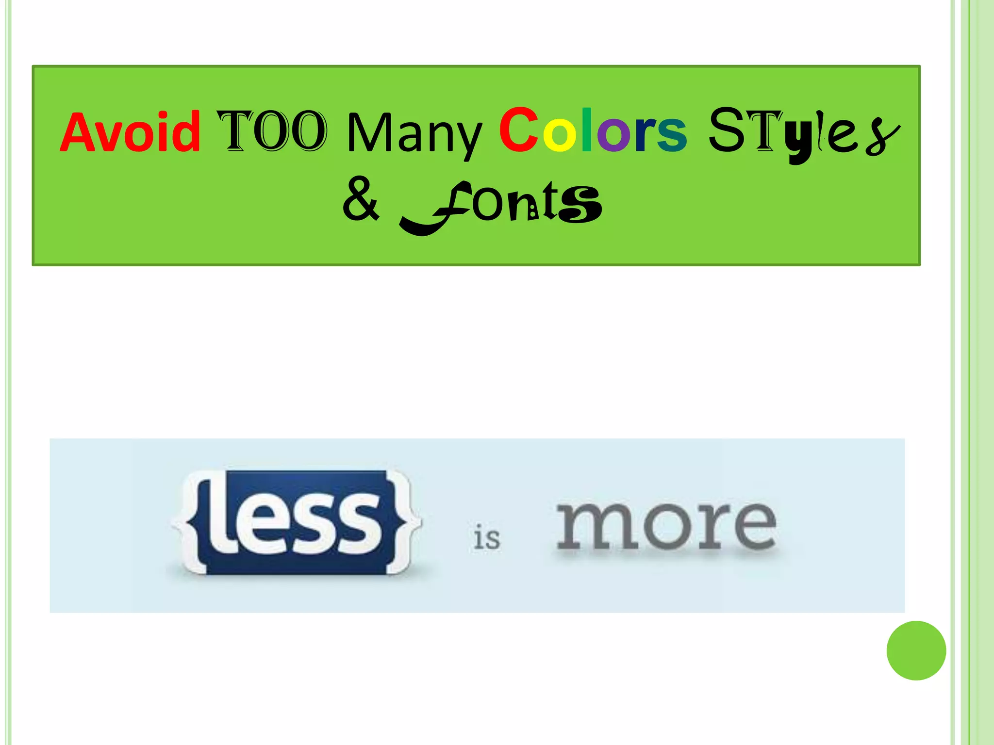
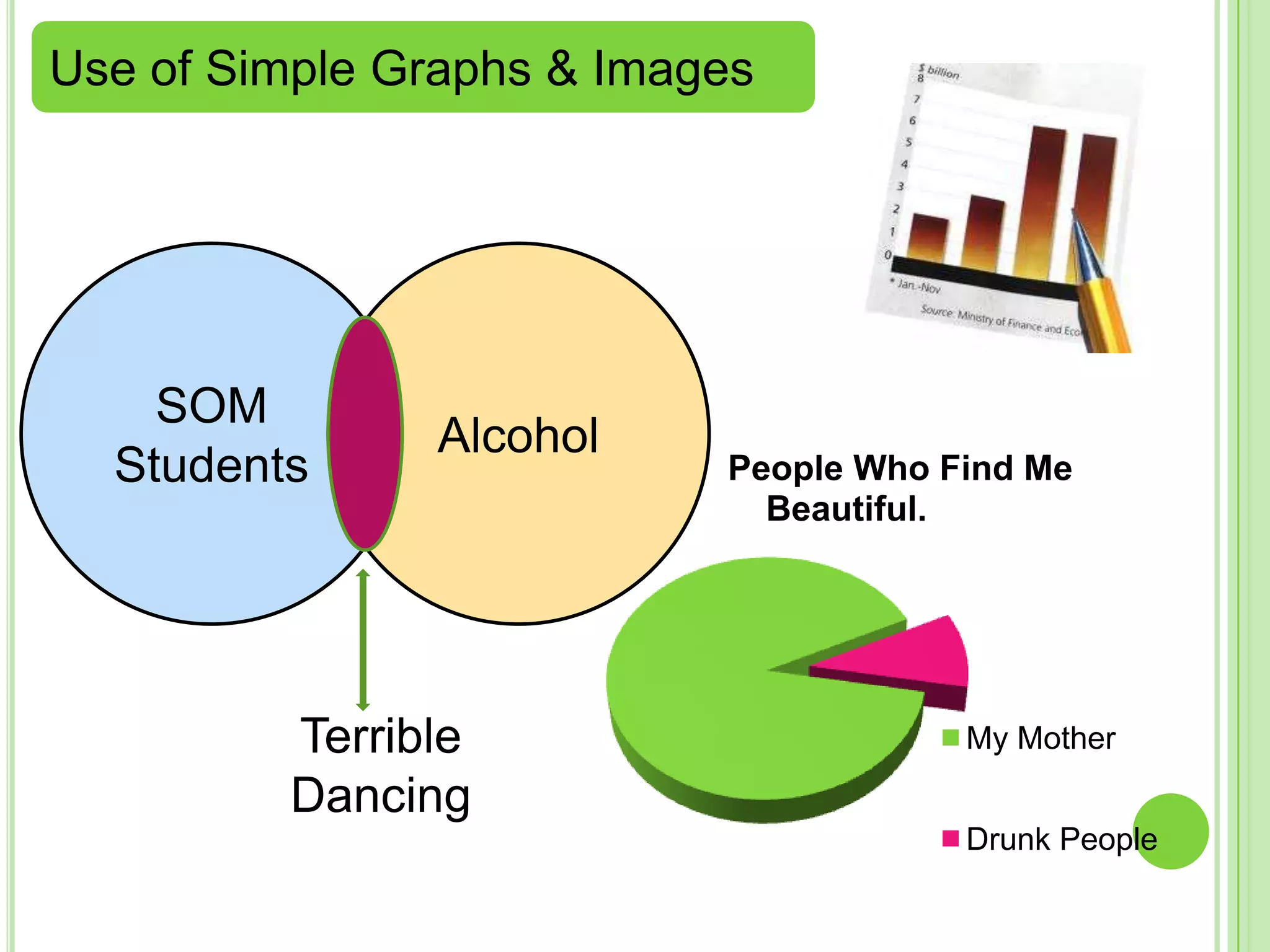

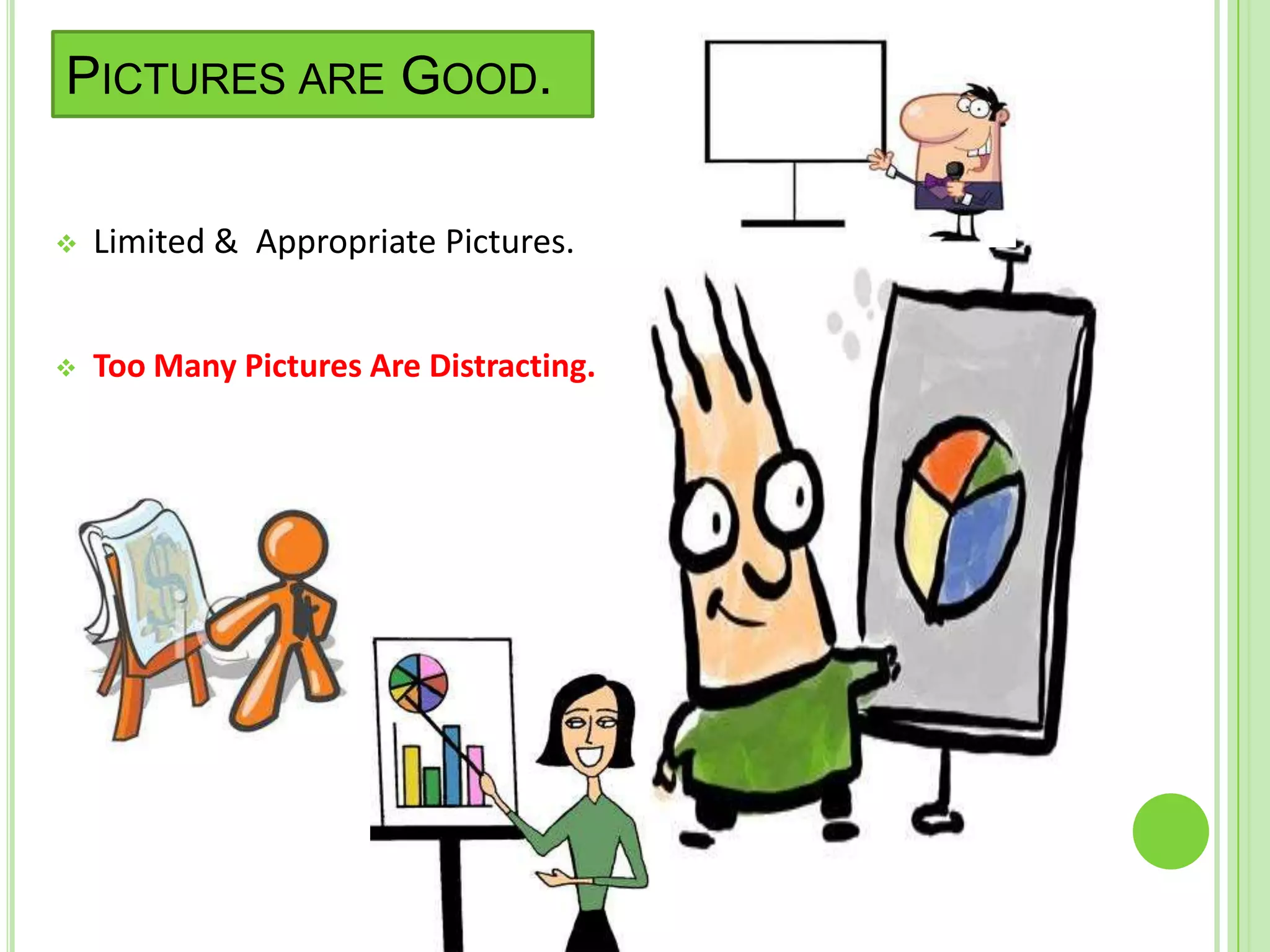
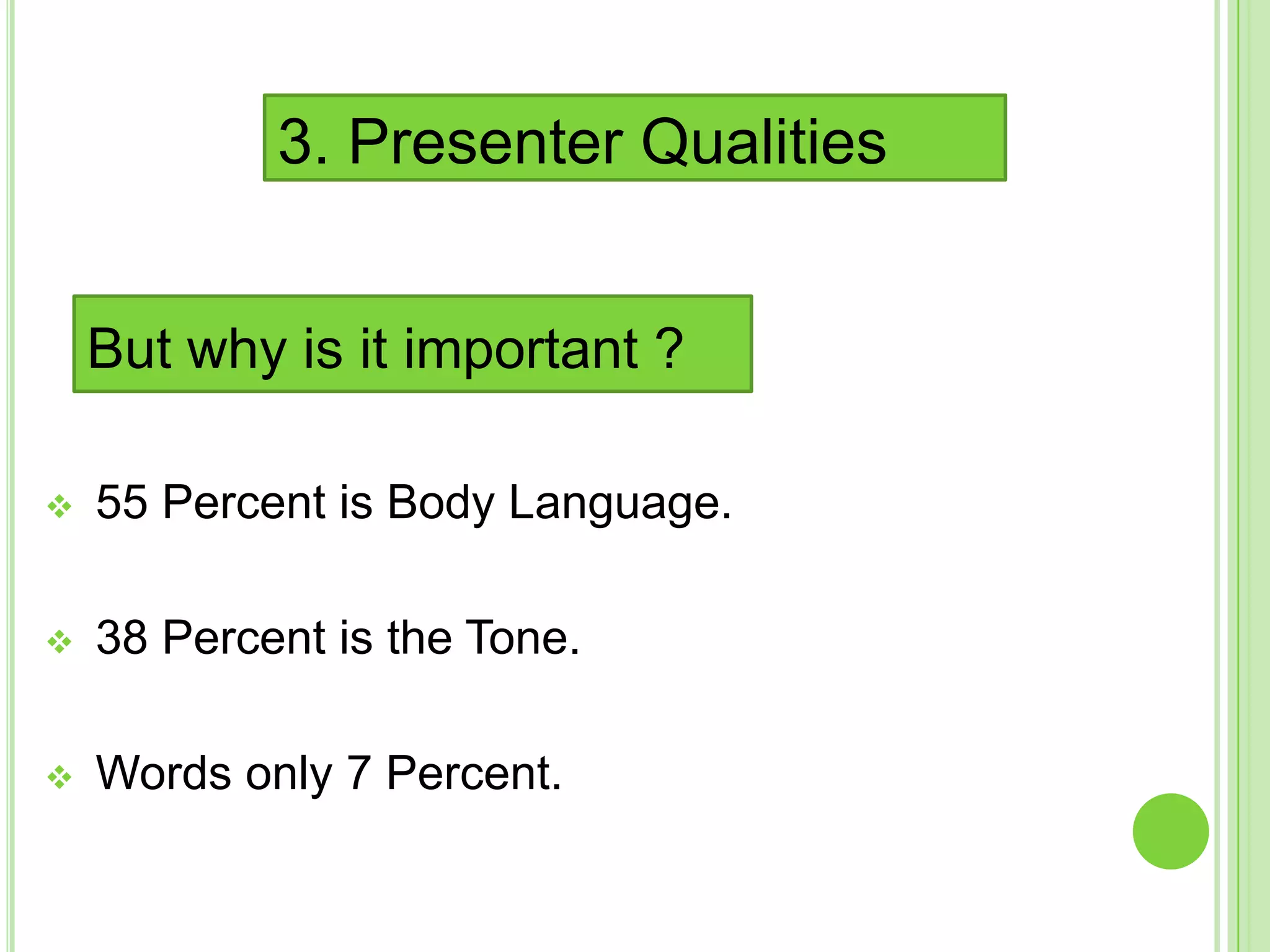
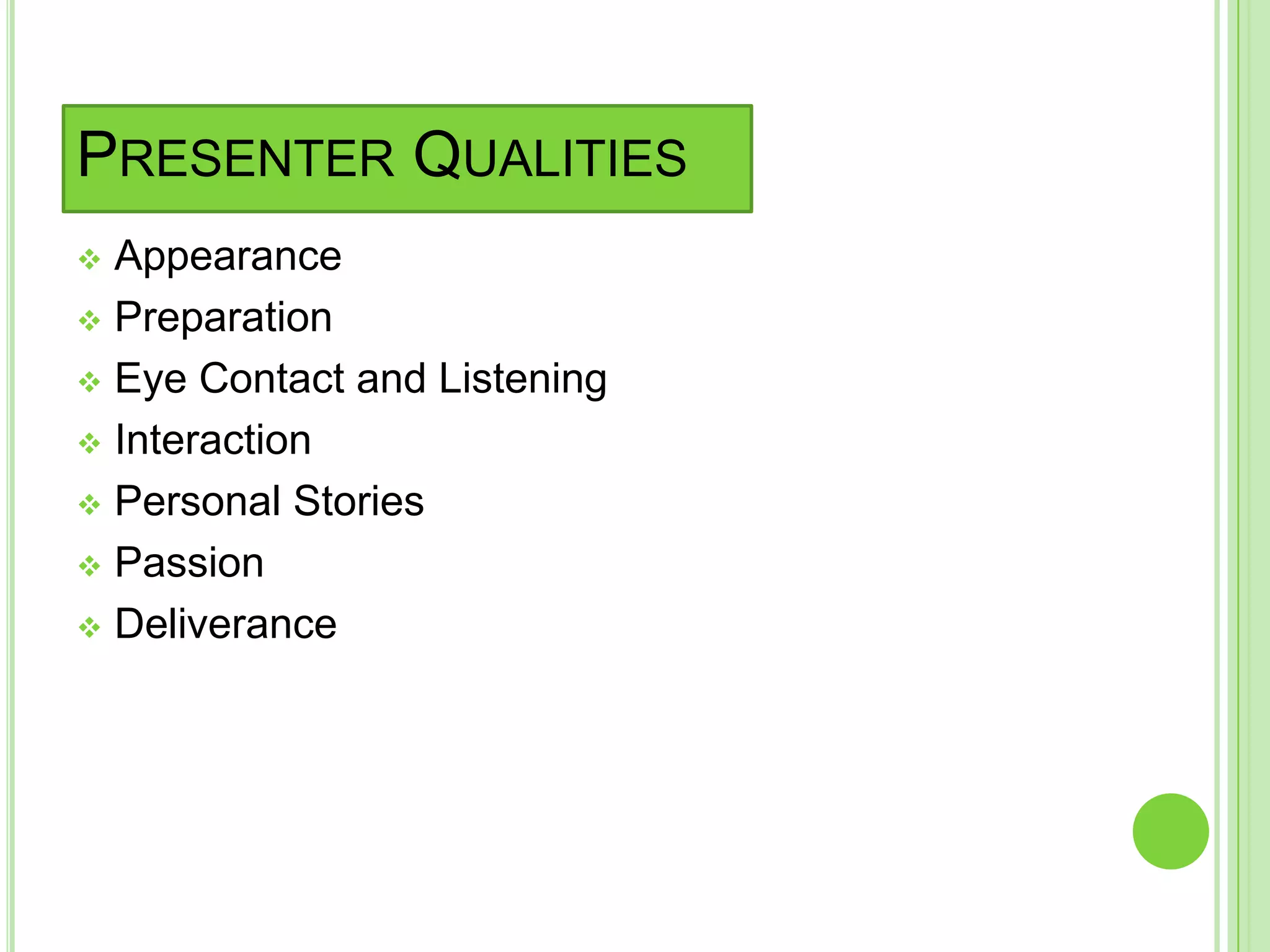
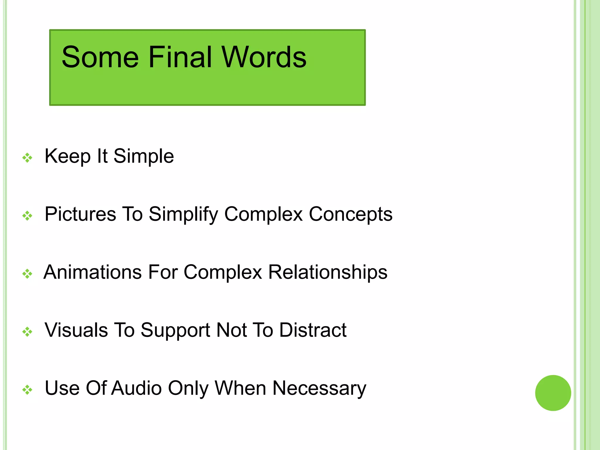

The document provides tips for an effective PowerPoint presentation. It recommends keeping slide design simple with color contrast and limited text. Bullet points should be used wherever possible. Appropriate fonts and font sizes are important, as are limited but relevant images and graphs. The presenter qualities like appearance, eye contact, passion and delivery are more important than the words alone, as body language and tone account for over 90% of the message. The overall message is to keep presentations simple and visuals supporting rather than distracting.


![Interview etiquettes [final]](https://cdn.slidesharecdn.com/ss_thumbnails/interviewetiquettesfinal-130306064517-phpapp02-thumbnail.jpg?width=640&height=640&fit=bounds)