Downloaded 172 times

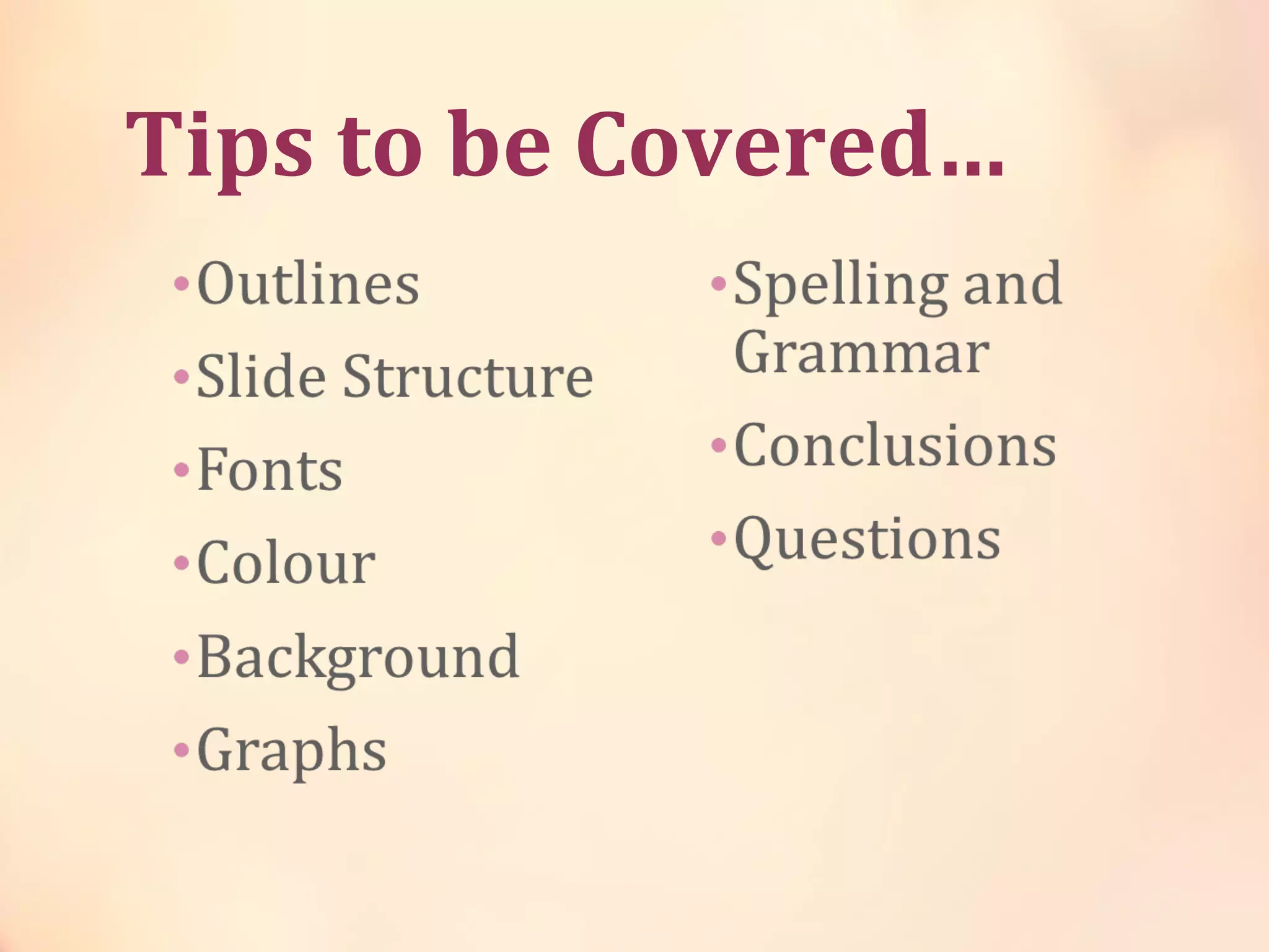
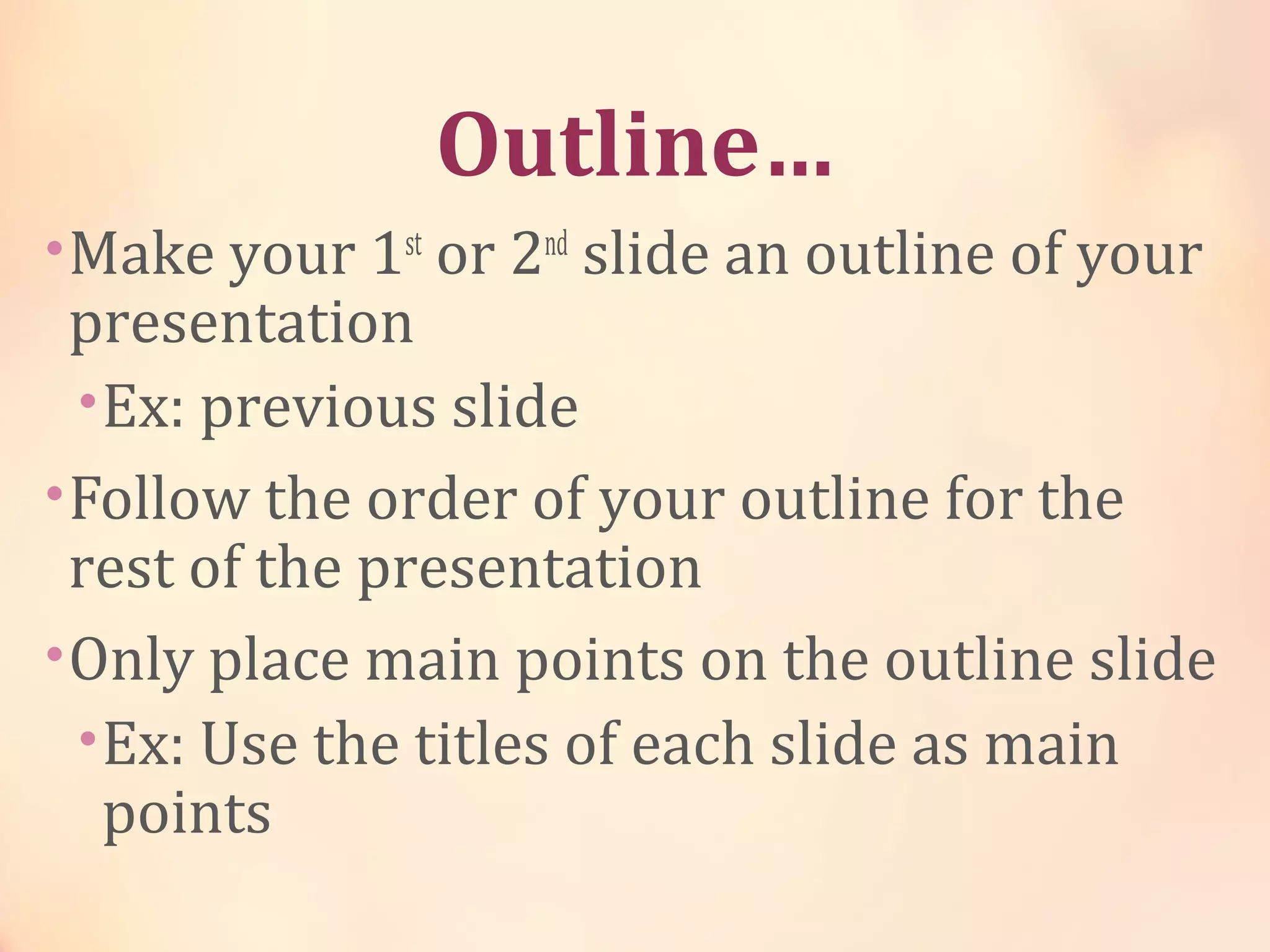
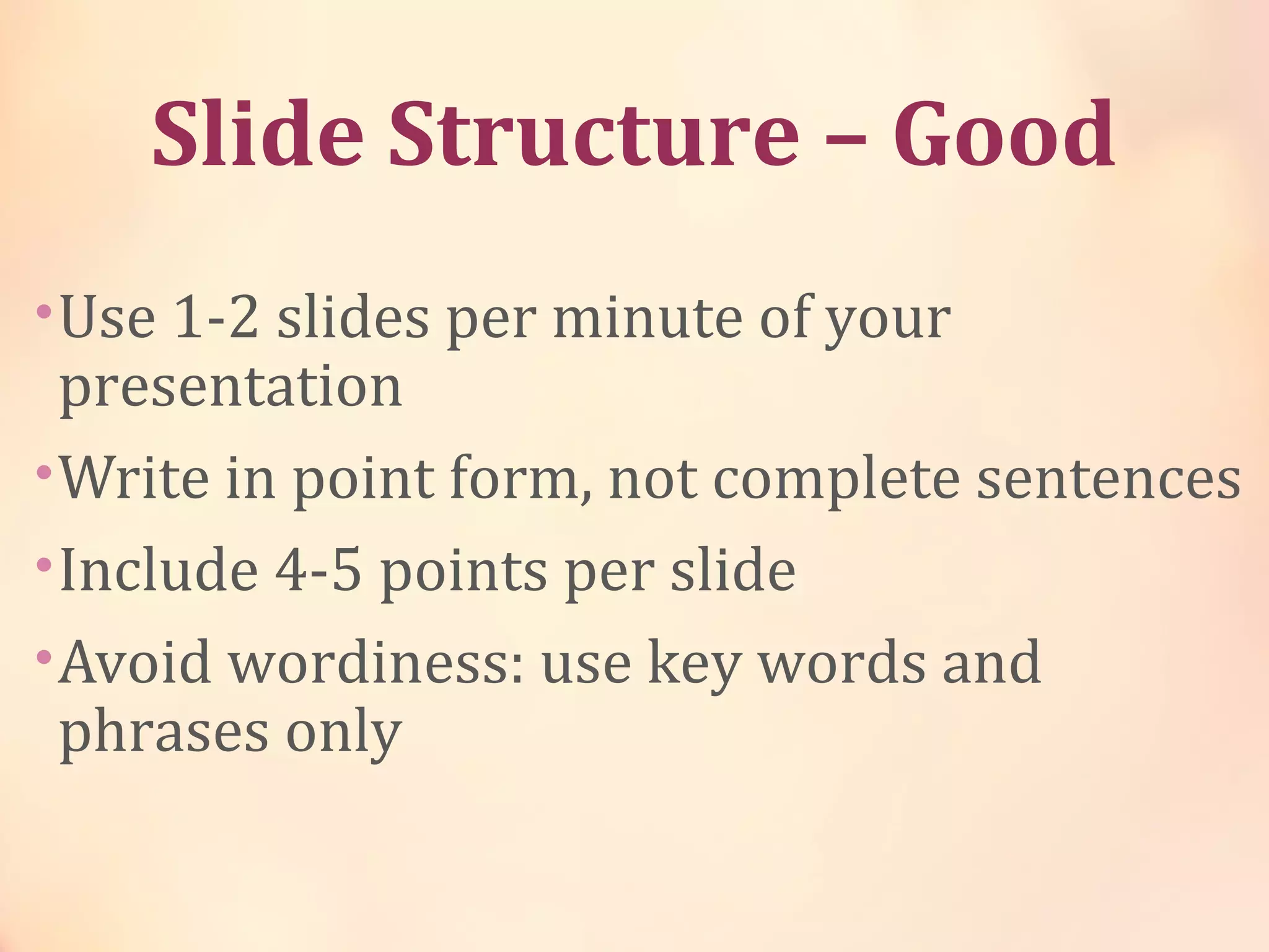

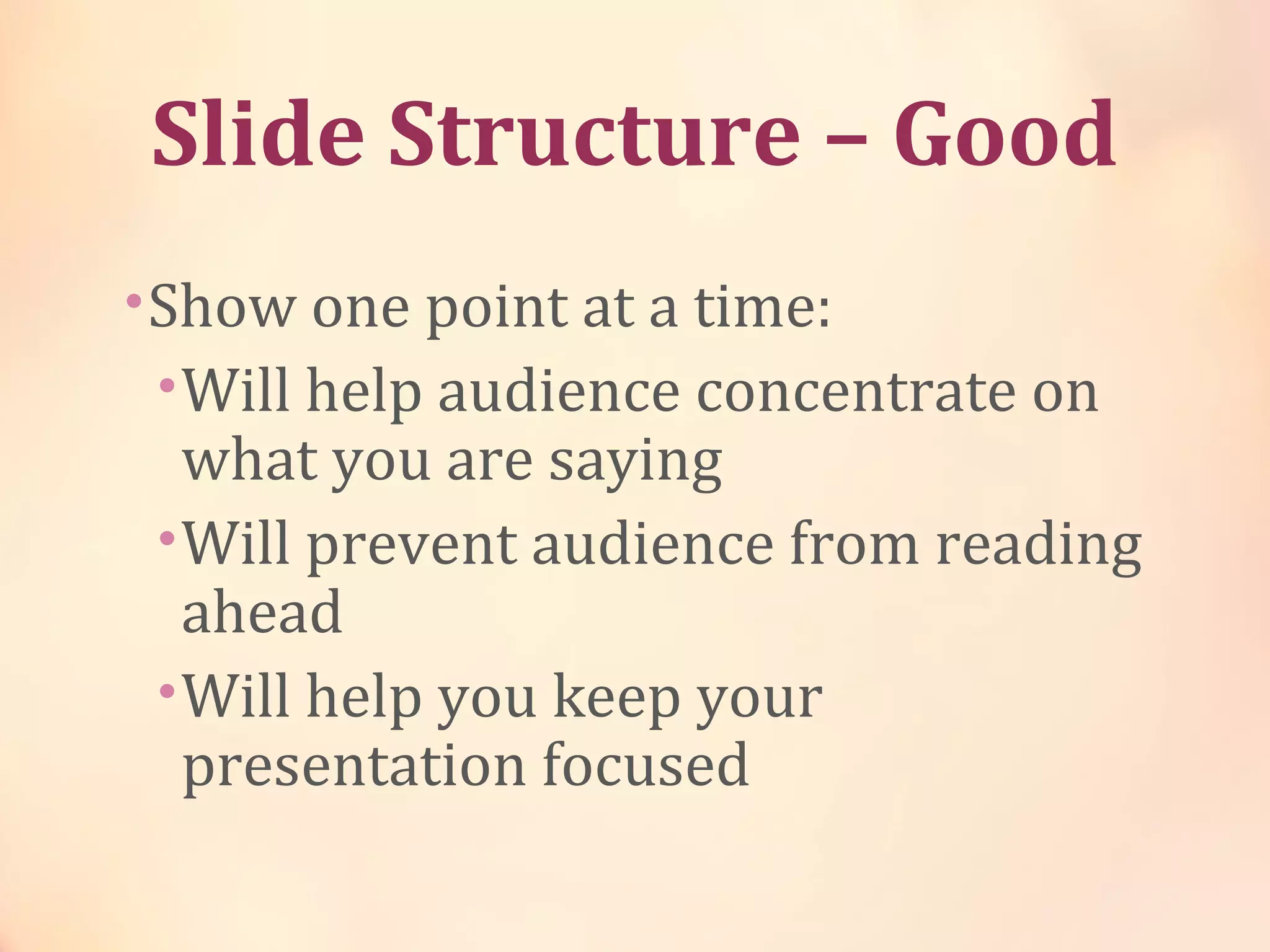
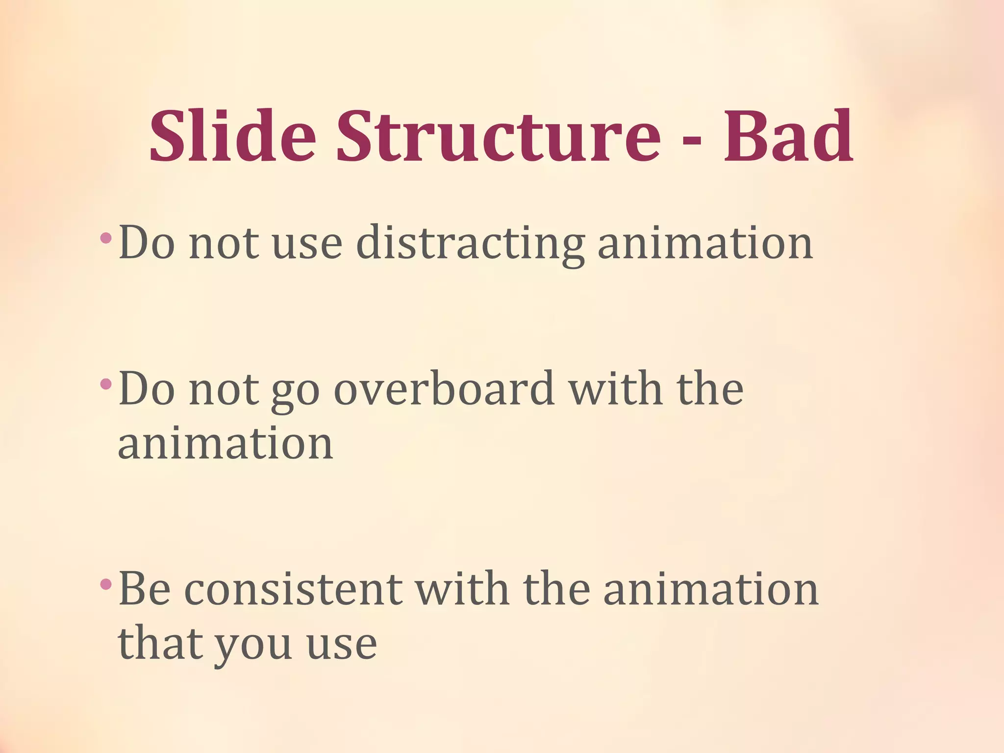
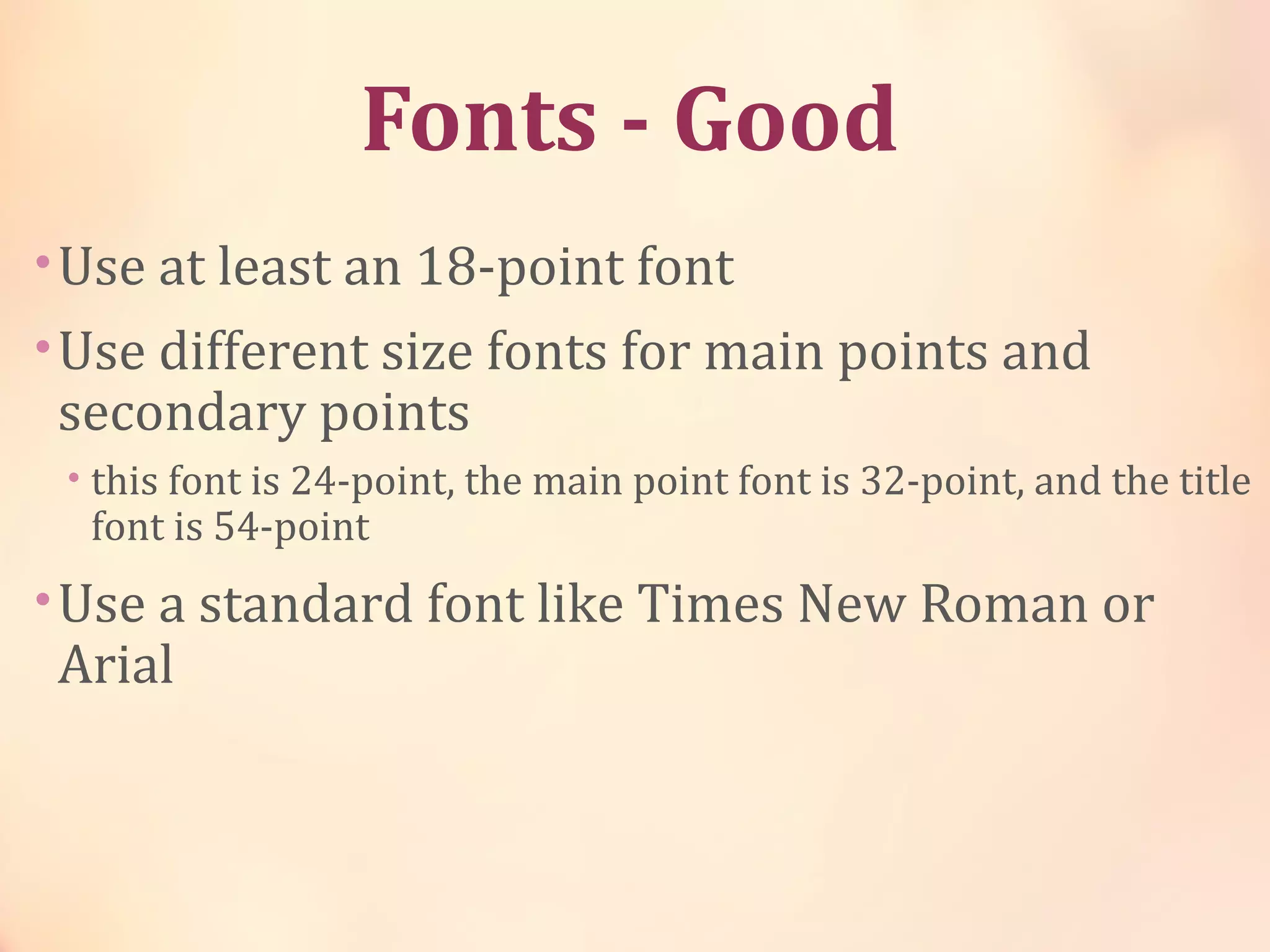
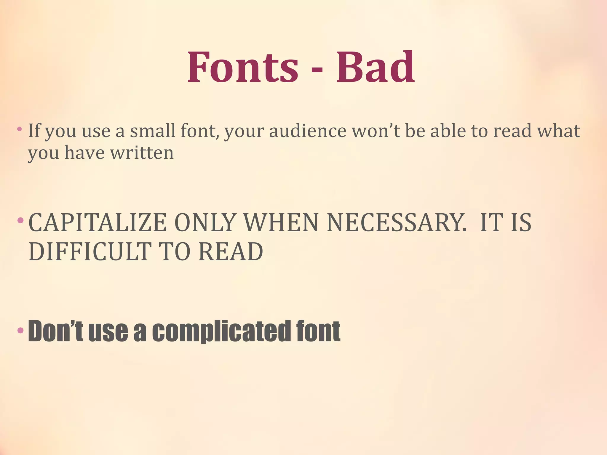
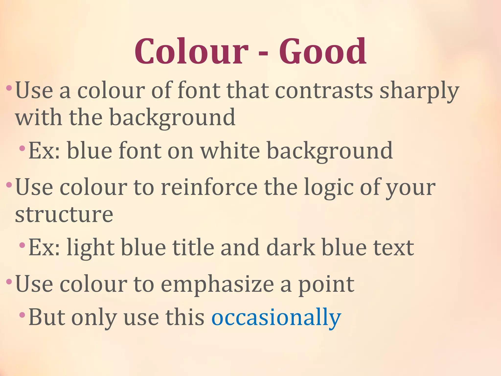
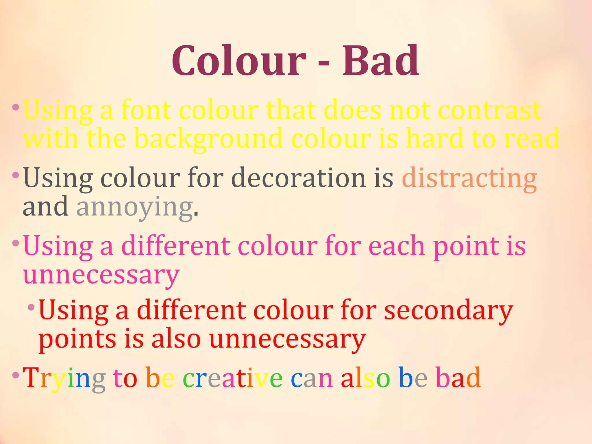
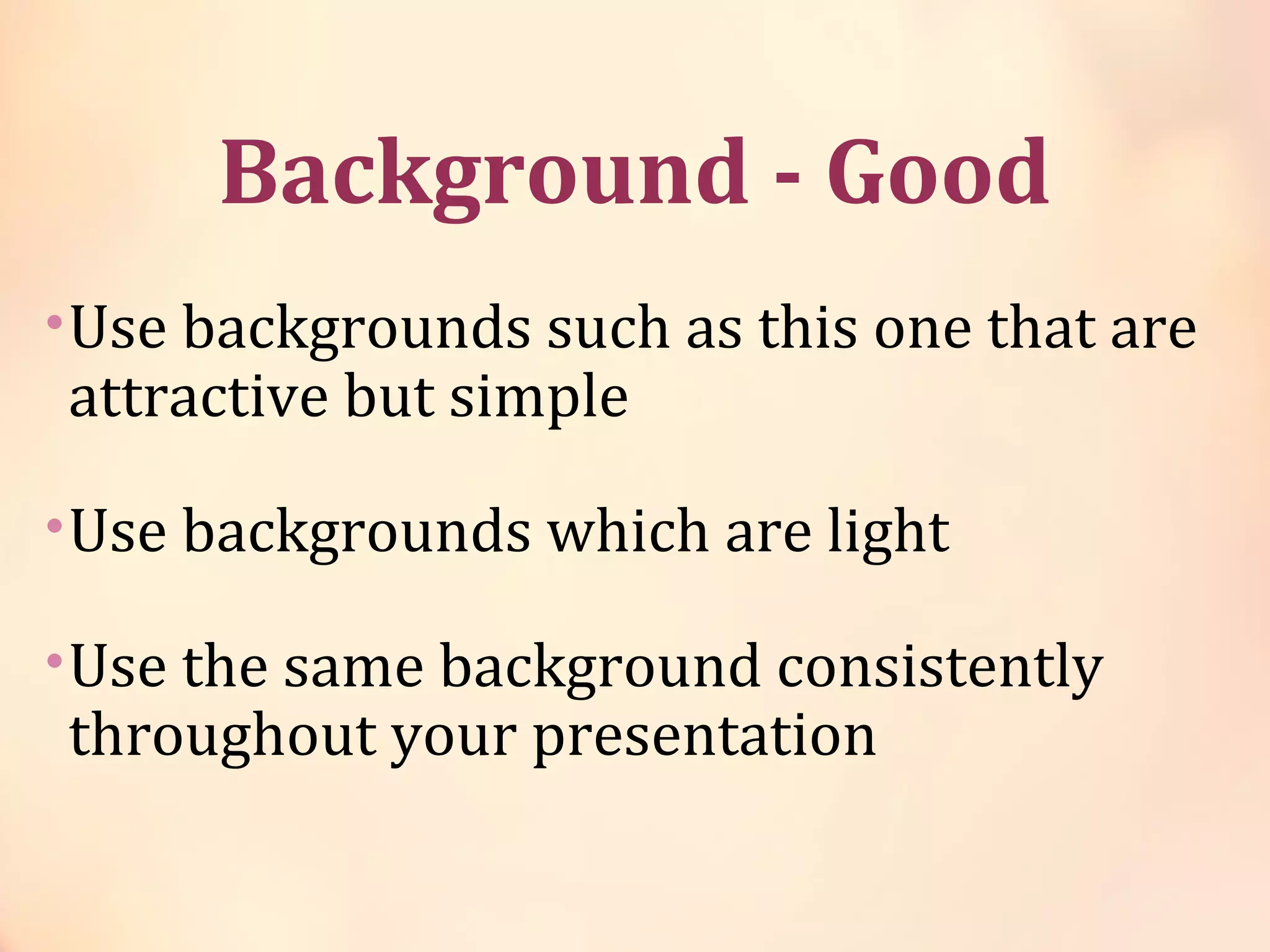
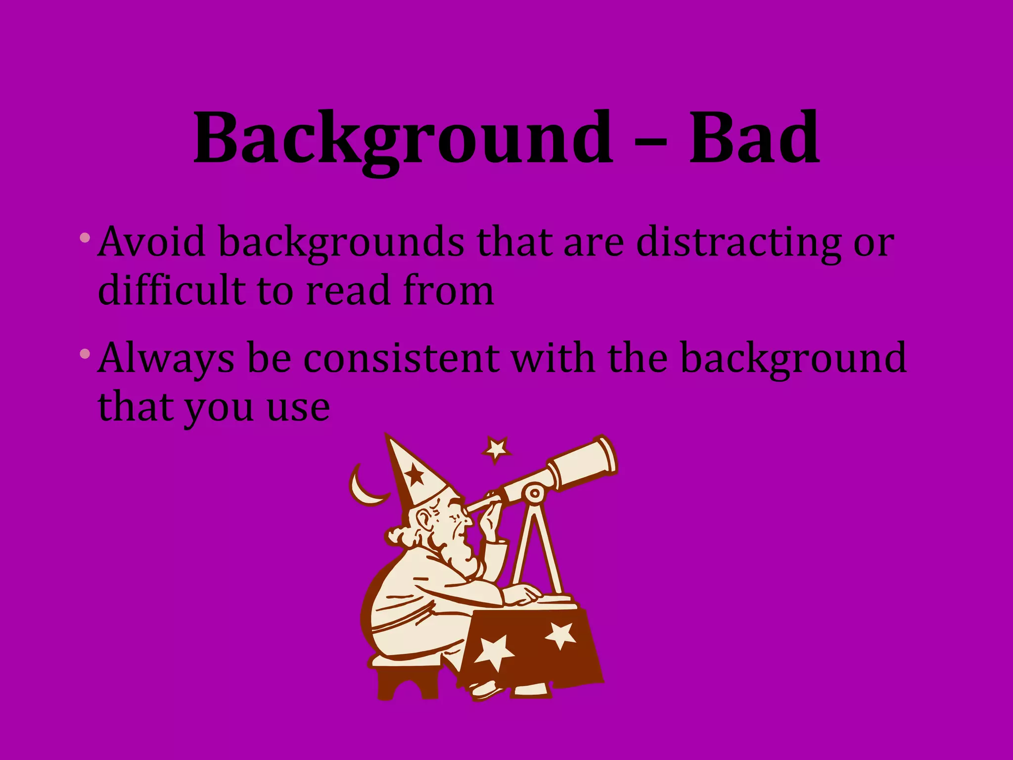
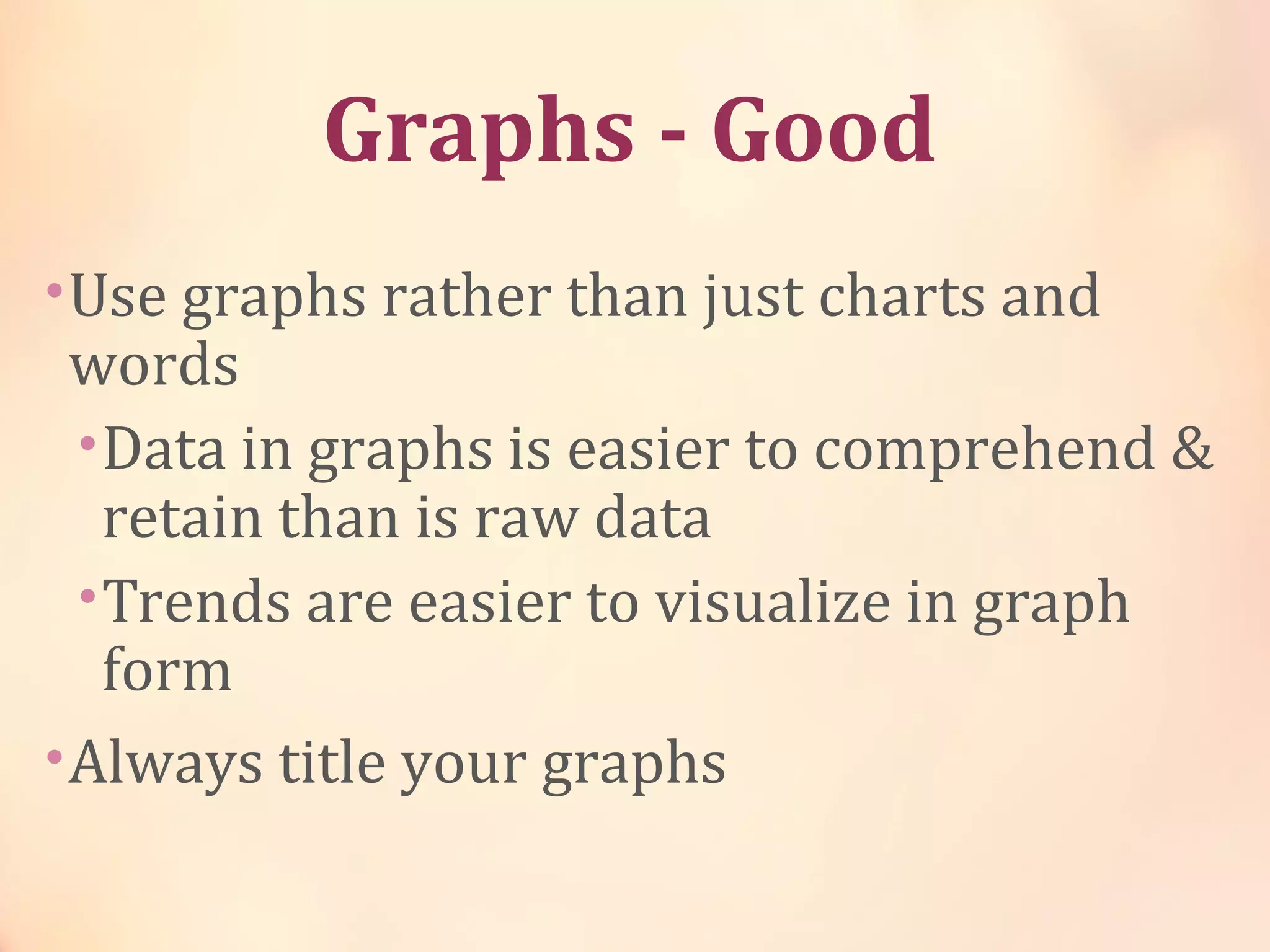


This document provides guidelines for creating effective PowerPoint presentations with 3 or fewer bullet points per slide, use of clear fonts and colors, inclusion of informative graphs, and balance of text and graphics. Key recommendations include using an outline slide to structure the presentation, writing in point form rather than sentences, employing consistent backgrounds and fonts, proofreading for errors, and closing with a summary and question slide.