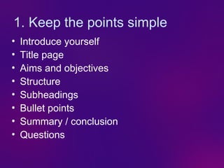
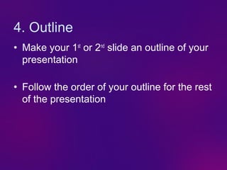
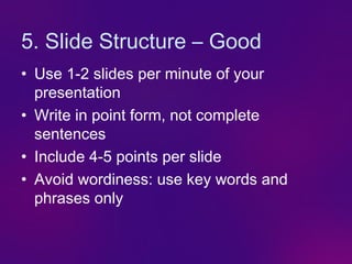
6. 4. Outline
• Make your 1st or 2nd slide an outline of your
presentation
• Follow the order of your outline for the rest
of the presentation
7. 5. Slide Structure – Good
• Use 1-2 slides per minute of your
presentation
• Write in point form, not complete
sentences
• Include 4-5 points per slide
• Avoid wordiness: use key words and
phrases only
8. Slide Structure - Bad
• This page contains too many words for a
presentation slide. It is not written in point form,
making it difficult both for your audience to read
and for you to present each point. Although
there are exactly the same number of points on
this slide as the previous slide, it looks much
more complicated. In short, your audience will
spend too much time trying to read this
paragraph instead of listening to you.
9. Slide Structure – Good
• Show one point at a time:
– Will help audience concentrate on what you
are saying
– Will prevent audience from reading ahead
– Will help you keep your presentation focused
10. 6. Keep the background simple
• Keeps a clear, clean design
11. 6. Keep the background simple
Keeps a clear, clean design
Avoids distractions
12. 6. Keep the background simple
• Keeps a clear, clean design
• Avoids distractions
• Allows good contrast
13. 6. Keep the background simple
• Keeps a clear, clean design
• Avoids distractions
• Allows good contrast
• Prevents confusion
14. 6. Keep the background simple
• Keeps a clear, clean design
• Avoids distractions
• Allows good contrast
• Prevents confusion
• Avoid PowerPoint’s own templates
15. Background – Bad
• Avoid backgrounds that are distracting or
difficult to read from
• Always be consistent with the background
that you use
16. 7. Keep the text clear
18 point
• 24 pt minimum
20 point
• 36-44 pt for heading 24 point
• Contrast colours
28 point
36 point
40 point
44 point
17. Contrast colours
Good Bad Bad Good
Bad Good Good Bad
Good Bad Bad Good
Bad Good Good Bad
18. 7. Keep the text clear
• 24 point minimum
• 40-44 for heading
• Contrast colours
• Don’t use black on white
19. 7. Keep the text clear
• 24 point minimum
• 40-44 for heading
• Contrast colours
• Don’t use black on white
20. 7. Keep the text clear
• 24 point minimum
• 40-44 for heading
• Contrast colours
• Don’t use black on white
21. 7. Keep the text clear
• 24 point minimum
• 40-44 for heading
• Contrast colours
• Don’t use black on white
22. 7. Keep the text clear
• Use a standard font like Times New
Roman or Arial
23. 7. Keep the text clear
• Using a font colour that does not contrast
with the background colour is hard to
read
• Using colour for decoration is distracting
and annoying.
• Using a different colour for each point is
unnecessary
– Using a different colour for secondary points
is also unnecessary
• Trying to be creative can also be bad
24. Fonts - Bad
• If you use a small font, your audience won’t be able to read what you have written
• CAPITALIZE ONLY WHEN NECESSARY. IT IS
DIFFICULT TO READ & IT LOOKS LIKE
YOU’RE SHOUTING!…
• Don’t use a complicated font
(including “serif” fonts) - like THIS
25. 8. Always have a good picture
• Photographs are fantastic
• Cartoons are fun (… sometimes!)
• Diagrams are
useful
• No picture? Then why have a slide?
28. 9. Animate quickly and simply
• Avoid transitions
• For text use:
– Appear
– Fly, from left/right/bottom (very fast)
– Fade (very fast)
29. 9. Animate quickly and simply
• For graphics use:
Appear Fly Dissolve in
30. 9. Animate quickly and simply
• Nothing fancy
It will only end up
REALLY ANNOYING
your poor audience.
• Keep it quick
Or you try to read or recognise it before it has
fully developed!
31. 10. Spelling and grammar
• Spellcheck!
• Proof your slides for:
– speling mistakes
– The the use of of repeated words
– grammatical errors you might have make
• If English is not your first language,
please get someone else to check your
presentation!
32. 11. Never just read out the slide
word for word!!
This is THE thing that annoys more people
about PowerPoint presentations than
anything else.
It is BORING!
Keep something back!
33. 12. Be very careful with sound
• No whooshes
• No chimes
• No lasers
• No typewriters
34. 12. Be very careful with sound
Great for learning languages…
French Français
Hello Bonjour
Goodbye Au revoir
Thank you Merci
…or adding a bit of realism!
35. 13. (Don’t) give out great
handouts
• Save until last
• Send to Word
• People will listen!
36. 14. Enjoy it!
Teaching and imparting knowledge and
experience is one of the fundamental
expectations of us as nurses within our
profession. (NMC, 2010)
Embrace it….
It’s fun!….
37. Conclusion
• Use an effective and strong closing
– Your audience is likely to remember your last
words
• Use a conclusion slide to:
– Summarize the main points of your
presentation
– Suggest future avenues of research
38. Questions??
• End your presentation with a simple
question slide to:
– Invite your audience to ask questions
– Provide a visual aid during question period
– Avoid ending a presentation abruptly
39. Thank you for your attention
“My PowerPoint presentation went so well,
I had it made into a tattoo!”
Editor's Notes
Explain that bottom three points say the same thing as the top point. Only quotes should be typed out in full (although a sound file would be better).
This is called the signalling principle – the title should explain the IDEA of the slide NOT just something like “Marketing Principles” or “Second Quarter Projections”.
Use B and W keys after first point to show how it works. Change to pen after graphics have come in. Ask the audience (as an example) whether they think what you see or what you hear is the most important in a PowerPoint presentation. Use line and gate numbers by each graphic to show how you could use a pen. Use slide number and enter to move to specific slides (remember to come back to this one – slide 20)
Explain that B&W is worst colour combination for people with Dyslexia. Pale colours can still be used effectively as next few slides show (slide 12 has a simple gradient if you want to make it a bit more interesting)
Remember not to click after cartoon – it comes in automatically Explain that you blank out the slideshow (see slide 20) to get attention back to you and just say stuff that was just going to be words anyway. Remember that words themselves can be a graphic (in boxes or explaining a particular point like in slides 9-10).
Read the first paragraph slowly and deliberately with your back to the audience – to make the point!
Just click to start French bit – the rest of the language bit comes in automatically.