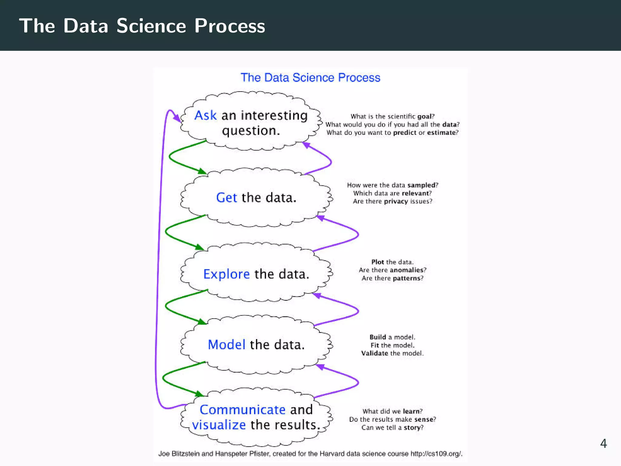
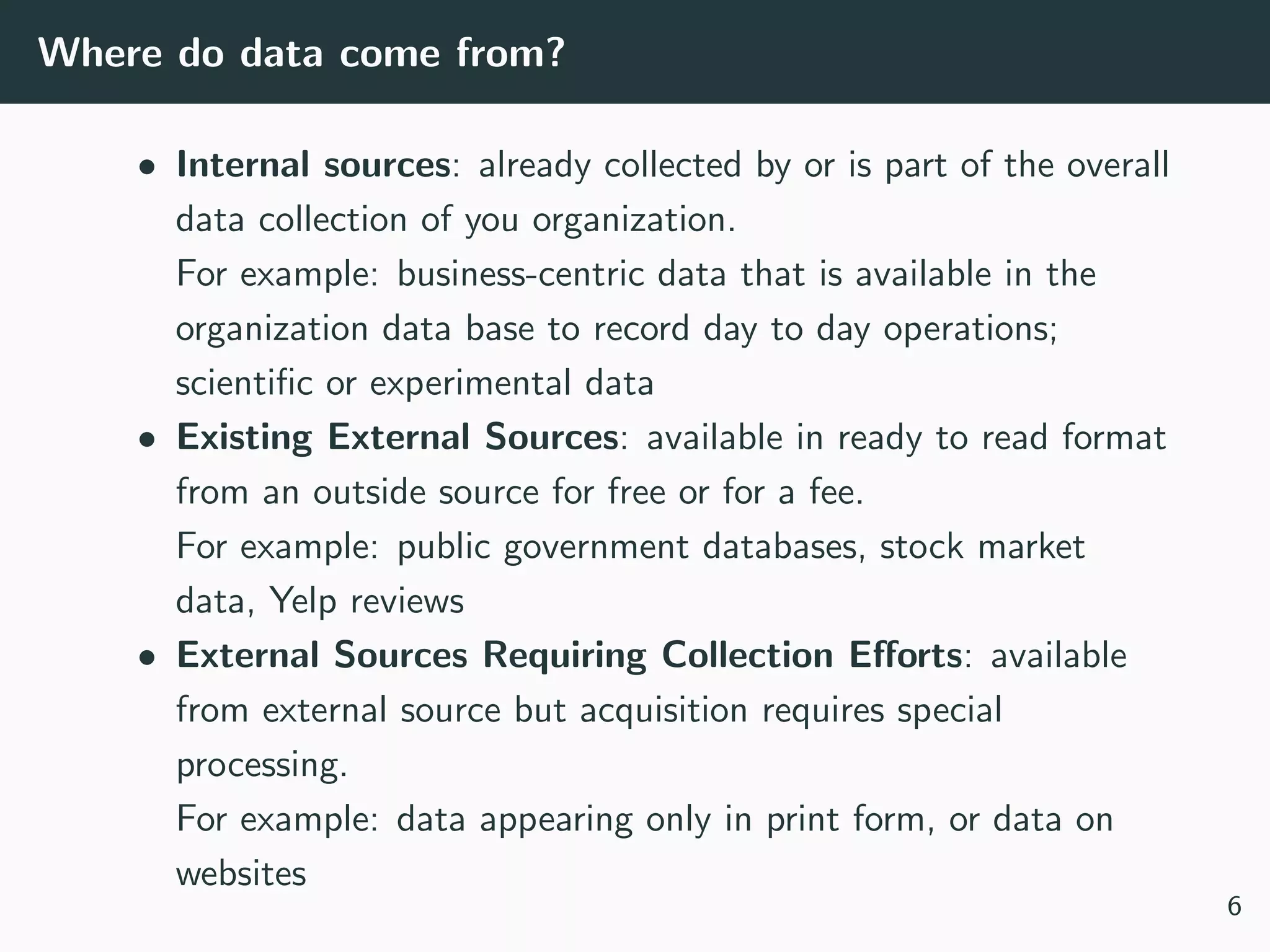
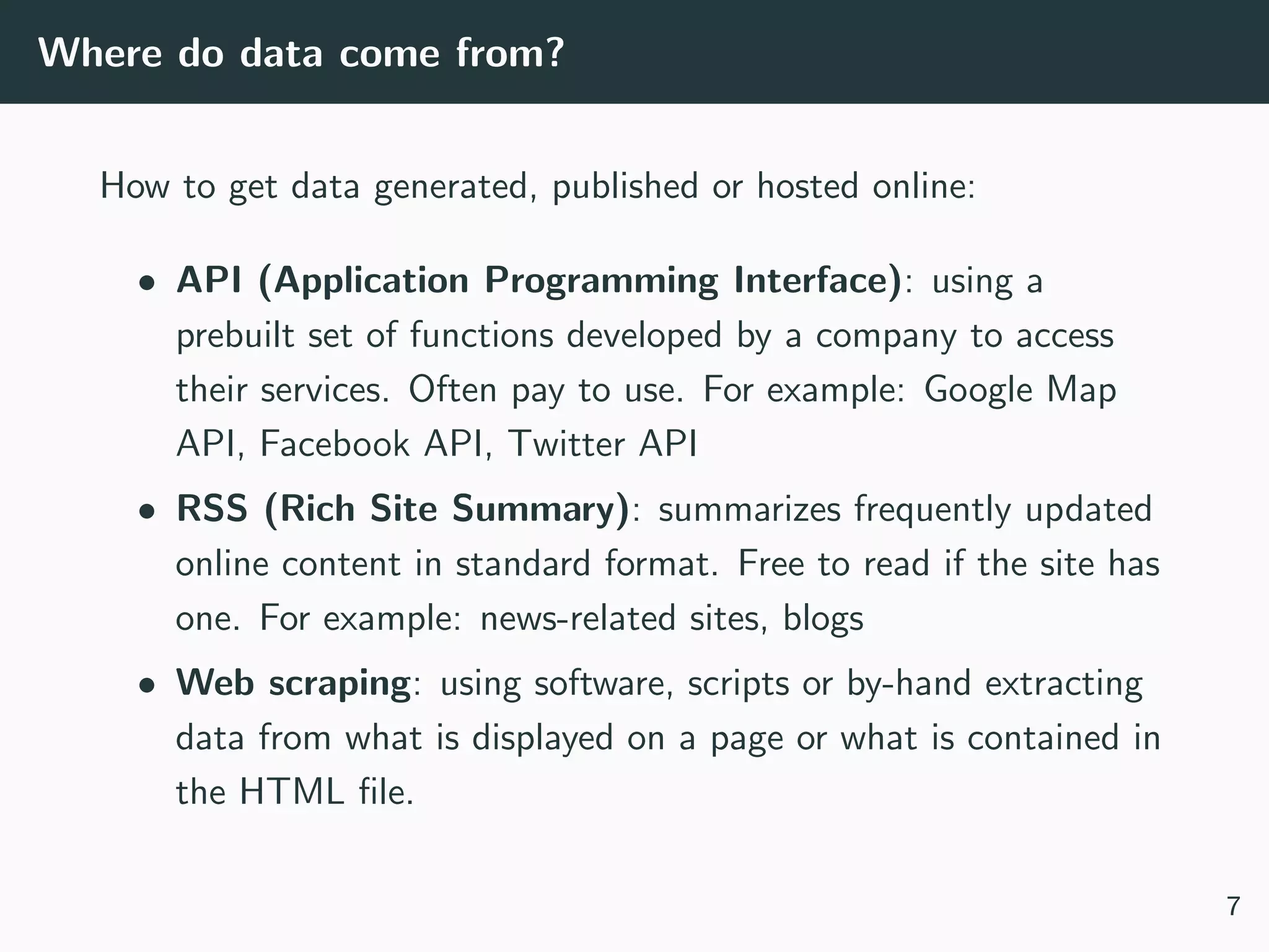
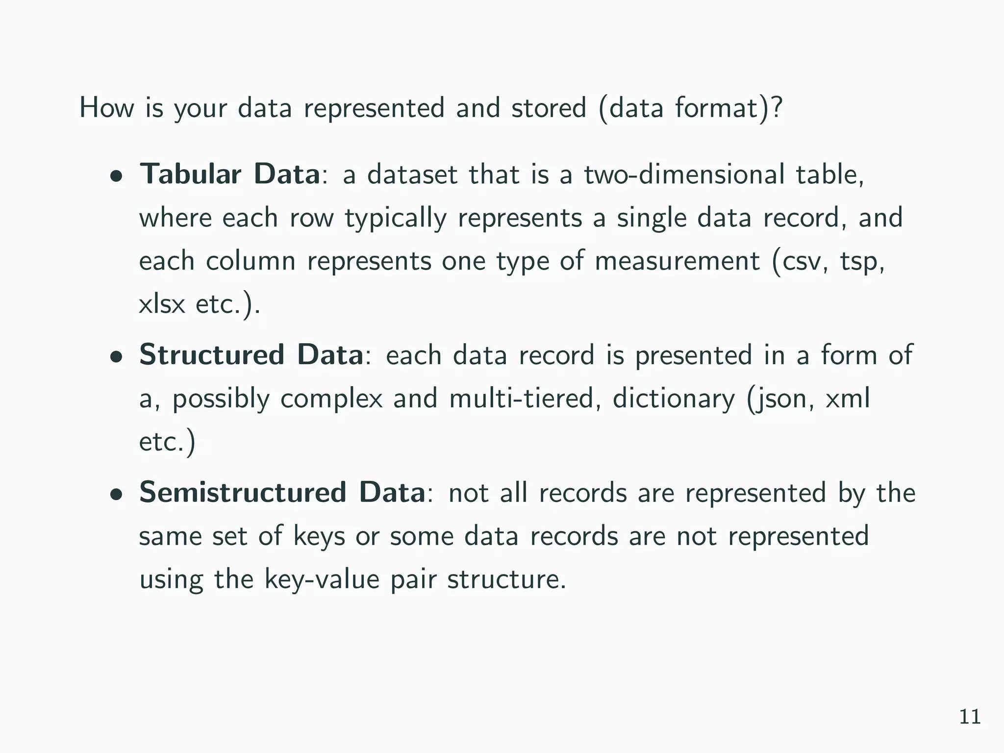
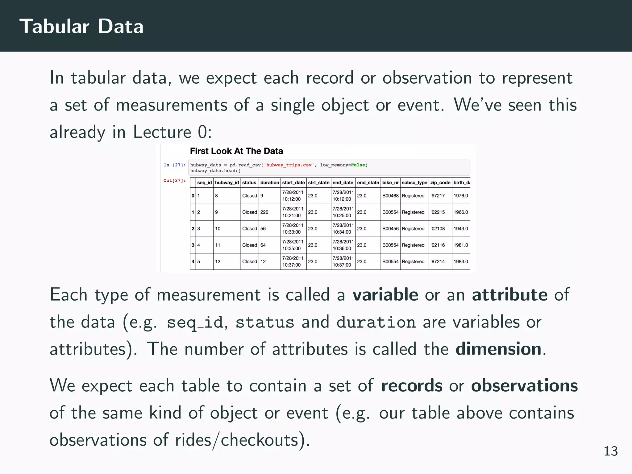
This document provides an overview of exploratory data analysis techniques. It discusses what data is, common sources of data, and different data types and formats. Key steps in exploratory data analysis are introduced, including descriptive statistics, visualizations, and handling messy data. Common measures used to describe central tendency and spread of data are defined. The importance of visualization for exploring relationships and patterns in data is emphasized. Examples of different visualizations are provided.


![Types of Data
What kind of values are in your data (data types)? Compound,
composed of a bunch of atomic types:
• Date and time: compound value with a specific structure
• Lists: a list is a sequence of values
• Dictionaries: A dictionary is a collection of key-value pairs, a
pair of values x : y where x is usually a string called key
representing the “name” of the value, and y is a value of any
type.
Example: Student record
• First: Kevin
• Last: Rader
• Classes: [CS109A, STAT121A, AC209A, STAT139]
10](https://image.slidesharecdn.com/lecture1eda-180918072710/75/EDA-11-2048.jpg)


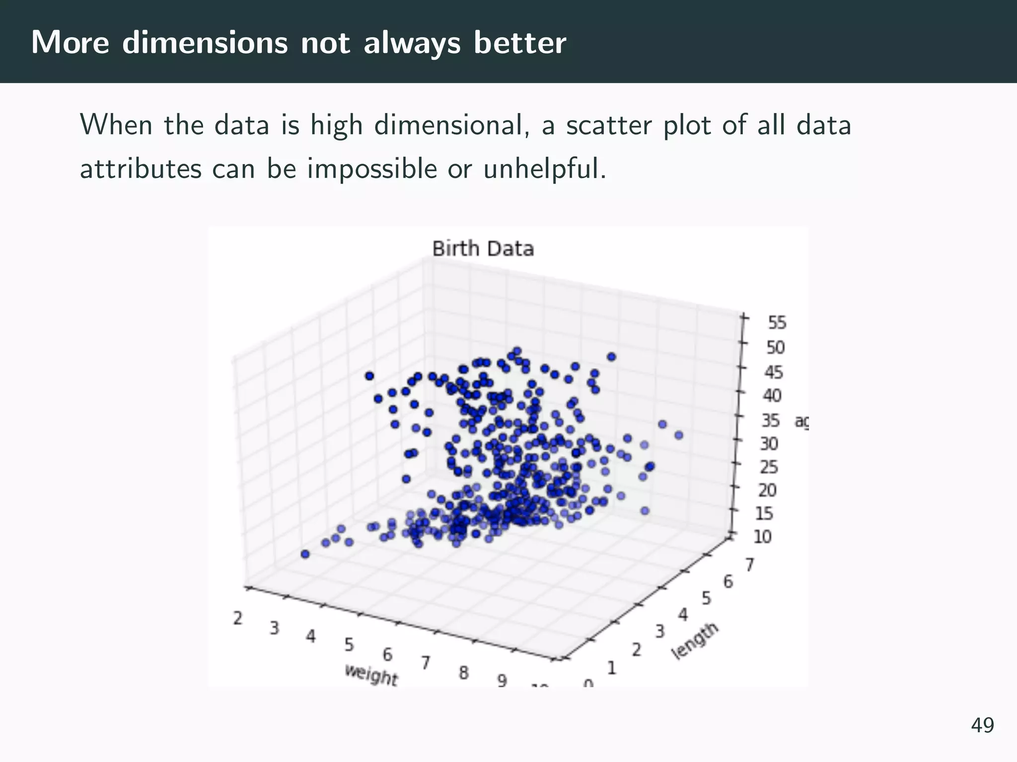
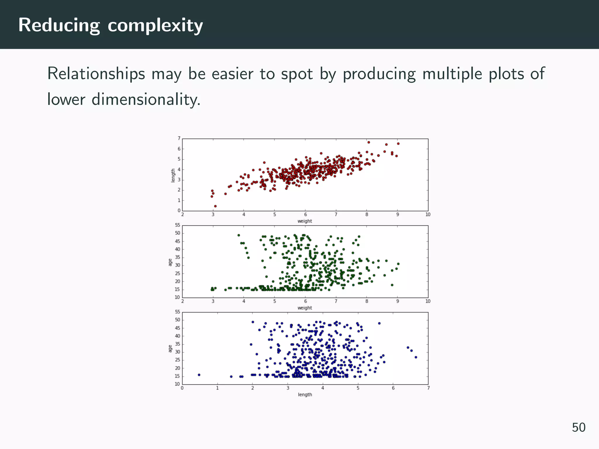
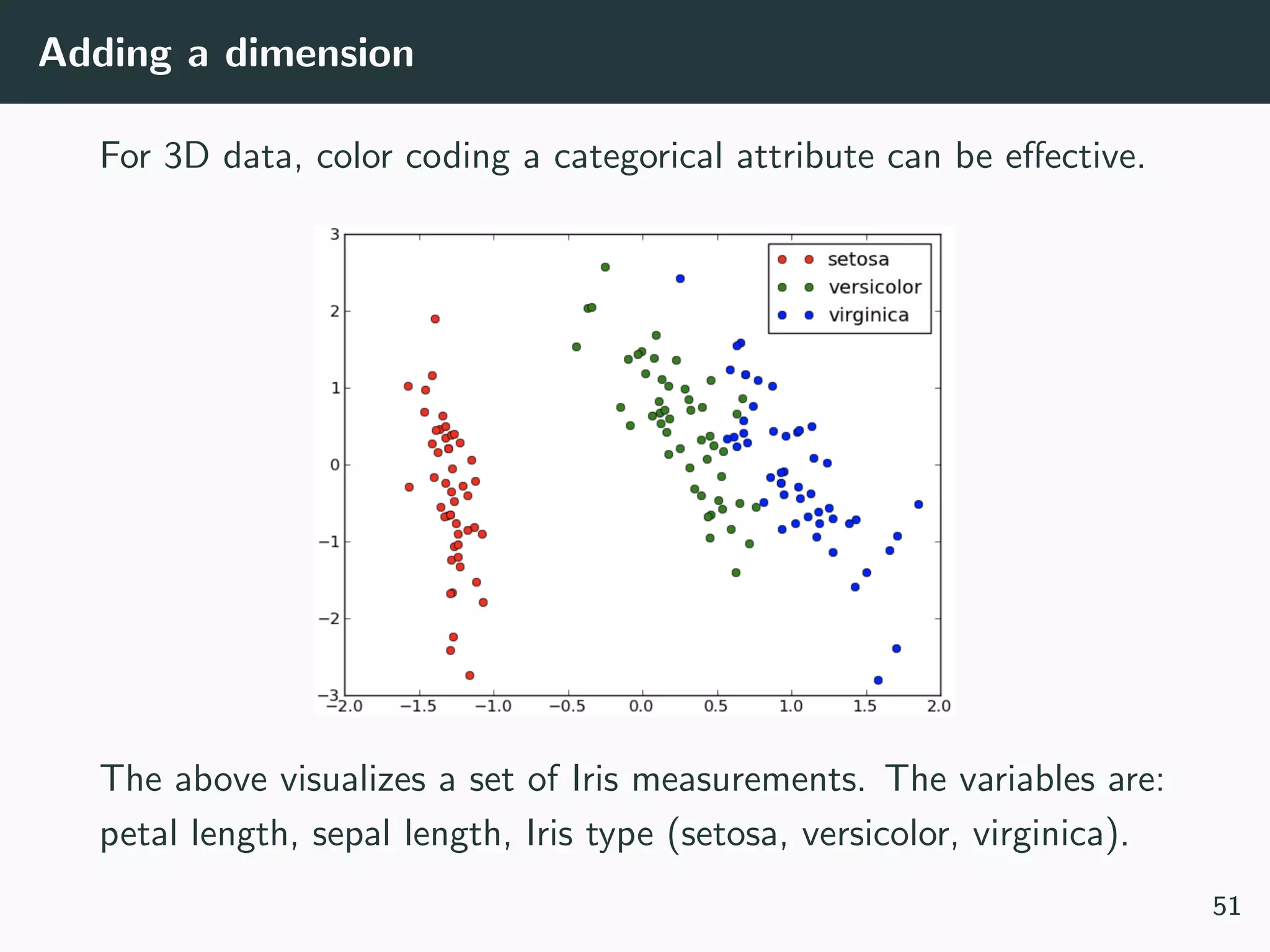
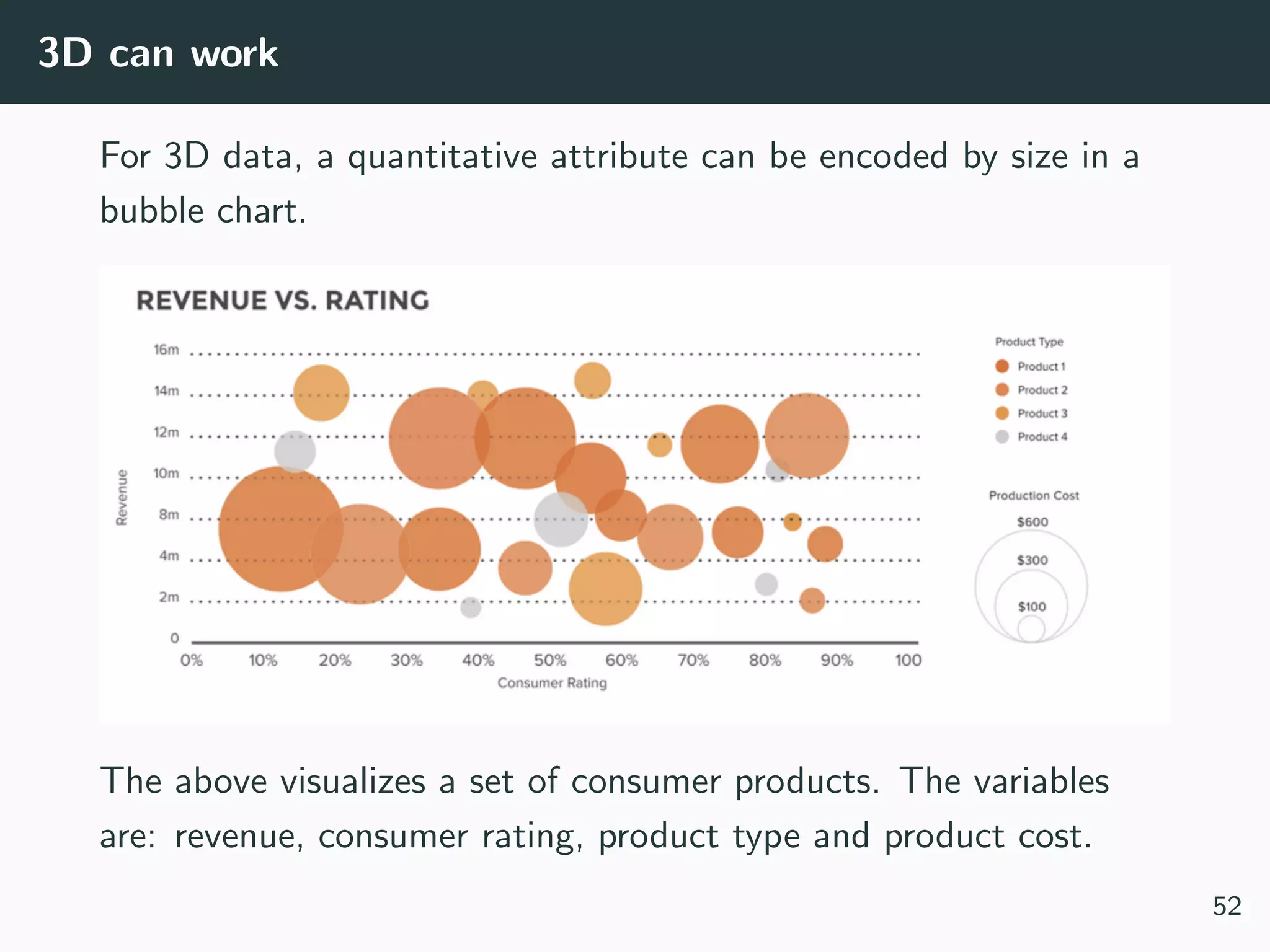
![[Not] Anything is possible!
Often your dataset seem too complex to visualize:
• Data is too high dimensional (how do you plot 100 variables
on the same set of axes?)
• Some variables are categorical (how do you plot values like
Cat or No?)
48](https://image.slidesharecdn.com/lecture1eda-180918072710/75/EDA-51-2048.jpg)