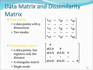
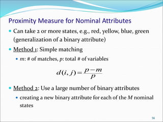
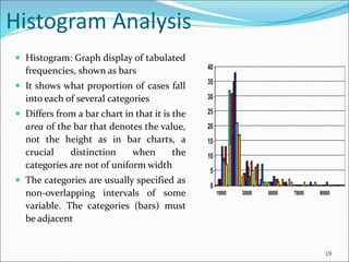
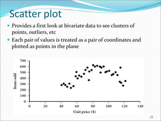
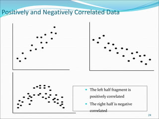
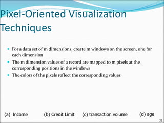
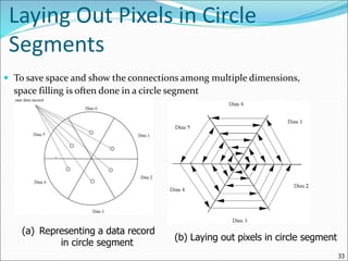
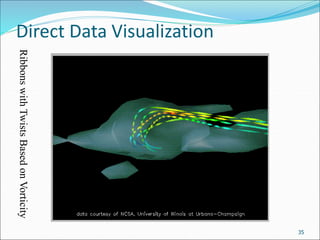
This document discusses various data sources and characteristics of datasets used in data warehousing and mining, including types of data objects and attribute types. It also covers statistical descriptions, data visualization methods, and the concept of measuring data similarity and dissimilarity. Key concepts include understanding structured data, data visualization techniques, and the importance of central tendency and dispersion in analyzing datasets.

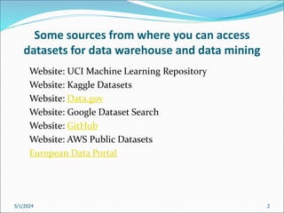
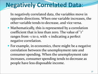
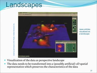
![Measuring the Dispersion of Data
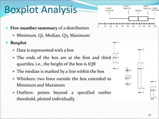
Quartiles, outliers and boxplots
Quartiles: Q1 (25th percentile), Q3 (75th percentile)
Inter-quartile range: IQR = Q3 – Q1
Five number summary: min, Q1, median, Q3, max
Boxplot: ends of the box are the quartiles; median is marked; add whiskers,
and plot outliers individually
Outlier: usually, a value higher/lower than 1.5 x IQR
Variance and standard deviation (sample: s, population: σ)
Variance: (algebraic, scalable computation)
Standard deviation s (or σ) is the square root of variance s2 (or σ2)
n
i
i
n
i
i x
N
x
N 1
2
2
1
2
2 1
)
(
1
14
n
i
n
i
i
i
n
i
i x
n
x
n
x
x
n
s
1 1
2
2
1
2
2
]
)
(
1
[
1
1
)
(
1
1](https://image.slidesharecdn.com/02data-240501074622-c02e5099/85/Getting-to-Know-Your-Data-Some-sources-from-where-you-can-access-datasets-for-data-warehouse-and-data-mining-14-320.jpg)

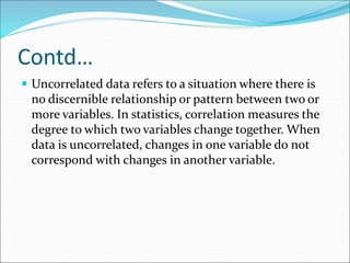
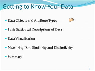
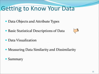
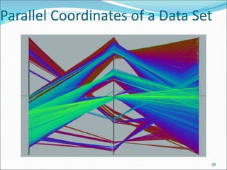
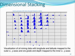
![Scatterplot Matrices
Matrix of scatterplots (x-y-diagrams) of the k-dim. data [total of (k2/2-k) scatterplots]
36
Used
by
ermission
of
M.
Ward,
Worcester
Polytechnic
Institute](https://image.slidesharecdn.com/02data-240501074622-c02e5099/85/Getting-to-Know-Your-Data-Some-sources-from-where-you-can-access-datasets-for-data-warehouse-and-data-mining-36-320.jpg)
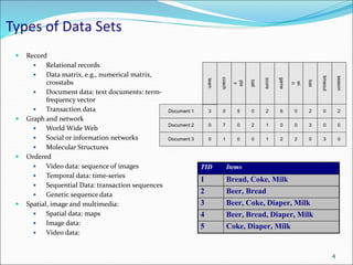
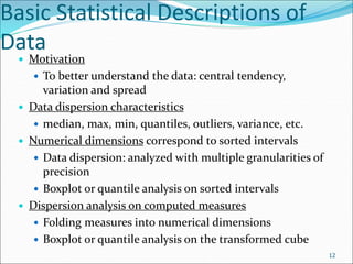
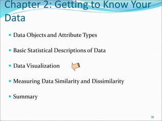
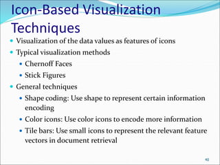
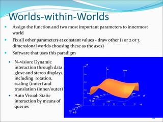
![Parallel Coordinates
n equidistant axes which are parallel to one of the screen axes and
correspond to the attributes
The axes are scaled to the [minimum, maximum]: range of the
corresponding attribute
Every data item corresponds to a polygonal line which intersects each of
the axes at the point which corresponds to the value for the attribute
38
Attr. 1 Attr. 2 Attr. k
Attr. 3
• • •](https://image.slidesharecdn.com/02data-240501074622-c02e5099/85/Getting-to-Know-Your-Data-Some-sources-from-where-you-can-access-datasets-for-data-warehouse-and-data-mining-38-320.jpg)
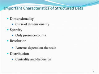
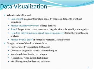
![Similarity and Dissimilarity
Similarity
Numerical measure of how alike two data objects are
Value is higher when objects are more alike
Often falls in the range [0,1]
Dissimilarity (e.g., distance)
Numerical measure of how different two data objects are
Lower when objects are more alike
Minimum dissimilarity is often 0
Upper limit varies
Proximity refers to a similarity or dissimilarity
54](https://image.slidesharecdn.com/02data-240501074622-c02e5099/85/Getting-to-Know-Your-Data-Some-sources-from-where-you-can-access-datasets-for-data-warehouse-and-data-mining-54-320.jpg)